


upperV03
-
Posts
6,359 -
Joined
-
Last visited
-
Days Won
44
Posts posted by upperV03
-
-
This year’s anthem jackets and travel gear are slowly starting to appear on MLS Store/Fanatics. One interesting one so far is Orlando, which hints at then incorporating red into their new away kit:

I would expect the shirt to still be primarily white, but with some red and purple accents.
-
 3
3
-
-
The purported leak of the Timbers’ new secondary kit has been making the rounds again the last few days, so I decided to try and recreate it and see what it would look like with their new sponsor logo:
It still isn’t confirmed that this will end up being legit, but I strongly believe it will be. The Timbers’ new anthem jacket for this year seems to have the two shades of green seen on the kit:
-
1
-
-
1 hour ago, BlazerBlaze said:
Really wish somebody would have gotten a pic of Giorgos Giakoumakis at Media day. There's been zero hints/clues of what ATLUTD's new away is going to look like.
All of the players wear their team’s primary kit for MLS Media Day. He was wearing the new anthem jacket, but it’s just the standard black/gold/red:
-
-
Shorts and socks of the new Red Bulls kit:
Really liking the direction so far, would love to see the shirt have a similar design to the MetroStars’ ‘97 home kit.
-
4
-
-
Shouldn’t come as a surprise, but Miami’s new primary kit (the shirt has been leaked several times) will once again have pink shorts and socks:
-
Vancouver’s new anthem jacket suggests that they’re going navy and gold for their new secondary kit:
Fitting since it’ll be their 50th anniversary this year. It also fits with the graphics they’ve been using:
This has been posted before, but worth mentioning again that Seattle’s new anthem jacket shows off the colors of their new primary kit. Of course the shirt will be primarily green, but this light blue color will be used in some form:
-
4
-
-
3 hours ago, gosioux76 said:
I'd like to see a simplification of the badge. Remove the outer circle and the words and use the thorns and soccer ball on their own. It isn't the kind of wholesale change that would upset a fanbase, but it can still symbolize the switch to a new era.
Now that’s something I could definitely get behind and could potentially see them doing. The partial logo has looked great on the training gear the last couple years:
They could strip it down completely and just use the thorns and the rose/ball without the container shape but I think it works best like this^. Just make the thorns green again and it would be perfect IMO.
-
5
-
-
11 hours ago, vtgco said:
Also, curious if the Thorns will get any change now that they've sold... Personally, I hope all they do is return to red primaries and the full-color logo.
I would be extremely surprised if the new ownership changes the badge. If they did, it wouldn’t be for another year or two but I think there’s too strong of a bond between the fanbase and the current badge for them to even consider changing it. I would definitely be on board with them returning to the full-color logo full time, though. As for red primary kits… I’ve heard that they’re supposed to return to them this year.
-
1
-
-
The Ducks will be getting a brand new set this year. So far, no rumors of what it will look like. It will be the first set to feature the B1G patch, though.
-
3
-
-
16 minutes ago, aawagner011 said:
What is up with these alleged third kits? Reposting LAFC because the original image is no longer visible.Why would LAFC and Miami have third kids with their city script on the chest? I get they are very evocative of the cities, but why would FLEX Tools and Royal Caribbean agree to not feature their logos on game kits that they already pay to sponsor? As always, Footy Headlines is the site claiming the third shirts will feature chest scripts.
All five of the third kits this year will have a wordmark on the front and the main shirt sponsor on the back (presumably below the numbers). Last year’s crop of third kits seemed to follow a similar theme to Nike’s NBA City and MLB City Connect programs. For this year’s crop, it seems like Adidas chose to do something similar to their Reverse Retro line.
QuoteThat Miami jersey is definitely concept only. I think that's also the case for LAFC since they are supposed to use something other than the 2022 template for the thirds
The Miami jersey is just a prediction by Footy Headlines based on a general description. The real thing will likely have a few differences. I’m led to believe the LAFC one is 100% legit (replica version, though).
-
Tomorrow is MLS Media Day, so expect to see some glimpses at a few of the new kits (for teams getting new primary kits, at least).
-
4
-
-
Washington is wearing gold/white/white. Trash uni matchup.
-
3
-
-
This image popped up on the Timbers subreddit this morning. It would be the away kit, not the third kit. I haven’t been able to confirm the legitimacy, but I’m leaning towards it being legit. If so, it seems like a pretty natural successor to their pink rose kits and also fits in with Adidas’ recent theme of doing nature-themed kits (especially the WWC away kits). Obviously it still shows the Alaska logo, but (again, if it’s legit) it’s likely that this mockup was from before it was official that Alaska was ending the partnership. I don’t love the central crest, but I at least think it makes sense with the tree design on either side.
-
2
-
 1
1
-
 1
1
-
-
Not only are we getting standard uniforms today, we’re getting the Christmas patches back on the uniforms:
This is how it should be. The NBA’s Christmas Day aesthetic was pretty much perfect before Adidas started making the special Christmas uniforms. It seems like they’ve decided to return to that formula this year, which is fantastic IMO.
-
15
-
-
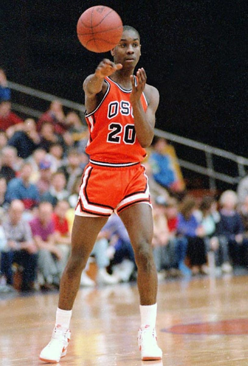
Famous Oklahoma State alum, Gary Payton:
In all seriousness, this is a dumb discussion. Oregon State has been wearing OSU on their uniforms for a long time. Their greatest, most famous player^ wore OSU on his chest during his time at the school. Before he got there, it was pretty much what all of their uniforms had on them. Nowadays they almost always have at least one uniform with it.
-
4
-
-
18 hours ago, VampyrRabbit said:
The jerseys look legit, and given that Miami started off wearing home shirts that had a Henley Collar, then it shouldn't be a surprise that they have gone away from the collar style on the 22-23 home shirt as well as changing the shade of pink again.
And if these are the new home shirts, then it's not a shock that they are pretty plain. Adidas know that they are going to sell a f***ton of them no matter what thanks to Messi - why bother with any fancy design elements?These would’ve been designed and finalized well in advance of Messi joining Miami.
-
1
-
-
Leak of the new Miami home jersey (child’s replica version):
This leak confirms a few things:
First and most significantly, the new MLS shirts will indeed be using the 2022 World Cup template still. I said it before on here, I personally am not surprised. Adidas will want their new template to be debuted on the Euro and Copa America kits, not the new MLS kits.
Second, Adidas is using a more saturated shade of pink for this new Miami shirt. Will be the third different shade of pink that’s been used for them.
Third, this confirms how the Royal Caribbean logo will look on Miami’s shirts.
-
1
-
 1
1
-
 1
1
-
-
The Ducks will be in the clean and classic green/white/white combo for Friday’s Pac-12 Championship Game:
Should be a great looking game as long as the Huskies don’t bring out their gold chrome lids or their trashy “Royalty” uniforms.
-
4
-
-
Oregon and Oregon State are in discussions about keeping the rivalry alive. Nothing is finalized yet but at the very least there are talks about scheduling a game between the two next year. Oregon will have to agree to a buyout with one of their already-scheduled non-conference opponents in 2024, or agree with one of those schools to move games to future seasons.
-
7
-
-
I really loved how last night’s Civil War looked. I’ve always thought these games look best under the lights, especially when the game showcases as much color as last night’s did. I thought the Ducks’ white pants and socks really helped the overall contrast and helped to alleviate the highlighter-esque effect. Had the Beavs worn their black helmets and/or pants, I think this would’ve been my favorite color on color Civil War matchup yet.
-
10
-
1
-
-
Wazzu going gray/white/gray in the Apple Cup:
Utah going white/black/black vs. Colorado:
Arizona State going with sparky and traditional gold/maroon/gold vs. Arizona:
-
3
-
-
1 hour ago, crashcarson15 said:
I sense this might not be the most popular opinion, but I really don't like the Civil War in color-vs.-color, especially not when Oregon State wears orange.
There's some contrast between the colors, but I find this pretty hard on the eyes at times:
… especially when you compare to the last time they played at Autzen and Oregon State wore a traditional road set, which I just think is a really nice and balanced matchup:
The one color-on-color combo I think works decently from a readability standpoint is Oregon State in black and Oregon in yellow, but that suffers from Oregon's yellow stuff normally being yellow and black vs. being yellow and green:
I don’t completely disagree. I like the green vs. orange, but not when it’s mono-green vs. mono-orange. I think the Ducks wearing white pants and socks will help a lot with the overall contrast this year, though I wish the Beavs were going with black pants as well.
I agree that the black vs. yellow is better from an overall contrast perspective, but I don’t think it showcases the colors as well as green vs. orange. My least favorite color on color option is orange vs. yellow, which they did in 2020. I personally like that they’ve seemingly adopted color on color as the tradition, but the 2012 and 2014 games were both pretty special as far as non color on color matchups go:
-
1
-
-
Oregon State has officially announced that they’re wearing all-orange on Friday vs. the Ducks, so here’s a look at the full Civil War uniform matchup:
-
7
-
1
-


:no_upscale()/cdn.vox-cdn.com/uploads/chorus_image/image/73047055/1925708337.0.jpg)


.jpg)
.jpg)


MLS Kits 2024
in Sports Logo News
Posted
Was able to find this clip from last year’s preseason town hall for the Timbers:
Certainly lends some more credibility to the away kit leak and also hints at the retro inspiration for the upcoming third kit.
*If you don’t wanna watch the clip, CEO Heather Davis is asked about future kit designs. She says for 2024 there will be a nature/environmental-themed kit in partnership with the Nature Conservancy and that there might be an opportunity to honor some Timbers history as well.