


upperV03
-
Posts
6,359 -
Joined
-
Last visited
-
Days Won
44
Posts posted by upperV03
-
-
Just now, MJWalker45 said:
Hopefully they change both kits instead of just swapping out the badges on the away kit, or even worse just using the old crest for another year.
Their away is staying the same, just with the new crest:

-
 2
2
-
-
Finally some still shots of the Beavs’ new orange lids:
I think the finish is actually the same as their last orange lids, which is unfortunate because it makes the helmets look a bit too red. It also looks like the decals are transparent so the orange of the beaver head is just the helmet finish. The white eye and teeth of the full-color logo would’ve helped the helmets look more cohesive with the unis.
-
6
-
-
Here are the orange lids for the Beavs. The helmet finish seems very similar to their previous orange lids (last worn in 2018), maybe a touch lighter. Even though it wouldn’t match the jersey and pant striping, I think a single black stripe would’ve done wonders here. They basically would’ve just been an inverse of their standard black lids, which would’ve been better than just the plain orange shell IMO. I also have no idea why they went with monochrome Beaver decals, definitely unnecessary.
-
1
-
-
You don’t need the name in your crest for it look good, as their Cascadian rivals have proven:
That said, I do think the Sounders’ new primary logo needs something else. As it stands, it feels a bit empty and more fitting as a secondary logo than the primary.
-
9
-
 1
1
-
-
From what I’ve gathered, a large amount of their fans wanted the orca as the primary element instead of the needle. It seems to be that the team wanted to double down on the needle as the primary identifier and felt like they had to throw in an orca at the last minute as a way to try and appease fans.
-
It looks like a prototype to me. There are a couple things that are a little questionable, as @hendocfc mentioned, but the overall construction is on par with this year’s authentic MLS shirts. It may be a surprise to some that this would seem to point to the 2024 shirts using the same template as this year’s, but it actually makes quite a bit of sense when you consider that Adidas’ Euro 24 and Copa America kits are scheduled to be released around March or April. Those kits will be the debut of the teamgeist-inspired 2024 template.
-
3
-
-
The last ever opening weekend of Pac-12 play (as it stands now) delivered some good-looking uni matchups. Really nice contrast in most of the games:
The 2 remaining Pac-12 schools delivered a clunker of a uni matchup, though:
-
1
-
-
Arizona changing the stripes on their white jerseys is genuinely one of the dumbest uniform updates I can remember. So dumb that it almost seems like someone made a mistake before finalizing the order.
-
13
-
-
“Quick, Oregon’s on, I better find something dumb to complain about!”
-
Colorado is wearing white/white/gold today at Oregon. Instead of the new white jerseys with gold numbers, they’re wearing the old Elite 51 white jerseys. Should be a great looking game.
-
2
-
-
Arizona State going mono-maroon vs. USC:
Probably smart, as all that maroon will hide the stains from what will surely be a bloodbath.
Meanwhile, Arizona appears to have updated their white jerseys to include the same red/white/red stripe that their new navy jerseys have:
I didn’t mind the stripe change on the navy jerseys because it still works well enough with the r/w/b helmet and pant stripes, but this change on the white jerseys is DUMB.
-
1
-
-
Utah is wearing their fauxbacks this week against UCLA, setting the stage for an absolutely gorgeous matchup in Salt Lake City.
The Beavs are countering Wazzu’s white/anthracite/white with black/cream/black (which should be their default road look). While I’m glad to see them go with the black pants, the matchup as a whole against Wazzu will be quite bland.
-
9
-
-
1 hour ago, Green27 said:
I personally love the Black/Green/Black combo. The yellow accents really pop, and the green gets to be the star without being overbearing. I really think it embraces school colors while looking sleek and modern, pleasing both sides of the aisle.
Agreed 100%, and I also think it’s pretty much the perfect choice to go with the special cleats. The cleats get to shine without the uniforms being too flashy or colorful (like last week’s g/g/y combo), while the combo itself is still strong enough to stand on its own as well.
-
1
-
 1
1
-
-
-
4 hours ago, tBBP said:
I always said I wanted to see a brown uniform in the NBA...well there that be. Need to see the real thing before I opine further...
The Blazers crossed that off the list back in 2020/21:
-
2
-
3
-
-
10 hours ago, dont care said:
I wonder why Nike would think that it’s a good idea to show that their shoes are actively making their feet hot.
Ahh yes, because otherwise it’s such a big secret that people’s feet get hot when engaging in athletic activities.
Not to mention the fact that the video makes it clear the idea behind the cleats came from Oregon’s long-time EQ guy.
13 hours ago, WestCoastBias said:Makes sense for Oregon to wear black against a team who's colors include black
Makes sense for Oregon to wear what they want for a home game.
-
3
-
 1
1
-
3
-
-
The Ducks have new Nike Dunk cleats with thermal-reactive uppers for next Saturday’s game against Colorado:
If the video is an indication of the uni combo, it looks like it’ll be green tops and black pants.
-
2
-
-
After debuting new jerseys the last two weeks, Colorado is wearing their old black jerseys on the Elite 51 template tonight. Thought that they had finally moved on, but the flywire just will. not. go. away. Strange move, especially when they could’ve just added a gold outline to the numbers on the new black jerseys. The Buffs are wearing gold helmets tonight (with black pants), so that’s a plus.
-
3
-
-
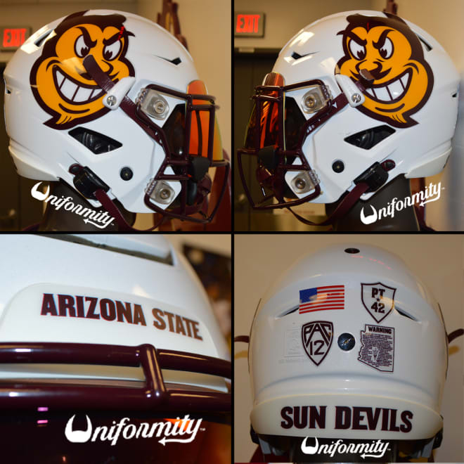
Arizona State going white/maroon/white with large Sparky face decals on the helmets:
I don’t really care for the big Sparky face decals (just use the regular Sparky), but they’re still better than any of the million different pitchfork decals they use.
-
4
-
1
-
 1
1
-
-
A few more Pac-12 uni combos for this week.
Utah going white/red/red vs. Weber State:
Wazzu going gray/crimson/gray for the 2nd week in a row, but this time with the traditional lighter gray:
Cal busting out the navy pants and going mono-navy vs. Idaho:
-
3
-
-
Thrilled to see them roll with one of the best available combos in this uni set. Pleasantly surprised that they’d go back to it after wearing it last year. Green/green/yellow hadn’t been worn since 2013 prior to last year.
-
5
-
-
Last week Colorado showed off their new white jerseys that have lot of gold, but this week there’s almost no gold in sight. They’re wearing black helmets with black and white decals and new black jerseys with white numbers and a white Colorado wordmark on the chest. The only gold is on the CU collar logo and the outline of the Pac-12 logo. They’re wearing white pants, too.
-
1
-
 1
1
-
3
-
 4
4
-
-
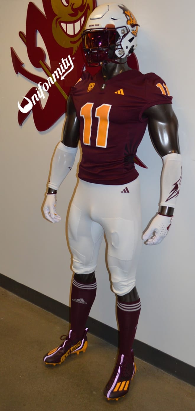
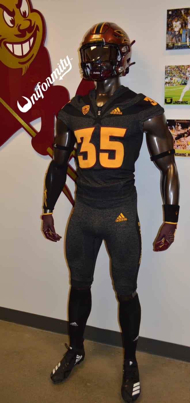
Despite getting a new uniform set this year, Arizona State is giving the heathered pajamas one last run-out this Saturday against Oklahoma State:
These have been one of the worst unis in CFB the last several years, but apparently they wanted to show them off one more time. As a reminder, ASU has a new black alternate with the gimmicky glow-in-the-dark number outlines that they’ll wear next month against Colorado:
-
Texas Tech going white/red/red vs. the Ducks:
Should be a good looking game with Tech in red and white and the Ducks in white and green.
-
2
-


/cdn.vox-cdn.com/uploads/chorus_image/image/69817913/1233512311.0.jpg)


Seattle Sounders FC announce plan to "explore the club's identity"
in Sports Logo News
Posted
Speaking of the new kit, just gonna leave this pic of this hoodie here. May or may not have something to do with the new kit