


Htown1141
-
Posts
711 -
Joined
-
Last visited
-
Days Won
2
Posts posted by Htown1141
-
-
Slight update to show the jerseys. Note that a few things have changed in terms of the actual uniform construction of the era. Most teams are using Reger Maris-style sleeves and colored away uniforms are more common, although not ubiquitous. A paler blue was chosen for manufacturing limitations of the period, and the stroke was thickened on the bird for the same reason. (the primary is just a vectorization of the sleeve logo)

-
 1
1
-
-
hey y'all! back at it again. I've had some time off from some things and have been working in the background on a fake league. I don't really have any sort of objective, just going to drop some things into the thread and hopefully y'all can tell me if it's era-appropriate.
If y'all wanna read about it, go visit here: https://ahsports.boardhost.com/viewtopic.php?id=432
First up,
Brooklyn Jays
Founded: 1884
Design Yr: 1949
Context: The Jays will most likely end up finishing the season champions, but their new president could pose a challenge to the established order. While his focus is not necessarily on the roster (it's one of the best in baseball), there's a sense that he wants to create a new look for the team. Inspired by a set from the 1930's, he wants to bring back the block B and add a better-rendered blue jay. I'm not sure how well this would go over with the fanbase, but the previous logo only exists for about 8 years or so.
If anyone has any notes, please feel free to share, unlike my most recent stuff on here, None of this is anywhere near finished.
-
5
-
 1
1
-
-
54 minutes ago, MJWalker45 said:
N.C. State looked pretty bad in these. They actually improved just by getting rid of the collar design.
I happen to like the shoulder stripes, but def to each their own there. The base design of the numbers and wordmark are pretty solid, and I don't think any of their helmet offerings made the stripes look out of place. They drew attention, sure, but the rest of the uniform didn't look nearly as busy and gave breathing room to a pretty busy visual element.
56 minutes ago, MJWalker45 said:Louisville would have been okay if they didn't due that weird thing with the numbers.
I think we're probably just in disagreement about particular aesthetics, but I think Louisville's numbers are fantastic. the 2021 reintroduction of the drop shadow also helps tie together multiple eras of UL's football, and the slanted TV numbers were strange, sure, but they accentuated a unique sleeve design and fit the direction of the uniform (quite literally).
59 minutes ago, MJWalker45 said:The way they treated their non top-tiers was pretty bad too. Stripes that didn't cover the whole sleeve, clipart designs that didn't do that either, it was just a mess.
The EMU and Bowling Green sets are from 2013, which admittedly aren't great. That's why I put the cut-off around 2015, when things started trending upward. I outlined also that the half stripes also irked me just as much as anyone else, but the WVN template should fix that for most schools. And it's not like those designs are particularly appalling, it's just that I'd assume the template didn't allow them to print all the way across (if you look at teams who did use the primeknit and had full sleeves, like UW and Miami, they had stripe insert panels on their sleeves). I was just trying to say that recently, Adidas has done right by their schools with very few misses, and hopefully the switch to the WVN as a more affordable option should let schools like Ohio, LA Tech, Northern Illinois and Southern Miss get their stripes back (Wyoming also wears the WVN template, and their stripes are all the way across).
-
Adidas gets a really bad rep here for their worst stuff, but they haven't made a bad primary look for a school since arguably UCLA in 2015? USF 2015? I argue that Texas A&M, Washington, Rutgers, NC State (I love the shoulder stripes and the new set), Louisville, USF (starting 2018), Miami, Georgia Tech, Mississippi State, Nebraska, and in the last few years BC, Kansas, and UTEP look as good, if not better, than they ever have. The alternates can get kinda quirky, sure, but for every "The 'Ville" set, there's 5 throwback sets that are lovingly researched (2018 Miami, 1939 and 1956 Texas A&M, 1990 UW, anything Mississippi State, anything Nebraska, 1950's Louisville) or a Mississippi State Statesmen/GT Black Watch sets that show a deep appreciation for their source material.
Their templates have been really strong since 2019 (the WVN A1 was released in 2019 and they fixed the collar on the primeknit), and their new top-end template, the A1 Ghost, looks to be their answer to the Vapor Untouchable. Their templated offerings with the primeknit left a lot to be desired with the weird half stripes, but if UTEP, Arkansas State's 2022 white uniform, and LA Tech's powders are anything to go by, most schools seem to be switching to the WVN that gives them as many templated sleeve offerings that go all the way across the caps, as well as UCLA stripes.
Put some respect on their name, Adidas does almost all FBS schools right and will accommodate for CD's designs as well (UTSA's Christopher Muñoz designed their current set). At this point, their hit rate is arguably higher than Nike's, and any proprietary numerals (2012 or 2020 A&M, UW, Louisville, GT [although I think these were designed by someone externally], NC State, Nebraska, Indiana, USF) go toe to toe with anything Nike has pumped out in the last half decade.
-
4
-
-
2 hours ago, JustABallCoach said:
It’s not a trend it’s a large part of the cities culture for over 30 years.East side, maybe. Or the rich white kids in West U or Memorial who act like what they think the fifth ward is and pretend to listen to the Houston rap scene (but really just Travis Scott). Houston is really odd in that if you were to ask 20 people from across town (including suburbs who say they’re from Houston) what “Houston Culture” is, you’d get about 20 answers. Montrose is different from is different from rice village (okay maybe those two are kinda similar) is different from bellaire is different from magnolia park is different from third ward and so on. Keep in mind that the most rabid Texans fans sure as hell aren’t in the loop, or even beltway 8. Admittedly, that’s because their branding and marketing mostly goes out towards the whiter suburbs, and it probably helped them secure places like spring/the woodlands/Conroe/Sugar Land/Pearland/Missouri City/etc. by having a “great white hope” as their largest spokesperson (nothing against Watt btw, seriously a great dude and did a LOT across Houston during his time here). The pivot towards communities inside of Houston proper just seems insincere, is all.
Also, the Texans would look SOOOO much better with a white facemask.
-
11
-
1
-
 4
4
-
-
Just a reminder that the Browns haven't narrowed down voting options to 10, you can vote for whatever you want! Might I suggest another design (currently sitting at #17, and has a thread in concepts to explain its subtleties... )
Also on the Panthers, here's the size of the TV number on the draft jersey. I know it's darkened (damn fullscreen video overlays) but can anyone tell if it's larger this year?
-
So, I don't know if y'all have heard, but the Cleveland Browns are asking fans to submit logo concepts for the rebrand of the Dawg Pound. I thought it'd be nice to throw my hat in the ring and show off what I've picked up over the years. Here's a look at what I submitted!
Be sure to go vote! https://web.witcontests.com/browns/v/eRk0xQO
-
16
-
1
-
 2
2
-
-
North Texas got some new uniforms! The Wing helmet looks to be the new primary maybe? There's expected to be a full green and black set coming soon enough. I'm a fan of sublimated number textures so I gotta say these are nice
-
1
-
-
Oh my god I am so sorry! I love the new update and I like the reshaping of the right ear a lot, the panther feels much more threatening. Here's the fix I tried a hand at. Didn't redraw anything major, just rotated stuff around lol
-
2
-
-
On 9/3/2021 at 10:14 PM, Sidney said:
Here is an update
- A new look on the far ear- I've redrawn the teeth area with a better perspective
-I've improved the mouth area in order to correct the far side of the face
- I've made the neck thinner
I like this a lot, but i think a couple of things are a tad off about it.
I like the shape of the right ear, but rotating it a little bit more down and shortening it up a little might tuck it a tad more back, conveying a better sense of motion. The right eye and whiskers need to be rotated a bit down too, because rght now they're angled up if you were to look at the panther from head-on. Lastly, I like the idea of the thinner neck, but you're losing a bit of that forward motion the original had. I think that sacrifice is fine, but that's the trade-off anyways.I hope this is fine, but I straightened as much as I could out to describe what I mean. As you can see, the original sketch is very wonky in its perspective, but all the bones are there. Just rotating some stuff around and shortening up a few areas on the right, everything beings to point in the right direction.
-
1
-
-
4 hours ago, Sidney said:
I had to put the 2 options ^^wasn't really sure. So nothing in particular about the face?
a couple of like perspective things are throwing me off about this. The bottom part of the jaw is a little wonky, with the far tooth being larger than the near tooth and a lack of indention to delineate where the bottom jaw starts on the far side. The far ear is a tad off too, it looks more like it's flying higher than the more pinned back shape of the fully shown ear (I think something like the original sketch might be better for that). I love the new shape, but it is now kinda missing that original "vaguely north and south carolina" shape that made the head uniquely built for the panthers. To remedy this, maybe try to incorporate something *sorta* like this shape? I have no clue if it would work and I don't think it really needs it, but using it as the nose or modifying the snout could possibly make it work.
This has been my favorite series on here in a minute, and this panthers logo looks like a great refresh! And uh, white whiskers
-
2
-
-
On 3/8/2021 at 3:36 PM, coco1997 said:
Thanks!
We've reached the final team in the series, the Houston Astros!
ASTROS HOME
ASTROS ROAD
ASTROS HOME/ROAD ALT
Despite not being much of a football fan, I’ve always loved the Houston Oilers’ uniforms, and for some reason their logo left a huge impression on me as a kid and helped spark my interest in sports design. Because in my re-colored universe both the Cubs and Tigers wear navy and orange, I decided the Astros would require a very different color scheme. Also, I figure one of the Texas teams should sport red, white and blue, so Houston it is. Therefore, in my recolored league, the Rangers look like the Spurs and the Astros look like the Rangers.
C&C appreciated! I'll post the Rangers in Dallas Stars colors next.Yeaaaaaa, could you use literally any other astros uniform set
 , the use of Columbia and red was definitely the right choice but I would love to see either their current set (or a modification of the post-sunrise 80’s set) used as the base. Love the series though, and the recolor away from sand and brick at least made this look palatable lol
-
2
-
-
One thing I wish I could get a better read on is the number font for a lot of these teams. I think one of the coolest things about early football uniforms was a lack of standardization in both size and shape, and only showing 11's doesn't allow for that, if that makes sense. Maybe using a famous player number (20, 22, 7, 81 for the lions, 15, 14, 36, 92, 4, 12 for the packers, etc.)
For the Texans specifically, I think a darker red or red/orange would look great, and the helmet design feels reminiscent of the Astrodome, actually. Maybe making it a slightly more overt reference (with like a circle at the top or something) might make it feel more connected to the city the way that others are. I also don't know about the sublimated H, I think something you could do that could keep the H in the design is make the vertical bars of the H into shoulder stripes, while the crossbar of the H becomes a stripe similar to Indianapolis' on the shoulders.
I love this series tho, and will probably come back to comment more about some other teams in the future. Kickass stuff, fr
-
2
-
-
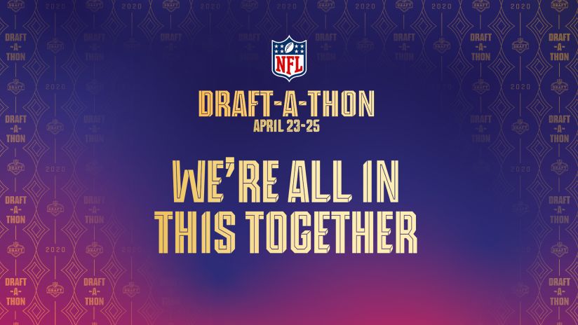
On 4/24/2020 at 1:22 AM, mgdmhl said:
Anyone know this font being used throughout the NFL Draft/Draft-A-Thon?
Dm me
-
10 hours ago, BayBaseballFan said:
Thanks a ton for this template. Super easy to use and was just what I was looking for.
Of Course! I'm actually working on a new hat template that I think is even better, and I'd be happy to PM you with it!
-
4 hours ago, colinturner95 said:
Shameless plug as it is, but why couldn't Adidas and aTm do something like this:
-Add stripe to helmet to match pant stripe
-remove all traces of the bevels from helmet logos, numbers, pant logos.
Now there's some level of harmony between all parts of the uniforms (ignore the socks and cleats, that's a holdover from my 72 project).
They don't need a fat helmet stripe. A&M has never really had a helmet stripe either, so I'd say just for the sake of tradition to keep it off. Also def white facemask (not that grey isn't a good option, but white works).
-
10
-
-
Having watched almost every A&M game since they switched to their current uniform set, Texas A&M needs 3 things for this combo to last a while.
- Get rid of the bevels on the numbers
- a larger wordmark.
-a white facemask
here's a before and after of what I mean, taken from a game last year against Mississippi State. (edited version is the first one)
I understand the want for those '98 uniforms, it was the team's only Big 12 title and that uniform holds a lot of significance to Aggie fans, as well as looks "like a college uniform should look like", with the faux-mesh and the incorrectly scaled wordmark with a basic font, it gives an old school feel.
HOWEVER, the look above accomplishes a simple, effective, and unique look that adheres to history at a school which revers its traditions. is addition by subtraction on the bevels, as a lack of them creates a much more direct look, while the number font is kept intact to still retain the vibe of the original uniform (an even weighted standard block makes the uniform vastly inferior, and if evidence is needed, look at the 1974-76 uniforms, also also the accompanying wordmark is one of the best in the country in capturing the the identity of its school while still staying aesthetically pleasing). The larger wordmark just balances the front of the uniform and gets rid of the empty space made by the Primeknit A1 template without looking awkward.
The racing stripes can (and should) stay for a few reasons:
Without it, the uniform needs either stripes (most likely either northwestern or Bucky Richardson-era stripes) or will go without any and become an updated version of the 98 uniform. Both are fine, but neither is an identifiable feature on the uniform the way that the stripes are, and allows for a more iconic overall athletic identity. Furthermore, JOHNNY GD FOOTBALL. Even if you're *barely* interacting with Aggie culture, you understand that Manziel looms large. He is still an icon in College Station despite everything that happened after his time at A&M, and the uniforms certainly hold an important place within Aggie culture because of it.
It's not a bad set, y'all! I think the bevels really soured a lot of people on the look, and hopefully this changed your mind(?) idk
-
28
-
-
9 hours ago, llfhockey said:
Does anyone have any recent Untouchable templates? PSD or AI? I don't have them on my new laptop and I can't find anything at all researching.
Dont tell anyone, butttttttttttttttttttt...............
try this:
extract all those into a new folder, go to \Jacksonville Jaguars\LOGO SLICK
It's a .pdf (open it in illustrator) and select page 4.
-
4
-
-
8 minutes ago, SFGiants58 said:Quote
To be a little more specific, Houston doesn't have any sort of national narrative. It's hard to explain, but the easiest way to think of Houston is that it's just a collection of small towns that kinda have to act as a singular unit because they accidentally expanded on top of one another, save for the medical center and downtown, which were built because the city acted like a city. Therefore, it can't really create a national narrative like New York, Los Angeles, San Francisco, Atlanta, or to keep it in state, Dallas, San Antonio, or Austin. There are very few (if any) generalizations to make about the city, and that's rooted in the fact that there isn't a culture here that's become nationally (and very often locally) relevant.
That's a fascinating way in which the city formed. I was learning a little bit about the history when looking into Dean Corll (who committed most of the murders in The Heights and a few other suburbs). One thing came up with great frequency, namely how the city went through a boom and its relatively small police force couldn't keep up (and refused federal aid, because the chief of police was a c-word). I can see how that hinders a national narrative, especially compared to the other Texas metropoles.
So to be a little more precise (again
 ) A lot of Houston can be broken up between 4 types of areas by their formation:
-Some dude bought land and realized it was worth a lot more as real estate or housing development than it was as cattle grass (see: River Oaks)
-Exxon or a subsidiary bought land and realized it was worth a lot more as real estate or housing development in between the oil fields and refineries (see: Kingwood, Clear Lake)
-The wards
-Some dudes from New York decide to buy some ranch and swamp land and start the city (Downtown).
Each neighborhood feels like its own town, though, with its own set of residents, distinctions and feel to it. None of these neighborhoods really fit together, though, which makes Houston different in that aspect..
Back to unpopular opinions!
Every team playing at the FBS level should use a custom number font. Whether that be a modified block similar to Michigan or UNC, a stylized modern block like Michigan State or Texas A&M, or whether it be something like Iowa State, Arkansas (when they wear their superior 2018 uniforms), or Illinois. Every team needs their own custom font, and it should be able to stretch across all of their sports. (this is a refinement of a previous unpopular opinion I made a few years back, so what)
-
2
-
-
14 minutes ago, SFGiants58 said:
I'm surprised that Houstonians feel that "lack of culture." You'd think there'd be some famous musicians or films local to the area, or even NASA might be part of it.
I suppose I forgot about Travis Scott. Like everyone knows Beyonce is from Houston, but the way Travis has taken ownership of Houston with his music (Astroworld was especially huge in Houston, both the thee park and the record even more-so) has kinda been a really cool thing that I didn't think I would ever see. A bunch of people at my school own astroworld stuff, and I know a few with Cactus Jack Jordan 4's specifically because they have the Oilers colors (see: indicative of Houston and its identity). So there is that.
NASA is also big, but it's pretty out of the way. From where I live, JSC and Space Center Houston is a solid 40 minute drive without traffic, and no one really goes down there unless they're on their way to Kemah or Galveston. I would love for it to be a bigger part of Houston's identity, but most people I interact with on a day-to-day basis are a few degrees of separation from anyone who works there (This is unlike Enron, in which I could name about 10 people I got to school with whose parents worked for the Crooked E).
To be a little more specific, Houston doesn't have any sort of national narrative. It's hard to explain, but the easiest way to think of Houston is that it's just a collection of small towns that kinda have to act as a singular unit because they accidentally expanded on top of one another, save for the medical center and downtown, which were built because the city acted like a city. Therefore, it can't really create a national narrative like New York, Los Angeles, San Francisco, Atlanta, or to keep it in state, Dallas, San Antonio, or Austin. There are very few (if any) generalizations to make about the city, and that's rooted in the fact that there isn't a culture here that's become nationally (and very often locally) relevant.
As far as Wes Anderson, only film lovers know he's from Houston and filmed his first movie at St. John's.
-
2
-
-
@Ice_Cap THAT is an unpopular opinion right there. Ask anyone from a city whose sports teams were relocated, and I promise only an increasingly few amount of people care about the history pre-relocation. The Tennessee Oilers are a bad idea for a lot of reasons. I doubt anyone in the city of Houston would buy merch that even though looks like what it did in Houston, has Mariota's name and number on the back. Even general t-shirts or cups or anything, it wouldn't appeal to anyone here because everyone old enough to remember knows how awful Bud Adams was about the stadium demands. He was an awful pr guy and Lanier as able to paint him as a villain, and the city and its people haven't forgiven him and his family for the blowing up of the '91 team or (more importantly) the relocation. But I digress.
People in Tennessee don't give 2 :censored:s about Earl Campbell, Billy Cannon, Warren Moon, Dan Pastorini, Robert Brazile, so on and so forth. The people of Houston do. It makes no sense to make the argument based on aesthetics alone to dictate the identity of a relocated sports team. Specifically in the Titans/Oilers situation, the Oilers while in Tennessee were very mediocre and posted some of the worst attendance numbers in the post-merger era. Although the stadium choice and hastened move by Adams had a lot to do with this, identity played a key part in this. People were going to be showing up for Houston's team, playing in Tennessee. Only when the Titans rebranded and a new stadium was built did they sell out in Tennessee.
@SFGiants58 Your arguments on the aesthetics of the Oilers are completely valid, and after explaining your problem with the striping, I can understand where and why you stand the way you do on the Oilers. However, there are some things I feel like I should further explain or clear up.
On 9/26/2019 at 6:08 PM, SFGiants58 said:QuoteThey light up when I ask them about the Oilers, but it . It's a real, genuine feeling that goes beyond simply remembering some exciting moments. It's inherent to almost every native (and many transplant) Houstonians: the Oilers mean something to a city that doesn't have much to care about in terms of culture, and even now have a greater impact on that culture than the Texans.
That's reasonable, especially when the color scheme and uniforms were so unique. The other team simply hasn't had room to grow, being a relatively-young expansion club.
On 9/26/2019 at 6:08 PM, SFGiants58 said:QuoteNow onto the logo.
Although I understand the clip-art angle, I don't think that you can argue against what it is. First and foremost, it immediately captures the mind as "Houston", or at least more than the Texans logo. Instead of being a standard r-w-n color palette with a stylized bull head, evoking Beaumont all the way to El Paso, this really is emblematic of Houston identity when it was created in 1960. Furthermore, the clipart argument is valid insofar as there are other options. In 1960, if you were going to draw an oil derrick, theres only a few ways to do it, and this is the one that looked best on a helmet. Despite its generic look, however, it was able to remain unchanged for over 35 years.
Unchanged doesn't equal good. I find the Texans' logo far more compelling and an excellent adaptation of the state flag. The "Houston" angle is appreciated, but the Texans' logo does lay claim to the idea that the Texans represent all of non-Dallas-Ft. Worth Texas. I like that as a way to stick it to the hegemonic Cowboys.
That's not necessarily what I meant but I get why you would interpret that to be what I meant. My main argument on that point was that it did its best in 1960 terms to derive the best way to represent a team named the Oilers. Are there better, more interesting ways to do it now? Absolutely, however at that point it did it's job and still looked serviceable at worst (and darn good at best) on a helmet despite its verticality. I just disagree that it's clip-art-y. At the very least it looks good despite being similar to clip art, and the logo would fit in well with the modern NFL.
On 9/26/2019 at 6:08 PM, SFGiants58 said:My guess is that it says "Houston" for memories of the past/part of the collective memory, which equals "nostalgia." You can be nostalgic for things you never experienced.
I mean yeah that makes sense. I'm often nostalgic for the Brooklyn Dodgers and, weirdly, Enron. However, the idea of that saying "Houston" isn't necessarily just nostalgia. I don't feel like I said this enough. Houston has about as little culture imaginable for any city, let alone the 4th largest city in the US. The closest shared experiences we have are Harvey, traffic, and the Astros. The reason I didn't include the Rockets is because they feel more global than local, although many in Houston, including myself, are Rockets fans (the case would be different in 1995 but whatever). The Oilers, until they left, were possibly the single most unifying part of Houston's identity. Even if you weren't a football fan, the Oilers meant something to you. The Luv Ya Blue stuff really was a huge thing here and will always be a part of what being a Houstonian is.
-
1
-
-
On 9/16/2019 at 7:34 PM, SFGiants58 said:
True, but they haven't worn the all-red in years. I completely forgot they did that! The Texans (well, Toros could also be the name) have a much greater identity potential than the Oilers. Their logo also passes the doodle test, but without looking like clip art. Had the Titans not switched up their uniforms, I'd give them the same defense (minus the doodle test).
At the end of the day, Oilers nostalgia is going to fade in Houston (and I'm sure it has already in Tennessee). Some of us uniform nerds will try to keep that Luv' Ya Blue flame alive, but not me.
As someone who has been born and raised here (in Houston), I can tell you certainly that almost every person older than 30 (and many younger) thinks the Oilers have some of the best uniforms of all time. Most don't care enough to follow this uniform :censored: but they remember the Oilers' and their bitchin' identity. The identity became something larger than just the team. It was Houston's first professional sports team, and for many in and around Houston, one of only a few things tying the surround area to the city and its (admittedly weak) culture. There was something intrinsically Houston, Texas about the Oilers, and my parents and their friends are old enough to remember Earl Campbell and Warren Moon and everything that happened. They light up when I ask them about the Oilers, but it . It's a real, genuine feeling that goes beyond simply remembering some exciting moments. It's inherent to almost every native (and many transplant) Houstonians: the Oilers mean something to a city that doesn't have much to care about in terms of culture, and even now have a greater impact on that culture than the Texans.
The show the extent of how little the Texans and their identity have shaped Houston as a whole is to look at my friend group.
Me (a Lions fan, because when I was 6 I thought their logo and colors were super cool, as well as Calvin)
A Panthers Fan
A Saints Fan
A fan of players, not a team
A Browns fan
A Seahawks fan
A Texans fan
All of us are reasonably big football fans, some more than others, but more importantly we only remember a time where the Texans existed. Of course we all watch the games, because it's what's on CBS on sundays, but none of us (even the Texans fan) find it to be must-watch tv. The identity plays a big part in that.
The Texans really look boring as hell.
Above is what I believe to be their two best looks of last year. Don't get me wrong, they're good looks. The way that the navy and red are able to play off each other, a minimal design that works well with the logo, one of the best number fonts in professional football. In fact, the only thing I would change is getting rid of the wordmark on the front (Actual unpopular opinion apparently??? NFL teams shouldn't have wordmarks on the front of their jerseys??), other than that, I think it's one of the prettiest looks to come after the turn of the century. Despite all this, they are literally the blandest look in the NFL. Their visual identity has no excuse of being before the time of digital graphics or modern uniform manufacturing like many of the older teams in the league, it just has no value to the city of Houston. I can look at this team, head to toe, and only gather that it's a team from Texas, and their name is possibly the Bulls.For an expansion team, this isn't good. No other way to go about it, this design makes no sense for an expansion franchise trying to establish itself in a football-heavy landscape. The point of this identity was to become Houston's NFL Team, because McNair and the NFL had to have known that the panhandle down to Brownsville, everything West of (and a lot east of) I-45 is Cowboys Country. It failed. It's a failure of an identity. It had one job, to reignite a burning passion for pro football in Houston, and compared to the Oilers, the Texans have to be viewed as one of the most spectacular failures in modern sports branding.
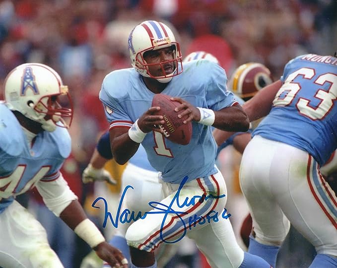
This is the prettiest look to ever debut in Houston. The striping is consistent, the colors work perfectly against a white back ground, and the columbia jersey still works as a very good backdrop to the striping pattern. I specifically used a photo without the helmet because it's its own topic, but the only thing I could possibly think to change from the 1979 set would be to give them the Texans number font (or possibly a modified block, similar to the current Jags numbers or an equivalent). Regardless, the '79 Oilers (or even the 90's teams in Houston, with the smaller sleeve stripes and red facemask) from a uniform and identity aspect are just as visually appealing, than the Texans. At least out of the people I've met and talked to, every single one can figure out what makes the Oilers uniforms look so good. The simple but iconic and unique elements (the striping and color scheme) are all that need to be ther for it to have the staying power it does within the city. I promise, not just based on nostalgia, that people would buy the hell out of an Oilers jersey with Deshaun Waston's number and name on the back. People who weren't even born would rock Oilers stuff if it was more accessible, because it looks good and says "Houston" to those who live here.
Now onto the logo.
Although I understand the clip-art angle, I don't think that you can argue against what it is. First and foremost, it immediately captures the mind as "Houston", or at least more than the Texans logo. Instead of being a standard r-w-n color palette with a stylized bull head, evoking Beaumont all the way to El Paso, this really is emblematic of Houston identity when it was created in 1960. Furthermore, the clipart argument is valid insofar as there are other options. In 1960, if you were going to draw an oil derrick, theres only a few ways to do it, and this is the one that looked best on a helmet. Despite its generic look, however, it was able to remain unchanged for over 35 years.
I'll probably work on this more at some point, and make this my "ultimate defense of the Oilers" argument, but I'll leave it here for now.
TL/DR: You don't know what you're talking about from a cultural perspective. Unless the Texans pull off some '69 Miracle Mets kind of run in the next decade or so, which is very unlikely, the Texans won't have the kind of pull the Oilers ever had in Houston. The "Luv Ya Blue!" era, as well as the "Run N' Shoot" era produced more hype and excitement in Houston than the Texans probably ever will, and even those who weren't around to see the Oilers recognize its value surpasses the Texans. It doesn't look to be changing anytime soon.
(No one gives a :censored: about the Oilers and the pre-Titans history in Tennessee, for what it's worth.)
-
9
-
-
13 minutes ago, Bowcat said:
Hey all, I just finished making a Nike NFL template. What would be the best way for me to share it on here? I use GIMP so its a .xcf file. If you'd like a quick preview of a piece of it here's a link to a sample jersey+sleeve: https://imgur.com/a/MuoTQIc
upload it to mediafire and leave a link in your topic post. Put in the concepts forum and add some concepts to the post, just to show off what you can do with it (also i think you need 3 posts before you can create a topic in the concepts forum)
-

They did it at the NFL draft too
For reference, this is the ACTUAL wordmark

-
3
-


Some random stuff for a fictional baseball league
in Concepts
Posted
I'm putting these two here side by side. I'm torn, personally. I think that the darker blue, although it doesn't contrast well with the black, is much more in line with team tradition. I guess a little more context is necessary, but the team's blue uniforms have existed from 1897-1901, 1912-1923, and 1937-41; 46-Present. The blue has almost always been a royal shade, making it kinda their *thing*, I suppose. An excerpt from their original name story is below.
I understand aesthetically wanting to shift to a lighter blue, but the more I think about it, I would rather keep it as close to the original blue as possible due to its importance to the team culture.
Maybe the squad changes colors after a year? from the lighter blue to the darker blue? Idk tell me y'alls thoughts