


Around the Horn
-
Posts
993 -
Joined
-
Last visited
-
Days Won
1
Posts posted by Around the Horn
-
-
2 hours ago, coco1997 said:
How does everyone here feel about the Yankees' apparent decision to not participate in the City Connect program? I get that the team has been historically committed to the "sanctity" of their brand, but still I think they could do something tasteful and within the parameters of their identity that would make most Yankees fans happy. I don't think anyone's suggesting they wear magenta and seafoam green like the Padres.
There is no design that could ever connect with the city more than an interlocking NY on top of blue pinstripes
-
 2
2
-
-
18 minutes ago, Morgan33 said:
The Predators issue isn't the use of gold at home, that was a brilliant move that has really helped their brand stand out. It's ridiculously bland jerseys, with nondescript, minimalist striping. Time has shown that maybe getting rid of silver entirely wasn't the best idea either. Still, they are very close to a great design and in my opinion, the solution lies between these two designs... Surely there's the potential for the perfect Predators jersey there.

I would be interested to see if they could pull off a keyboard sleeve stripe like what's inside the collar separating the gold from the navy but the dark keys taper like fangs
Might be *too* busy though
-
4 hours ago, Ridleylash said:
Oof, these are pretty bland. It just seems like a needless attempt to "modernize" the classic blue jersey that just ends up coming off more like a Walmart knockoff trying to ape the Liberty jersey's style than anything. The overwhelming amount of blue makes the pants stick out like a sore thumb, too.
And the captain's patch is...less than ideally placed;
The more I watched the game tonight, the more I was thinking a navy alt would look fine if it was the old NEW YORK font on the front instead of the shield
Also the lack of a drop shadow looks awful on TV because it makes the numbers thinner and harder to read...
-
1
-
-
14 hours ago, ruttep said:
Here's the marketing spiel if anyone wants to read it:
The more I look at this, the more it just looks like a Knicks city jersey reject repurposed for hockey
-
6
-
-
On 11/27/2023 at 11:25 PM, Old School Fool said:
Wondering what the neutral site games later in the In Season Tournament will look like? Here's the court from NBA 2K24. It's exactly what you expect.
Also yes, all 30 courts are in the game during the tournament. Play at your own risk.
This would be a good design for a neutral tournament court if they just got rid of the color
-
 1
1
-
-
7 hours ago, GFB said:
Once again, the helmet finish makes the red too dark.
If the "candy" finish is a must for you, then they need to bump the red up a shade (from 187 C to 186 C / 185 C) to compensate.
Now that the red pants are back B/R/B needs to become the regular home look
-
4
-
-
The Lafreniere breakout is here
Nice to see him finally put it all together under a new coach
-
I really hope this is just the stadium series jersey
-
-
I like the idea of that Sixers jersey but you need to have the entire phrase in the same font as the Reading Terminal Market sign for it to really work or just put Philadelphia on the front with the arrows underneath it IMO
-
2
-
-
Hopefully today's choke job mothballs the Eagles' black pants
-
8
-
 1
1
-
-
FNIA went downhill the moment they started adding segments from the stadium in the middle of the broadcast and cut down the amount of time they showed the day's highlights
-
5
-
-
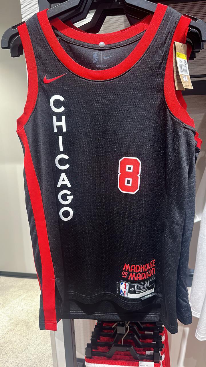
9 hours ago, Pirate_Nation said:
Way too much dead space between Chicago and the number
Move them closer to each other or make them larger-
3
-
 1
1
-
-
The Bruins' centennial uniforms reinforce how important the yellow shoulder yolk is to the regular look
-
2
-
 1
1
-
-
As I type this there are almost the same number of posts on the NFL instagram about Taylor Swift attending the Chiefs game as there are about the Dolphins scoring 70 points
We're never going to hear the end of this are we?
-
1
-
 1
1
-
-
16 hours ago, DCarp1231 said:
This version over those. Not a huge fan of the faux leather. Just wish the golds matched
Add the helmet/sleeve/pant stripes from the set from before the name change and they've got something here.
-
9 hours ago, kimball said:
This has the same problem as the Pelicans. The name is too small
-
6
-
-
Nice uni matchup in the Phillies-Royals game, although I personally prefer the old Royals script
-
3
-
-
10 hours ago, fouhy12 said:
These two combinations with the 80's Jets logo is all they need to wear. Gorgeous.
-
11
-
-
Do we think any of the teams with new alts would unveil them before the draft?
-
I opened insta on my phone to the NFL's post of the jerseys at the top of my feed while reading the part of the thread where y'all were discussing the Ohio State inspired concept and actually burst out laughing
Turns out the reason why they didn't leak is because they were in front of our faces the entire time
-
The Phillies are in cream today
Perhaps they're pulling a Braves and the city connect with be power/maroon?
-
2
-
-
When they first leaked I didn't like them, but the whole presentation with the court and social media stuff have warmed me up to them.
-
6
-
-
Gorgeous matchup in Philly tonight
-
7
-
1
-
 1
1
-
 3
3
-
2
-
 1
1
-


/cdn.vox-cdn.com/uploads/chorus_image/image/67722824/usa_today_15142531.0.jpg)


2023 - 2024 NBA changes
in Sports Logo News
Posted
The fact that I'd take these back right now just shows how much the Knicks have mailed it in design-wise in the Nike era