


coco1997
-
Posts
4,823 -
Joined
-
Last visited
-
Days Won
14
Posts posted by coco1997
-
-
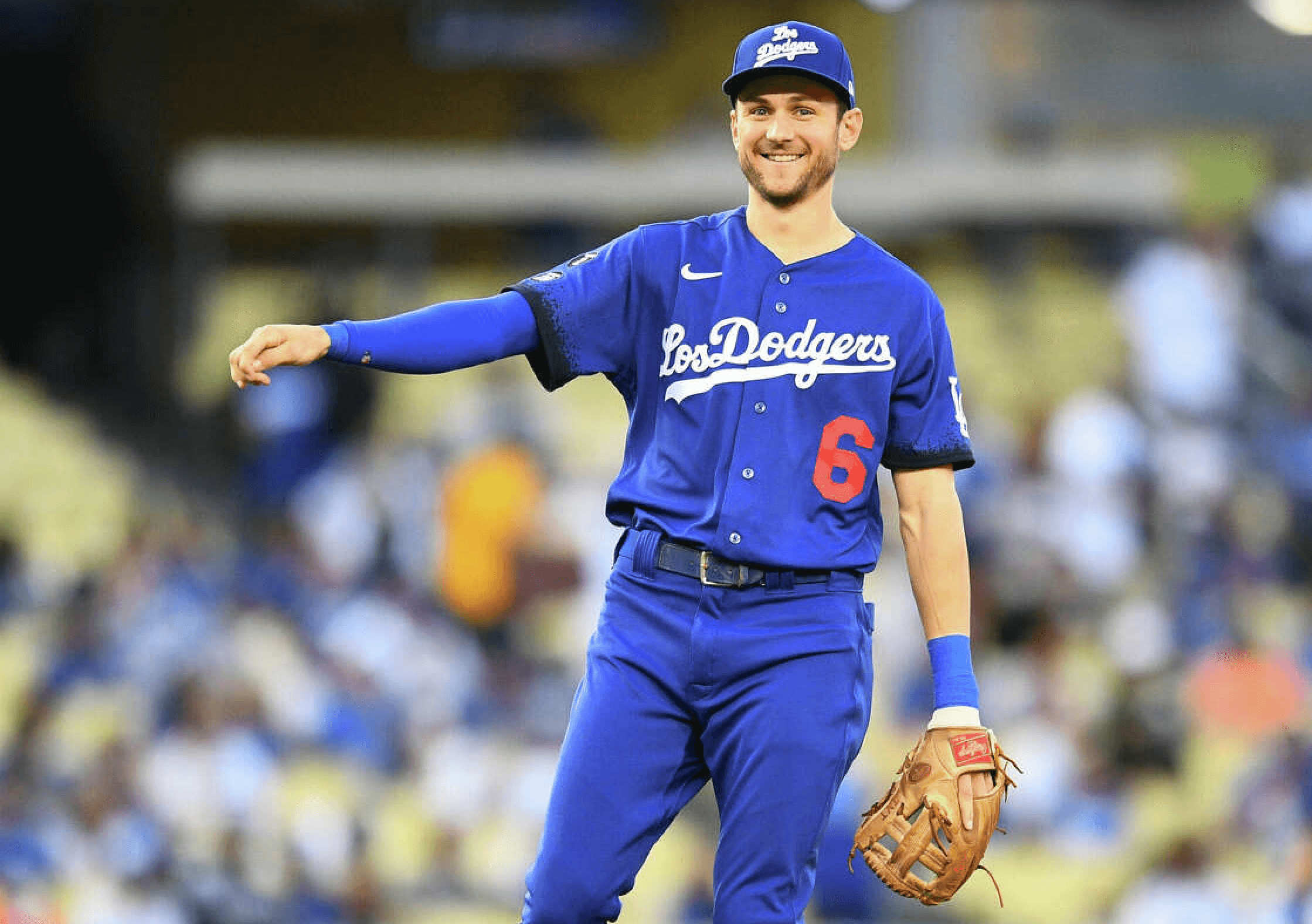
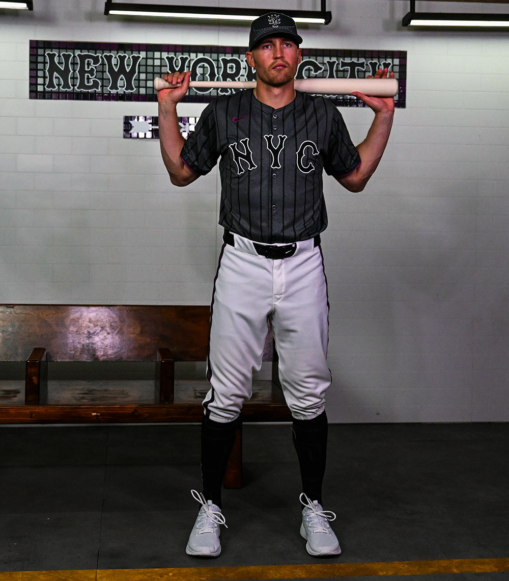
Next up are the Mets!

Notes:
- I find it funny how the teaser for the Mets' City Connect had everyone convinced the uniforms would be mainly purple, when it wound be being nothing more than an accent color. My goal here was to crank up the purple a bit, which I did by recoloring the "NYC" jersey letters, cap logo and cap bill.
- Even though I don't hate how it looks as much as I thought it would, I still think pinstriped jerseys need to be paired with matching pants, so we end up with a monochrome concrete gray look.- A small pop of white is added to the roundel and sleeve trim.
C&C appreciated! The Rays are next on the City Connect schedule, so I'll be back with a tweak of that design soon.
-
 1
1
-
 1
1
-
-
4 minutes ago, BC985 said:
Won’t happen. You can’t sell youth gear with the word cigar on it.
-
1
-
 6
6
-
 1
1
-
-
Just now, WBeltz said:
I hate that NYM CC hat with such a burning passion. The roundel logo one looked so much nicer.
At the very least it would look better if the "NY" was purple.-
3
-
-
I like how the teaser convinced everyone the uniforms would be heavily purple and it's basically just an accent color on the uniforms.
-
5
-
-
10 hours ago, JohnnyCowboy5 said:
I really hope TB's City Connect set isn't based around that dumb sunray logo.-
2
-
-
3 hours ago, Silent Wind of Doom said:
"For the Lou"? Is that a thing?
-
 1
1
-
1
-
-
4 hours ago, aawagner011 said:
Without getting into the weeds of normal uniforms (there would be countless examples), I can think of a couple recent changes to City Connect uniforms.The Dodgers reverting from all blue with a script cap to a more traditional cap (albeit with a black bill) and white pants.
The Rockies introducing white pants.
- I wish the Dodgers and Rockies had kept their original-colored pants, but these things absolutely need to be worn high-cuffed.- The Dodgers' original CC cap was abysmal, so their updated cap is an upgrade by default, but it's still too similar to their primary cap. I'm really curious what they have planned for their new design.
- Switching to sand-colored pants was a huge upgrade for Arizona. It helped make their City Connect set feel less like an alternate and more like its own thing.
- I'm surprised the Brewers haven't adopted powder blue pants for their CC set yet.-
3
-
-
Assuming this is true, 4/29 is probably the date of the Rays' City Connect unveiling.
I'm honestly probably most excited for Tampa Bay's design. I mean, how could it possibly be worse than their current bland uniforms?
-
7
-
1
-
-
On 4/15/2024 at 11:09 PM, Cujo said:
Before / After
-
1 hour ago, Old School Fool said:
No one is going to point out the Diamondbacks have a sick new helmet logo for the City Connect?
I wish that was their City Connect cap logo.-
5
-
-
On 4/12/2024 at 12:49 PM, BlueMoon18 said:
Again, good work on this.
Home - More teams should do this! Off-white as a home color just feels right to me.
Road - As much as I slightly hate gray, honestly Seattle is one of those teams I can give a pass for that. It works for them.
Home Alt - This works as a replacement for the fauxback, although I will argue that you could use their original unis in their current colors as the home alt if a fauxback could still be done.
Road Alt - This. Just. Works. I'm not gonna say anything else here.
City Connect - Good call on adding red, but I feel like some red stripes on the pants would make this better.
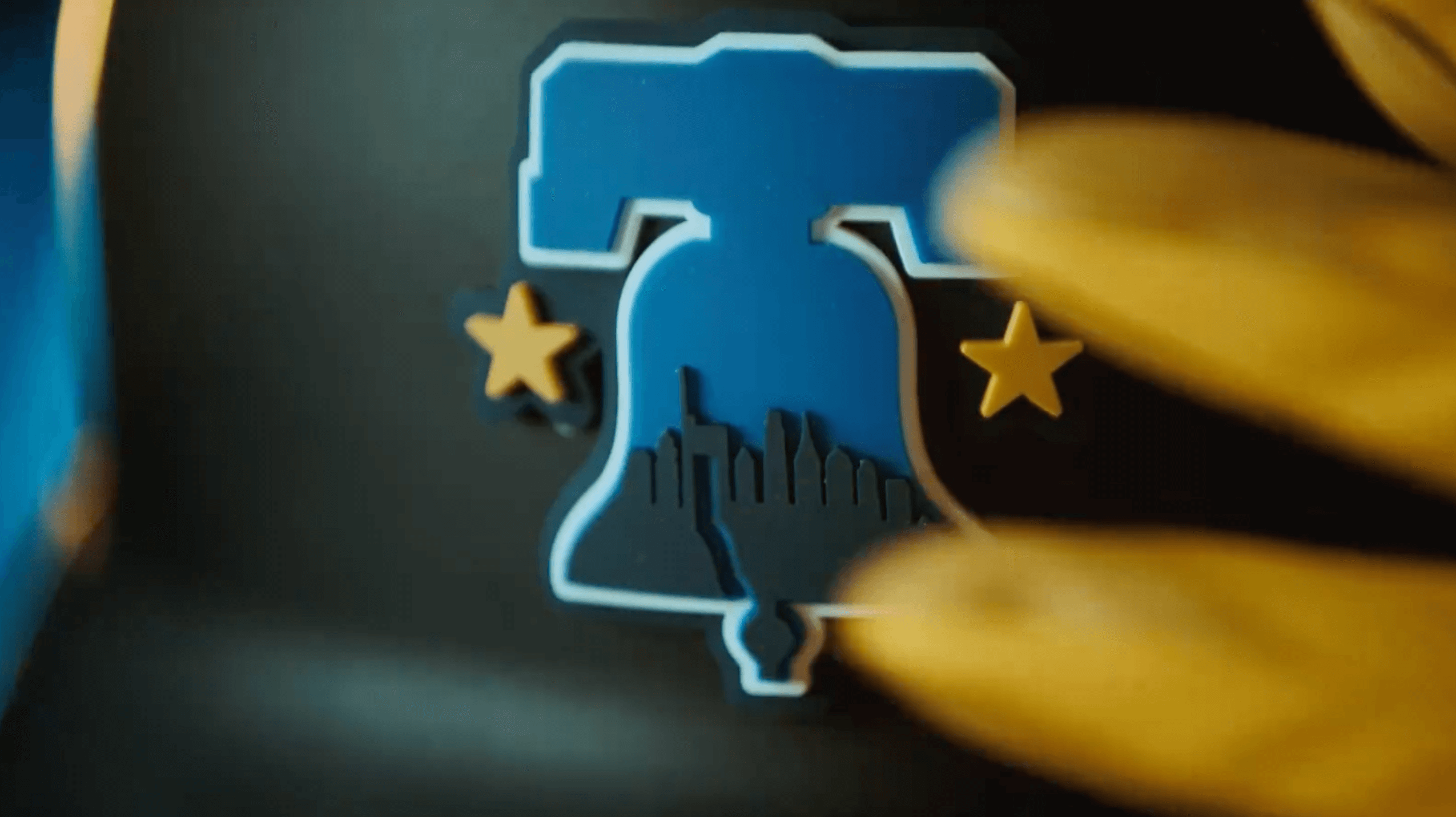
Also, on the Philly City Connect, I feel it's more of the gradient they used (almost like the JAX Jaguars' old helmet) that caused such a negative reception than the lettering. A decent amount of them have different lettering that works with the design (as Philly's does), and historically gradients haven't been the most well-received (outside of the UTA Jazz's city jerseys for like 4 years), so it's more likely that.
Thanks for the feedback! I really appreciate it.On 4/13/2024 at 8:59 AM, udubfan19 said:they just don't look right in cream, but the CC is definitely better than the current mess.
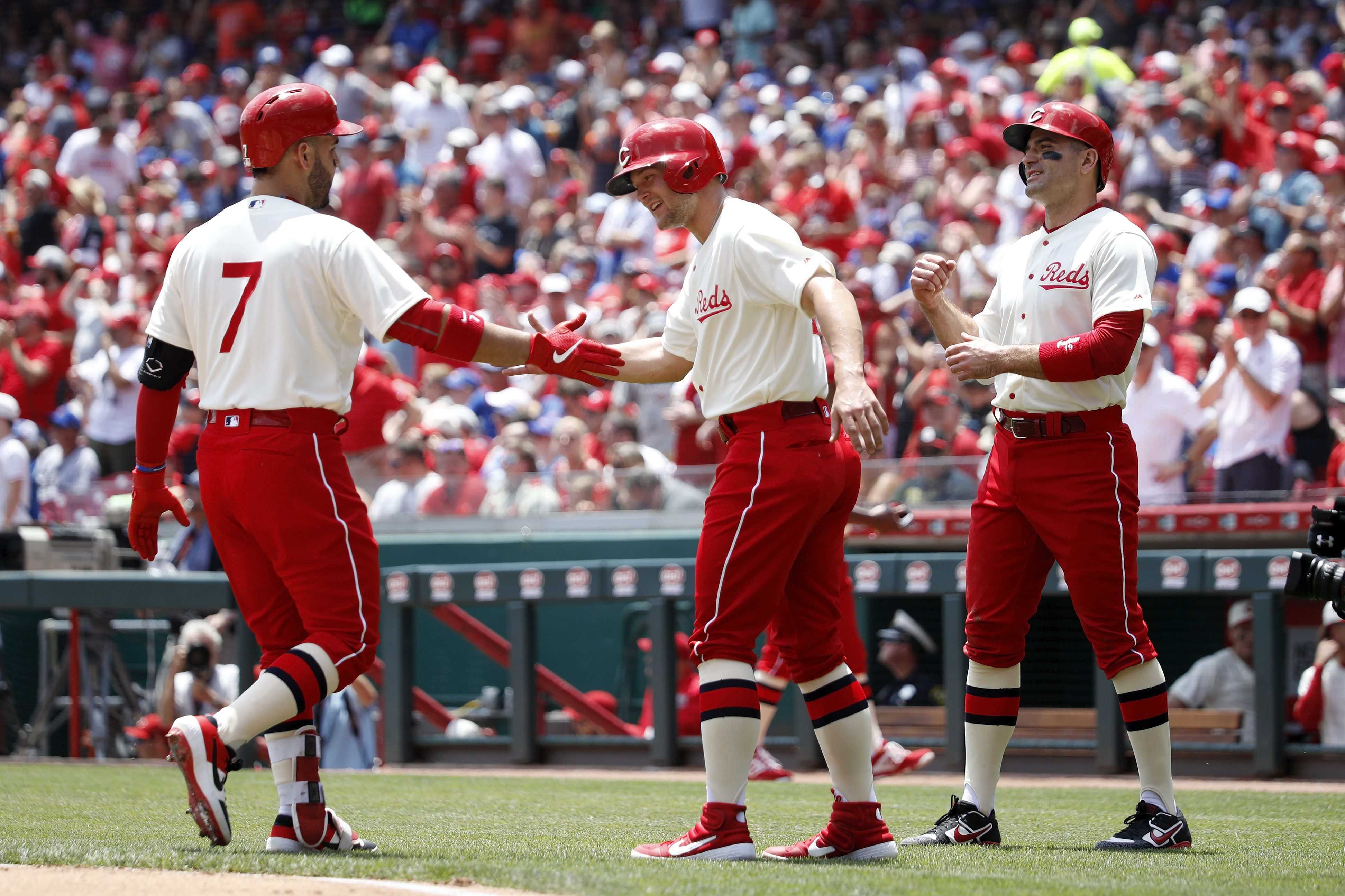
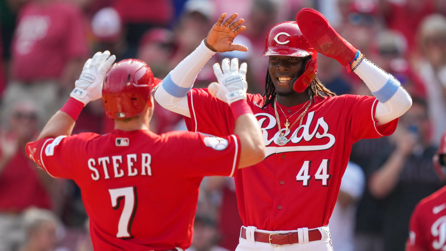
Yeah, I'm not 100% sold on it, either. I was really just trying to combine Seattle's home and Sunday alts into one design, as I did with Philly.CINCINNATI REDS
HOME:
ROAD:
HOME ALT:
ROAD ALT:
CITY CONNECT:
Notes:
- The Reds get a new home throwback based on their 1936 look, which embraced the team’s “Redlegs” nickname.
- Pinstripes return to the home uniform to set the new throwback jersey apart a bit more. I think I've determined this is my all-time favorite look of Cincinnati's.
- Black is scrubbed from the four main uniforms, both to produce a cleaner look and to make the color unique to the team’s City Connect set.
- Cincy's Spring Training jersey is reportedly listed in MLB’s 2024 Style Guide as “Alt 2,” which means it could technically be worn during the regular season. To my knowledge it never has, but I think I prefer it to their other red alt, as it reminds me of this great look from 1956 and would make the script “Reds” exclusive to the throwback.
- The City Connect tweak is one I previously shared, the only real change being the wordmark and numbers now match the style of the cap logo.
C&C appreciated!-
3
-
-
The sleeve stripes resembling wings is a genius idea! I also love the new red alt using just the "C" instead of the full "Guardians" script. I dig the "Land" alternate, though the base color looks a little too saturated to my eyes--it's almost peach-colored.
-
4
-
-
23 minutes ago, MJWalker45 said:
I like the jersey. If it were paired with white pants it'd be great. But they'll probably do something funky with them instead.
A pinstriped jersey with white pants honestly sounds pretty rough. If a jersey is pinstriped, then the pants worn with it should match.-
3
-
-
50 minutes ago, WBeltz said:
I prefer this one over the Bridge Embroidered one from the prior page.
Also with the bridge embroidered one, it’s possible it could be a fashion CC cap. They’ve done that with other CC teams. Although I don’t know with that Detroit one. That could be either way.
The Tigers one also has an “on-field headwear“ sticker, which tells me that’s the cap that goes with the jersey. Unfortunately. -
34 minutes ago, NYCdog said:
Another possible Mets leak.
This could actually end up being pretty nice. The big letters give it an early 1900s feel, a la the New York Giants:
-
7
-
-
41 minutes ago, Brian E said:
looks like we have a mets city connect cap leak:
https://www.instagram.com/p/C5tDIQzRlFB/?igsh=MWFram96eTMxbmlpbg==
And a possible Tigers leak, too:-
3
-
-
On 4/6/2024 at 12:21 PM, BlueMoon18 said:
Had Philly done this for their City Connect instead of the actual result, I swear it would get nowhere near as much hate as they do. Sometimes simple is best, and this works perfectly as an alternation to what could have actually been a good jersey. Nice work!
Thanks! I'm not convinced this version would have been that much better received, as I feel the biggest issues most people have with the Phils' new set is the wordmark and wonky numbers style, neither of which I really mind.
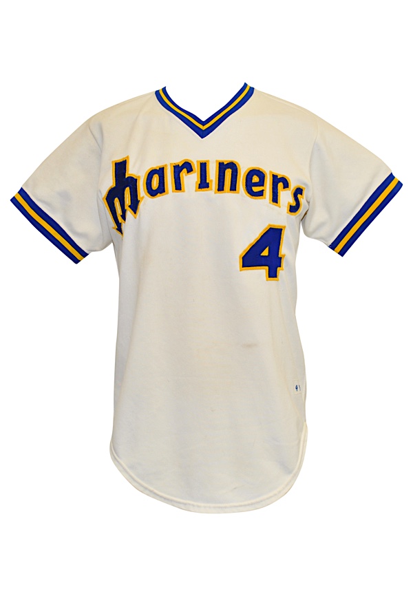
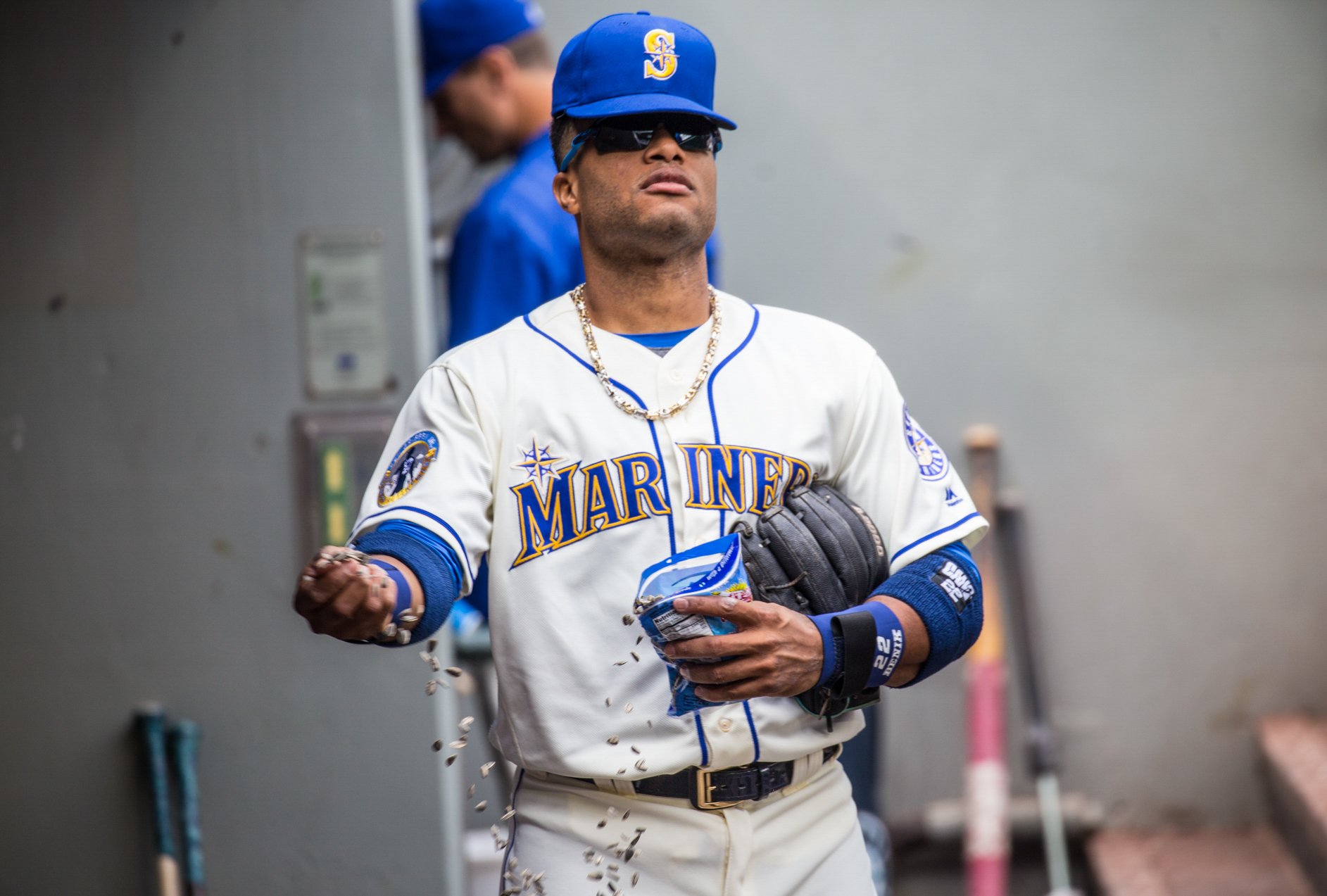
SEATTLE MARINERSHOME:
ROAD:
HOME ALT:
ROAD ALT:
CITY CONNECT:
Notes:
- It was an odd choice by Seattle to drop their gray road jerseys while keeping their Sunday home fauxbacks, because 1) the team now has gray pants without a matching jersey, and 2) their City Connect set is also blue and gold, which makes the fauxback, in my opinion, redundant.
- After ditching the team’s Sunday home fauxbacks, I asked myself, “Why can’t Seattle’s primary home uniforms be off-white?” I'm not entirely convinced it works, but you be the judge.
- The whole set uses a more vibrant shade of teal/seafoam green, similar to the one from the team’s Spring Training caps. The new home cap is also a recolored version of the ST hat, which swaps out the "S" logo for the compass.
- I decided to work up a new road alt design that replaces the “Seattle” wordmark with the “S” logo. I also streamlined the home jersey wordmark by dropping the second stroke around the letters.
- As I tend to prefer custom style numbers, I restored the M’s’ rounded numbers across the board.- I previously shared my Seattle City Connect tweak here, where you can read a breakdown of the changes I made. In short: The black pants are now white, newly added t-bars are inspired by the Steelheads, a touch of red comes from the Rainiers, and the crossed tridents on the cap bill were suggested by @Frylock.
C&C appreciated and have a great weekend!-
6
-
2
-
-
Always love to open the Concepts forum and see an update to this series! The NJ Devils do not disappoint. Daredevil's original yellow costume is actually my favorite of his, so I'm glad you were able to work that into this set as an alternate.
Still hoping to see a Ghostbusters-themed team at some point!

-
1
-
-
Always happy to see a new MLB series around here, and I'm excited for this one! I really like the ground rules you've laid out for this series, and I'm interested to see how you manage to follow them for certain teams.
-
1
-
-
I'm back again with the first team from the final year of initial City Connect designs, the Philadelphia Phillies!
My first tweak is cross-posted from my new Nike 4+1 series:
Notes:
- Put me down as one of the who actually like the Phils’ new City Connect uniforms. They’re pretty much the prototypical City Connect design: wildly different team colors, city iconography-inspired logos, “edgy” looking numbers and dark pants.
- One thing I did feel the need to change was the jersey gradient; I’ve always felt the best uniforms and logos are ones that can be easily recreated with a simple pen and paper, and it’s a bit hard to do that with a gradient. The jersey instead now features the Philadelphia skyline, a la the cap logo. I also converted the jersey into a partial pullover.
- This is a super minor detail, but I made the Liberty Bell letter "O" on the sleeve patch gold to match the socks.
- Thanks to @MJD7 for helping with the wordmark!
The next tweak is a bit more significant:
Notes:
- Funnily enough, the inspiration for this version came from this women's fashion shirt I found on the MLBShop.com.- I was worried this design might veer a little too closely to the Cubs' City Connect, but in my universe the North Siders' design would be green, so the similarities would be minimal.
- Front numbers are added for balance.
I like to think that this second version might have been a little better received than what we actually got. C&C appreciated!
-
1
-
-
Apparently this art has been on the MTA for years, but it would be funny if this more or less wound up being the Mets' design.-
2
-
5
-
-
The Mets in purple…I hope somebody does a wellness check on Paul Lukas on April 19th.
-
1
-
1
-
12
-
-
A former MLB.com writer is claiming on Twitter that the Mets City Connect uniforms will be black. This wouldn’t really bother me if the team didn’t already have that awful new black alternate in their jersey rotation.
-
3
-
-
1 hour ago, JohnnyCowboy5 said:
"There have been 20 uniforms released so far, with nine more to be added during the 2024 season -- starting with the Philadelphia Phillies (April 12) and followed by the New York Mets (April 26), Tampa Bay Rays (May 3), Detroit Tigers (May 10), Cleveland Guardians (May 17), St. Louis Cardinals (May 25), Toronto Blue Jays (May 31) and Minnesota Twins (June 14). We'll also get another set this season from the Los Angeles Dodgers (June 21), which will make them the first team with two City Connect looks. After this new batch arrives, the New York Yankees and Oakland Athletics will be the only teams without one.
Here's our breakdown of the uniforms that have dropped to date. We'll continue to update the list as new City Connect unis are unveiled."
Tracking all of MLB's City Connect jerseys and debut dates - ESPN
Is this true?
If it was posted by a reputable site like ESPN, I’m sure it’s legit. I’m guessing we’ll get confirmation from MLB soon enough.Side note, going by that schedule, May is going to be a loaded month!
-
2
-


/cdn.vox-cdn.com/uploads/chorus_image/image/72852349/1689520281.0.jpg)
The State of the Uniforms is Not Good: An MLB Concept Series
in Concepts
Posted
Can't say I'm a fan of the new trim on Chicago's home and road unis. I like the use of the City Connect logo on the black jersey, but I think it would look odd to pair the black pinstriped jersey with white pinstriped pants.
However, I LOVE that throwback, and I'd buy that white front paneled cap in a heartbeat. If I could make one suggestion, I'd slap some numbers on the pants which could be a reference to just not the team's '82-86 but their '87-90 look as well.