


coco1997
-
Posts
4,823 -
Joined
-
Last visited
-
Days Won
14
Posts posted by coco1997
-
-
On 12/19/2023 at 10:39 AM, johne9109 said:
Memphis GrizzliesXElvis Presley
Memphis had to be Elvis' it just had to be. The circle wordmark is also in a similar vain to the Grizzlies wordmark. I swapped the light blue on the normal white jersey for the grizzlies yellow to tie into Elvis' jumpsuits

Love it! I'd like to see the TCB logo incorporate somehow.-
 1
1
-
-
Nice job on the Sox. If it's within your abilities, I'd consider converting the home, road and navy jerseys into pullovers. The '80s license plate style unis with their big, horizontal stripes don't really work on a traditional, button down template. As a general comment, try to shrink the size of the jersey numbers, if possible.
Keep up the good work!
-
4 hours ago, Old School Fool said:
I've always wanted the Yankees to wear this in a regular season game. This is all you need to do.
The Yankees don't look right in softball tops. If they do a City Connect, the jersey and pants should be the same color (preferably their navy blue).-
3
-
-
6 hours ago, Coiler said:
Love how you've made the Phillies a lot more distinct than they've sometimes been in real life.
Thank you!
I'm back today with the start of the next leg of this project, which will feature a few alternate takes and defunct team identities. Just as the first leg started with the Angels, so will this one!
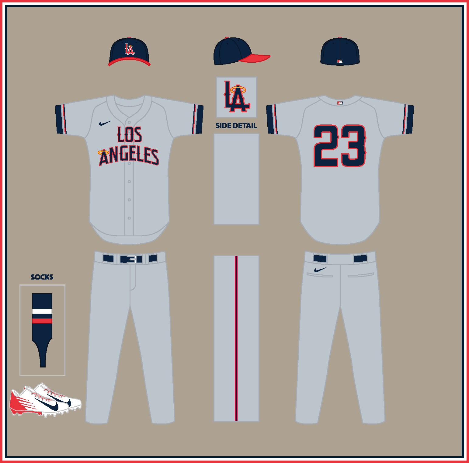
LOS ANGELES ANGELS (est. 1903)
HOME:
ROAD:
HOME/ROAD ALT:
Notes:- Even though I'm very happy with how my original Angels set turned out, I wanted to reach a bit further back in history and modernize the original Los Angeles Angels of the Pacific Coast League.
- For visual reference, I scoured the Internet for photos of Angels player Zee-Nut cards, which were baseball cards sold with Zee-Nut snacks in the early 1900s.
- Key differences from my original Halos set include pinstripes and the "LA" monogram, which was used by the PCL Angels for decades before getting co-opted by the Dodgers upon their move to Los Angeles in 1958.
- The road jersey features a stacked wordmark, inspired by this look from 1909, while the alternate features inverted pinstripes based on this ensemble from 1917.
C&C appreciated!
-
7
-
-
7 hours ago, Anubis2051 said:
Yes, yes we would:
Ok, but do you dislike these, too?
-
3
-
 1
1
-
 1
1
-
-
51 minutes ago, spartacat_12 said:
I've always thought that if the Yankees had to have an alternate, it would make sense to use the Yankees script that's been frequently used on their dugout jackets. I don't know if it would make sense as a CC, since it doesn't say New York, but it wouldn't look out of place alongside the pinstripes.
Not a problem. Keep in mind the Angels ones just say “Angels” on them. -
Great work on both the Canucks and Guardians!
-
1
-
-
1 hour ago, Victormrey said:
Incredible set for the M's
 I think you nailed it!
The Pilots' sleeves keep that unique look from their beginnings, and the numbers match perfectly the style.
29 minutes ago, VampyrRabbit said:One of the best things that Nintendo did when they bought the Mariners was change the team colours to navy and teal. That said, I do like the home and the alternate, though the original Seattle Script looks nicer than the one you've used.
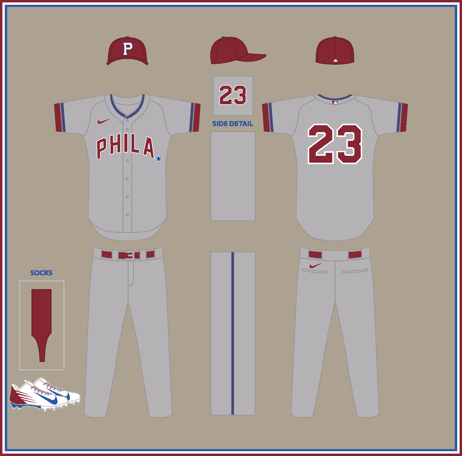
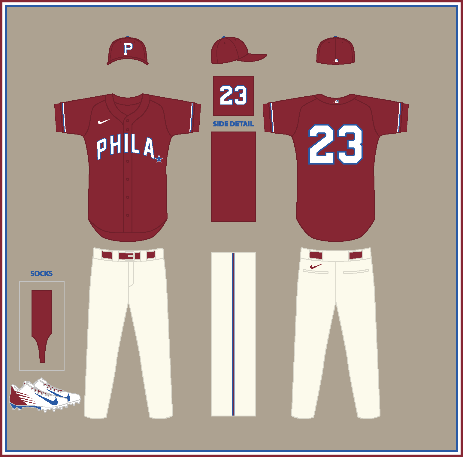
Thank you both! @VampyrRabbit, I've corrected the M's road jersey to use the original 1977 Seattle wordmark.PHILADELPHIA PHILLIES (est. 1883)
HOME:
ROAD:
HOME/ROAD ALT:
Notes:
- The Phils originally wore blue at home and a shade of dark red not terribly different from the maroon they’d begin wearing in the 1970s (and on their current throwbacks) on the road.
- As a nod to the team’s current uniform scripts, the period at the end of the “PHILA” wordmark is now a star.
C&C appreciated. Some alternate takes and defunct teams are up next!-
5
-
-
15 minutes ago, Ferdinand Cesarano said:
There's an idea for a throwback that I hadn't considered! While I don't go for coloured jerseys or coloured pants from an aesthetic standpoint (a stance which makes my admiration for the White Sox' City Connect uniform something that surprises even me), this is a legitimate uniform from the team's history.
One reason the Yankees might not want to go the inverted pinstriped route for their City Connects is because the White Sox beat them to the punch with theirs. -
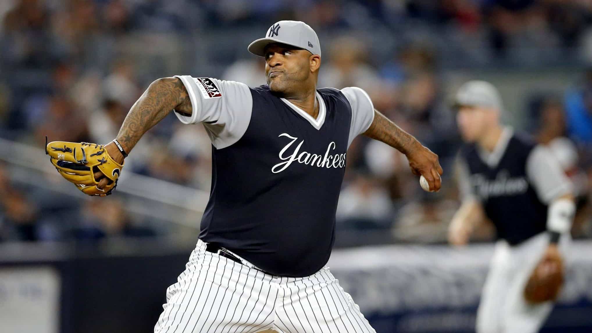
Some ideas a Yankees City Connect set could draw from:
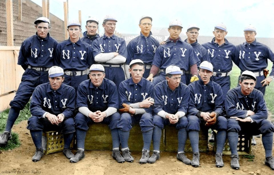
1904 New York Highlanders, mono-navy with giant "N" and "Y" on the chest
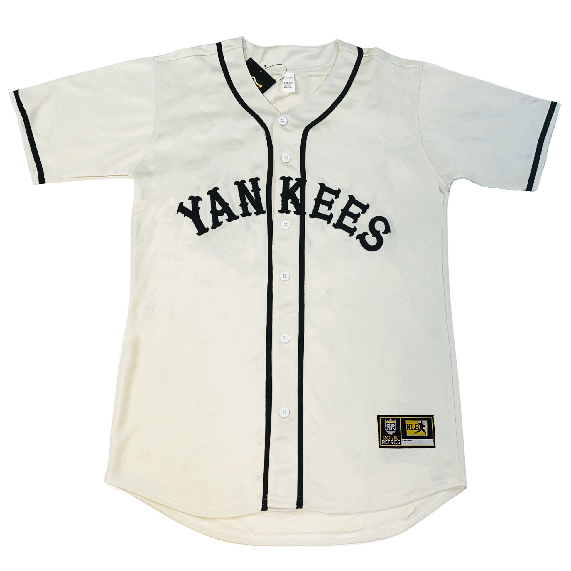
1927-30 road uni with "YANKEES" across the front
Non-pinstriped, off-white New York Black Yankees-inspired unis
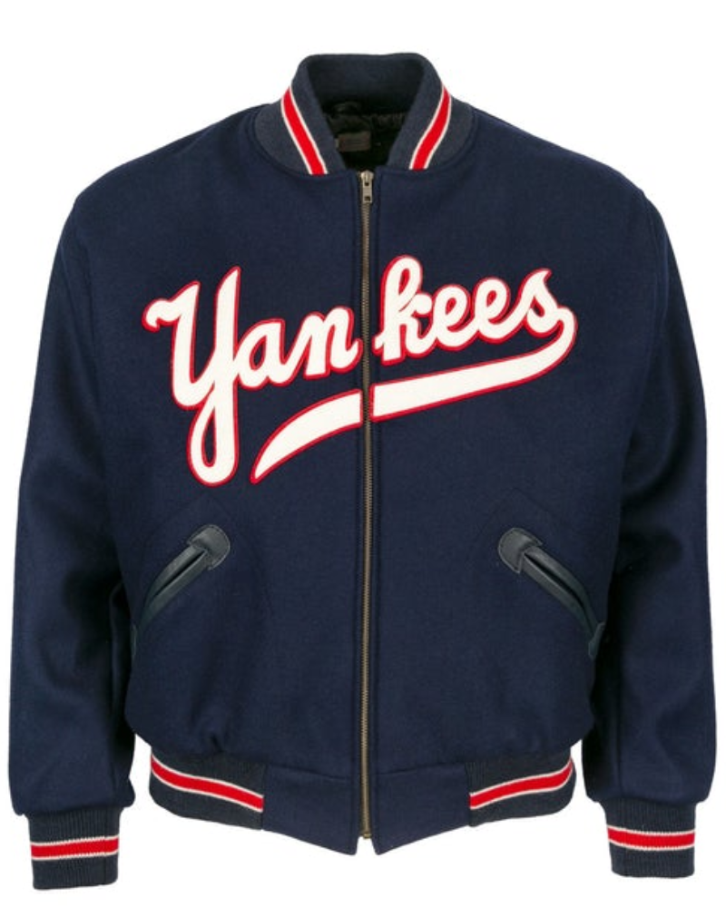
This gorgeous dugout jacket from the 1940s
The team nearly switched their road uniforms to reverse pinstripes in 1974.
The clever script from the team's current secondary logo
The Yankees were one of the few teams who made those horrible Players Weekend uniforms from 2019 look half-decent (picture these in navy instead of black, obviously).
Again, all ideas that draw from the team's past and don't call for any crazy new logos or colors. Just my .02 cents.
-
7
-
-
On 12/15/2023 at 9:09 AM, maxwasson said:
First leg? Does the second leg imply you'll be doing defunct teams?
SEATTLE MARINERS (est. 1977)
HOME:
ROAD:
HOME ALT:
Notes:
- This one is a pretty straightforward conversion of Seattle’s original pullover, sansabelt uniforms from 1977 into a modern, button-down design.
- As I mentioned early on, I didn’t give Milwaukee the Pilots’ captain’s sleeve stripes because I was planning to use them for this M’s design.
- Shoutout to @MJD7 for suggesting the number font, which pairs nicely well with the scripts and cap logo.
C&C appreciated! Wrapping up the 30 present day teams next.-
3
-
1
-
-
8 hours ago, Marlins93 said:
I'd add the Brewers, Reds, Giants, Braves (lazy), and maybe even the Red Sox to that list. Pirates are among the absolute worst, too, even aside from the batting helmets. The Braves is basically a derivative knock-off of a throwback.
The Braves one was clearly Atlanta’s way of skirting around Nike’s 4+1 rule since they didn’t want to drop either of their alternates. I kind of respect them for doing that, haha.-
1
-
-
14 hours ago, schlim said:
I think we can stop with the sanctity of the Yankees uniforms. Classics yes, but there's an ad patch on them, so the hand wringing over an alternate jersey is closing the barn doors at this point. Plus, they've worn every mother's day, little league, camoflauge and other assorted merchandise MLB has offered over the years.
Bingo.Like I said, the Yankees could easily do something that’s different than anything they currently wear but still fits within the parameters of their identity. Reverse pinstripes or monochrome navy would both hearken back to the team’s history, and a “Yankees” script or block wordmark on the front would look really nice. I mean, would anyone really be opposed to the Yanks wearing a jersey that actually said “Yankees” on it?
I hate to use the Dodgers’ City Connect uniforms as an example because they’re easily one of the worst, but the Bronx Bombers could base the basic idea of their design off those and I think it could work well.
-
6
-
-
How does everyone here feel about the Yankees' apparent decision to not participate in the City Connect program? I get that the team has been historically committed to the "sanctity" of their brand, but still I think they could do something tasteful and within the parameters of their identity that would make most Yankees fans happy. I don't think anyone's suggesting they wear magenta and seafoam green like the Padres.
-
2
-
 1
1
-
-
1 hour ago, Coiler said:
Love the Pirates and especially Tigers (who really have been tame IRL when they had the opportunity to let loose)
Rangers, I was going to say "Do their version of the Senators", but that would either be plain red or generic dark blue/red.
I may have a Senator-fied version of the Rangers planned for my next series.
COLORADO ROCKIES (est. 1993)
HOME:
ROAD:
HOME/ROAD ALT:
Notes:
- Like the D-Backs and Rays, this one is just a rehash of the Colorado design from my Bringing '90s Expansion Teams into the Modern Day series. You can read a breakdown of that design in this post.
C&C appreciated! Two more teams left before I finish the first leg of this series.
-
3
-
-
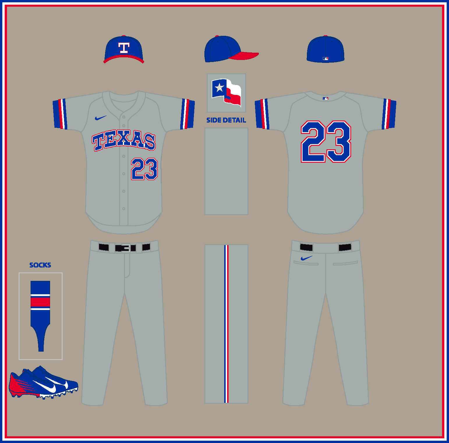
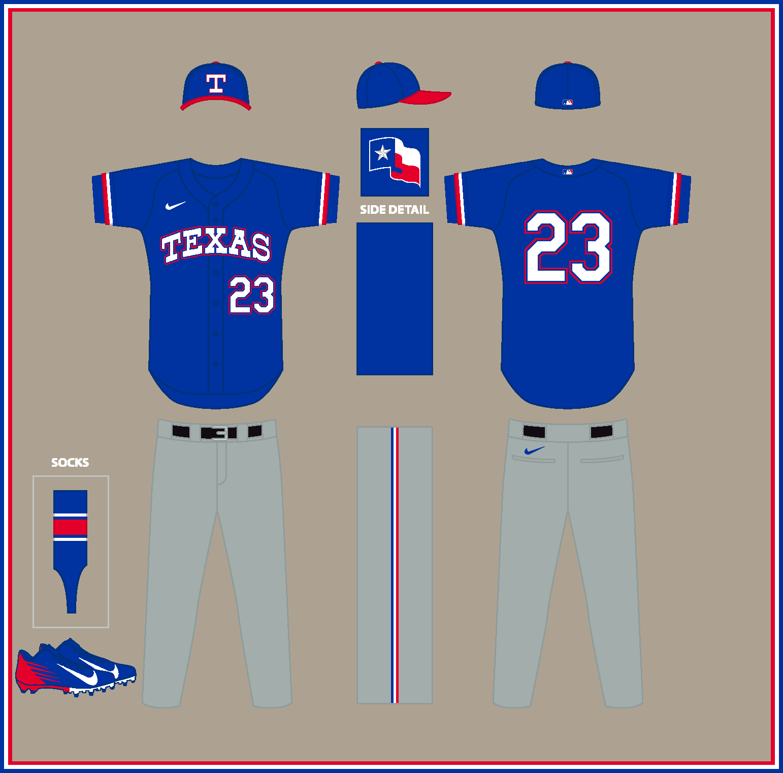
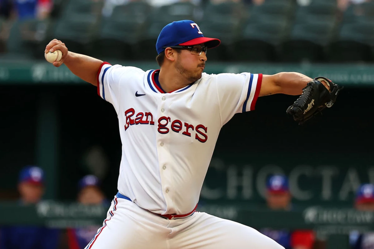
TEXAS RANGERS (est. 1972)
HOME:
ROAD:
HOME/ROAD ALT:
Notes:
- For the reigning World Champs, I restored the team’s original look from 1972, which featured more vibrant shades of blue & red and a block “T” cap logo.
- Since the team wore “Rangers” on both their home and road jerseys in ’72, I used the “TEXAS” wordmark, first worn in 1975, for the road and alt.
- For consistency with the road wordmark and numbers, the home script has been tweaked to feature outlines as opposed to shadows.
C&C appreciated as usual!-
2
-
-
1 hour ago, BBTV said:
I assume he's referring to how the MLB logo is now under the placket stitching, forcing the NOB (and number) to be lower by a couple of inches.
If they cant put the MLB logo inside Nike's new-reduced placket, then they should move it to the sleeve where the Majestic logo was.
-
1
-
 1
1
-
-
-
On 12/9/2023 at 4:21 PM, seasaltvanilla said:
Don't San Franciscans generally not like "San Fran"? And it feels odd to have a nickname on a classic look jersey.
I can't speak to San Franciscans' aversion to "San Fran," but I will say I went with the nickname mainly because I liked that the asymmetry mirrored the original "NEW YORK" wordmark. My original idea was to just use a block "GIANTS" wordmark:
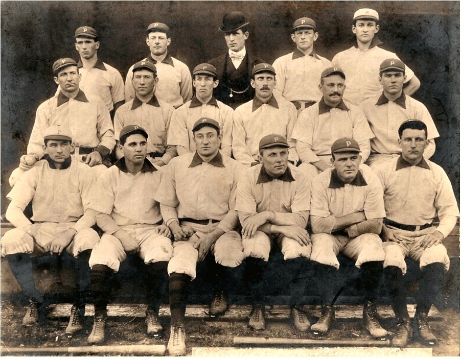
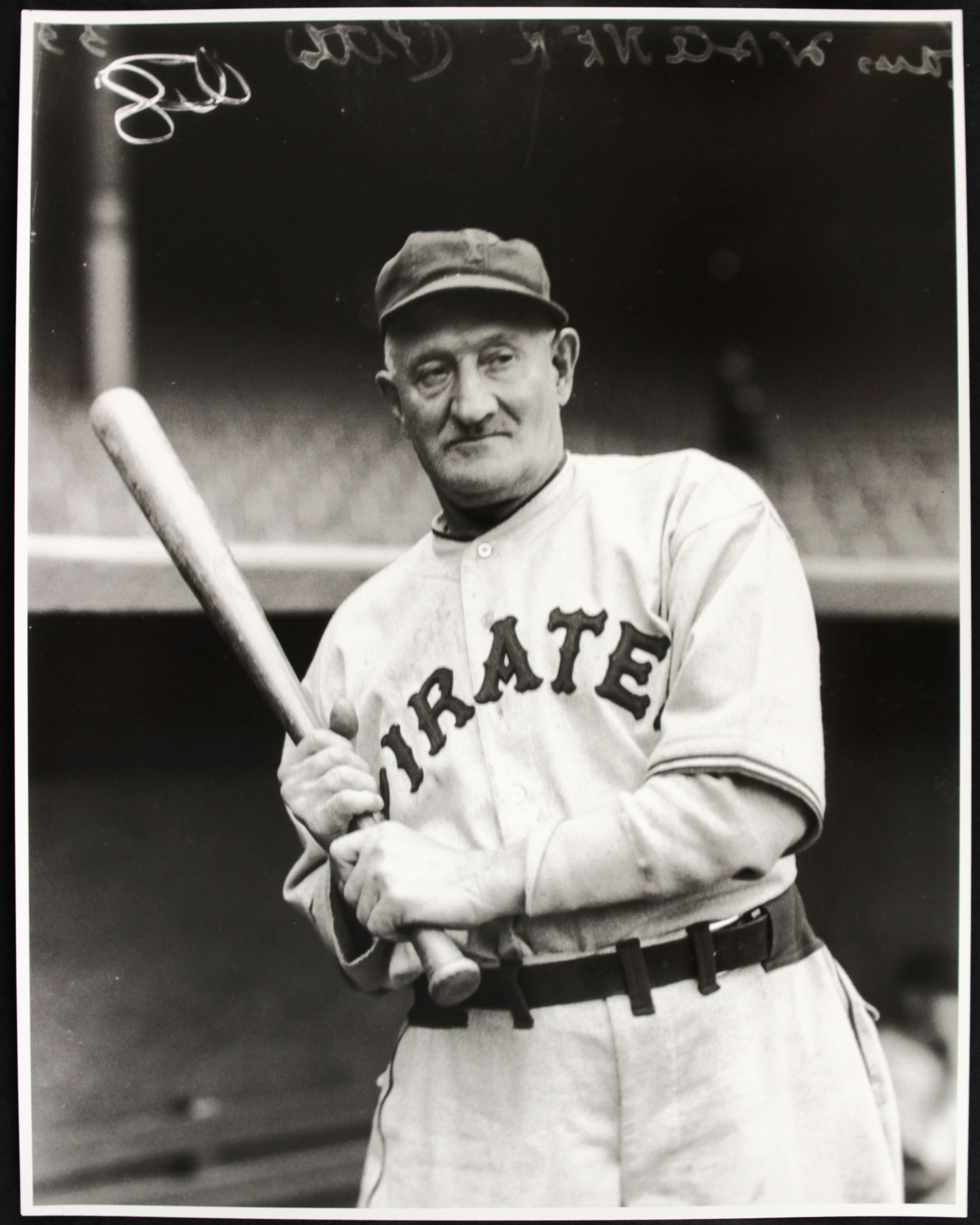
In hindsight, this might have been the way to go.PITTSBURGH PIRATES (est. 1891)
HOME:
ROAD:
HOME/ROAD ALT:
Notes:- The Bucs wore blue and red for the first few decades of the Modern Era, but seeing as it’s next to impossible to imagine a Pittsburgh team in anything but black and gold, I kept their classic color scheme.
- I kept the partial button-down and contrasting collar from the team’s original uniforms because it seemed to scream “pirates.”
- The Tuscan-style “Pirates” wordmark wouldn’t appear until 1933, but I used it here because it matches the team’s original “P” cap logo quite nicely. I also added Tuscan style numbers to go with the wordmark and cap logo.If anyone would like to see the Pirates in their original blue and red, I don't mind working that up. C&C appreciated!
-
3
-
-
On 12/9/2023 at 7:56 AM, Victormrey said:
I think the Nats 2005 look without the the metallic gold looks incredible! The bevelin is more subtle, helping the wordmarks not to look dated. I also really like the colour wordmark swap between the home and road jersey. Great work as usual!
As for the previous designs, the Rays look excellent with their original gradient, and the navy/brown colourway fits the Cubs like a glove. The blackout cleats is a genius detail

Thanks for the feedback!
DETROIT TIGERS (est. 1901)HOME:
ROAD:
Notes:
- The Tigers were one team for whom I felt it absolutely necessary to change colors. Detroit’s original uniforms were black and maroon, with little contrast between the two.
- Maroon becomes orange and black becomes midnight blue, the same “almost black” shade used by the Rangers for their City Connect uniforms. I assume the lack of orange on those original Tiger uniforms had something to do with what color dyes were available at the time.
- Per tradition for Detroit, no alternates.C&C appreciated!
-
5
-
1
-
-
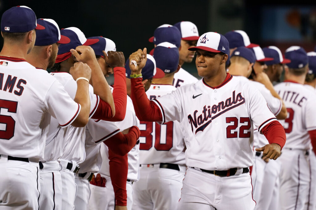
WASHINGTON NATIONALS (est. 2005)
HOME:
ROAD:
HOME ALT:
ROAD ALT:
Notes:
- I briefly toyed with something Expos-inspired for the Nats, but since I had done that before, I instead decided to update Washington’s original look from 2005-08.
- Block wordmarks return, as does the beveling on the wordmarks and numbers. I also replaced metallic gold with silver and darker shades of red and navy for the beveling on the wordmarks and numbers.
- The color distribution here is closer to the Nats’ current uniforms, which balance navy and red a bit more evenly.
- I figured I’d take this opportunity to drop the Walgreens “W” altogether and go all-in on the “DC” monogram.C&C appreciated!
-
2
-
1
-
-
4 hours ago, gosioux76 said:
I think the Marlins branding is a really odd case. I really love the colors -- the combo of black, pink and a bright aqua is unique. But the super black-heavy way it's applied makes it lose all the vibrancy of those other colors. Just drowns it out and makes everything look drab and hard to read.
It's "caliente red," not pink. I wish it was, though.-
3
-
-
Baseball Hall of Fame Announces Negro Leagues All-Star Tribute Game (uni-watch.com)
A lot of cool uniform potential with this. -
11 hours ago, vtgco said:
Love that Atlanta one! Makes me want to see a whole blackletter-themed rebrand for them haha
Eh, I guess the cream is a bit out of place for Milwaukee; I guess a cream Nike swoosh would help a bit but maybe not enough. Thanks for humoring me.
No problem! I was happy to try it out.


/cdn.vox-cdn.com/uploads/chorus_image/image/63185509/usa_today_12289070.0.jpg)
/cdn.vox-cdn.com/uploads/chorus_image/image/68887212/1308959887.5.jpg)


/cdn.vox-cdn.com/uploads/chorus_image/image/33538401/FoxxRuthGehrigCochrane.0.jpg)


/cdn.vox-cdn.com/photo_images/1096607/GYI0061399007.jpg)
What If Every MLB Team Kept Its Original Look? (Houston Colts 2/26)
in Concepts
Posted
SAN DIEGO PADRES (est. 1936)
HOME:
ROAD:
HOME/ROAD ALT:
Notes:
- The original Pacific Coast League Padres wore just black & white, which is unfortunately pretty bland for a team based out of San Diego. I therefore paired black with red, which became the team's primary color in 1939. The Friars have thrown back to those original 1936 unis on several occasions.
- A new block "PADRES" wordmark is created to go with the "SAN DIEGO" one.
- Interestingly, some of those early PCL Padres uniforms abbreviated the city name to just "S," which I used for both the cap logo and alternate.
As always, C&C appreciated!