


YelichGraphics
-
Posts
2,523 -
Joined
-
Last visited
Posts posted by YelichGraphics
-
-
Just now, MJWalker45 said:
It's been changing at least over the past four years. It was Under Armour, then New Era, and now No Bull. Under Armour had it for a long while after Nike took over the gameday uniform contracts.
It'll change again next year as well. At least the performance gear which I don't really know if it matches the interview gear or not.
-
 1
1
-
-
23 hours ago, MJWalker45 said:

No Bull has replaced New Era as the clothing provider for the NFL Combine this year. They are also the primary sponsor this year.
I want to say this changes year by year
-
1
-
-
I started here when I was 12, 10 years later I have a design gig with New Era. I send everyone in saying build up your portfolio, that's the best way to find yourself in a design gig.
-
2
-
-
1 hour ago, VikWings said:
I've seen a few decent looking chrome college football helmets, but have yet to see one that doesn't look horrendous in hockey.
The only team that gets the pass IMO is Notre Dame. They are the only team that should be wearing chrome in hockey
-
2 hours ago, wildwing64 said:
The Penguins with their throwbacks in 2016, before switching to them full time
Sabres also did something similar to this in the last year of their slug uniforms. I know it was said previously that they wore their 2007 royal in the playoffs, however they did the same thing when the navy "classic" alternate was introduced. They wore them as their primary dark uniform in the 2010 playoffs during their first round exit to Boston, only to switch to them full time the next season.
-
12 hours ago, kaleb_girod said:
This has probably been talked about here before, but anybody else think the Broncos should’ve never made orange their primary jerseys and kept the navy?
Or is it just me?They are the Edmonton Oilers of the NFL. I will always think they will look better in blue.
-
 1
1
-
-
44 minutes ago, PlayGloria said:
Agree with both of you. Honestly, this is really the only set of pants they need. Just swap out the jersey for home/away and they would look fantastic. I don't even mind the white socks on the road.
Home:
White helmet, red jersey, white pants, red socks
Away:
White helmet, white jersey, white pants, white socks
Black set: get rid of it
That's all they need. The pieces are all there with this set. It just needs to be matched up.
The might be an unpopular opinion but out of all of the BFBS uniforms the cards pulls theirs off the best. Its a nice alternate for one to two games a season.
-
6
-
-
Bills in white pants vs Dolphins in teal pants, chefs kiss
-
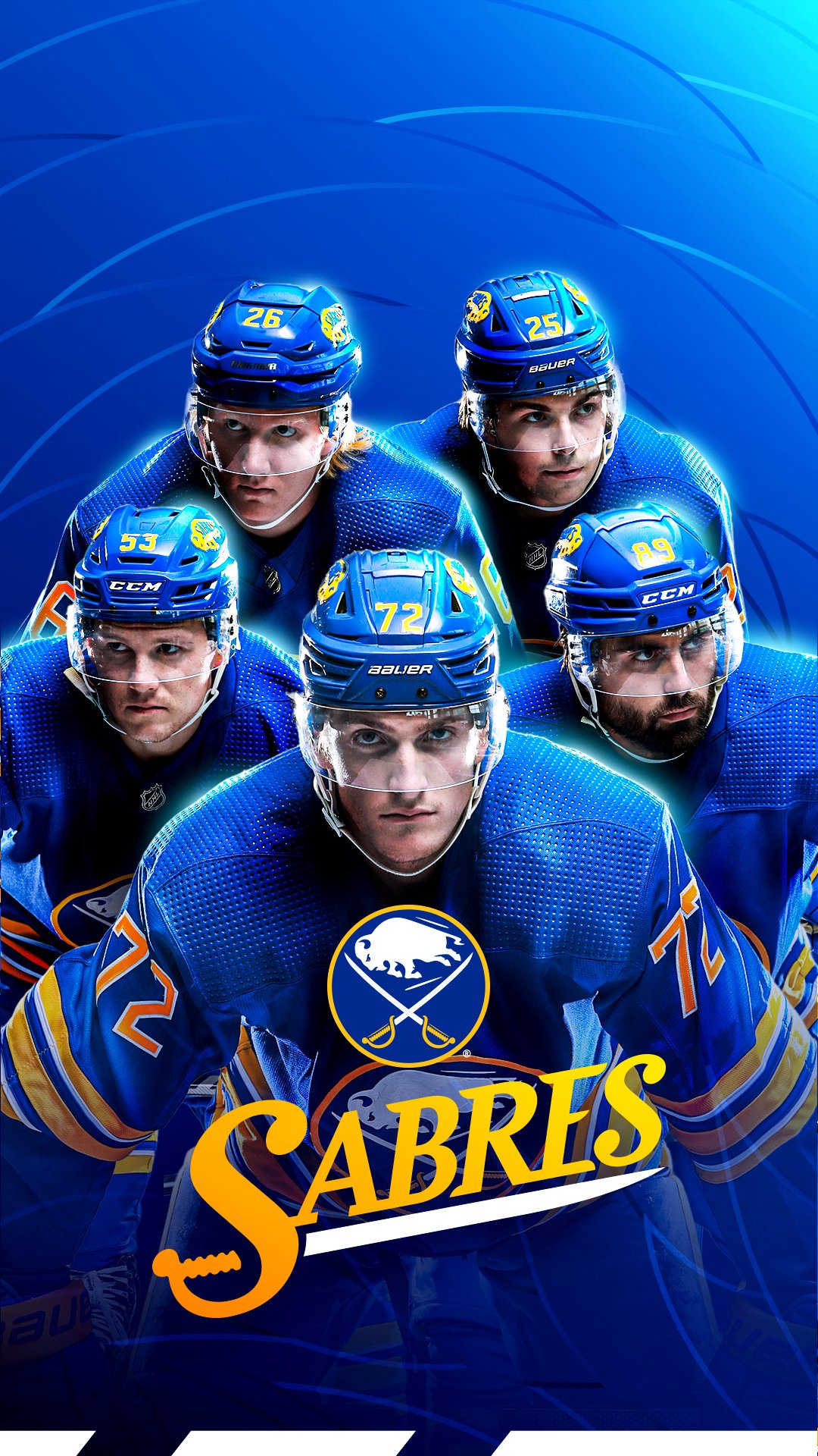
13 hours ago, mattwillcox said:
Some interesting stuff from the Sabres. Anyone with access to the logo slicks know if this wordmark is official, or just for social use?
I believe it's just social use, but it's been used pretty regularly during the past couple of seasons. In fact I'm almost positive it was designed by our very own @MrWonka
And to follow up on your question it is not on any logo slicks that I can find
-
1
-
 1
1
-
-
Isn't the Adidas contract over after this season? If so my fear is a Nike centric modern Flyers
-
I'll say it, even though I know its an unpopular opinion.
This is not a bad uniform.
Honestly other than the half gold half matte black helmet, and just the helmet, I've liked every single one of the Jaguars uniforms.
-
 1
1
-
 3
3
-
4
-
-
Anyone notice that the Colts are using their old word mark in the end zones?
-
1
-
-
Here what it looks like on my screen
-
2
-
 1
1
-
-
anyone know why my spacing is so messed up?
-
Am I bothered by the amount of ads? Yes. But at the end of the day hockey is still being played. If it wasn't for such 💩ty leadership and marketing the NHL would not be in this position, and as a fan and uniform enthusiast that pisses me off. But like I said before hockey is still being played and it's not to distracting from McDavid doing ridiculous things and the Sabres being mediocre to sucking
-
2
-
-
For the Rams it gave results that were definitely intriguing but they where all head on approaches. Unfortunately DALL-E only gives you a certain amount of requests so I did not request a side profile but I definitely can when I get the requests back.
So for my inspiration I drew mostly from the first two, as well as their current alternate logo, and their old hand drawn logo.
-
6
-
-
Something that very popular at the moment is DALL-E the Artificial Intelligence generated images. I've seen multiple posts on twitter, plenty of YouTubers use it for inspiration, so I figured I'd use it for some football concepts.
Now some of these requests gave me perfect looking logos. And others...... I'm going to have to use some of my own inspiration, not to mention doing what I can to make keep up with each teams current and past looks.
I couldn't ask for better results than the Cardinals. It might have to do with every Cardinal team basically having the same logo, but I'm choosing to look past that

Here is my logo based on the results
-
10
-
-
1 hour ago, nash61 said:
Okay, on that topic, is Peyton's right uniform Indianapolis, or Denver?
Both are his true jersey. Super Bowls and MVPs not taken into account, he had 18 retired by both teams. If your number is retired by that ream that's the right uniform.
-
2
-
-
Todays the day, the sun is shining, the leaks have already been posted, the tank is clean,
THE TANK IS CLEAN
-
2
-
-
nevermind
-
-
1 minute ago, officeglenn said:
Nope. Just paste the image URL and it should embed automatically. Actually right-click on the image in Imgur and select "Copy image address" -- the Copy Link button just copies a link to the gallery (not the actual image) and won't embed.
guess its been a bit since I've been on the boards
-
Do the BBCodes from Imgur no longer work to post images?
-
John’s Hopkins is another D1 school that has yet to be added


2024 NFL Changes
in Sports Logo News
Posted
Color me wrong, pun attended, but as far as I know the Browns are still using the same Pantones as last season. @TruColor could verify but from what I saw on the style guide they still use PMS 2028 and NFL Brown