

Chewbacca
-
Posts
862 -
Joined
-
Last visited
Posts posted by Chewbacca
-
-
1 hour ago, Kg54mvp said:
Yeah it has.
I pop over here once in a while. I’ll see terrible nicknames, make sure the wild aren’t going full time green and gold, and head out!
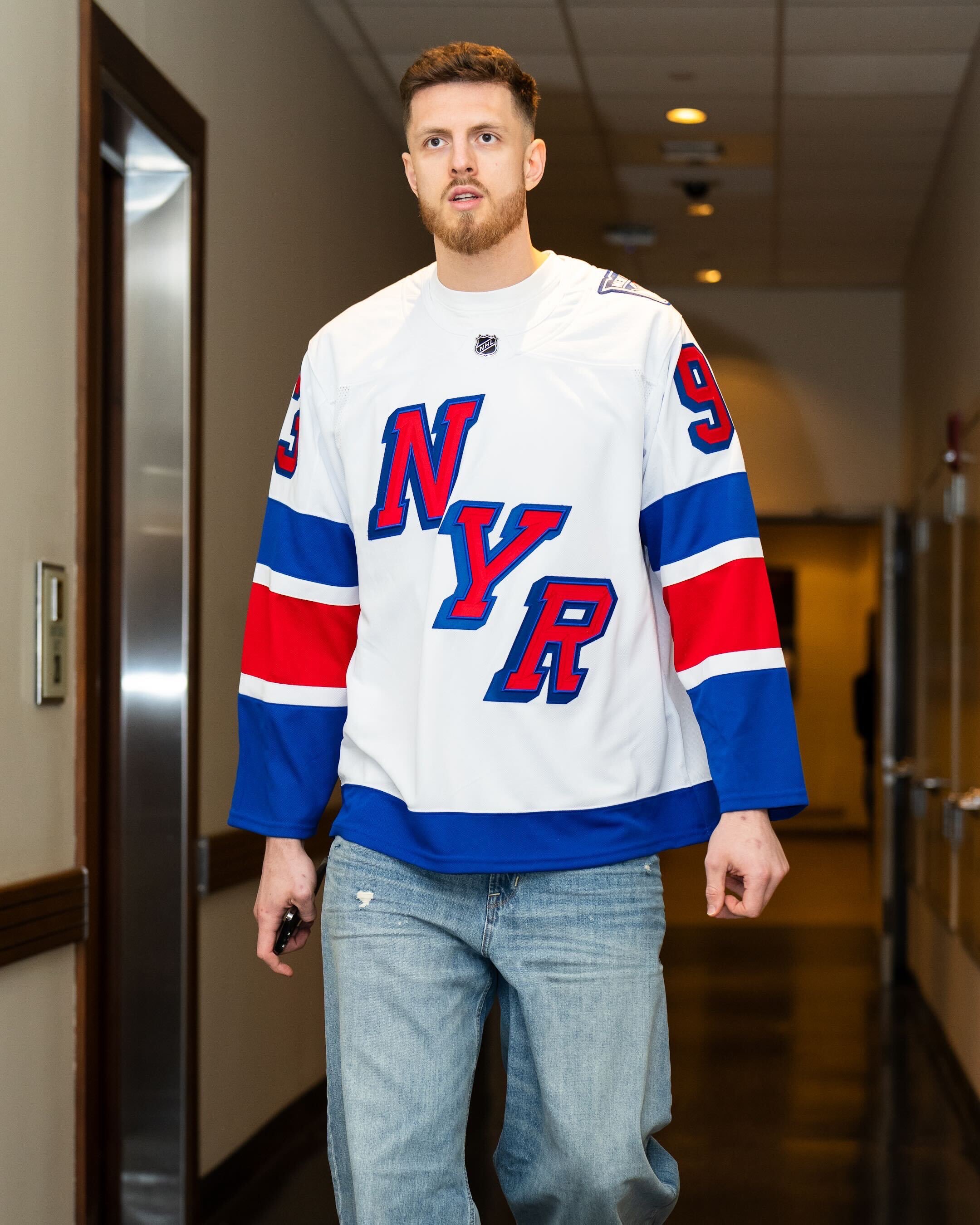
If you think the name suggestions here are terrible, what do you think the Utah NHL team should use as a name?
-
Utah Yetis; Salt Lake Strikers; Salt Late Stingers; Utah Blizzard Eagles; Utah Icebirds; Utah Snowbirds; Utah Desert Eagles (if they can’t use Golden Eagles or just Eagles); Utah Snoweagles; Utah Yellowjackets (I could see Columbus rejecting this idea); Utah or Salt Lake Bison; Salt Lake Seagulls; Salt Lake Snowy Owls. Those are ideas I think would be alright choices. I hope this new team will at least use a unique colour. My choices would be either purple or a baby blue.
-
On 4/6/2024 at 2:20 PM, Mr. Krabs said:
Have there been any word as to who will wear their third jerseys in the playoffs? I'm especially curious as to what the Hurricanes will do this year with their identity crisis.
I have a feeling the Canucks might just elect to wear the Skate in the playoffs.
-
On 3/27/2024 at 10:48 AM, Nordiks_19 said:

I remember seeing this concept on the nhluniforms Facebook page and was really hoping it would be that instead of the lame and ugly one they ended up with
Although I much prefer their original uniforms, I’d gladly take that over their current head-scratcher of an away uniform any day.
-
14 hours ago, Klondyke said:
Lions have told season ticket holders to look-out for a jersey that celebrate their 70th.. No idea if its going to be a retro or just a new third. They were really vague about it
I think it was such a waste for BC to bring out that gun-metal alternate for two lousy games a couple years ago only to never use it again. I would like to see them give that uniform at least one more season of usage. As I say that, BC needs an orange jersey asap.
-
Although the Avalanche have won the Stanley Cup in the past few years with their current look, instead of messing with their uniforms, I would love to see them go back to the drawing board and come up with something new.
-
 2
2
-
 2
2
-
-
On 2/15/2024 at 4:47 AM, VampyrRabbit said:
As long as you're not being a dick, like what you like.
It's not really my cup of tea, but I understand why people like it and the idea behind the uniform, and it's a lot better than the Mono for Monos sake Oilers and Devils alternates, and the Canes almost mono now home uniform.
I didn’t make the comment that I liked the Stars current alternate jersey just to be a jerk. I think it is a cool, outside the box idea that (I think) works well for an alternate jersey for the Stars.
-
1
-
-
19 hours ago, PlayGloria said:
That would be epic.
I assume you're talking about this one. If so, I would buy one the second they are available.
I've read some other things that happened around this era. Apparently there are drawings indicating that Blues management wanted the team to skate onto the ice out of a large trumpet, much like the Sharks skate out of the shark head.
I have also always thought a jersey designed around the 90s trumpet logo as the crest could be really great.
I think a jersey with this trumpet logo or the rejected third jersey would be a cool idea for the Stadium Series. It seems like that event is all about going crazy with uniforms. That jersey would fit into what the Stadium Series is all about and I have a feeling a lot of fans would love to see it on the ice. Aside from the Stadium Series, I think the trumpet logo on a third jersey would be a nice change. It could make for a really cool jersey.
-
3
-
-
On 2/6/2024 at 11:20 AM, Nordiks_19 said:
https://theathletic.com/5254698/2024/02/06/blackhawks-winter-classic-wrigley-field/
Oh great, more Blackhawks in the Winter classic.. I'd see the Blues dust off their late 80s - early 90s look
I wouldn’t be surprised if we see the Blues bring out a St. Louis Eagles-inspired sweater for the Winter Classic.
-
1
-
-
After seeing the Flyers/Devils Stadium Series game, I did not like either uniform. I find it interesting that years ago the NHL would make teams such as the Flames switch to white letters for player names after initially planning on black letters yet New Jersey gets the ok to have completely illegible letters on their jersey tonight. I think it’s too close to their regular home jersey but made worse without any white. I like the logo. That design flipped in black would be a big improvement over the Jersey jersey if they do another third jersey anytime soon.
-
21 hours ago, Bayne said:
The Wild's green and yellow jerseys are decet (I don't love them as hard as a lot of people seem to) but I think their red and green jerseys are beautiful and they should just continue to own that look. I find it to be far superior to the North Stars re-colouring, and it's their history as the Wild. By doing this they are yet another team succumbing to an alternate history that shouldn't dilute their already unique and strong identity.
I think the best way forward for the Wild is to switch to forest green and gold.
-
 1
1
-
1
-
-
17 hours ago, Morgan33 said:
I'm just glad somebody brought those colours back since Dallas would rather ice an even tackier "Black Ice' fashion jersey than honor their true history...
Those colours are too good for nobody to use them. Just get rid of that hideous advert and it's one of the best looks in the league.
Is it bad that I absolutely love the Stars alternate jersey? I think as a third jersey, it is really cool.
-
7 hours ago, TBGKon said:
Lightning tease that leaked third jersey for next week. Per the link below, sounds like it will be worn for the 15th, 17th, and 19th.
After Tampa wears this uniform for the required amount of time, I think it’s time for them to try a third jersey that is a completely new idea. I think they need something that uses an electric blue and perhaps some lightning bolts on the sleeves. If I sound crazy saying this, so be it, I don’t care. Tampa Bay needs to go back to the drawing board with their uniforms. If they are going to keep their main uniforms as is, at least give us an alternate uniform that’s exciting and fresh. I usually prefer simple uniforms and I kind of think I will like their new alternate but still… I think Tampa Bay has become a little too simple.
-
3
-
-
On 2/4/2024 at 2:42 AM, M4One said:
So the jerseys are just plain white and not cream like the mothership had it as. I guess it was just really poor lighting in the promo pics,
Thank goodness, this looks much better as a white jersey than it would if they went with a cream colour.
-
5
-
-
I was hoping for a white version of the Flyers third jersey for the Stadium Series game. I think it would have been a great choice.
-
I think the Jets need an actual Jet on their helmets. I can appreciate tradition but I don’t think the New York Jets have ever had a good logo.
-
2
-
 1
1
-
-
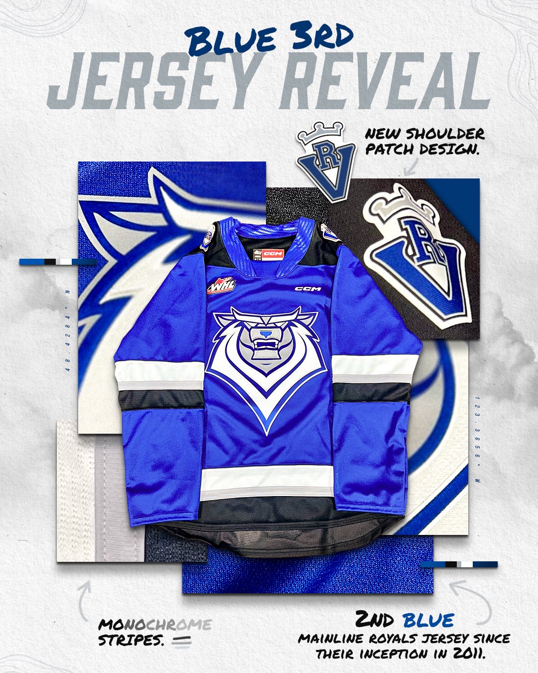
On 1/2/2024 at 3:22 PM, kiwi_canadian said:
New Victoria Royals thrid jersey:
I think these jerseys are too dark and I am tired of the numbers matching the jersey colour trend. I think this would have been a lot better if they went with a lighter blue. Maybe it’s just the lighting of the jersey in these photos but it is just too dark imo.
-
I cannot stand Canada’s red jersey with the black shoulders and stripes. It’s way too dark and monochrome and it desperately needs white accents.
-
22 hours ago, VancouverFan69 said:
I hope the Lions go with true pro look. No more monochrome black unis; bring back helmet striping with matching striping on the pants; much prefer orange as the primary dark colour.


The Lions should always be orange first. Their switch to black was really disappointing.
-
4
-
-
All this talk about the Nashville Predators uniforms and I’m really surprised no one has discussed their navy blue Reebok third jersey from the end of the 2000s. I still think they should’ve gone with that and the matching away they were planning on wearing it with.
-
1
-
2
-
-
4 hours ago, Ridleylash said:
I would have rather seen a white version of this worn for the Stadium Series and nothing more. I’m not a fan of this look. Also, with Fanatics replacing Adidas next season, why are teams bringing out new alternate uniforms this season?
-
4 hours ago, mjarvie said:
So the Kings are selling their home jerseys with Mercury Insurance patches on them, and in the 6 games I've been to this year, I can't remember seeing anyone buy one or wearing one in the arena... so with that knowledge, they're not selling well in LA.
Good, hope it stays that way.
-
5
-
-
5 hours ago, ruttep said:
This is somehow even more gimmicky than the Carolina Hurricanes. But if a junior team wants to do that, go for it. Will be very displeased if someone in the NHL does this, though.
I have a feeling Carolina’s already working on it.
-
With this new rule regarding helmets, I think this will open the floodgates to more awful looks down the road. As for the Kraken leak, I am super disappointed. It looks like a beer league team used the Ottawa heritage jersey design for their uniform. I was hoping for a 1915 style Metropolitans sweater in Kraken colours with a simple Kraken style ’S’ reading SEATTLE down the S like the original Metropolitans logo.
-
1
-


2024-25 NHL Changes
in Sports Logo News
Posted
Nice to see some people in these forums still have a sense of humour.