


BC985
-
Posts
947 -
Joined
-
Last visited
Posts posted by BC985
-
-
For a sport that is often criticized for not doing enough to promote its players and teams, the people running the league make a lot of backward decisions. Instead of marketing our teams, and their players, lets make everyone wear the same uniform for the all-star game and wipe out all identifying marks. For our next trick, we should alter the uniform in a way that shrinks the players' names and makes the sport a complete laughingstock in public opinion.
MLB's demise will be blamed on a lack of interest, but there will be other contributing factors. We are seeing them in real-time.
-
 2
2
-
-
9 hours ago, aawagner011 said:
This article claims that it was MLB, not Nike nor Fanatics, that led the decision to move the batterman logo down. The reason? Greater visibility.
The quote is from Eduardo Perez from the Baseball Tonight with Buster Olney podcast.
I am probably getting way ahead of myself here, and I have nothing to back this up, but if you move the player name and number down by pushing down the MLB logo you have created a big space to add an advertisement patch and would only have to remove the MLB logo to accommodate it.
-
2023 Columbus Crew MLS Cup championship ring:

-
I am still hopeful that Nike will fix this for 2025. You might remember when they got the NBA contract, the uniforms would tear like a sheet of paper. It was a bad look and Nike fixed it. If the players are mocking the uniforms, the fans have/will follow. That is not good business for Nike.
-
1
-
-
Spring Training caps and regular season BP caps? Not to Mention the clubhouse caps and most teams having 2-3 AC caps. Merchandise fatigue anyone?
New Era is becoming to MLB what Nike is to the NBA.
-
1
-
 1
1
-
-
1 hour ago, McCall said:
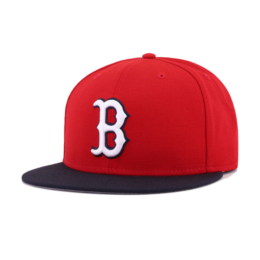
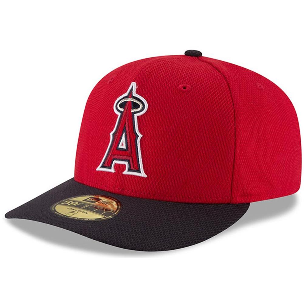
I actually disagree there. The logo being primarily red would make it look like a solid red hat with navy bill and squatchee. Those contrasting elements look better when the logo is also (mostly) a contrasting color from the crown. The Angels former BP hats did that. Looked off. I actually really like this hat as is. I had one similar back in like 2000, only the all the yellow elements were white. It was back towards the end of when recolored hats were the craze.
Good (squatchee isn't navy on this particular picture of the white B, but it usually is):
Questionable:
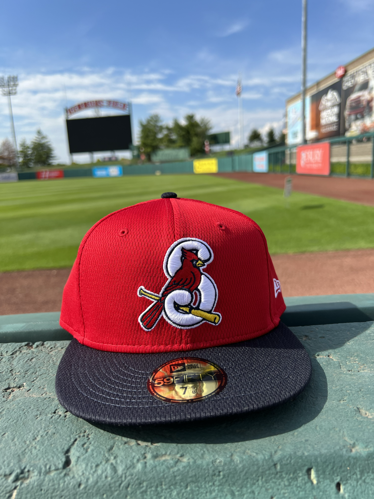
Agree to disagree I guess. I really like that Angels hat myself. I think the all red hat with a red cardinal is too much. Fortunately the Springfield Cardinals have a nice Saturday cap that is close to what I have in mind.
-
Not only is that Cards hat a retread, it would look way better with a navy brim and squatchee
-
1
-
-
3 hours ago, WSU151 said:
I realize I'm quoting myself here, but this might be the first year in a while where we have two different lines of hats for ST and BP
This Padres ST hat was leaked today:
I found this Padres BP hat on eBay (listed as 2024 Batting Practice hat, and yes, that is the Padres gray/brown jersey color as the front bell panel)
OR...the Padres will have two different hats for both BP and ST lol. It does seem like the ST hats are a bit more bright this year, so maybe that's the goal for spring.
Maybe they will have a home BP hat and a road BP hat. While that might be overkill, it has happened before.-
2
-
-
7 hours ago, aawagner011 said:
Real life photo of the Yankees road jersey. Pretty sure this is an authentic and not a replica. You can tell it’s the new template and not the Field of Dreams because of the extra collar trim, batterman below the headspoon seam, and the letters are slightly taller than the FOD set. I’m loving the simplicity. Long overdue.
Missed opportunity by Nike to create a faux flannel jersey.-
5
-
-
2 minutes ago, aawagner011 said:
This post on Reddit has the best hi res photos of 11 teams so far.
The MLB logo placement on the back is brutal.
-
6
-
-
On 10/31/2023 at 1:42 PM, TBGKon said:
Not in MLB, but the St Louis Rams went from royal and athletic gold to navy and vegas gold after Super Bowl XXXIV.
Houston Rockets won back-to-back and then went to the pinstripe uniforms.-
3
-
-
The Texas Rangers will likely be the last World Series Champion without a sponsor sleeve patch.
-
 1
1
-
-
When your league is constantly making headlines for poor logo design (Chicago crown, Montreal snowflake, Columbus flag, and now San Diego) maybe, just maybe you should hire some design consultants Don Garber. It is embarrassing.
This goes without mentioning that Nashville is not very good and St. Louis almost immediately pivoted to their secondary logo that I believe will be the primary within a few years.
-
6
-
-
Eagles 2022 NFC Championship ring:
-
Does anyone ever see someone wear the all-star game merch outside the team hosting the game? It is easy for me to say this is overkill but maybe it does get worn?
-
7 hours ago, FiddySicks said:
I really don’t mind the trend a lot of the leagues have lately of doing a “uniform series”, and think there have been some really great alts that have come out from it all. But baseball has done the worst job BY FAR. There isn’t a single one of these CityConnect connect unis that has been good enough to keep long term, and every single set released after the first season has been straight up trash. I’ll be happy when this is over and hope that none of these teams keep these around long term.
Bold to assume this will end after City Connect. Nike will just move to some other series of uniforms. I think the long term plan is to have American sports mirror the rest of the world where there are multiple new uniforms available to buy every year.-
3
-
-
The Father’s Day caps are out. I wouldn’t be mad to see the Rays switch to this:
-
21
-
-
I for one am shocked by the lack luster City Connect uniforms after seeing how well Nike handled the NBA.
/s
-
5
-
 1
1
-
-
Only change I would make is swapping which side the chest logo and number are on. Other than that, I think it is a solid look. I might buy the hat.
-
2
-
-
Phillies National League Championship ring:
-
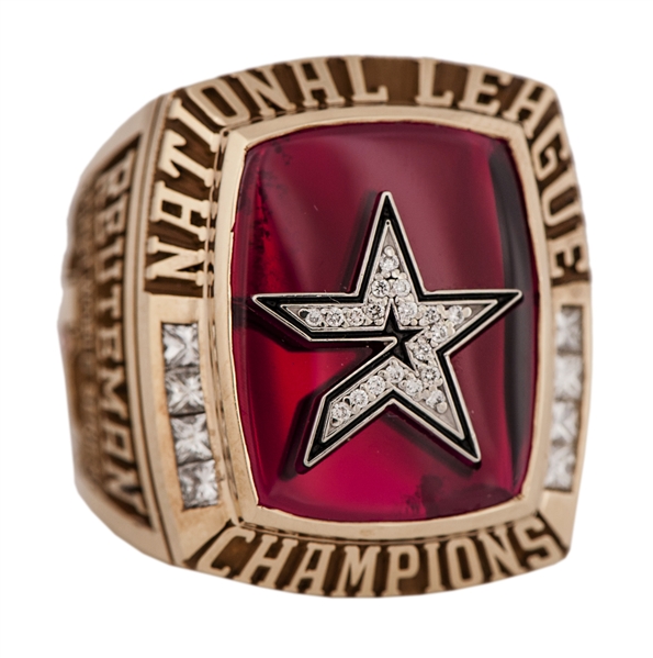
The Astros will be receiving their 2022 World Series rings soon. I recently found an auction for a 2005 NL Championship ring that was supposedly rejected by MLB because it was deemed nicer than the White Sox ring (according to the auction). It looked like this:
This is what the Astros ended up getting:
-
1
-
-
16 hours ago, cajunaggie08 said:
I saw in the parent site's MLB Change Summary that the Astros have officially removed their orange caps from the rotation for this year. They haven't appeared on-field since 2018 but they were listed as an official option and included as official team merchandise the entire time. I even picked up one with a 2022 World Series Champions patch on it the night they won. Oh well. Until next time orange cap. We know you'll be back at some point.
This hat never looked right to me. If Houston made the bill orange, it would make a great Sunday cap with the home whites. I believe the Astros did that at one time.-
1
-
-
5 hours ago, gosioux76 said:
I live not far from SIUE and see their branding all around. While this isn't great, it corrects one thing that always bothered me: the different font used for the "e" in SIUE.
I haven't been in this area long, but I've wondered whether that isn't rooted in some desire to create separation with SIU-Carbondale by emphasizing Edwardsville.
In short, yes. Even though they are sister schools, there is some bad blood between them. Despite enrolling more students, SIUE receives less funding than Carbondale. I graduated in 2009, and there was talk back then of separating the two schools. It almost happened in 2018.-
1
-
-
SIUE is also doomed to be stuck between two brandings as this was installed a few years ago and the school has said it will not be removed:


CCSLC Championship Ring Thread
in Sports Logo General Discussion
Posted