-
Posts
4,898 -
Joined
-
Last visited
-
Days Won
5
Posts posted by ColeJ
-
-
I've still got a Culpepper vikes jersey. Loved those uniforms, and loved Daunte. He was a mainstay on my FF team for years, too.
-
 3
3
-
-
I blame autocorrect on my phone. Lol.
-
In a lot of cases, I actually really like the look of the "phantom yolk."
-
 1
1
-
-
man... i forgot how much i loved those old seahawks uniforms. probably some of my favorite football uniforms ever, honestly.
-
 1
1
-
-
The Navy-era Whalers look ten times better than the green-and-royal Whalers, in my opinion. Especially the logo.
Those uniforms had probably the most aesthetically pleasing color scheme I've ever seen. Navy, green, and silver are gorgeous together.
-
 3
3
-
-
Benn brothers forgo initials... Thankfully, since they also share an initial. Ja. Benn and Jo. Benn would look awful.
-
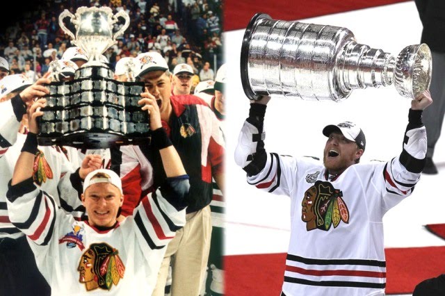
there is no question what the right uniform for Hossa is... it's not even a matter of his right team, because his right "uniform" is worn by 2 different teams.
dude won 3 cups with the chicago blackhawks and a memorial cup with the portland winterhawks.

-
 3
3
-
-
Dallas Stars number font is slightly incorrect in NHL '16
So is the cut o the jersey. They use rounded yokes in the game, and not the sharper "western" style they do in real life. Both inaccuracies bug me, because I'm a nerd.
-
I hate the Cleveland Cavaliers logo set... But their current uniform set is probably one of the best overall sports uniforms I've ever seen. Love that shade of yellow. Love the simplistic layout. Love the font. They look great.
-
 1
1
-
-
the only thing wrong with the classic sabres jerseys is the mismatched sleeve/waist stripes. if they went with the blue/white/yellow/white/blue around the waist of the homes, and came up with a simple and appropriate secondary logo for the shoulders of the home and road (or just omitted it entirely) then they'd be perfect.
the current sabres uniforms are just a trainwreck of trying to do too much. if they wanted a "modernized" look, they should have just replaced the buffaslug logo on the buffaslug sweaters with the classic logo. if they wanted the classic look, they should have left out all the silver and piping and overdone outlines, and just brought back the classic look verbatim.
-
i'm pretty sure i like the new clippers stuff better than the new bucks stuff.
and that's not really much of a compliment towards the clippers, at all.
-
 1
1
-
-
i wish the NHL allowed 0 and 00... i always thought 0 would be a really cool number for a super confident roy-esque goalie.
-
the new york rangers navy blue vintage alternate jersey is absolutely beautiful, and one of the best sweaters in the league.
it is also light years better than the old liberty jersey.
-
The Tampa Bay Lightning have never had a decent logo in their entire existence. that includes secondary logos. So much potential, so much mediocrity.
also, tampa's road jersey is far superior to their homes. the Tampa Bay wordmark above the logo gives it SOME kind of visual interest. even though i think it's a subpar lazy design, i'd totally wear a white hedman or stamkos jerseys if i had one.
-
the way the toronto raptors have embraced the poor grammar of their "We The North" slogan is embarrassing and exactly why i can't stand to watch basketball.
-
if you don't know who pavel datsyuk is, then you should probably just skip over all hockey posts in this thread, rather than expect full biographies on why it is wrong. he's kind of a big deal.
that's his "wrong jersey" because he's wearing #56, likely as a rookie, rather than his usual 13.
-
The navy/dark red color combo is the only color scheme that reminds me of lumberjacks, which is the direction I think the Canucks should take.
-
All the talk in the NHL thread about the old Sabres look and I come across this tonight. Weird.
Can you please identify who this is?
Seriously, people have asked this before. Another poster labeled Yogi Berra (a few posts later), surely you can tell us who a random Sabres player.
joe juneau.
-
i firmly believe that the vancouver canucks have never had a worthy primary logo in their entire existence, and their current color scheme feels like nothing more than a shallow throwback to an era in which they were hardly relevant. it isn't a bad color scheme, but the way it is used feels like a throwback to the "glory years" that weren't even really very glorious.
-
 1
1
-
-
The Brewers primary uniforms are fantastic. If anything, I'd change the number font and go with a slightly brighter blue..... but other than that, the brewers look fantastic.
-
I love these.

My favorite 90s experimental jerseys.
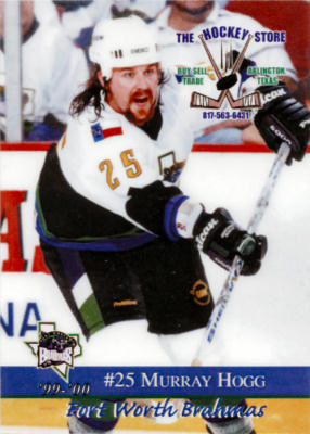
every time i see those, i'm reminded of the bizarre recolored version my fort worth brahmas wore for a year or two. black, purple, white, and green. that little splash of green at the bottom made very little sense. these are the best pics i can find.


-
The Blackhawks don't have st. Patty's day uniforms. Only Chinese counterfeiters do.
-
 1
1
-
-
That's the joke.
-
I'm a Boston Red Sox fan, and I find myself missing he simplistic grey/navy roads from the past few years already. I thought it was clean and classic.
-
 1
1
-


Unpopular Opinions
in Sports Logo General Discussion
Posted
The Carolina Hurricanes have a great primary logo.