


rmered
-
Posts
3,648 -
Joined
-
Last visited
Posts posted by rmered
-
-
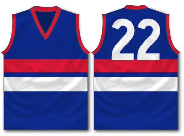
One for the Aussies

And one for the Americans

-
 7
7
-
-
Something I've always wondered about, but never actually had to do. Until now.
I'm trying to re-create this:

The idea is it's a TV set.
What I am trying to do is re-create the outline around the screen which looks to have a white/grey to black gradient.
Any ideas on how to do this in Illustrator?
Would you just trace the shape, or is there a better trick?
And how to make it so it looks like it fades?
-
Does anyone have Shumway's basketball template?
-
I don't know where to reply, here or BF.
This seems fitting.
Just too many to comment on.
Excellent stuff, love most of them.
Each has a Discrim touch that is always unique.
-
Multiply. 65% opacity.
Do you think this looks like Polyester or Wool?
-
Wasn't doing Darken.
I guess reading the instructions and following them was what you expecting, well, I saw your little plan and avoided it.
Have now Darken-ed and it works. Just need to find a better piece of material to take the shape out of
-
You might be working with a locked or background layer. See if one of your layers has a lock on it, that may be the issue.
Also, welcome back sir. Haven't seen you around in a while.
Thank you, it's nice to be back.
And this thing is driving me mental.
So I did have a background layer, but I deleted it and still have the same problem.
-
looks amazing.
But I can't seem to make the Photoshop template transparent.
Am I missing a step?
-
Where did the Photoshop Help thread go?
I am trying to find a way of creating a layer over the top of a footy jumper to make it look realistic.
One for wool jerseys:

One for polyester

Any ideas?
Am guessing it's going to end up being desgined in Illustrator (which these were) then have a layer added to it in Photoshop.
But how to create that Layer.
-
Does anyone know of a tutorial to turn these into a template?


Or better still, could just step me through it here, where I can ask questions.
File is here if you want to play with it:
-
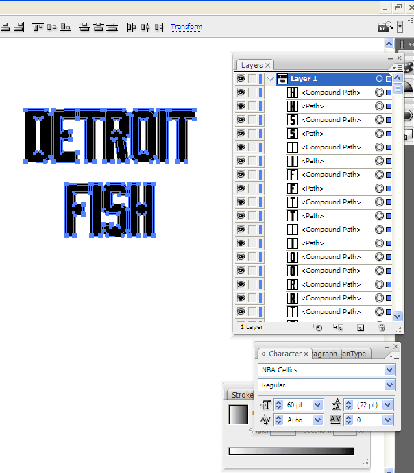
Least worst solution I've come up with so far is to make the original letters a Compound Path, then do the Offsetting.
This way I only have to change one Compound Path, instead of all the letters that make it up.
Still think CS2 handles it better though.
-
You can ungroup the background layer (after you offset) and get rid of the original letters.
well that's where I am at now.
How do I not have to continually delete stuff I never wanted in the first place?
Surely there must be some sort of setting that lets you only select the new Offset Path and not both Paths.
-
The text is not in a group.
And it still occurs.
Jimmy, what I am doing is outling a bunch of letters, not sure how you mean paste them in place when it selects not only the outline but also the paths I am offsetting.
See how it automatically selects both what I have just created and what I was Offsetting? I don't want that.
You want your letters to be one group, and the outline to be another. The easiest way to do this is to take your text (shape or object), copy it, and lock the layer it's on (layer 1). Create a new layer BEHIND the text (so layer 2 is under layer 1) and paste on that layer in front or paste in back (Apple F or Apple
 . It won't matter which command you do because the new layer is under/behind the original layer.
You should now have two layers with the same text in the exact same place. Offset the bottom layer and leave the top layer locked.
But then, won't I get two sets of letters for every time I outline something?
EG. I Copy Detroit onto Layer 2.
Then I outline it, Now I have two Ds, two Es, two Ts, and so on. on Layer 2.
Maybe I colour them all White.
Now I have Black text on Layer 1, and White text on Layer 2. This is OK, even though I don't like having 2 of evrything.
However, I now want to make Layer 3, which is Red.
So I create another Layer, copy the White into it, then outline it.
Then I change the colour to Red.
In Layer 3 I have four Ds, four Es, four Ts you see where I am going with this.
In CS2 I just Offset Path and it highlighted the new path created. Which I could then Group and move to another Layer or simply re-colour.
-
The text is not in a group.
And it still occurs.
Jimmy, what I am doing is outling a bunch of letters, not sure how you mean paste them in place when it selects not only the outline but also the paths I am offsetting.
See how it automatically selects both what I have just created and what I was Offsetting? I don't want that.
-
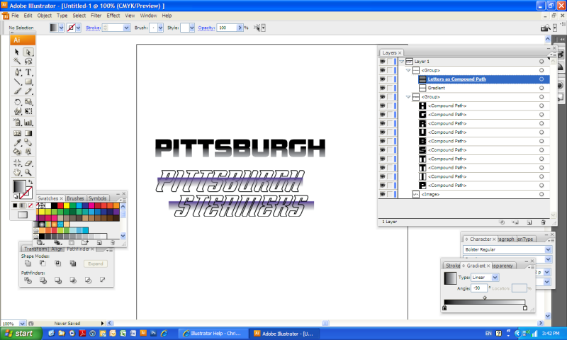
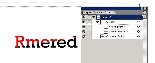
Okay, help, PLEASE. I HATE ILLUSTRATOR. I also hate how finicky clipping masks are.
After struggling to get this stupid gradient how I wanted it (hate the gradient panel, too. Noticing a theme here?), I'm clueless as to how to get the gradient to appear only within the confines of the text. It's got to be an easy fix with a clipping mask but I'm stumped. HELP? I've also clicked like every possible thing in the pathfinder. They all do exactly what I don't want to do.
The text is stroked, grouped, no fill with black stroke, converted to outlines.

I would make all the letters in Pittsburgh one Compound Path. Then make that your Clipping Mask over the top of the gradient.
Steps:
Take your Pittsburgh font and convert to Path with Create Outlines.
Copy it and paste in front (this way you can still change the colour of the rest of the letter that is not gradient)
Select all the letters, and Object>Compound Path>Make
Now move your new Compound Path above the gradient in the Layers and select both
Right Click and Make Clipping Mask.
Now the letters are what determines the border of where the gradient can be seen
I end up with this:
-
Good day to you all.
Here is my situation.
I have upgraded to CS3.
(Not what everyone would prefer, but maybe what some could afford/justify.
My problem
When I do an Offset Path, I do Object>Path>Offset Path
This works fine.
But what I am left with is both Paths remain highlighted.
So if I am outlining text, I have to de-select every letter that I want to remain one colour, while selecting the new outlined letter.
Is it possible to change this to simply highlighting the new Path I have made with Offset, like CS2 does?
If so, how?
-
I came across a whole bunch of soccer jersey templates.
They are made in PS.
I want to convert them to Illuatrator
anyone know the best (easiest) way of doing this?
Basic design

Seams

Shadows:

Material:

Final Product:

-

See how the edges are crinkly?
How do I create that in Illustrator?
Is it a brush? Or style?
I don't see why you couldn't use a brush to replicate that.
Great, thanks. I think I've got it close enough.
-
See how the edges are crinkly?
How do I create that in Illustrator?
Is it a brush? Or style?
-
Would this be any use if I put this in my sig?
Or have these vector templates grown old?
Ot does everyone who wants them already have them?
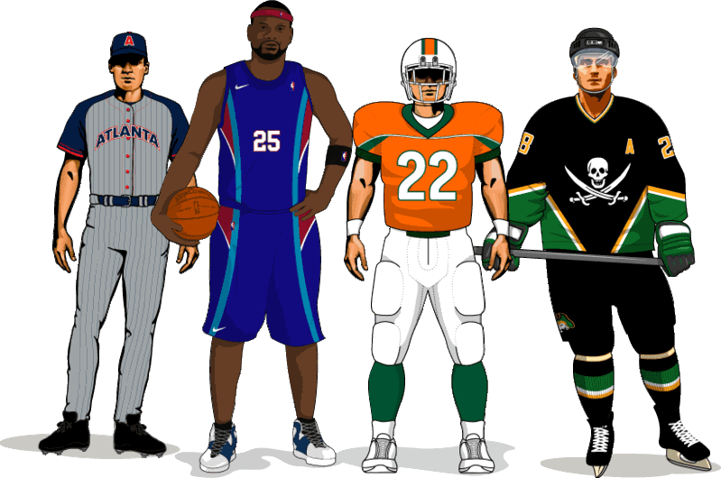
Woah, does that come in Raster, w/o the Hockey?
No, vector only.
I guess if someone wants to take the vector file and raster it they could.
-
Would this be any use if I put this in my sig?
Or have these vector templates grown old?
Ot does everyone who wants them already have them?
-
I'm kind of unclear as to what a vector is. But it sounds like you guys are saying I need it.
http://www.sketchpad.net/basics1.htm
This explains it pretty well.
As mentioned above, Illustrator for 2D graphics like logos, Photoshop for 3D images like photos.
-
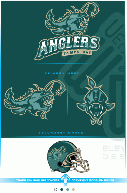
Hey just got illustrator 10, not the best one I know but it's still good. I want to know how to make solid gradient type of things with colors in wordmarks that can be seen on a lot of concepts here.
Some examples (credit to AAO)...

Is there some tool I can use to make it easier or do I have to use the pen tool and do each letter individually?
I don't see a gradient on either logo.
Do you mean how the White in Anglers changes to Green?
If so, I would do that with a Clipping mask
You make the Letters a Compound Path, pick an angle you want the colour you want to see and then place the clipping Mask over the Compound Path.

type and convert first to Path, then Compound Path. Then Ctrl C, CtrlF to copy a version of it in front of itself

Decide on the angle you want to Mask
Create Clipping Mask, selecting the top two items.
As for the Timberwolves logo, it appears the Green on that is either done individually on each letter.
I found an easier way to do what you're talking about with the example you just provided...albeit with Illustrator CS2 (don't know squat about version 10), using the Pathfinder palette.
Essentially...you could type out a word, convert it to outlines (I know the shortcut--can't remember which menu it's under - Shift+Ctrl+O or shift+open apple+O on Mac), and then draw a shape over the word in the style you'd like the shape to appear in the letters--like rmered did with the triangle thing. Select both the word and the shape on top of the word, and copy and paste them. Then, select them both using the Pathfinder palette, find what I believe is called the Shape Intersect tool (it's two overlapping boxes that look like a Venn diagram--the colors are darker where the boxes overlap), click on that shape intersect tool--and what happens is the top shape now looks like cutouts in the shape of the letters. One more piece...in the "Object" menu, select "Expand Appearance". BAM--shapes. then you can simply take that group of cutout shapes and place them back over the original word.
I hope this isn't too confusing, as I ain't got a clue how to use the "print screen" feature on either platform and as such am unable to provide on-screen references.
(Shortcut to the last step of that: hold down Ctrl on PC or the open apple key on Mac and click on that shape intersect button and it will automatically expand instantly.)
Nice tip brandon, that works in AI10 too.
-
Hey just got illustrator 10, not the best one I know but it's still good. I want to know how to make solid gradient type of things with colors in wordmarks that can be seen on a lot of concepts here.
Some examples (credit to AAO)...
Is there some tool I can use to make it easier or do I have to use the pen tool and do each letter individually?
I don't see a gradient on either logo.
Do you mean how the White in Anglers changes to Green?
If so, I would do that with a Clipping mask
You make the Letters a Compound Path, pick an angle you want the colour you want to see and then place the clipping Mask over the Compound Path.
type and convert first to Path, then Compound Path. Then Ctrl C, CtrlF to copy a version of it in front of itself
Decide on the angle you want to Mask
Create Clipping Mask, selecting the top two items.
As for the Timberwolves logo, it appears the Green on that is either done individually on each letter.

 . It won't matter which command you do because the new layer is under/behind the original layer.
UPDATING VINTAGE LOGOS
in Concepts
Posted
How about some Aussie logos?
They don't need the text or the grey background.