-
Posts
34 -
Joined
-
Last visited
Posts posted by GridironUniform
-
-
On 9/15/2020 at 8:58 AM, pitt6pack said:
The removal of conference logos in the NFL continues.
Well the addition of the AFC logo in Cleveland's end zone reverses this trend and looks good here ..its a nice field and an even though I generally agree about preferring full color end zones, I think this is an upgrade over the past couple years. The striping on the 50 is nice, although I think either the NFL shield or Cleveland's helmet would be better than nothing at midfield.
-
Too bad this year's fields won't look like these old fields of the past, or something like this:


-
 1
1
-
-
1 hour ago, pitt6pack said:
Good catch. Replicating all the letters for that will be a bit tedious, but at least I can pull from the Buccaneers wordmark.
I couldn't tell you when the Bucs had orange endzones, but if I had to guess, I'd say the 1979 NFC Championship game (first year the Bucs made it to the playoffs, and first conference title game)
I actually remembered it as a whole different end zone, but actually they only added "World Champions' to the the regular end zone, so its easier than it could have been....
And nope they didn't paint the end zones for that NFC title game either.
Here's a hint, it wasn't in Tampa.
-
Awesome to see these Bucs fields, especially the playoffs... i wish they colored the end zone more, but i guess it makes it more special since they don't.
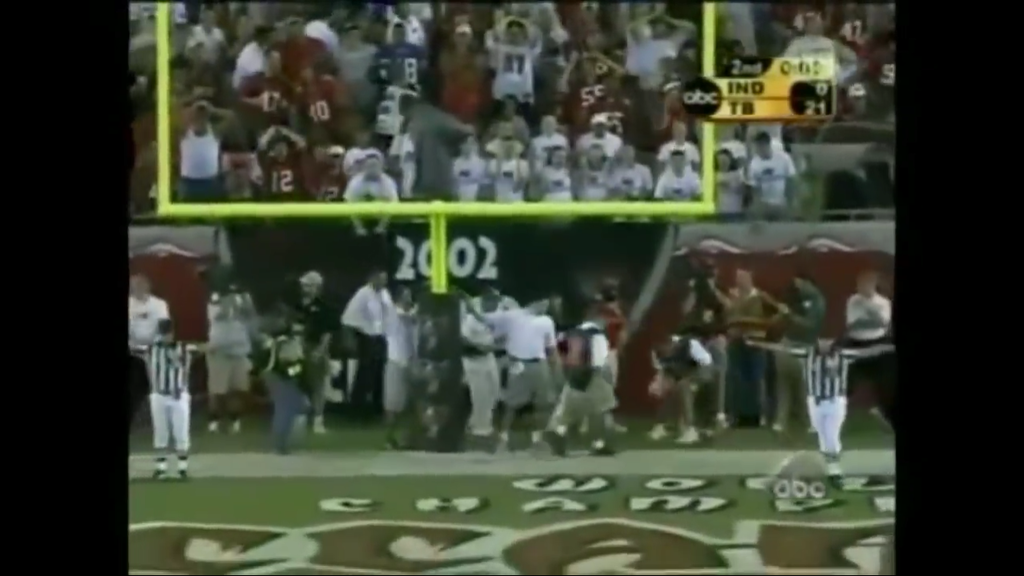
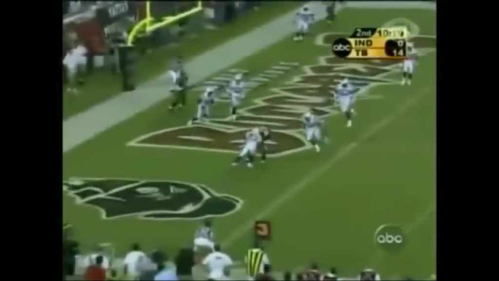
They of course never made the Super Bowl during the Bucco Bruce years and for home playoff games in 1979 they didn't color the end zones.... however, trivia question here, who can tell us when was the only time there ever was a orange painted Buccaneer end zone?
Also one correction, for 2003 season (I believe for the whole year) the Bucs put "World Champions" in the end zone.


-
Okay let's try these:
NFC First Round Playoff Game, January 8, 1983: St. Louis at Green Bay

Monday Night Football, October 17, 1983: Washington at Green Bay:

-
7 hours ago, SFCOM1 said:
Small Update to the skins Packers field. The helmets where a bit narrower towards the center of the endzones. And the Face mask bars where a singlebar style (Much like Theisman's own helmet) for both sides. Both Green Bay and washington where of the same design. Green Bay's was much like the
"Skin's" but with their full logo and bordered in white. The middle of the field had a very small "G" in gold only.Thank you, yes I just go for the broad strokes, and let you guys chime in with the details.... I saw the Gold G on the field for the 1982 playoff games vs. Cardinals but wasn't sure if it was still there in 1983 for that game. Apparently they used the same helmets but in Cardinal red with white trim. Wonder if they did the same for other opponents in that time frame or for just the playoff game and the Monday Night game because they were "special" games?

-
Also, this, the field from the 1983 Redskins at Packers MNF classic game.

-
 2
2
-
-
The 1997 "Feel The Power" end zone was used by Bucs all season, not just the playoff game, here's a screenshot from Week 9? Minnesota at Tampa Bay. I see to remember "Feel The Power" was an NFL wide thing, not just the Bucs, especially Week 1, however not sure if any other teams used it on their field.

-
 1
1
-
-
One correction to the Chiefs thread, the 1986 with new red endzones actually started at least as early as 1984... That year they had the AFL 25th Anniversary logo at midfield as well.
Source: 1984 Chiefs Team Yearbook


-
I guess you might have seen, for today's game Cowboys didn't put the "Divisional Playoffs" logo on the field of play... they put it outside the sidelines instead. Just the NFL shield on the 25s.
-
Three small details, I don't know if you want to consider showing or not:
- In today's Raiders-Texans game I noticed the hash marks were outlined at midfield inside the Texans logo.
- For the Titans last game of the season, the colors for the two college teams (Nebraska & Tennessee, I think) were inadequately covered up in the endzones, they were showing through
- How about the "Salute to service" stuff and the pink-tober stuff... someone mentioned on Twitter that for the Eagles game against the Vikings, they had pink trim on the Eagles wordmark in the end zone
I understand if you don't intend to incorporate these, just wanted to mention them.
-
Just saw on Sportscenter, it appears the Seahawks will have a lime green end zone tonight to match their uniforms.
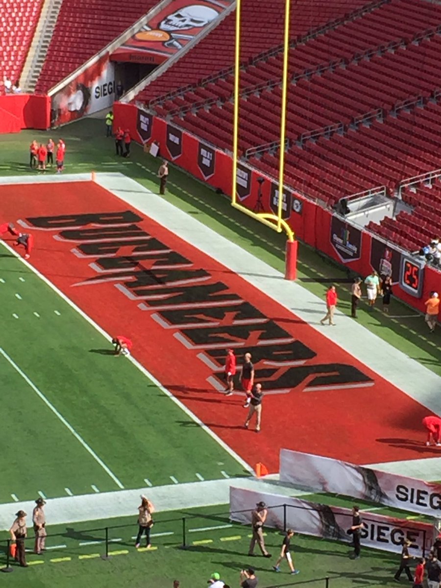
Also last Sunday, Saints-Bucs game at Raymond James the Bucs had painted their end zone red now that USF is done for year.
http://www.bucsnation.com/2016/12/11/13913884/buccaneers-paint-end-zones-red-against-saints

-
Here's another NFC Championship field, from the 1978 season. I like how they put the NFC logo at midfield. Interesting that the Rams didn't put Cowboys in the visiting end zone for the Conference Championship, although a year earlier they did for a divisional playoff game against the Vikings. Rams chose to wear white uniforms at home and force the Cowboys to wear their hated blue unis.
Dallas Cowboys (28) at Los Angeles Rams (0)
Los Angeles Memorial Coliseum
January 7, 1979
-
 2
2
-
-
Well I couldn't find a Modified Cooper Font that looked anything like it, but I found "Hamilton Clarendon Condensed 1899" that looks pretty close
November 11, 1984 - Denver at San Diego
(These fields that I am doing are not to the full 9144x4344 resolution, just meant to be a starting point and to chronicle some research into what some of the past NFL fields looked like. I'm not as skilled graphically as the others in this thread, just trying to help out and add some images to the collection.)
-
 1
1
-
-
-
-
-
-
-
-
-
..okay one more ugly one. Again, this is just a rough sketch of it, but the 1982 AFC Championship (Jets at Dolphins) was played in the rain and mud and on an even worse field than 1985. I guess the dark green was to cover over the Orange Bowl lettering or something, but this is the best they could come up with? I am looking for my DVD copy of this game to verify the whole field, but based on what I saw from some highlights, this is what I have so far. I don't think A.J. Duhe minded how bad the field looked, however.
-
5 hours ago, pitt6pack said:
You forgot to make the 'S' upside down as well. I also made a few other changes, including the number font. But wow this field is ugly.
...also I didn't realize how way too big I made the oddly-orientated conference logos on the 25 yard lines..... Thanks for fixing it up for me, I knew you would make it better. I'll try to stop creating more work for you, LOL!
-
4 hours ago, RayFinkle said:
I've already posted and said this field looks great. If there was some red paint in those end zones, WOW, what a field. An incredible regular season field. But I know painted end zones on a grass field in the North East climate would most likely not work out, LOL.
I don't know if there is room to submit a hypothetical field in this thread without causing any confusion (maybe this could be a new thread in itself) -- but how about a hypothetical AFC Championship field at Gillette Stadium, circa 2002 or so. I realize now that the two Steelers-Patriots title games were in Pittsburgh, and the game logo I used was from 2005, so this never happened on a couple levels, but none-the-less here it is with color end zones (and opponent's end zone) in all their glory. I think I may start a whole thread with what Conference Championship fields could (or should) have looked like....
-
 1
1
-


NFL Fields - 2023 Wild Card Playoffs
in Concepts
Posted
Well Jacksonville had to get creative to cover up the Florida-Georgia field graphics... Jags logo on a teal rectangle at midfield and larger NFL shields on the sideline 25 yard lines to cover the SEC conference logo and of course the greened-out college hash marks...