-
Posts
1,104 -
Joined
-
Last visited
-
Days Won
1
Posts posted by ramsjetsthunder
-
-
I feel like the Vikings and Giants supposed leaks make me less confident that what leaked for the Broncos and Texans is accurate...the inaccurate wordmark for the Vikings makes me at least think these may not be 100% spot-on.
-
 3
3
-
-
-
-
12 hours ago, thisguyphelps said:
Rams (? Possible history)
What is the possible history you're referring to?
-
 1
1
-
-
5280 is gonna be on the uniforms somewhere. So let's just mentally prepare for that.
We can only pray its on the inside of the collar and not down the side of the pants
-
 5
5
-
 1
1
-
-
Well that could've been a lot worse.
-
 6
6
-
-
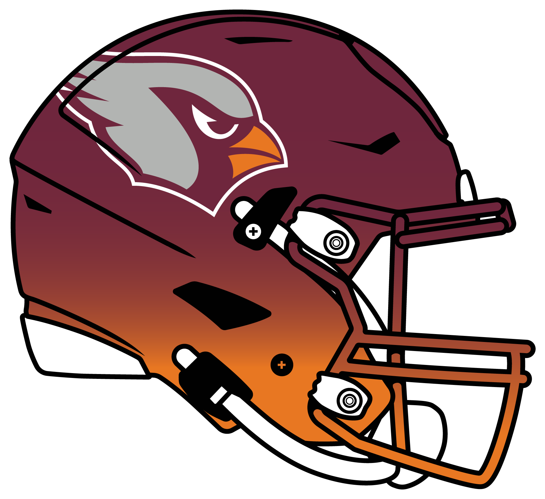
A bit worried the Texans are gonna change their logo....almost all their hats on NFLShop are gone. The ones still there are on sale.
-
Edit: moved to 2024 thread
-
I almost would've preferred the Chiefs go W-A-H so we didn't get the exact matchup we got a few years back.
-
The NOB on the Giants' away jersey in Madden is blue. How does this happen
-
This is a good look, and yes, it would be better with white pants.

-
 6
6
-
 1
1
-
 1
1
-
-
-
On 9/14/2023 at 6:11 PM, AppleValley2020 said:
I don’t know if it has been asked but what is the deal with the teams wearing all white socks? Is that a popular look?
Beats me. I know there's a theory that Nike started the trend to save money on sock dye.
-
Mods, let me know if this isn't allowed--I know the discussion of concepts came up a few months back--But since we're on the topic of Cowboys color balance, this would be an ideal Cowboys set IMO:

You could throw out the White alt. I just challenged myself to make 3 sets for each team about a year ago and concocted this.
-
 2
2
-
-
38 minutes ago, throwuascenario said:
Which team that currently uses navy would not be better off changing to royal or black?
I'll add Notre Dame, the Patriots, and the Texans to this growing list.
-
 3
3
-
-
47 minutes ago, HOOVER said:
The problem is that Orange and White are too similar, tonally. There’s not enough contrast. They compete. It just creates problems with Navy.
Their number font is dainty. It’s dated. You’d never put it on a new uniform design.
So, the first thing I’d do is change the font to the 1-color block font they use on their most recent throwbacks. White on the Navy jerseys, Navy on the White jerseys.
I’d drop the outline on the C logo altogether and move to a Satin finish on the helmet. I’d add an Alt helmet: Matte White shell, Navy facemask, single 1” Navy stripe, Orange 1-color C logo. Maybe even make that the primary helmet. Maybe consider using the Bear logo on it.
I’d retain the sleeve stripes & color pattern from the current White jersey and copy it to the Navy jersey in Orange/White/Orange. I’d drop the GSH from the sleeves and just wear it as a left chest patch. I’d consider adding small stars to the striping pattern on the set to tie into Chicago’s flag.
Pants might have a single stripe to match new Alt Matte White helmet. Otherwise, might be plain White, Bear logo on front right hip opposite Swoosh (EDIT: can’t do this, NFL Shield logo is there). Navy pant would be optional and only worn with White jersey and would be plain, no striping (EDIT: same as Throwback pant).
Striped socks would mirror jersey sleeve stripes; a set of Navy with Orange/White/Orange stripes and a set of Whites with Navy/Orange/Navy stripes.
Agree / Disagree
I agree (assuming this is your position) that the Bears are the worst of the Classic Uni sets in the NFL (with Raiders, Colts, Browns being most superior)
-
 1
1
-
-
For what it's worth, the NFL's new "Flavortown Collection" has the Texans in light blue.

-
 2
2
-
-
The answer for the Cowboys is obvious: a dark royal blue and a slightly more subtle silver-blue.
-
 14
14
-
-
-
On 9/7/2023 at 1:15 PM, spartacat_12 said:
Pretty refreshing to hear a team say that they won't come up with new alternates just for the sake of it.
Yes, especially when the owner said a few years back he'd like a new uniform every year. Looks like we dodged a bullet, at least for now.
-
 2
2
-
-
4 hours ago, Pigskin12 said:
As expected. Pretty bland choices all around so far:
Jaguars white over black
Bengals white on white
Titans all-white
Bills all-blue
Lions all-white
I was gonna root for the Lions but now I kinda don't want to
-
 2
2
-
-
-
-
2 hours ago, DCarp1231 said:
QB: 0-29

-
 1
1
-
 1
1
-
 6
6
-
 1
1
-


:format(webp)/cdn.vox-cdn.com/uploads/chorus_image/image/72734895/1724730110.15.jpg)


2024 NFL Changes
in Sports Logo News
Posted
You know the biggest mystery.... how did Antonio Brown become the foremost authority in uniform leaks?