

TBGKon
-
Posts
15,435 -
Joined
-
Last visited
-
Days Won
1
Posts posted by TBGKon
-
-
3 minutes ago, coborjobs2010 said:
I saw this about an interview Cal did this morning, "For those wishing a different uniform was home or away, the league basically told them which ones they had to use for home/away."
Seems like most Houstonians prefer the red as well, but I guess it wasn't possible?That seems strange. I'm trying to think if any of the recent new uniforms have changed home uniform colors. The Falcons and Rams come to mind (primary red to black & navy blue to royal blue respectively)
-
4 hours ago, DCarp1231 said:
Somehow, the AFC South got bluer
Yeah, this is kinda how I feel. The Texans new look isn't bad, but I always thought they should embrace the red as a primary uniform to contrast the in-state NFL team Cowboys navy blue primary.
-
 6
6
-
-
4 hours ago, JM11_Design said:

From release video on Youtube. Darker blue, lighter red.
Now the real question, what is the PMS for H Town Blue, and is it the same as Titans Luv Ya Blue?
-
1
-
-
7 minutes ago, Brave-Bird 08 said:
Why wouldn't the Texans use the opportunity to enrich an alternate in the light blue instead of just using it as trim? That alternate is a major disappointment, especially because the numerals are red but the H is blue, so it's going to look disjointed.
Probably because they'd get heat from Tennessee, and maybe they did and this is the compromise.
-
1
-
-
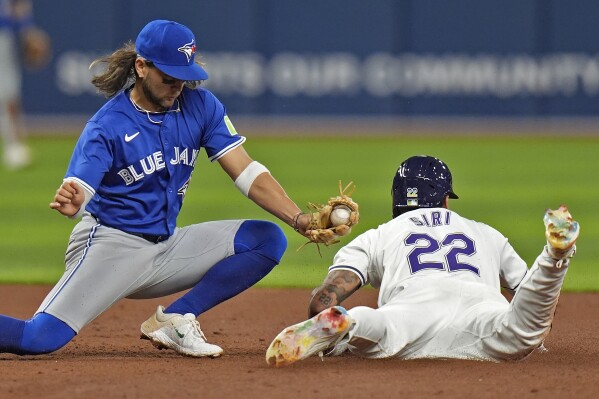
6 minutes ago, 8BW14 said:
The enlarged photo from Uni Watch apparently shows the TV numbers have no outline. Ugh, why? Who thinks this
 is okay? Sometimes the simplest solution really is the best one. Just outline them.
I can’t wait to hear the contrived, convoluted reasoning for this decision.
Seattle has had TV numbers not outlined on their current uniforms as well. Its nothing new.
-
4
-
-
18 hours ago, CaliforniaGlowin said:
Yea but @Conrad. has the insider info
Ok, but that doesn't mean he's free to disseminate information.
-
4
-
 1
1
-
-
2 hours ago, CaliforniaGlowin said:
Any major rebrands next season?
Clippers, who we saw already. I don't believe there's anyone else known at the moment.
-
1
-
-
9 minutes ago, JTernup said:
They had some Cigar City Nike shirts a couple years back that I really liked that I've been hoping would inspire the City Connect gear. This word mark on a light blue jersey with light blue pants would be a great city connect.
I do like the design, but the only issue with the Cigar City moniker is that it belongs to Tampa proper, and since the team plays in St. Petersburg that might not look good when they're in the middle of working out the details of a new ballpark in St Pete.
-
2
-
-
49 minutes ago, coco1997 said:
I really hope TB's City Connect set isn't based around that dumb sunray logo.I'm hoping for light blue jersey and pants, but with a crossover into the gradient Devil Rays throwbacks.
They're rumored to wear these on a Friday for the first time and currently Fridays are Devil Rays Days when they wear the throwbacks at home. It would only make sense if they kept that up.
-
3
-
-
-
11
-
1
-
 2
2
-
 1
1
-
 1
1
-
-
Take 5 minutes and watch this. You really have to feel for the fans, however many there are. I know it would be a real gut punch to lose any of my teams (and until shovels go in the ground for the Rays, I could be within 4 years of feeling this way).
-
7
-
-
10 hours ago, BBTV said:
I don't watch many (well, any) Falcons games. Do they ever open the roof during games, and even if so, does it really let a meaningful amount of light in? Can't support a dark uniform for domed teams that don't have some kind system for letting real light in.
They do, maybe once or twice a season I think. I do see they did it in Week 9 2023. Below are some pics. Definitely not as dark, but I'd say on par with Minnesota's clear roof brightness.
-
27 minutes ago, Silent Wind of Doom said:
Come on... Those things are clearly butterscotch.

I've been watching the uniforms to update the current lineup for each teams. Here's the jerseys still MIA at the moment...
Boston Red (although it was worn as Spring Training) and Navy
Tampa Bay Gradient
Toronto Powder Blue
Angels City Connect
Texas City Connect
Cubs City Connect
Milwaukee Pinstripe and City Connect
St. Louis Cream and Powder Blue
Atlanta Red and Navy
Washington Pullover
Dodgers Los Angeles Gray
San Francisco Orange and City Connect
Obviously, this early in the season there's plenty of chance some teams just haven't gotten the day to line up (usually home Friday) for them to wear their City Connect uniform and we've gotten direct word that some are delayed, but anyone heard any news on the rest of these? And inside scoop or official word I've missed on any of these being trashed?
Rays throwbacks are in use and worn on home Fridays, and have been worn twice so far.
-
2
-
-
49 minutes ago, HOOVER said:
Alright, since I've been talking about it forever, I ran a quick & dirty mock-up of my ideal Falcons uniform with Dark Silver helmet (sans Gold):
Add a Gold outline to the helmet stripe, logo, and the Swoosh & accessory details (like on cleats) if you wanted to go that route. Either way, this would do it.(I wouldn't even be completely heartbroken if they added a small 1" tall "ATLANTA" above the number in a clean new non-italic font.)
Sorry, too similar to division rival Tampa Bay in a black jersey.
-
3
-
-
14 minutes ago, FiddySicks said:
Phoenix is (I think) the 4th biggest media market in the country. Even if it’s a bit of a small flop, it’s still probably more successful than an enthusiastic Salt Lake City.For clarity, Phoenix is 11th in media markets as of the 2023-2024 Nielsen media ratings, just ahead of Tampa Bay and just behind San Francisco/Oakland/San Jose
https://en.wikipedia.org/wiki/List_of_television_stations_in_North_America_by_media_market
-
1
-
-
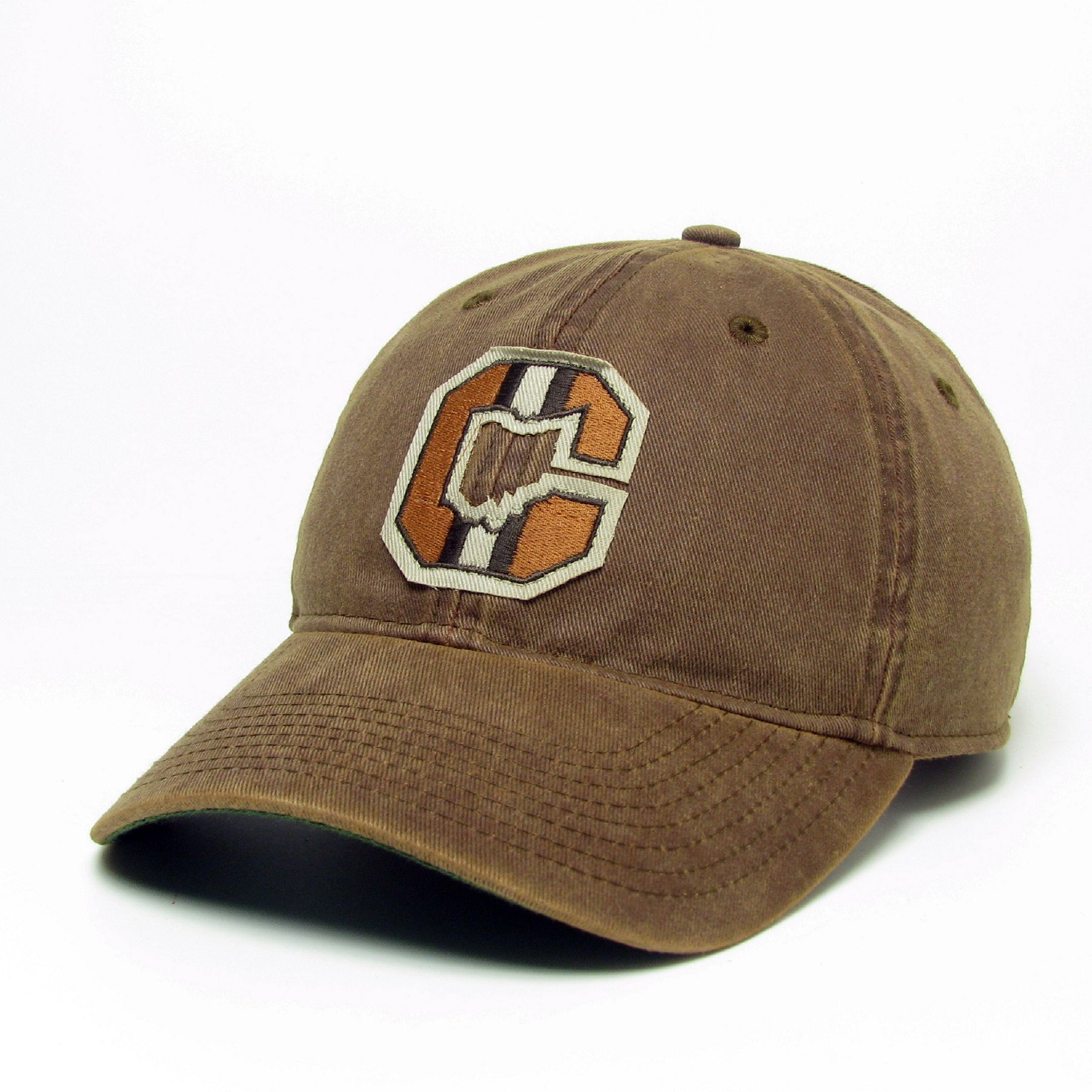
2 hours ago, Cujo said:
Like the logo like the one seen on this hat -- This goes 1000000x harder than that blank-ass circa 1989 default helmet they continue to recycle.
Interesting take, and in the current colors this might work.
-
52 minutes ago, tigerslionspistonshabs said:
Man, I'm kind of on board with Scorpions.
Agreed, Scorpions and Talons seem like pretty good names.
-
1
-
-
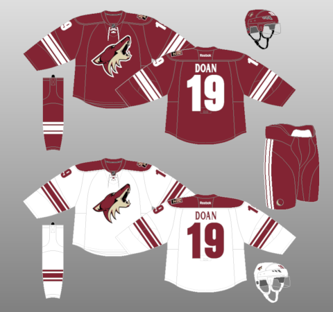
2 hours ago, bowld said:
Assume #3 is the white one that leaked.
#4 will likely be light blue so that leaves us with red and blue for 1 and 2
Honestly #2 could be the leaked white jersey.
-
1 hour ago, SportsFan12 said:
Not sure if anyone saw this. Not sure how they are doing this before the schedule is even out:
The opponents are known, so thats likely what theyre looking into.
-
On 4/13/2024 at 7:18 PM, The_Admiral said:
What in the WordArt is going on with that header? Is that italic and an arch at the same time?
It gives off these vibes
-
10 minutes ago, zubazpirate said:
Salt Lake City seems like a weird landing pad for the NHL. It's a pretty small market (smaller than Calgary and Edmonton from a population standpoint, although I'm sure their GDP is a fair bit higher), and it already has a significant competitor in the form of an established NBA team. Usually the NHL only goes for smaller markets when it's clearly the biggest game in town (Columbus, Raleigh, most Canadian cities).
Maybe they'll be able to make it work, but it seems odd to me that they'd choose a small, relatively crowded market as opposed to a huge city like Houston. Even a place like San Diego is significantly bigger and without direct competition (the NBA and NHL teams up the road in LA/OC don't really count).
Yes, but Salt Lake had something most of those other places may not have currently had.....an owner that was ready to move quickly.
-
2
-
1
-
-
10 hours ago, LMU said:
Now the question is… where do the Kings relocate their Frozen Fury preseason game now and how long until yet another team kicks them out. First was Vegas, now (probably) SLC. They’re moving most of the preseason to Quebec in the fall so… you’re telling me there’s a chance?
Why not Phoenix
-
Coyotes are native to Utah, so that could work. I looked at a list of animals native to Utah and found some possible original options that haven't been said (not in the Big 4 leagues):
Foxes
Bighorns
Pronghorns
Jackrabbits
Merlins (hawk family)
Kestrels
-
14 minutes ago, Sport said:
Always thought "Coyotes" as a team name is really cool. You can abbreviate it to Yotes or Dogs, comes with a fun howl cheer the fans can do. Plus it's got good logo potential. I wouldn't mind if they kept it for Utah. The kachina logo doesn't make much sense there, but neither does Jazz.
Theres always these....


 is okay? Sometimes the simplest solution really is the best one. Just outline them.


/cdn.vox-cdn.com/uploads/chorus_image/image/72832113/1776851182.0.jpg)


2024-25 NHL Changes
in Sports Logo News
Posted
Mammoth is low key a sleeper in this presumptive list.