-
Posts
378 -
Joined
-
Last visited
-
Days Won
2
Posts posted by Phils Phan
-
-
-
The all-black hat was atrocious, but that one is kind of a guilty pleasure of mine. However on the field it just didn't pop at all.Since the Mets are in the news, here's an unpopular opinion.
While the Mets never had any business with black in their color scheme, I loved this hat on its own:

-
While the white pants were unpopular, my opinion is that the Buccaneers, when they actually, y'know, dressed like a pro football team, didn't look good overall when they wore the white pants. With the pewter pants there was a perfect color balance to compliment a simple but nice design, however when they wore white pants it was mostly pewter on top and literally none anywhere else. Yuck.
-
 1
1
-
-
Love that color scheme.I understand the love for the original Sonics look and why the rebrand before the move to OKC was also well liked, but I really like(d) this logo and uniform set and prefer it over any other Sonics look.

-
Orange and grey, just...why?
-
Those powder blues are hideous, and genuinely cause me stress as someone with OCD about symmetry.
-
This is an awful, awful uniform:

-
It's the perfect blend of big logo, asymmetrical design, color scheme and complete lack of reverence for any guideline to uniform design previously upheld, that Jaguars uniform is everything 90's uniforms have to offer besides gradients.
-
That Thrashers jersey would have looked good if they'd changed literally everything about it.
-
 1
1
-
-
So you like it because it's simple? So why do you love this dreck and not other unis with no actual design to them?Okay, this is probably a highly unpopular opinion, but whatever. This?

Wordswordswordswordswordswordswords. Blahblahblahblahblahblahblah. Yadayadayadayadayada, etc.
Sorry, I didn't read all that... I was was too busy staring at the best uniform in football.
Hey, can you tell me what you find attractive about this uniform? No sarcasm at all here, I'm honestly curious. Not everything can be handwaved as "personal opinion," and I wonder just what it is that you and others see that I don't?
Sure. To me, one of the absolute hallmarks of design (and one that's being blown out of the water in the current climate of sports design) is economy. Along with symmetry, variety, harmony, etc., economy is one of the basic principles of organization. I tell me students all the time, if you can tell the story with 5 lines, sometimes that's all you need. (But usually, they just keep drawing anyway.)
Just like writing, cooking... hell, anything, there's a point when you've nailed it, and anything added is just superfluous filler, cluttering up the perfect statement. Of course, its personal preference... I say "simple and complete", you say "plain and lacking" but by my standards of design (no, not just "nostalgia".... the 60's Falcons don't mean anything to me) this is perfect.
-
I was gonna make a joke about the Cubs and World Series teams but it never sounded right, please ignore this post.
-
Madden to this day features a yellow Packers jersey that fortunately was never used. Packers look so hideous in all yellow, I actually never use the green tops in Madden for the garnish novelty of those uniforms.
fixed
-
There's potential (Red helmet and black jersey is a really nice combo), but yeah it's very plain with some annoying flaws. You didn't even mention the unspeakably out of place gold on the helmet either.Okay, this is probably a highly unpopular opinion, but whatever. This?

This is a horrible jersey. Now, I'm fully aware that the Falcons' current jerseys aren't exactly top-notch, but that hardly excuses these. There's a fine line between beautiful simplicity (Green Bay) and generic movie team (Miami Sharks), and these dance all over that line. First, the color balance is off. I've never really been a fan of the "nothing matches" combo, but these particularly annoy me. Bright red helmets, nice...but where's the rest of the red to bring this together? Why are primarily black socks being worn with this jersey, confining the rest of the red mainly to pants and sock stripes, giving the impression that this is a black/white team, with red as trim (save for the helmet, of course)? And speaking of stripes, why are there none at all on the jersey? There's a clear stripe on the jersey, pants, and socks, so why is the jersey bare, save for numbers and another pet peeve...a 95% black logo, with nothing else save thin white and red outlines, on a black jersey. Brilliant. Maybe this is where some modern looks got the idea from. Truth be told, this doesn't look like an NFL jersey. This looks like a retro Texas Tech knockoff, or some random college squad. I firmly believe that this is one of those looks that only gets praise due to the majority of modern designs going off the rails. Again, there are truly classic looks, and then there are those that pitifully try to imitate them. These are the latter, in my opinion.
-
Well...it is...
In before someone says that's better than what the Bucs wear now…Tampa Bay Buccaneers Prototype helmets.


-
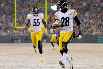
I LOVE the Steelers number font. It's a good way to not have a boring old block font but not have a crazy futuristic font like the Bucs or Vikings.
Yep instead they have a "belongs on a word document" font.
-
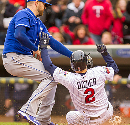
This. So much this.Stirrups are a bad look in baseball. They're not as horrible as the pajama pants, but the solid socks are the best by far.
However I would way rather see long pants than stirrups
So you'd rather players look like complete tools instead of a little silly?
-
To be honest that almost seems as big of a stretch as the people who said the piping on the Blues' Edge unis represent the St. Louis Arch.
And the throwbacks are awesome. I mean yeah the logo sucks, but it's the same on the prototypes with an inferior color scheme.
-
No you are not at all. Any team wearing that knock-off alarm clock font will automatically look unspeakably bad no matter what.My unpopular opinion: The Bucs aren't that bad. They're not great, by any means, but their new uniforms aren't the worst thing that's happened to the NFL like most would have you believe. Let's break it down:
The helmet: The logo is too big. That said, the old one, I feel, was too small, so the new helmet was a step in the right direction, just taken a bit too far. I like the "chrome" (really brushed metal) facemask. It adds to the pirate feel and reminds me of a sword.
The jersey template: When Nike said they were tweaking the Bucs' look, I assumed it would be more akin to the Panthers' new logo. The jersey didn't need to be changed, but if you're gonna modernize a jersey, you could do a lot worse than a plain shoulder yoke with a small, angled accent color. The pewter contrasts nicely with the red or white, and the orange brightens up what is an otherwise dark look, even with the brighter red than before.
The numbers: Alright, there's no defending these. I'm all for non-traditional, non-block numbers, and to be honest, I think the double outline on the old numbers were too thick and made everything look muddy. But this was not the way to go. I tried to think of something other than the popular "alarm clock display" putdown, but it's too accurate.
The pants: I like them. No real complaint. The incomplete stripe up the side also reminds me of a sword, which fits.
The logos: Not bad, but not great either. The old logos were starting to show their age and look very late-90s. They could have been cleaned up a little better than this, though. The new logo looks less like a skull and more like a robot.
Altogether, it's not awful. It's mostly unnecessary, but not bad.
With time I've also gotten used to the Bucs look. Ditch the pewter pants and socks, add an orange jersey with white letters and NOB and we're golden 'til the next rebrand.
-
Here's one I've almost feared telling, while I ADORE their home uniforms and even like their road uniforms (though a white version of their home would be superior and I hate the imbalance of red and blue on the uniforms), I'm not really a fan on the Canadiens logo. It has potential to be a good letter logo as the H within a C could make it so the top half could be perfectly symmetrical to the bottom half, but as is that's not the case.
-
-
Those Oilers uniforms wouldn't have seemed too bad compared too many of the other Edge disasters that year.
-
-
Why are people complaining about the attendance in Florida? I saw hundreds of people there!
-
Vintage white doesn't look good on the Senators... Both the current alternate and the matching Heritage Classic iteration are the worst jerseys in the current iteration of the Senators history.
A cartoony whale forming a C in an incredibly awkward forced way without one the team's main colors in it that was created as an advertisement for a company and has an incredibly pointless script on top of it to sell uniforms during the Olympics doesn't look good either.
-
 1
1
-


Unpopular Opinions
in Sports Logo General Discussion
Posted
I like thick striping on baseball uniforms.