


Bob5151
-
Posts
57 -
Joined
-
Last visited
Posts posted by Bob5151
-
-
5 hours ago, CaliforniaGlowin said:
So much red, blue and black

I love the teal and orange together.
I love the kraken branding, but playoffs???

I think this is a case where using some of the team's secondary colors would liven it up a bit.
Orange for Philadelphia, yellow for Pittsburgh, purple or green for Arizona, the lighter blue for Seattle, etc.
I guess it's only really noticeable when all 32 are presented together like this though.
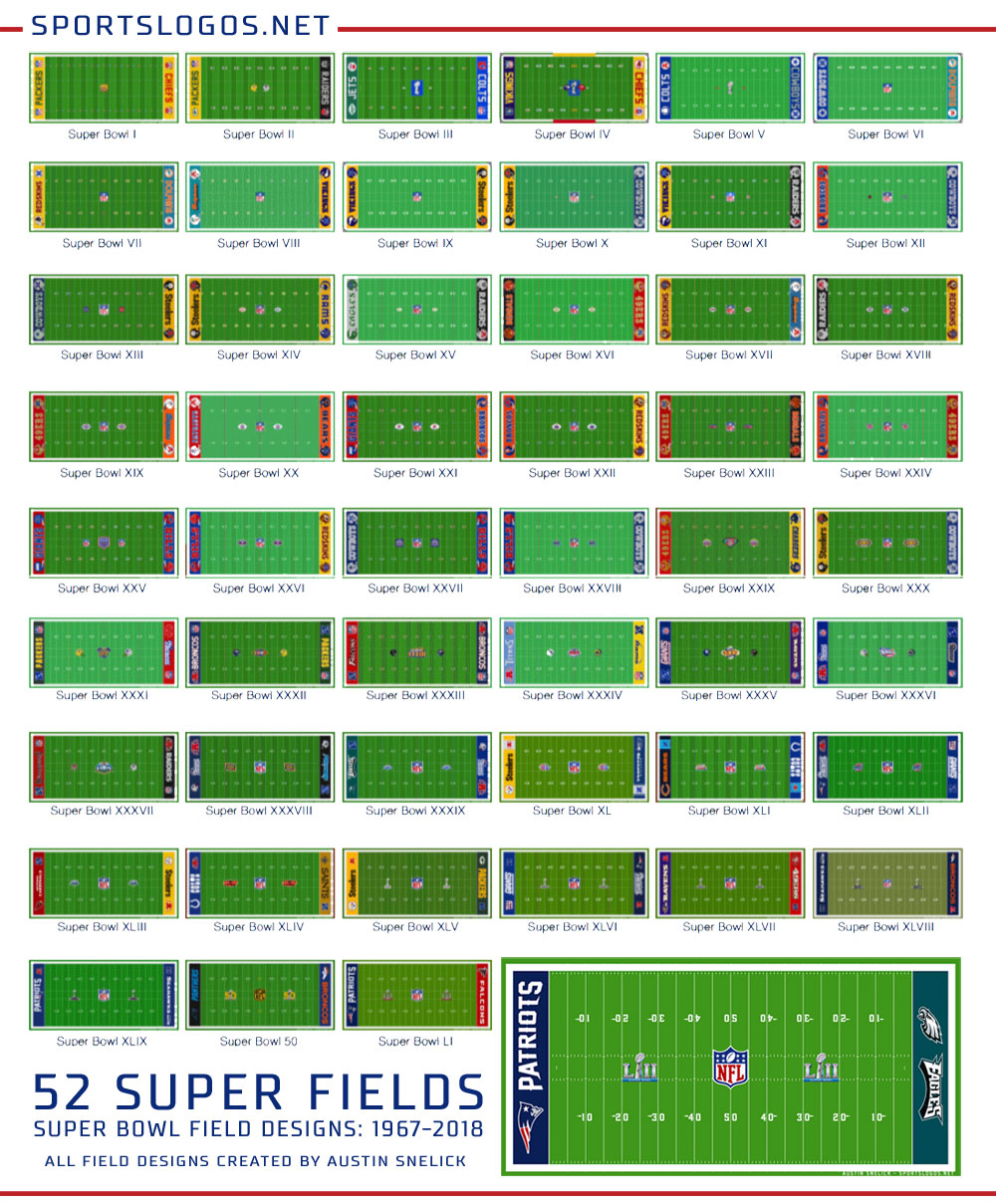
Looking at this page: https://news.sportslogos.net/2018/02/02/a-look-back-at-super-bowl-field-designs/football/ some of the best looking endzones IMO are the ones where teams use their secondary colors (yellow Steelers and Rams, gold 49ers, gray Eagles, orange Dolphins, etc)

-
On 8/16/2021 at 10:48 AM, DTConcepts said:
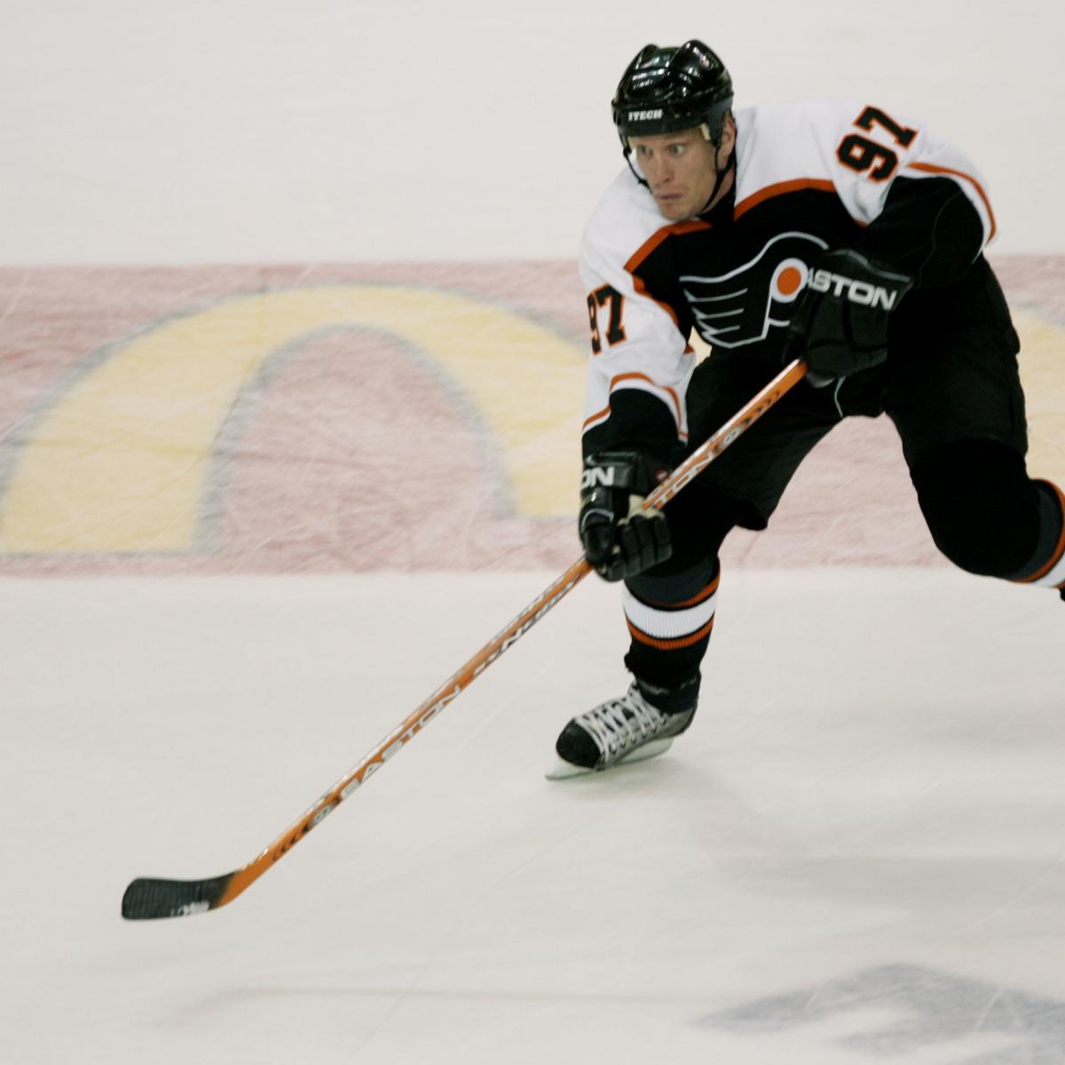
These jerseys suck. The Flyers belong in orange.
I thought these were great as an alternate look- to be worn a few times a season. Unfortunately, the Flyers, like a few other teams in the late '90s/ early 00's (Florida, Ottawa, Washington, San Jose) took cool-looking ALTERNATE looks and promoted them to full-time status, taking away from A)- seeing a different color combination or a different take on the logo, and B)- making a generally fun occasional look the full-time look.
I always thought these were really cool different takes on the main visual identity of these teams, and perfect as alternate jerseys. It was when they got promoted to full-time or playoff road (then home) jerseys that they lost their luster.
-
 1
1
-
-
5 hours ago, joey joe joe jr. shabadoo said:
Beautiful, solid look.
The below jersey eventually was raised from 3rd to permanent road...and while it's not bad it's something that should've been kept as an alternate. Don't like the pointy shoulders

This is something that a couple teams did in the late 90's/early 2000's. The Flyers' black jerseys were awesome as once-in-a-while alternates, but then eventually they replaced the orange jerseys as the playoff roads, and then the oranges were phased out entirely.
The Stars, Senators, Flames, Panthers, and Sharks all did likewise, promoting alternates to full-time road status. Not all were bad looks, but some seemed cooler as alternate looks that you saw occasionally.
-
2
-
-
1 hour ago, SilverBullet1929 said:
Does anyone know why the Marlins got a custom teal-colored Jackie Robinson 50th anniversary patch in 97? Only them and the Expos got custom patches. The Expos I understand because the wording on the patch was switched to French but the Marlins only changed the color of the patch. Why didn't other teams get custom colored patches?
This is something I've wondered about too.
-
1 hour ago, Rj0498 said:
These darker revamps of familiar looks, actually are kind of cool


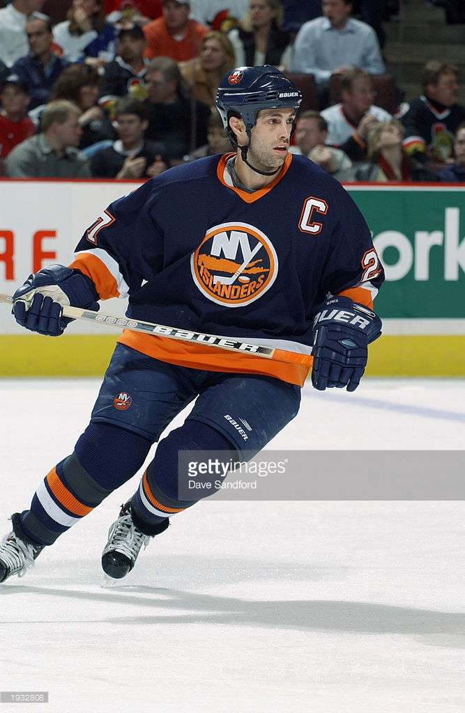
I do like a lot of the darkened looks of the late '90s on their own, I just think that when so many teams did it, it really sucked some visual life out of the league. You had the Isles and Oilers going to navy blue, the Flyers ditching their signature orange in favor of the black uniforms, the Sharks started wearing their black alternates a lot more often at the expense of the teal unis, the Stars went from kelly green to a dark hunter green that was barely distinguishable from the black on their unis. Florida promoted their navy alternates to full -time road (then home) status instead of the bright red set, and the Flames were wearing that black uniform with the flaming horse head logo instead of red.
Really, I don't think any of those looks were bad on their own, but when they all replaced brighter, and in some cases, iconic looks, it kind of made the league a little dreary looking for a while.
-
4
-
-
10 year old me thought those Trevor Kidd Flames goalie pads were the greatest things on the planet. Still pretty awesome looking.
-
1
-
-
This is the best Lightning jersey imho:
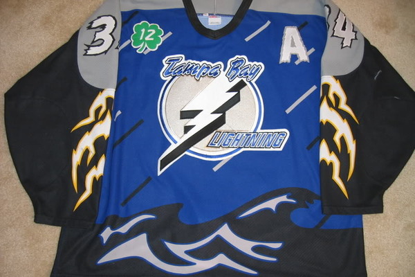
This could have joined the Wildwing Ducks jersey as a member of the "so 90s I can't even hate it" club, but it was just too poorly executed. The logo may the worst primary logo in NHL history, and the rain drops look like sprinkles. A gradient made of horizontal lines for the rain and the 2nd logo would have made this a classic
One thing I miss about older alternate uniforms (1990's) such as this one is that they seemed to be a more "fun" take on a team's identity (Wild Wing, the Bruins' Pooh Bear, the Canucks 2 gradient jerseys the Stars' "full jersey star" jerseys, ect). Perfect to break out a few times a year, and then you had the regular sets to build your identity around.
Everything now seems like color swaps or throwbacks or otherwise uninspired alts. Maybe it's just nostagia talking.
-
The mid '90's uniform is my favorite Texas Rangers look. The only thing I don't get is the road jersey did not have the headspoon piping like the home jersey. The rest of the piping on the sleeves and pans matched, though. Always kind of bothered me.
-
I dont think that the canucks have had a bad logo or jersey.
Not even these two?


I think these are great as alternates. A different, "fun" take on the regular sets. Perfect for once in a while.
-
I didn't really care for them when they were around, but I really miss those original Coyotes uniforms.
-


MLB 2022 Uniform/Logo Changes
in Sports Logo News
Posted
Thank you for putting it into words for me