
.png.6a667346a694f027023ab73b7108fbc5.png)
.png.f3be934f249381cebc19d99339adb90f.png)
gimmick
-
Posts
117 -
Joined
-
Last visited
Posts posted by gimmick
-
-
I really like the Vegas Golden Knights Winter Classic uniforms.
There's something appealing about the simplicity and the old school elements.

-
 3
3
-
-
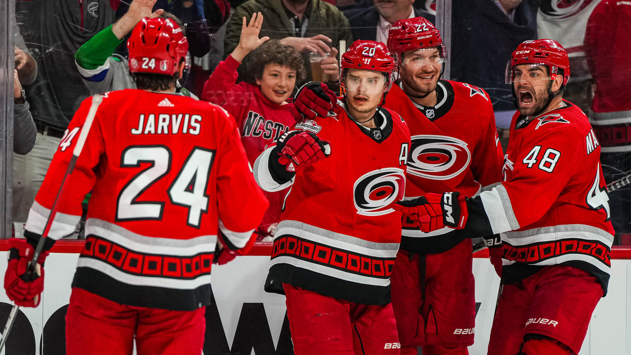
I agree with ruttep.
The Canes had it right the first time.
Preferably without the phantom yokes, but that's not a deal breaker.
One thing they would need to fix (and they've addressed this recently) is the secondary logo.
Is gotta be two flags (hurricane warning), not one flag (storm warning).
-
4
-
-
On 3/22/2024 at 12:23 PM, ruttep said:
Carolina, this isn't hard. You brought back your best uniform ever as an alternate last year, wore it in the playoffs, and then inexplicably dumped them for the previous red jersey . . .
Just bring back the road version as well
-
1
-
 1
1
-
-
These are really outstanding.
Any thoughts of trying a white helmet?
-
 1
1
-
-
I just noticed that you have "HOUSTON" on the blue jerseys and "TEXANS" on the white ones.
Shouldn't that be reversed, or did you do that by design?
-
I like these, but I'd like to see the numbers and player name on the white jersey reversed - red number with blue trim and the player name in blue.
Also, I'd like to see the socks on both uniforms topped in red.
-
2
-
-
I like the Flyers darker shade of orange, too, but I wish they would have kept the stripe on the hem (just seems like classic Flyers to me). I also wish they would have put trim on the sleeve numbers - if there's trim on the back number, there should be trim on the sleeve numbers IMO.
To me, the 1970s Broad Street Bullies uniform was perfect. It had the darker orange, the trim in the sleeve numbers and the stripe on the hem.
Was it plain? You could say that, but the orange and black made it pop.
More importantly, you could just get a quick glimpse of the uniform and you knew that was the Philadelphia Flyers. When a uniform can achieve that kind of recognition, it's usually a keeper.
-
1
-
-
I love this idea!
I've always preferred a color vs color matchup as opposed to "color vs white/color vs white, etc etc")
Thank you.
-
I haven't seen too many Rockies concepts that I've liked, but I like this one.
The beveled lettering and numbers work nicely IMO.
-
1
-
-
I would like these even better as a Tampa Bay Lightning concept (just use black in place of the dark blue).
-
Yes! Much better.
-
1
-
-
All of them (Rays, Marlins and Diamondbacks).
-
1
-
-
On the jerseys with a front left chest logo, line up the front number with the chest logo and I would love all of these.
-
Love these.
The only one I don't like is the option 3 white. I never liked that chest stripe they introduced a few years ago. While I think a chest stripe works sometimes (Montreal for sure and Florida to a point), Minnesota's just looks slapped on with no regard for the look of the rest of the uniform.
If the option 3 white was basically a white version of the colored uniform, like in options 1 and 2, all three options would be great.
-
1
-
-
Something like this for Tampa Bay? Not sure if mainly blue or mainly black looks better.
-
Love these, especially after the tweaks.
Question. What if you used red numbers with green trim on the white jersey (like they currently do)?
That way, the home and road jerseys would both have numbers with trim giving them a more cohesive look.
-
2
-
-
I've always wished that Boston would go back to brown and gold.
-
1
-
-
I love those Anaheim Ducks Reverse Retros, too (all together now , "make them your primaries").
However, I read that they will be wearing orange pants with them. Why??
Since the bottom of the jersey is orange, wouldn't the uniform look better if they wear black pants?
-
2
-
-
Thank you for fixing the striping on the Bears blue pants.
As a Bears fan and a uniform "nerd" with mild OCD, it soothes my mind.
-
I like these. How about orange pants for the road uniform?
-
I thought I'd try my hand at a Tampa Bay Lightning uniform "update".
I wanted to reference their uniform history in the update.
I couldn't decide if I liked a mainly blue or mainly black uniform for them, so I made both.
-
1
-
1
-
 1
1
-
-
How about making the road tequila sunrise uniform gray?
-
-
Fantastic job!
They already had a really nice uniform to work from, but for whatever reason, they decided to stray far from it.
This beautifully keeps the basic look with a little update.
Hopefully, someone over there with an eye for uniform aesthetics (if they have any) will see this and suggest it when the NFL allows them to make changes.
-
1
-


Unpopular Opinions
in Sports Logo General Discussion
Posted
I agree that baseball stirrups don't look good (anymore). They're really an unnecessary part of a baseball uniform.
They looked good "back in the day", but that probably had to do with the fit of the uniforms (baggier) and the fact that players knew how to wear them properly (just a little sanitary sock showing and the higher side in the back).
It's comical to see some of today's players trying to wear stirrups - a few pull it off, but not many (and the "2 in 1s" are an abomination)
Also, yes, shorter pants still look better than long pants.
All they need is a solid team colored sock (team striping would be nice, too)