


tscuzzy
-
Posts
72 -
Joined
-
Last visited
Posts posted by tscuzzy
-
-
57 minutes ago, MJWalker45 said:
the Axiom helmet has a new facemask available this season.
uhhh has anyone pointed out the massive gap between the decal "S" and the helmet?
-
11 minutes ago, Sec19Row53 said:
Devil's advocate - what do fans know about design? Do you end up throwing too much at the wall because of so much input?
They put all the fan input from focus groups in a brief and gave it to Nike/NFL for the actual design process. Because they tried to appease everyone with at least one uniform, I could see some criticism arising from the lack of continuity across each uniform.
-
 2
2
-
-
There is not much to see, but the new Texans navy uniform is in the background of this video:

Confirmed red NOB with white numbers and red trim? Looks like the same numbers that got leaked on the white uniform
-
3
-
 2
2
-
-
Is it controversial to be annoyed when teams wear non-primary uniform for a championship game? Seems like UConn wearing throwbacks would just breed confusion in the future. Same thing with the nuggets last year and their city uniform.
-
1
-
-
7 hours ago, Brave-Bird 08 said:
Sorry to quickly pivot, but seeing "global logo" made me think for a second about each team's "global" logo -- and man.
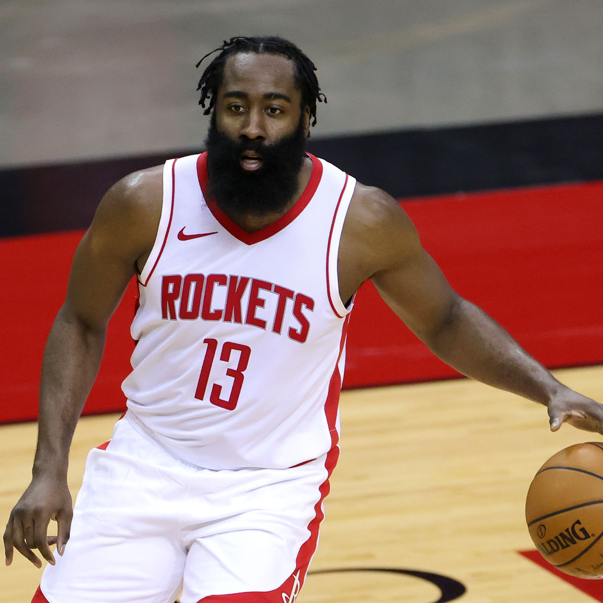
Is the Houston Rockets technically official logo the worst in American pro sports?
Gah... how was this approved.
1. Wordmark style doesn't match the R logo (blocky vs curved). Houston R-Rockets, nice stutter.
2. What is happening behind the K?
3. The lines on the basketball... what are they doing
4. The ribbon (?) around the basketball is oriented up, while the ring around the R is oriented down
5. The flat side of the ribbon points east-west... while the flat side of the R ring points north-south
The Rockets have been a disaster starting in 2010 when adidas introduced the rev30 uniforms. Before then they had shiny fabric with a number that matched their wordmark. I imagine there was some sort of manufacturing issue and adidas offered them the pacers font as a fix... Even when they changed the wordmark and got new uniforms in 2019 they STILL didnt change the number. mind boggling
-
3
-
-
Anyone else think the Mavericks should be thinking rebrand (or at least refresh)? I feel like the logo looks stuck in 2005. Something like below with a new wordmark would do wonders.
-
5
-
-
2 hours ago, fortunat1 said:
I agree with this. Why the Raptors haven't gone back to purple, red, and black is beyond me. Surely any new purple jerseys will be differentiated from the throwbacks, meaning that they won't really be stealing sales from their throwbacks.
I partially agree about the Rockets. While I'd say that their red and yellow look is good in a vacuum, it's not a great scheme given the existence of the Atlanta Hawks. I'd rather them go for a double red scheme, much like they experimented with on their earned jersey a few seasons ago. Something like a classic-ish set based off this year's city jerseys would look nice, swapping blue for burgundy of course. It'd be unique to them and should look pretty nice. I also wouldn't hate them going back to red and silver as long as it comes with refreshed logos and uniforms. The current R logo seems a bit dated and the uniforms they wore through the 00s-10s just weren't that good. They can do so much more with their name and brand. Red and silver could totally work if done right. As shown by their current city jersey, a traditional red and blue look isn't awful either, but it's not necessarily my first choice for a rebrand.
I was so upset that the Hawks beat the Rockets to the retro re-brand... it's a fair point, but they did share colors for about 30 years
-
4
-
-
The league has too much red & black and I really wish the Raptors or Rockets would consider a slightly different direction with primary colors.
Portland and Chicago should be exempt since they have a longer history with those colors, but do we really need two red/white/black teams per conference?
For me the fix is the Raptors to utilize more purple, and the Rockets to utilize more yellow or gray/charcoal
-
9
-
-
when you do a side by side , to me its a clear upgrade, even though its not that drastic. i expect the navy uniform to be a slight update like this one, and the other two to be more distinct.
-
1
-
-
The Texans have let it be known that they aren't changing their primary logo but I wonder if that includes colors. It's always been interesting to me that they didn't go with the official Texas flag colors, given the name and obvious logo connection to the flag. Depending on the lighting, I find the actual shade on the helmets and uniforms to kind of vary between these two blues.
-
11
-
-
This is one of the best rebrands I can ever recall. That red jersey is FIRE. Love the wordmarks too. I can't believe they dropped the black and brought back the nautical theme.
The only complaint I have is the ship looks a little too much like a Royal Caribbean cruiseliner and not a clipper ship. It took me a while to realize those are sails and not levels of a cruise ship.
Lot of people bringing up other teams like the Twins. Across all pro sports in the USA, we have to realize there's going to be some overlap right? Its like 120 teams...
-
2
-
-
Paul George mentioned on his most recent podcast that the Clippers are getting new uniforms next season. Specifically they were discussing how they don’t wear red uniforms anymore and he said “something in store next season. I can probably drop that. They fire too… it’s gonna be the favorite”
-
1
-
-
These are great! The H-Town uniform reminds me a little too much of the Titans, which I imagine the Texans do not want to mimic in anyway. They can do this by featuring more red, which the Titans uniforms lack. Alternatively, I think the uniform will look more like one of these hats they sent out:
I would prefer they go the white route, as a nod to the old Oilers:
-
3
-
-
The texans VP of marketing said a while back that there would be multiple helmets and 4 new uniforms: one traditional, one modern, one bull themed, and one with an h town blue nod. now that we know that will be a trim color only, my guesses:
new helmets: 1) white helmet with texans logo , 2) red helmet with bull horns (or vice versa red logo helmet and white with bull horns). out with navy helmets and embrace the bull theme.
new uniforms: 1) more traditional navy, 2) more modern white, 3) red bull themed, 4) white with h town blue (oilers nod)
this aligns with hats they gave out to media at a sneak peek event last year:
-
6
-
-
Cannot stand the Lakers in yellow vs a white uniform. Good lord. Why not the Pels in navy?
-
2
-
 1
1
-
-
On 11/21/2023 at 8:35 AM, SantosD_ said:
NBA teams need to bring back some color variations on arm sleeves/accessories:
Getting real tired of the "rolled up waistband" look. Can the multibillion dollar sports league let these guys tailor their short length to their liking? It looks terrible
-
4
-
-
Absolutely disgusting.
-
3
-
 1
1
-
 1
1
-
1
-
-
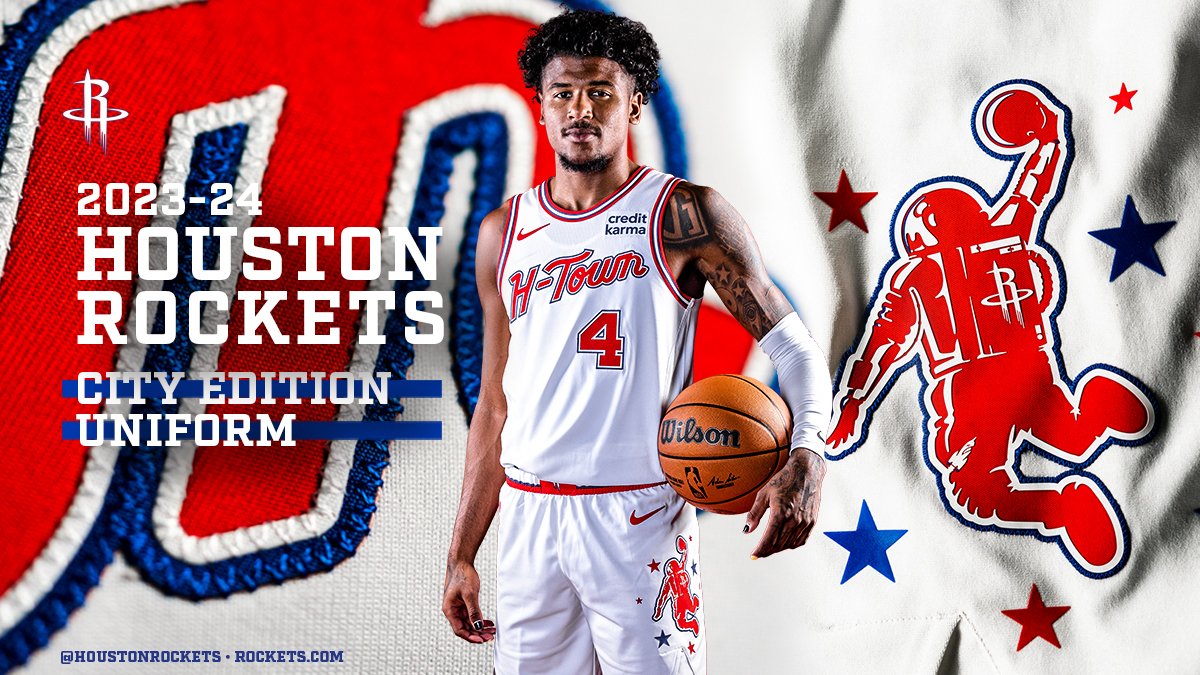
Rockets are calling this logo the "dunkstronaut". Lot of potential here for an official secondary logo one day. They need to drop the R ... there is just so much potential behind a space/earth/rocket logo.
I was a little offended by the shade of blue (very Clippers like), but they are staying true to the old UH uniforms:
-
8
-
 1
1
-
1
-
-
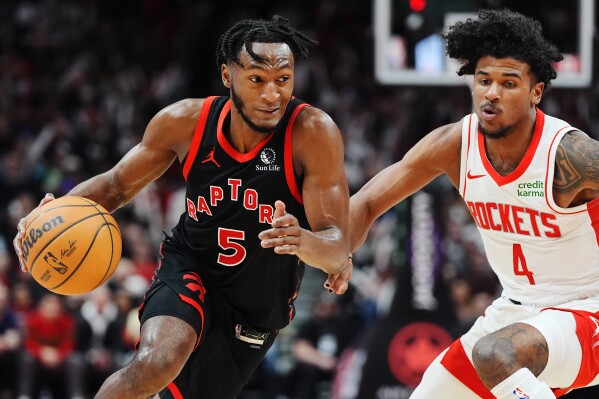
Portland, Chicago, Toronto, and Houston are all starting to look wayyyy too similar at a glance with their identical color red/black/white schemes. Because Portland and Chicago have a longer history with red and black, I think its on Toronto and Houston to switch things up. You could even throw Atlanta into this mix.
-
9
-
-
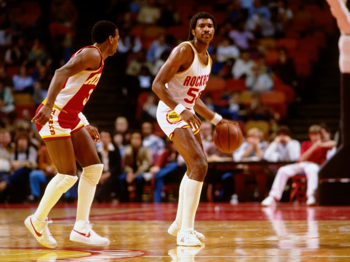
Going on year 14 of the Rockets refusing to implement a unique number font. They’re still using the Pacers identity from 06-17, which they switched to when Adidas introduced rev30 fabric for the 2010-11 season. Find me a more subtle NBA uniform oddity.
-
5
-
-
On 5/16/2023 at 10:00 PM, j'villejags said:
Seeing the fan shirts the Nuggets had laid out for Game 1 had me thinking -- what if they adopted more of an Avalanche-esque color scheme?
Don't forget the Colorado Rapids!
Underutilized color scheme in sports for sure.
-
1
-
-
It's just sad how such a classic look has been abandoned by the Lakers... they have to bring this back soon right?
-
8
-
2
-
1
-
-
Warriors in black at home, lakers in yellow on the road, warriors fans in yellow t shirts. I’m gonna have an aneurysm
-
5
-
1
-
1
-
-
Warriors in black at home, lakers in yellow on the road, warriors fans in yellow t shirts. I’m gonna have an aneurysm
-
 1
1
-


2024 NFL Changes
in Sports Logo News
Posted
forgive my terrible photoshop skills but matte helmet + reducing the red trim does wonders IMO... it just looks so amateur in the leaked pic