


Stampman
-
Posts
9,566 -
Joined
-
Last visited
Posts posted by Stampman
-
-
And one last comment so far--I did give some likes on some of the concepts--and rather than comment on each one, I have decided to go with the above--and then add some general comments
1-in general white pants in hockey is not a good idea--it rarely works well--and players ending up on the ice can turn them into something not too far from a wet t-shirt.
So going with a colour will work much better.
2-the strapless socks that match the pants? That may remind some of the copper all look--nto a greta one--for a one shot? Maybe--btu some of the concepts would be improved by either adding stripes tot he socks--or changing he colour so they don't match the pants.
-
 1
1
-
-
On 4/4/2022 at 2:57 PM, johne9109 said:
Calgary Flames
The Calgary Flames get a Calgary Stampede inspired uniform. The font used and the secondary logo is taken from the logo for the Stampede. the pants, socks, helmet, and gloves take their colors from jeans, hat, and gloves you would see on riders at the stampede. The back of the collar reads stampede city. The promotional image is a recoloring of Calgary's flag

The colours are a bit jarring, even if I get the reasons, maybe if there was some overlap between jersey & pants?
Then again--sometimes jarring can be good
-
1
-
-
On 3/31/2022 at 3:07 PM, johne9109 said:
Boston Bruins
I originally wanted to stay away from doing some revolutionary war themed, but Boston is so steeped in that history it was hard to avoid. The jersey features 13 red and white stripes (including the collar) to represent the original 13 colonies. the shoulders feature the join or die snake and Massachusetts flag. The logo is colored to replicate the Colonial Colors (one of the first flags of the union. 1775 is also inscribed on the inside of the collar. The promotional image is a take on this Boston tea party logo I found and put a hockey spin on
While I think this was well done & get the meaning behind it--it would be weird for a lot of Bruins fans to see their team in the Canadiens colours...
-
1
-
-
The Oilers could do better than a stuck in the early 70s logo--btu too much baggage with it for fans--so they are probably stuck with it.
-
4
-
-
On 6/3/2022 at 7:55 PM, monkeypower said:
Stamps wearing the 75ths again today, this time on the road with Edmonton in their new whites at home. This year's headshots are in the 75ths as well.
The main problem right now is that they are wearing the red pants from the previous (current?) away set and red socks, so it's colour rushing (and those red pants don't have any stripes on them).
Yeah, they'd look better with white or grey pants--not black.
I do love those jerseys though.
-
Wow--I absolutely love those new Stamps jerseys.
The main thing that would stop me from buying one is that I don't like wearing polyester.
But I am still considering it.
If they released a cotton T-Shirt version I would get it quite quickly.
-
I've always liked the Argos boat logo--and this new version is better than the previous ones.
I like the flow of it--and the colouring is well done--and as mentioned--the waves/sleeves
I'm looking forward to seeing this in action
-
1
-
-
And now the US teams:
Again--a fun thread & some cool ideas.
Portland: I like the colours. I like that the fish is not anthropomorphized & carrying a ball & doing a straight arm with a fin--it's a fish.
I cerated a fish logo & helmet for a fantasy league here a number of years ago before life popped up & I had to withdraw--so nice to see a fish logo (& someone here fine-tuned the logo for me, but I designed it & the unis.)
Boise: I love the helmet-I also created an angle helmet for the CFL fantasy league here--and the current owner of the team still uses a variation of my helmet. How can I not love that helmet? A couple of suggestion though--could you use something other than blue in the uni? There's already a lot of blue in this league. (But not a big deal necessarily). The other is that the moosehead looks real lumpy, the antlers are very good, but he head is a lumpy mass.
St. Louis: One of the better fonts, & I like the look of the uni-other than the piping. Although as also mentioned & discussed the logo is a bit confusing.
Hartford: the green is a bit overpowering--did you try it with he green & brown reversed--that might help, but otherwise real nice uni--I really like the stripes & overall design--very football & a bit different than anybody else.
Orlando--the blue doesn't work for me here, but I like the rest of it--the wings are well done, and different enough than the mouse antlers--so nice job overall, other than the way the blue (Again a lot of blue) mixes with the yellow.
Columbus: other than the logo --one of my favourite helmets in this series. The variations on the stripes & the colours work real well. It sets the team apart for sure.
But the logo confuses me-it looks more like a cactus or an anchor, it could be more clear.
But again overall--a fun series with some great ideas.
-
1
-
-
A bit late to the party--but a fun thread.
I had left some comments in the request thread first, before I saw this
So here are some comments team by team:
BC: I like the subdued orange, although I find it odd to see front facing logos on a football helmet (When it's a face)-but that's no complaint about the quality of the logo
Edmonton: I do prefer the update to the double E it might be a bit busy--but nice job.
Calgary: Nicer uni idea than some of their recent ones-and I like that black is more an accent or trim colour--so points for that.
but the logo doesn't do it for me--the horse doesn't show movement, and it should (Especially they have horse race down the sidelines after a TD)
Saskatchewan---good concept, but he helmet is a bit busy--I would remove the crest from the helmet & leave the "S" and wheat. I do like the wheat on the pants though.
Winnipeg: nice uni except for the piping-it distracts megrim how cool the rest of it looks-and I agree with the previous comment that the White W would be better on the helmet.
Hamilton: I love the stripes, it's been done before, but this is done well & makes sense. However the helmet logo is a bit busy & bit too large
Toronto:The secondary logo looks too much like an Ottawa Senators logo--but main one is good-(But too big on the helmet)-although I love their football boat logo.
Ottawa: the logo is too unclear for a helmet--good idea, just needs some clarity I like the plaid LALl their unit should include plaid.
Montreal: I like how the agog maintains an M, an A & a bird.
Atlantic: I like the uni & colour scheme--well down that way, but that logo is too confusing--not feeling it--It is not clear what it is without an explanation & even then...
Quebec: I agree with you on the logo, simplify it and use the canoe & the Voyageur--lose the tress for the helmet--you can still sue the full logo in team branding.
London: quite nice in the scratches for the stripes, etc. Hamilton has done something similar, but not the same by any means--this is more than different enough.
this logo would benefit form a sideways logo or a 3/4 angle logo that shows movement--it would make the helmet pop.
-
1
-
-
Piping on cocky & Football jerseys.
I'm okay with it on baseball jerseys--but it bugs me on hockey & football ones.
Not sure why.
-
1
-
-
I've used a number of these back when I played Madden on the PC more often.
(I would not be beyond making some more though.)
Here are a few of the ones I've used (Minus word marks, etc.)
Sorry some are small
I may post more, or not...
-
4 hours ago, jlnhlfan said:
Yes, they had green one time and teal at another.
They started with a different green, blue & white.
When Charles Finley bought the team he switched to Kelly green & yellow.
When he dumped the team on the league they switched to the teal & yellow.
Although the Finley era wasn't much loved by many fans--I did like those uniforms. Instead of white jerseys they had yellow ones--that were basically a reversal of the green & yellow ones.
-
1
-
-
From Uni Watch Blog todayUser ActionsFollow
 Vintage MN Hockey@VintageMNHockey
This photo surfaced @UniWatch from a @9modano & Smith signing in 1989 (Never seen ☆ prototype jersey in background)?

I know I've never seen these jerseys before, has anyone else? There's some snazzy elements to them, but probably an overall mess. Thoughts?
Overall mess indeed but an interesting idea.
I'm glad they never went with those--I agree on the mess thing
-
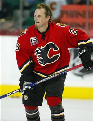
Darren McCarty- Calgary Flames
Well he had a good first season with them...
-
#66.
So what?
They were Flames uniforms--and the number is a number...
Nobody was going to confuse him for Mario--and there's no rule saying someone else can't use it.
And I doubt it bothered Mario.
-
I hate when guys like Iginla and Jagr become rent-a-players at the end of their careers. Sort of tarnishes they're main career team "feel" when they wear 17 other sweaters in the league.
Well the Dallas picture doesn't count as a rent a player --they drafted him.
Then they traded his rights in the Nieuwendyk trade to the Flames.
It can count as a wrong uniform as he never wore it in a game.
-
Bringing back the ugliest uniforms the NHL has ever seen? (Okay other than some of the third jerseys--and even then, only a couple of those were worse)
It's fun for a concept series, but I hope they never do that.
-
Ken Morrow and Neal Broten are the only members of the 1980 Olympic team to win the Stanley Cup. Neal Broton was also the first winner of the Hobey Baker Trophy in 1979 (College Hockey's Most Valuable Player).
Ken Morrow did both in the same year and won the Stanley CUp the next 3 seasons as well.
-
Ken Dryden was the first player to win the Stanley Cup and have his name ingraved on it before winning the Calder Memorial Trophy as rookie of the year the next season...
He is also the only person to win the Conn Smythe before the Calder--others have won both--but the Calder first.
-
Not sure that blue works--at least on the 3rd.
But if the shade was a bit less vibrant it would probably work a bit better.
Then it might work.
-

But he's not in it--as per the thread title--okay, he's not in it--yet.
-
Hint: He wasn't a professional athlete--if he's who he looks like...
-
Maybe I missed it, but nobody's gonna bring up, the unused 1997 Miami Dolphins helmet?
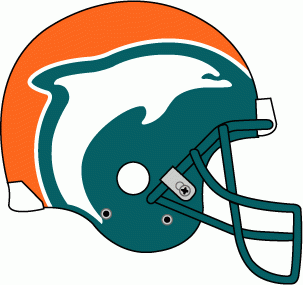
This one I like--it's unconventional--but perhaps that's why I like it...
-

I just realized that this logo resembles the old Calgary Flames alt logo. Coincidence?

At least the Colts one has hair...


My Ideal NHL - Winnipeg Jets (32/32)
in Concepts
Posted
As a Flames fan--I never liked the Blasty logo--and primarily because it's a bald horse.
If it had proper flaming mane--maybe.
How about trying something with that?
the City one I do like--the flag is indeed useful for uniforms--and years ago I used it for a Calgary Baseball team concept.