


TVIXX
-
Posts
1,048 -
Joined
-
Last visited
-
Days Won
1
Posts posted by TVIXX
-
-
Espn tweaked their nba graphics
-
WSU Shockers to the American athletic conference
-
Wow look at all those Bulls fans before jordan

-
 4
4
-
-
1 hour ago, 8BW14 said:
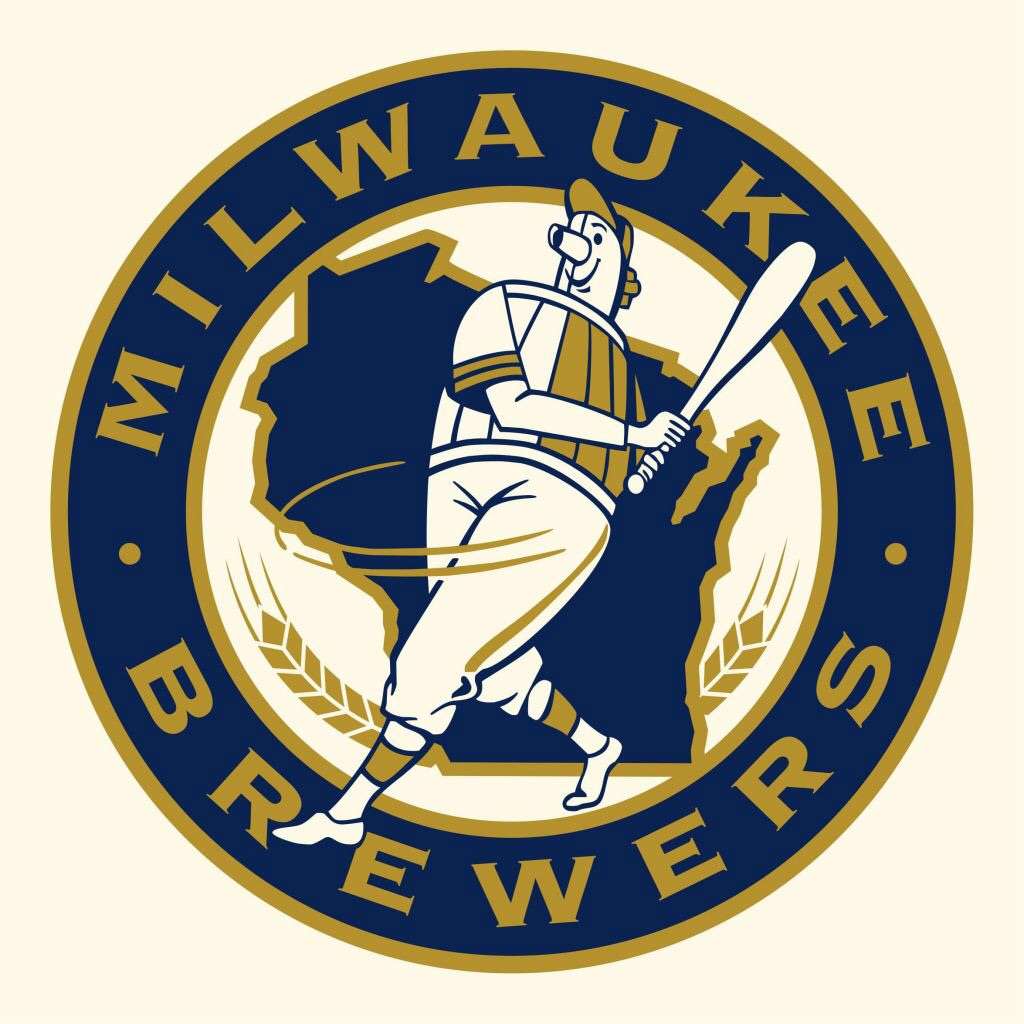
I hate the brewers glove logo and I prefer that they wear navy and gold to royal and yellow. Having said that, I'dreally like to see them start over with something new since they have this weird mix and not-match of two different eras going on now.
I always thought the Brewers should've expanded on their fan jersey from 2012


-
-
I really wished the replies to the Rams going to navy/white were the same as the padres
-
2
-
-
The team name and logo will be unveiled monday at 11am
-
MLB Comination of eras (Brewers)
-
The rattlers worn uniforms inspired by the Brewers "youniform" jersey this past sunday
-
I suggested Fondy Walleye
-
http://www.sabreathletics.com/general/2016-17/releases/20160815jjd9g9
the northwoods league is expanding to fond du lac, wisconsin
-
Oklahoma City Thunder
Orange Baselines With Oklahoma City Thunder Navy with White Outline
Orange Paint With Navy Markings
Center Court http://www.sportslogos.net/logos/view/qdx55wdx4akljqkvzi1s3e6t3/Oklahoma_City_Thunder/2009/Partial_Logo
-
Atlanta Hawks
Current Design
Wood: Triangle Pattern From Jerseys
Baselines: Red With Black Atlanta Hawks With Highlighter Outline
Paint: Red With Black Markings
Center Court: http://www.sportslogos.net/logos/view/22084522016/Atlanta_Hawks/2016/Alternate_Logo
Atlanta Hawks
Previous Design
Baselines: Red With White Atlanta Hawks With Navy Outline
Paint: Red With Navy Blue Markings
Center Court: http://www.sportslogos.net/logos/view/9dtq0qlm5fg5e5nhaipw/Atlanta_Hawks/2008/Alternate_Logo
-
Brewers just admit you're getting new jerseys next season
-
1
-
-
will the homepage be getting a similar new look?
-
Milwaukee Bucks
Green Baselines With Milwaukee Bucks in white with a cream outline
buck heads place inside the 3 point arc similar to alt court
Center court the M logo without the ball
-
http://media.operationsports.com/shots/624/35651.jpg
Could you make a clearer version of this court,please
-
Charlotte Hornets Current [Keep same wood shading from current court]
Teal Baselines With Charlotte Hornets
Teal Paint With Purple Markings
http://www.sportslogos.net/logos/view/512016172015/Charlotte_Hornets/2015/Alternate_Logofor center court
really liked what you did for phoenix
-
Phoenix Suns
Purple Baselines With Phoenix Suns
Purple Paint with orange markings
PHX Bird Logo for center court
-
could you do a 90's jazz court with the mountains on the court
-
all look good
-
any updates coming?
-
could you possible clean up this backhawks logo
http://www.sportslogos.net/logos/view/546269201958/Chicago_Black_Hawks/1958/Jersey_Logo
-
The brewers 1990-1993 wordmarks looked more messed up than the current ones
-
1
-


The Sports Media Thread
in Sports In General
Posted
NBCSN will shut down at end of 2021 as several sports properties will shift to USA Network, according to reports (msn.com)