


chcarlson23
-
Posts
2,203 -
Joined
-
Last visited
Posts posted by chcarlson23
-
-
3 hours ago, M4One said:
Saw this on reddit. Official bootleg jerseys sold at the Wells Fargo Center for $120. They are made by a company called Valiant.

So it’s a non-bootleg bootleg?
Did the Flyers then reach out to a different company to have them create their jerseys for the team store?
Honestly this could be a great solution to the jersey market, if teams could find their own third party, and hopefully a local one, to make a cheaper, (but probably nicer quality
 ) replica version.
I mean I guess you won’t have all of the bells and whistles, but that jersey seems to be nicer than a Fanatics replica. It looks like an actual tackle twill logo.-
 3
3
-
 1
1
-
-
Loving the series so far!! One question though, are you going to be doing helmet logos? I love that some teams have a secondary or wordmark logo there, and we’re seeing less and less of those in pro hockey in favor of ads. I don’t think that will happen soon in College hockey, so it would be near to see what you could put on the lids.
-
Minnesota looks fantastic!! Although I don’t think the white breezers works. The light blue you use on the numbers would probably work well for the breezers.
-
1
-
-
9 minutes ago, The_Admiral said:
Bad news: they do, generally for the Rangers and Flyers
And even if they do happen to have a strong allegiance to a team from their original hometown, winning can really shift that. The Lightning probably have gone through some stretches of having many “outta town” fans being transplants, but after 3 Cups and about a decade of success, I don’t think they’re really worried about the Rangers or Bruins drawing more fans for those games. And certainly not other places like Minnesota, Michigan, or Ohio.
But contrast that to a place like Phoenix, where the team and management always stinks, and it leads to the tiny 5,000 seater being about 99% road fans.
For Atlanta, if they do want to make things work, as long as they market well, and use those transplants to fill seats, it won’t matter that the crowd is mostly road fans for a while. But they’ll have to start winning, and look more like a Nashville, Dallas, or Tampa than a Phoenix, otherwise this franchise could be the Nordiques 2.0
-
10 minutes ago, Morgan33 said:
You mean like this? I see blue on the numbers but not on the striping.
I've explained ad-nauseam on this thread why they went with black equipment and why it was necessary. To eliminate any instances of burgundy and blue touching on the uniform. Look at how awful these colours look side by side. No contrast or definition what so ever.
Yeah that’s a huge flaw with the current Avs road jersey. The silver on burgundy striping is really awful on its own, without the fact that blue is now much more predominant in the set.
Honestly the burgundy and blue touching is whatever for me. Maybe it’s just a difference of opinion, but I guess I don’t see the 90’s set as so much better than the current set. Maybe a little better? But the home set works well with the blue breezers and gloves.
And the Avs could have gone with so many different options to keep the burgundy and blue separate, over adding black to the set.
Pretty much every jersey the Avs have worn have had major flaws when it comes to using their colors and distributing them in a pleasant way.
-
2 hours ago, Morgan33 said:
It doesn't need to be anywhere else. It's on the primary logo, numbers and equipment. It can be seen no matter what angle you're looking at the uniform from. Why must it arbitrarily be shoehorned onto the striping?
Why does it have to be arbitrarily shoehorned into the numbers and gear then? The striping on a hockey jersey should carry the weight of the colors. If your striping doesn’t have the colors that you included into the numbers, there’s something off about the design.
-
4
-
-
On 3/1/2024 at 9:00 PM, Morgan33 said:
Here's the thing people tend to overlook about black on sports uniforms... Neither black nor white are technically colours. They are neutral shades. Putting the black equipment in the colour hierarchy of this uniform is like doing the same with the white uniform base. The actual colour hierarchy of this perfectly balanced uniform is Burgundy > Blue > Silver*. Just like on the home version.
*although silver could technically be classified as a shade as well,
This doesn’t make any sense. Black and white are not neutral colors or neutral shades. Unless planned, they can really stick out. White breezers and gloves have a tendency to do that. But black would too if paired with a team that doesn’t have that in their color scheme. The Habs aren’t out there rocking black breezers, because they’ve never had black in their color scheme.
And you absolutely have to include them into the color scheme, because it does add to the visual weight and/or effect of the look. You would probably say something like “Team A has ____ on their dark jerseys, but not their white jerseys.” So white is literally included in the color hierarchy of a white jersey.
I also don’t know how you can say that 90’s look is perfectly balanced. You’ll have to explain that more, because what I see, (and obviously this could all just be a difference in opinion) is a set that has a lot of burgundy and white up top, and then really random black gear in the middle, and then socks that emphasize more blue than anywhere else in the set. (I know there is both blue and black across the set, but at a distance, such as watching the game from the stands, all I can see of black is the gear, and of blue is the socks.) It feels a little bottom heavy, and that two colors that are featured below the waist aren’t really present on the jersey.
The Avs probably used black gear, because burgundy or steel blue breezers and gloves were probably too hard to come by in the 90’s. So they chose black, and then shoehorned it into the rest of the sweaters, forever making their color scheme ridiculous complicated.
-
2
-
-
Honestly, if you’re up for it, you should do a 32 team league, and come up with identities for the cities that didn’t make these 16. Probably could go without the voting just to simply, but I’d love to see what you had in mind for the other places. Especially the Twin Cities
-
What a ridiculous game in Minnesota today. The Wild hosted the Canucks today, and Vancouver was up 4-1, then 5-3 at the end of the second. The Wild scored 5 goals in a matter of minutes to take the lead 8-5. But the drama didn’t stop there as the Canucks made it a 8-7 game before the Wild iced it with two empty netters for a final of 10-7.
But 3 hat tricks in the game, one from JT Miller and then the Wild had two from both Joel Eriksson Ek and Kirill Kaprizov.
I heard it broke an NHL record for the most goals/least amount of combined shots at 17 goals in a game with 51 registered shots on net.
Just insanity from the Wild today. Of course they head to Winnipeg tomorrow, which is another tough test for them. I have no idea what to make of this team. The dropped a bad one to the Sabres, just to follow it up with this. I’d love to see them continue to push for the playoffs, but it’ll feel pointless for another first round exit. They need to either make a run like the Panthers last year, or lose out for a good pick.
-
Twin Cities lol
-
3 hours ago, Wildcomet said:
I'm a fan of the design! I like what they came up with for the flag and this does a good job imo of translating the elements from the flag to the sweater.
Question... So I've seen a couple times now where people on this site have posted this site for having their designs produced and am curious... did you just email them to propose making the design or do they have a space for submitting designs for possible production?
Thank you!! It’s a simple design for the flag, so it was pretty easy to move to a sweater!
And I believe that they usually get in touch with people through social media, but they do also have an email you could send to them. I think they usually see a project that they like, and then they reach out.
I posted this design on Twitter/X, tagging an account that’s been following the Minnesota Flag change. They shared it around and someone else commented that Olive and York should make these, so they DM’d me and wanted to get started which was awesome!
-
1
-
-
Today is the last day for purchase if anyone wants to buy one!!
You’ll have until 12 AM eastern, 11 PM central to buy one!
-
-
Winds. And maybe just call them the Chicago Wind
-
Chicago
-
10 minutes ago, B-Rich said:
I think he was being sarcastic...
Welp that’s valid. Sarcasm is hard on the internet ahahaha
-
48 minutes ago, OnWis97 said:
If I take everything I read at face value, most MLB teams need to flee their urban hellscapes. The Twins, Mariners, Giants, Dodgers, and Cardinals, just to name a few, better get to the suburbs or roll the dice on smaller markets.
What do you mean by this? The Twins literally play in one of the nicest and affluent neighborhoods in Minneapolis, at the corner of North Loop. I have no idea what you mean by urban hellscape. I mean sure, there are not great parts of Minneapolis, but geez
-
1
-
-
Looks great!! I would probably go with the current arched Minnesota, to match the name and numbers better, vs the throwback arch. But overall a great set!
-
1
-
-
I am happy to announce that these jerseys are now for sale!! I am partnering with Olive and York, as well as the flag company, Flags for Good. The pre-sale will go until the 15th of February, and any purchase will include the new Minnesota state flag!
Minnesota Flag Hockey Jersey Bundle PRE-ORDER – Olive & York (oliveandyork.com)
-
The Ivy League throwbacks are sweet!
How about more college hockey, with the Big Ten?
-
1
-
-
Warbirds! Just a fantastic name, and a great identity overall
-
It reminds me of the joke of a polar bear in a snowstorm drawing
-
1
-
 1
1
-
-
I really like the design for Iceland! However, the light blue numbers on the navy jersey don’t work the best. I feel like they would be very hard to read in real life. Plain white ones would probably be better if you want to maintain the single color numbers and names.
-
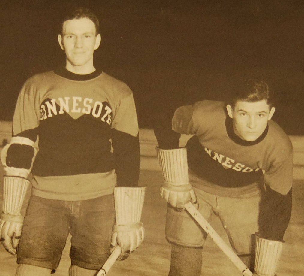
I took a little break from my Twin Cities League series to work on these sweaters inspired by the new Minnesota State Flag!
And while working on them, I ended up noticing how similar they were to these Gophers sweaters in the early 1930's.
The font used for the wordmark and NOB is the same as the "Explore Minnesota" ad campaign, which uses Brandon Grotesque. The numbers are a different font, but I thought meshed better with the sharp edges of Brandon.
C&C welcome!
-
3
-


:no_upscale()/cdn.vox-cdn.com/uploads/chorus_asset/file/8029517/VMH_GopherJerseys_6.jpg)
2024 NFL Changes
in Sports Logo News
Posted
I wholeheartedly agree. Both the previous set and the 80’s-now-current set have similar feels. They’re “modern” looks to get rid of the Namath style jerseys that are both honestly kind of boring. The white and green contrasting sleeves are unique, and feel like the Jets. These two sets could just be for any green and white team. I don’t disagree that the 80’s set looks nice, but I thought the last one did too. So to replace it with a set really similar to it is kinda odd.
I feel like most fans are gonna notice that it no longer has black outlines, and that it doesn’t say New York anymore.
The Jets have an iconic look with the Namath set and contrasting sleeves. I’m not sure why they’ve wanted to get away from those at all. And these 80’s throwbacks are so similar to the previous set that I don’t know why people were clamoring for them so much. They’re kinda cut from the same cloth, just in different decades…