


WhitecapsForLife11
-
Posts
84 -
Joined
-
Last visited
Posts posted by WhitecapsForLife11
-
-
4 hours ago, MJWalker45 said:

This year Ted Lasso has been doing a great job of using actual EPL uniforms and numbers, and even have Mexico's proper 2022 kits. Apparently they couldn't get a deal with Canada because they are all wearing 2021 Nike training kits and no Canada Soccer logos, nor even a basic maple leaf logo. The numbers are basic Nike teamwear as well instead of the bespoke Canada numbers.
I don't know, a basic-looking Nike kit for Canada seems pretty realistic to me (cries in not getting a proper WC kit).
-
 3
3
-
-
On 3/19/2023 at 9:37 AM, upperV03 said:
Always strange to see the Galaxy in an away kit at home (especially with the opposition in white), but their new kit is so good that I don’t even mind:
Your picture reminds me, maybe I'm in the minority on this, but I do not love the all-white Whitecaps look. They've gone with that look every time this year with their new kit but I much prefer the blue shorts, feels like it adds some nice colour to the overall look after years of the all-white look. Plus, the white top kinda fits the name of 'Whitecaps' too.
-
 5
5
-
-
On 2/21/2023 at 10:49 AM, aawagner011 said:
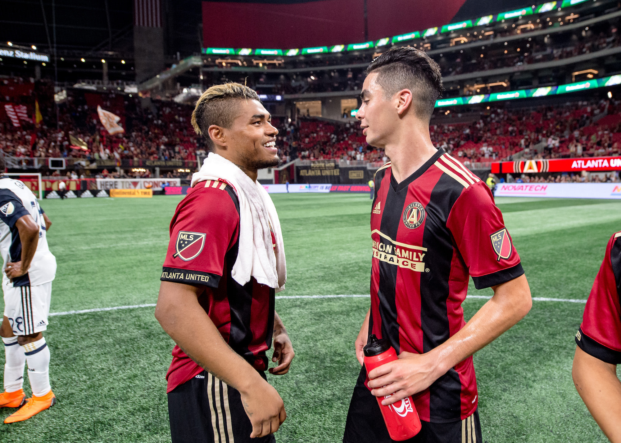
When I saw the customized side stripe a few MLS teams had, I wished Atlanta went with a red and black striped design instead of the gold. I like the gold on the collar and cuffs but it sticks out too much on the sides. It bothers me how the gold doesn’t match with the red trim on the shorts. Those two elements look like they are supposed to match. It would make things much more cohesive and wouldn’t stick out like a sore thumb when viewed on TV.
The 17/18 design that this is trying to emulate let the stripes be the focal point with minimal gold details. By contrast, the design above has a bit too much visual clutter. The eye doesn’t know whether to look at the stripes or the gold. It’s still a nice shirt, but could have been a touch better.
Not sure why, maybe it's because the cut feels/looks sharper at the shoulder, but the bottom template with the three stripes that don't go along the upper arm looks way better in my opinion than the typical Adidas look with the drooping three stripes from above. It feels more modern and less cluttered with logos on the side of the arm and the design as a whole. I'm fairly certain that was also the case in 2019 (at least, the first Whitecaps hoop kit) and it looks fantastic. I wish they went back to this style and made it their permanent template/style for kits.
-
1
-
-
Oh maaaaan those Canucks alternates are nearly exactly the jerseys I want them to wear. Great work on Vancouver.
-
1
-
-
That Panthers set is *chef's kiss*. Love the upgrading of the black helmet and removing silver.
-
1
-
-
3 minutes ago, upperV03 said:
Vancouver with the reverse hoop jersey, and it’s absolutely gorgeous. Honestly think I like this better than either of their white hoop jerseys. Looks like they used the old socks in these photos, so that’s the only thing presented here that should look a little different.
It's a small change but I'm liking how the stripes and numbers are light blue instead of white. I think it makes the kit pop more. I agree that it might be better than the home one and I love that one.
-
1
-
-
https://www.instagram.com/p/CaEKiBUhm6-/?utm_source=ig_web_copy_link
Looks like Vancouver is going to go with an inverse version of their home kit for the away as expected. Hopefully this means the hoop will be our design going forward though I'd love us to start releasing third kits that could feature other designs apart from the hoop; feel like Vancouver can play with a lot of different natural elements like they've done before, hopefully more about the mountain side of the name as we've focused quite a bit on water/rain in the past.
-
2
-
-
New TSN scorebug debuted at the WJC that’s more in-line with the rest of their updated packages. IMO an upgrade from their previous look, but curious to see how it will look with other sports like Basketball, Soccer, and Football.
-
3
-
-
Has anyone else seen the new graphics for TSN's Sportscentre? Saw them last night and today after the NFL game and liking the look. Finally updated their old look that was a few years old w/ a lot of red and 3D moving graphics to a 2D, arrow-focused and grey-heavy look that is pretty nice, though I think should still benefit from a little bit more red in some parts.
-
1
-
-
I'm not sure if this counts, but I do remember playing the NBA Live 16 demo and seeing that the screen where all of the logos are shown and the Phoenix Suns logo is outdated. Other than that i got nothin but I'm liking this thread so far
-
I really like the Ducks, my only problem is the little bit of black in the circle of the logo looks out of place with no black on the jersey. Keep it on the mask, but recolour that part of the circle green. Everything else has been great so far, keep it up
-
Not sure if this has been said yet but the new Charlotte Hornets jerseys aren't up yet


:format(webp)/https://www.thestar.com/content/dam/thestar/sports/soccer/mls/2023/03/19/leerdam-helps-galaxy-earn-1-1-draw-with-whitecaps/20230319010324-64169ce7eb18302e8a49d052jpeg.jpg)

:format(webp)/cdn.vox-cdn.com/uploads/chorus_image/image/71990426/1247178268.0.jpg)
.png?auto=webp)
.png?auto=webp)
.png?auto=webp)
 New TSN scorebug debuted at the WJC that’s more in-line with the rest of their updated packages. IMO an upgrade from their previous look, but curious to see how it will look with other sports like Basketball, Soccer, and Football.
MLS Kits 2024
in Sports Logo News
Posted
Not gonna lie, the skyline design there would actually make for a pre nice kit, I'd say.