


packerfan21396
-
Posts
718 -
Joined
-
Last visited
Posts posted by packerfan21396
-
-
Gonna go through my process in case you prefer what I came up with and if you wanted to try yourself for the next logo creation:
1. Perspective warp as above, and then overlayed over the existing logo:

2. Add guides to determine the size of the circle of text, and create the inner circle with paths:
3. Generate text along path (for me, I used a GIMP plug-in, but there are plenty other plug-ins in other programs that produce the same thing):
4. Add text and raise the banners to be more centered between the text:
-
 4
4
-
-
On 8/19/2022 at 1:00 PM, pitt6pack said:
I'm looking for some help with the Jets midfield logo from 1996-1997.
I just don't know how to get the words to circle around the logo, as seen on the field.
Would someone be willing to help on this one? I'd really appreciate it.
Thanks!
27 minutes ago, RBronish said:[logo]
Beat me to it, I would just make the New and Jersey closer together, like in the source that I perspective warped:
Also, its possible that the font you're actually looking for is Decotura.
-
On 7/13/2022 at 7:47 PM, TheGiantsFan said:
WISCONSIN
At the request of @NicDB, I eliminated the state’s longtime “America’s Dairyland” slogan to reflect Wisconsin’s urbanizing population. Inspired by the 1998 Sesquicentennial license plates, my redesign combines several Wisconsin landscapes: dairy farms, the Apostle Islands, and the Milwaukee skyline. The wordmark is inspired by an optional plate design and contains two truckles of cheese above each “I”. The serial divider is inspired by Wisconsin’s unique state highway shields and the state’s motto is found at the bottom.
First off, congratulations on the completion of a top tier project; truly some fantastic work. Recreating all the renewal stickers is also a top tier detail that adds a lot to the authenticity.
While the Wisconsin highway shape is unique, the current shape is a compromise so that numbers can fit well; originally, the Wisconsin highway marker was just a downward pointing triangle:
Could be a bit cleaner to make the divider the downward pointing triangle, plus then it could look like some minimalist cheese and who doesn't love a bit more cheese?
-
I feel like of all the 414 iterations, the serif one in number 4 feels the most connected, I'd probably make the 1 skinnier though, it's a bit strong to me. As for CC monogram, how would a Chanel type monogram look like to mimic the 414?
-
1
-
-
The typographical term for that is called overshoot, and it's meant to compensate for the inaccuracies of how our brains see things. In Hoefler&Co's blog post about their font, Ideal Sans, they described it well saying, "Typefaces are born from the struggle between rules and results. Squeezing a square about 1% helps it look more like a square; to appear the same height as a square, a circle must be measurably taller. The two strokes in an X aren’t the same thickness, nor are their parallel edges actually parallel; the vertical stems of a lowercase alphabet are thinner than those of its capitals; the ascender on a d isn’t the same length as the descender on a p, and so on. For the rational mind, type design can be a maddening game of drawing things differently in order to make them appear the same."
-
5
-
 1
1
-
-
I think you might be onto something on the top one, but I think to fit an H and T into a monogram nicely, you might want to make a tall skinny T and a short wide H that intersect in the middle.
-
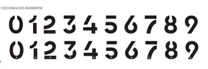
Packers' yokes are finally the proper size and shape making for a fantastic concept, my only suggestion would be to make the collar green like the yoke. Also, the current block is definitely fitting, but I'm yearning for the day the Packers make a retro number font a la Bears throwbacks; could even go the 1939 Packers route with box top 1's and limited serifs.
-
2
-
-
40 minutes ago, alesoares12 said:
(movie pictures)
Yearbook Solid with a pointier M
-
3 hours ago, alesoares12 said:
What the font of "Mean Machine"?
This graphic uses College Condensed (all caps), but I doubt this is what the actual 2005 movie uniforms used.
-
On 2/9/2022 at 7:35 PM, EJ_GRFX said:
Does anyone know what type of font is this ?
-
Been getting the errors that have been mentioned, just seems like the CSS isn't working at all.
-
2
-
-
On 1/9/2022 at 6:45 PM, rattyrattera said:
Could one of you identify or find a similar font to this East Carolina helmet letter font? Thanks!
(1972-1973)
Looks like Rockwell Bold with a de-serifed C.
-
1
-
-
On 12/10/2021 at 4:46 PM, SFGiants58 said:
Could somebody please help me pinpoint a font similar to this Sankei Atoms jersey?
Agency FB Black is similar as well.
-
1
-
-
On 11/6/2021 at 11:23 AM, colinturner95 said:
This work better?
It does, but unfortunately, I feel like this is a hand-drawn Clarendon to hug the Just Do It banner.
On 11/5/2021 at 8:33 PM, pepis21 said:I'm looking for nubmers font, it's similar to nike ahtletic but different in many ways.
76ers' explanation of the jersey say the numbers are based off the 76-77 team, which wore these numbers instead:
(Dr. J has a replacement 6 here)
Which has been reproduced well for the 2016 MLB All Star Game batting practice jerseys, but not on this Mixtape jersey. If you want historical accuracy, I'd use these:
Otherwise, the modern reproduction that looks similarly wonky as the Mixtape numbers is usually called Athletic Gothic:
-
On 11/3/2021 at 1:36 PM, colinturner95 said:
I imagine that Clarendon is probably pretty close, but does anyone have a more exact match for the 72?
Image link is dead for me.
-
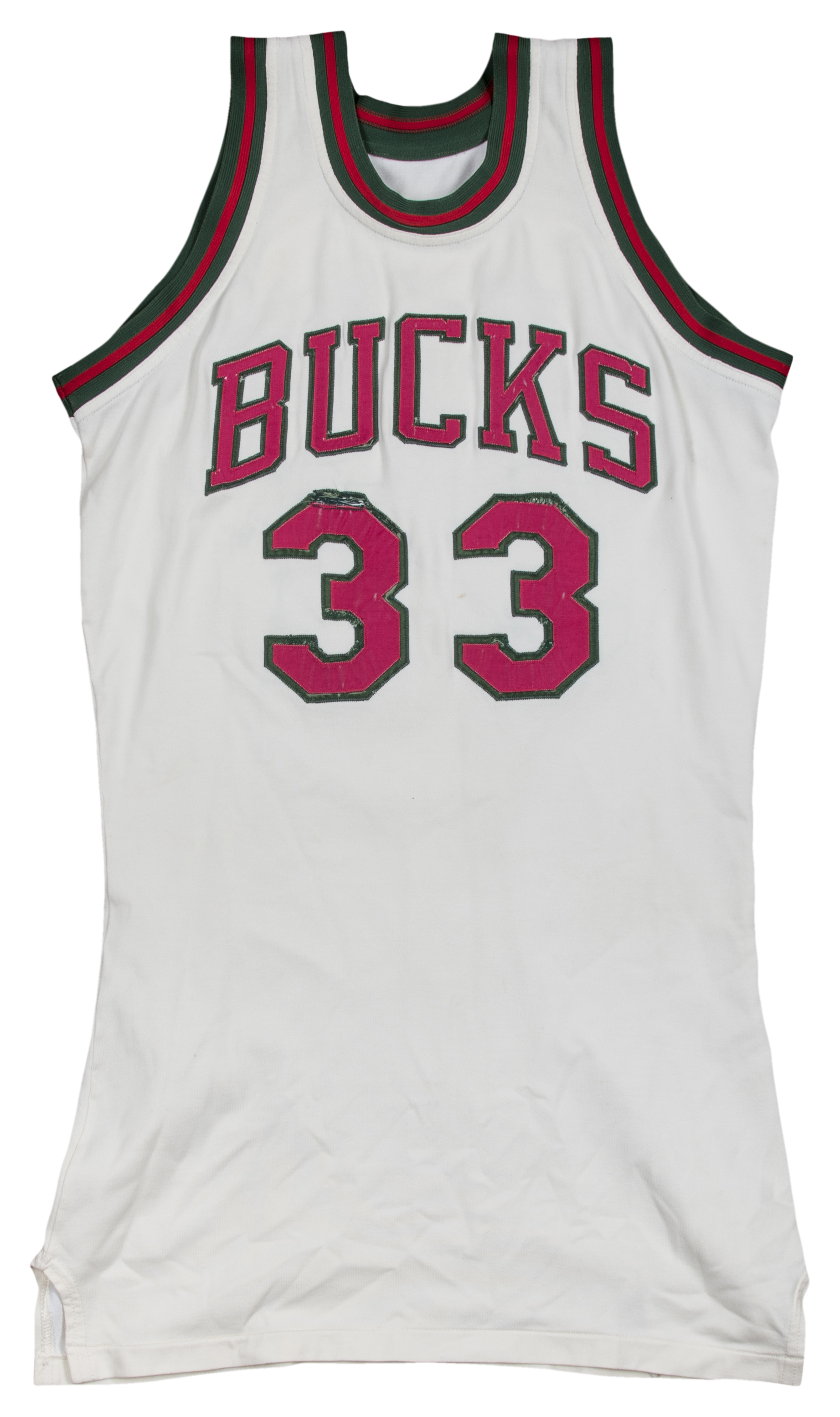
I think the most disappointing part about the Bucks one isn't the absence of red, but this hacked together wordmark on the front:
It's clearly the Bulls wordmark with a created C and K that are thinner than the B, U, and S:
The real one had wider, thinner letters, consistent letter height, and a serif on the C :
However, the balance of colors is surprisingly good considering all the eras that are smashed together, and it could have looked a lot worse, so I'm alright with what Nike produced. Not blown away, not too disappointed, just meh.
-
16
-
-
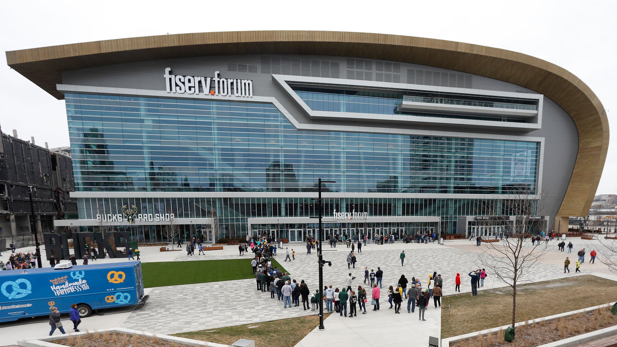
3 hours ago, lordsketor said:
Panorama Club on the top of the sides is a nice touch too; a fantastically designed ring.
-
2
-
-
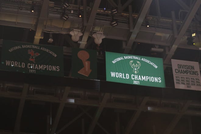
Bucks ended up updating the 1971 banner to match the 2021 banner and adding a Larry O'Brien Trophy banner even though they only have one:
-
1
-
-
Missed it at the third jersey reveal, but the Milwaukee Admirals added a new banner to their eclectic group:
With all of the rest:
I appreciate the effort to attempt to match the Calder Cup era banners, but the created wordmark that's carried over from the new retired numbers banners is quite unbalanced due to the font treatment. Would've been so much better if the wordmark from the division champions banner was used on the retired numbers, and just the full primary logo on the 19-20 banner.
-
On 8/26/2021 at 5:27 PM, pepis21 said:
Anyone know the name of this ugly font?
Mostly likely a custom kit number font, but Qanelas Bold is similar and de-stenciled.
11 hours ago, colinturner95 said:
Anyone have anything close ish?
Looks like a good bit of custom typography, unfortunately. Might want to peruse a list of brush scripts to see what suits your needs the best.
-
3
-
-
19 hours ago, Gothamite said:
I seriously doubt they re-numbered any jerseys. The pattern was to keep uniforms as long as possible, buying a few new ones every year to replace those that could no longer be re-stitched together. Since they had different vendors from year to year, that meant different stock numbers. It is very unlikely any of those number fonts were a deliberate choice.Well okay, but I feel like there was a big order in for uniforms in one place in 1950 with the Wilson/Russell block, and the wider block was the quickly made local shop replacements.
-
2 hours ago, guest23 said:
Clearly they intended the numbers to be blockish , yellow, and legible. Don't think they had a style/branding guide other than close enough.
They said on a forum discussing the minute details of sports design.
-
1
-
-
1 hour ago, Gothamite said:
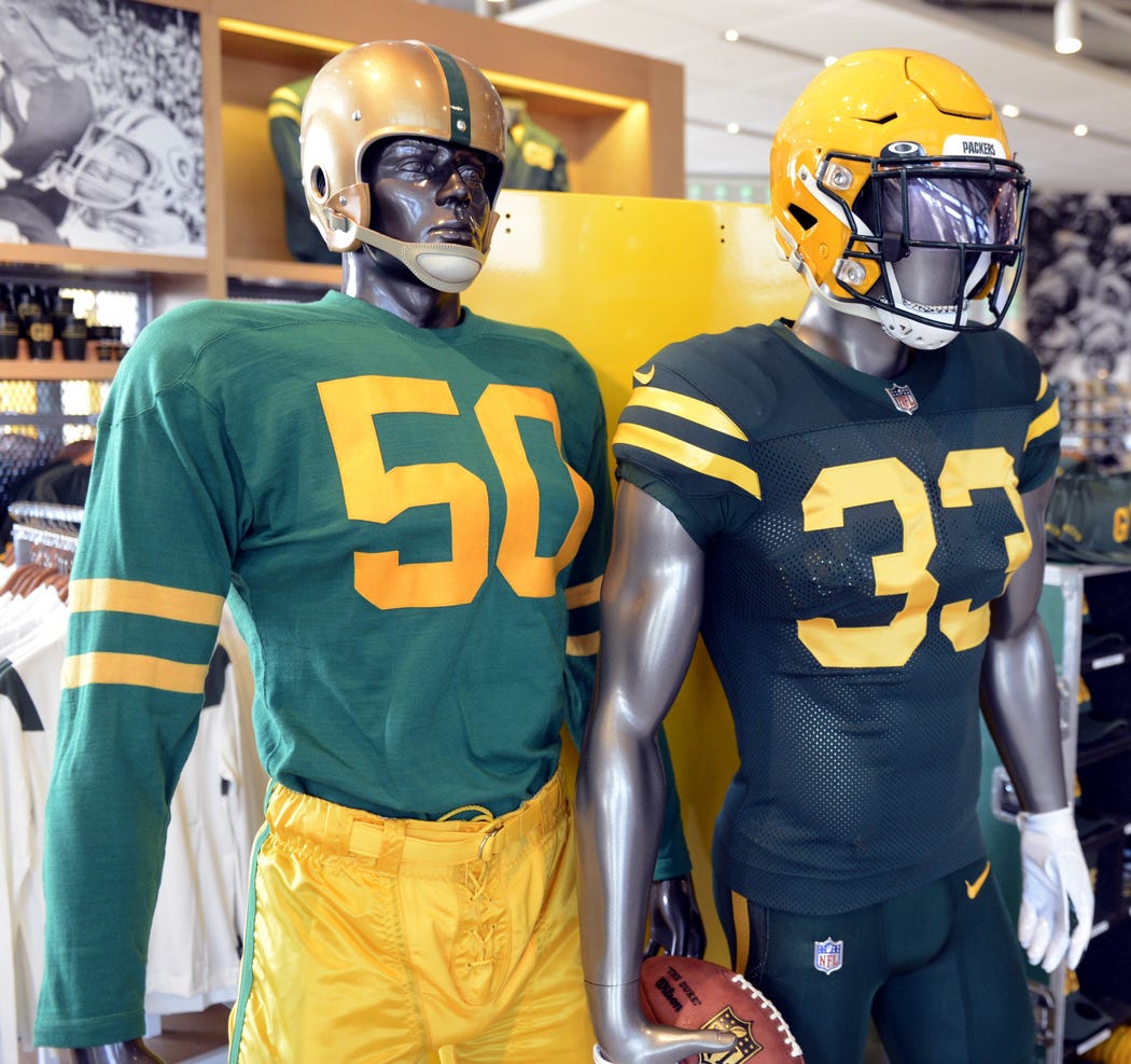
So this is how the Packers are promoting the new alt in the Pro Shop, alongside a reproduction of the 1955 uniform.
I’m guessing the Hall of Fame didn’t have a mannequin in the 1950 uniform this actually recreates.
That's a damn shame it's not in kelly green. It's funny though, when I went to the Pro Shop at the beginning of Training Camp, I saw the GB logo sideline caps and just thought they were part of a lame league-wide sideline cap city initials template.
-
8
-
-
1 hour ago, MJWalker45 said:
The problem with the numbers are there are three different 4's and at least two different 5's, 7's, 6's and 1's in the original uniforms.
That is also the 1953 team photo, where these style of jerseys have been renumbered and maintained for 4 seasons. They wore alts in the the 1950 team photo, but in 1951, only a couple jerseys had been renumbered making it clear what the intended number font is:


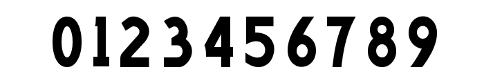
Recreating NFL Scorebugs
in Concepts
Posted
Looks like the score bug font is based on Hyperspace Race Condensed Heavy (tweaks to 2 and 7, created a monospace 1 as well for the time and quarter). Also, for other uses, it looks like they use members of the Media Sans family (but a tad thicker, and tweaks to various letters and numbers).