


MCM0313
-
Posts
4,287 -
Joined
-
Last visited
Posts posted by MCM0313
-
-
47 minutes ago, rfraser85 said:
So are they ripping off the Chargers now?
Glad I’m not the only one who immediately thought of them upon seeing that number.
-
1 hour ago, TruColor said:
So - this new lighter Blue (officially designated as "H-Town Blue Light") is NOT the same shade as the old Oilers/Titans Columbia Blue/Titans Blue. Probably the reason the NFL said to go ahead with this. Original Columbia Blue on left, new H-Town Blue Light on right:

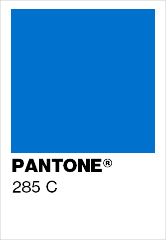
Wait…285? That’s the Chargers’ shade. Ha!
-
4 minutes ago, BadSeed84 said:
And the worst part if they stop so low, with the little Texans logo so low to accommodate that players wear their shirts out now since thats "fire"
Yeah, untucked undershirts should be an absolute non-starter, to the point that a player should be removed from the game until he tucks his shirt in. Don’t @ me.
-
 1
1
-
-
1 hour ago, tscuzzy said:
I want more horns!
I want more non-white socks.
-
8
-
 2
2
-
-
1 minute ago, Froob said:
I think they should be. I like when the numbers are the same color as the primary jersey.
That’s the safe option, and it usually looks fine. It’s not the only choice, though, and there have been lots of good looks (current Giants, 1997-2002 Falcons, Orange Crush Broncos) that used the secondary color for the number on the white jersey.
-
2
-
-
16 minutes ago, Froob said:
Bugs me the road numbers aren’t orange.
They never have been.
-
1
-
-
1 hour ago, infrared41 said:
True, but the Eagles aren't wearing white helmets, brown jerseys with sublimated feather textures, and yellow shoes and socks because it represents the quality craftsmanship and hardworking, high flying example of the American eagle. That's the difference.
PLEASE DON’T GIVE THEM ANY IDEAS!
-
1
-
-
31 minutes ago, DCarp1231 said:
Can Houston just pull a Dallas and only ever wear these
Apparently that’s the Bruno uniform (Bruniform?), because we don’t talk about it.
-
1
-
-
3 hours ago, Cujo said:
"It'Z aGaInSt NfL RuLeZ 4 tHeM 2 UsE TiTaNs CoLoRz"
With the red socks and H-Town Blue shoes, I actually kind of like these. Without those splashes of color? Nah.
-
2
-
-
25 minutes ago, gosioux76 said:
I'd be confused. I'd also wonder why, of all uses for a time machine, this is what we've chosen.

The uniforms of the pre-1997 Broncos and Dolphins, pre-2000 Rams, 1997-2002 Falcons, pre-2004 Bengals, and pre-2005 Cardinals are absolutely worth the use of a time machine.
-
2
-
-
29 minutes ago, 8BW14 said:
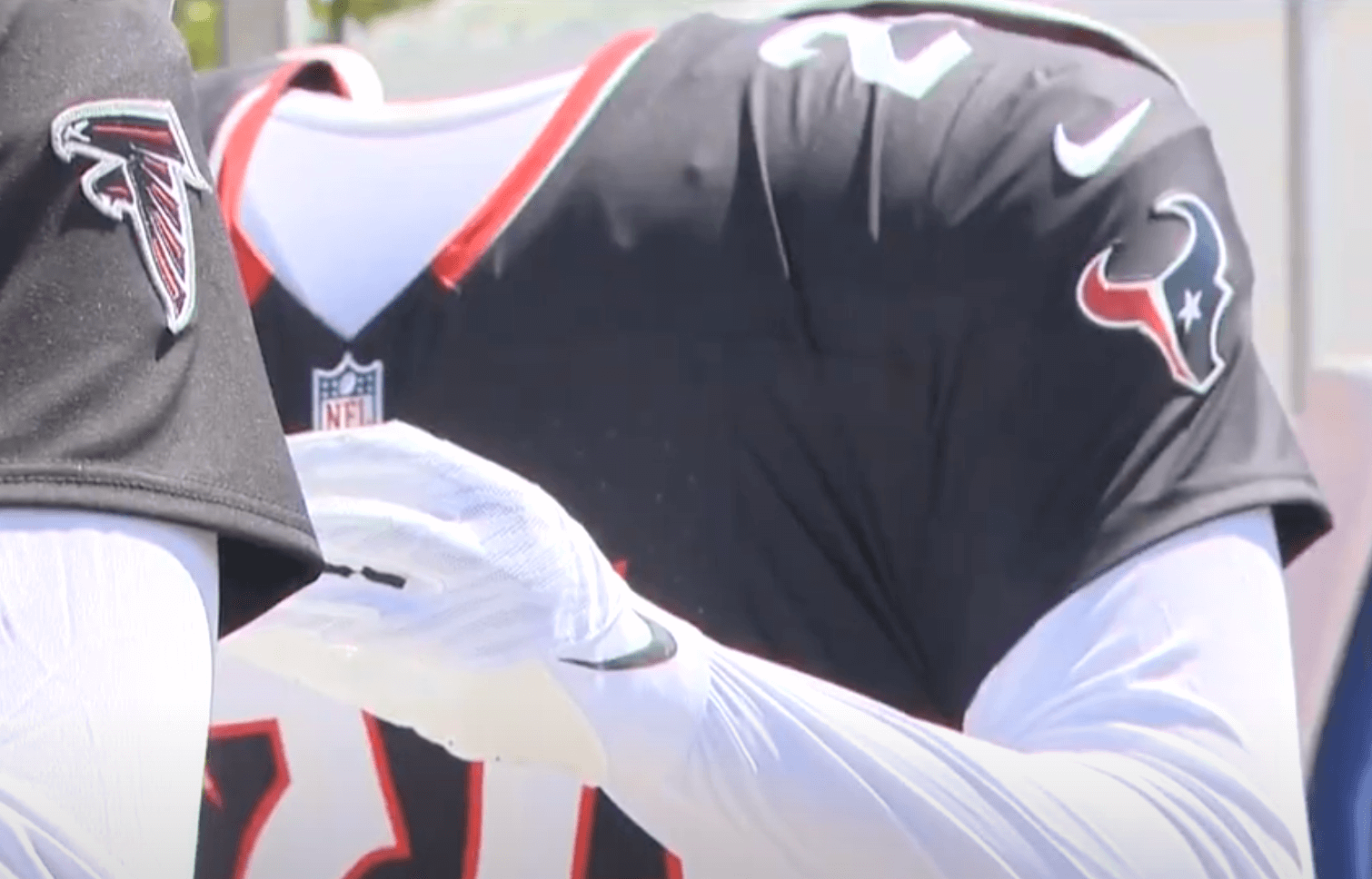
Just noticed a curious thing about the Texans new home jersey, which is relatively simple and inoffensive, except for one baffling detail:
The enlarged photo from Uni Watch apparently shows the TV numbers have no outline. Ugh, why? Who thinks this
 is okay? Sometimes the simplest solution really is the best one. Just outline them.
I can’t wait to hear the contrived, convoluted reasoning for this decision.
1993 Patriots.
-
1
-
-
1 hour ago, schlim said:
This is a great picture of those front numbers! You can really see how dense the air is in Arkansas!
Yeah, but just looking at that picture, I really can’t tell what the elevation of the area is. At least the Broncos fixed that.
")
-
 1
1
-
-
18 minutes ago, FiddySicks said:
Also a good representation of where they pulled that example from.The triangles represent thin air, not the developers’ rectums.
11 minutes ago, tBBP said:Well, if anyone wants mini-reprieve from the ongoing Denver Colorados fiasco, how about a couple heaping tablespoons of steer-seasoned salt??
Wouldn't surprise me one bit to find out she was/is the reason for the "H-Town Blue" even being a thing in the first place...
Well, the Titans have always had that right legally. They are the same franchise as the Oilers. The Texans are not. I’m glad the Titans are sticking in that lady’s craw.
-
4
-
 1
1
-
 1
1
-
-
5 minutes ago, TrueYankee26 said:
At least it would makes sense for Minnesota and any other Upper Midwest team if they did that because of the climate *runs before tomatoes goes my direction*
As a one-off sure. And as somebody else posted earlier, I would gladly take this in exchange for no more plain white socks with their regular uniforms.
-
2
-
-
1 hour ago, Sodboy13 said:
So the mothership reports that the Vikings are also adding white helmets, to go with new leaked white alternate jerseys, which have LITERAL ICICLES HANGING OFF THE NUMERALS BECAUSE OMG THEY'RE SO ICY AND CLEAN.


I cannot wait for this trend to White Star Line itself straight into the briny
ing deep.
I think this is the year that the
 trend jumps the
  in popularity.
-
1
-
-
33 minutes ago, ramsjetsthunder said:
You know the biggest mystery.... how did Antonio Brown become the foremost authority in uniform leaks?
Well, his brain has been leaking since at least college. At least now it’s leaking useful things.
-
2
-
-
Just now, VikWings said:
True, but if you can't come up with anything as good or better and keep trotting out gimmicky crap, then just give us the throwback uniform.
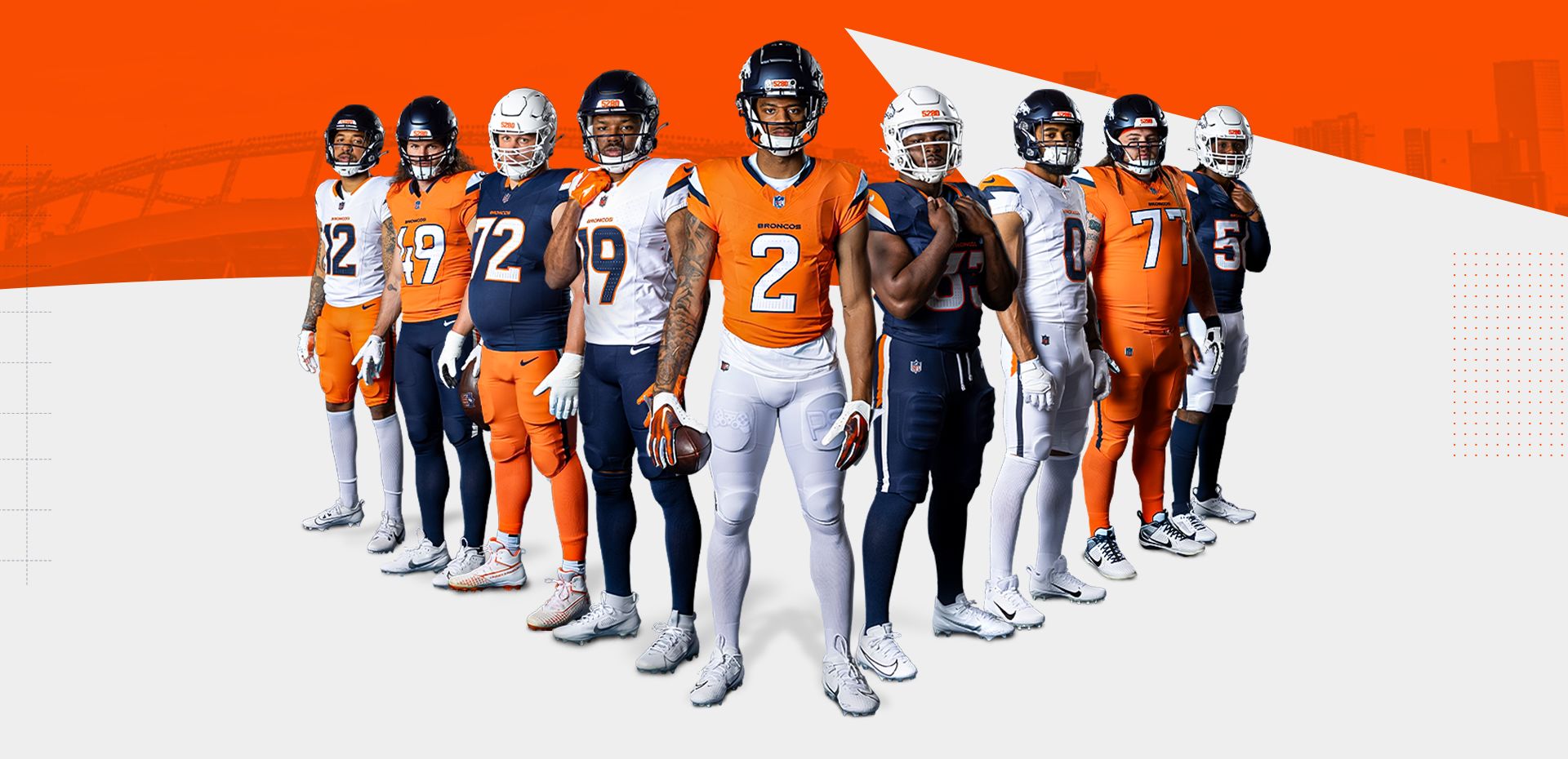
Bingo. Look at what the Broncos just released - which is far from the worst of Nike’s redesigns! - and then compare it against the pics of the throwback. Then tell me which one is better.
-
1
-
-
17 minutes ago, aawagner011 said:
Just because you have so many possible combos does not mean you need to show off all of them!
These have a couple redeeming qualities but definitely a few too many pieces of flair. They didn’t know when to stop and just said “give me all of it.”
And we have proven yet again the biggest epidemic to NFL uniforms remains what should be the easiest fix.
There are rules the league could use or, failing that, create. There just needs to be the will for enforcement, and right now there isn’t.
-
1 minute ago, HOOVER said:
Here’s the fix:1. Navy Helmet
2. Orange Jersey (home) White Jersey (away)
3. White Pants
4. Navy Socks
This is all the team should ever wear. The White helmet, Navy uniform, Orange pants, and Orange and White socks should all go in the incinerator.
We need to shame these teams out of thinking all of these combos are necessary. All it does is devalue the primary look and water down the identity.
I agree about the white helmet, navy pants, and white socks - they should all be disposed of. I would like the orange pants if they’d ever wear navy socks with them.
-
4
-
-
22 minutes ago, chriscj1983 said:
About time someone said what everyone was thinking.
You know, when I was in upper elementary school, a cousin of mine was born. She’s a super nice person, but as an infant she…shall we say, she had an odd head shape. She resembled the popular portrayal of a Martian.

To be clear, the whole extended family was thinking this. I was just the only one to blurt it out.
And so it remains…
-
1
-
 1
1
-
 1
1
-
-
29 minutes ago, Sodboy13 said:
Oh, this advice never works out for anyone.
(Dumb joke redacted)
-
1
-
-
1 hour ago, DCarp1231 said:
Exactly. Give him a boner and you’re good.
-
1
-
1
-
-
2 minutes ago, DCarp1231 said:
Simple- because it’s a throwback for a reason
A Jets-like modernization is all the D-horse needs to become a full-time thing.
-
4
-
-
7 minutes ago, Chromatic said:
Reminds me of the Seahawks uniforms, where the core concept of the uniform isn’t terrible, but it’s brought down by a bunch of obnoxious, extraneous details.
I will say I really like the blue helmet over white jersey over orange pants combo and hope that becomes the default.
With blue socks that’s passable. With trash white socks it looks like Boise State.
-
2
-


 is okay? Sometimes the simplest solution really is the best one. Just outline them.


2024 NFL Changes
in Sports Logo News
Posted
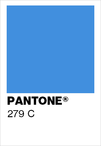
1. So, with individual colors not being trademarked, could the Texans have told the Titans to screw off and used 279? Or does Tennessee have leaguewide rights to that color? Or would there be some kind of infringement based on being in the same division? Related:
2. I remember reading long ago (like, a decade or more) that the league allowed each team to have one color that was unique to them; other colors they had to share. Is that still the case? Because, honestly, it looks like most teams don’t have a unique color of their own anymore. I mean, what - Dolphins’ aqua, Panthers’ electric blue, Eagles’ teal, the respective shades of purple worn by the Ravens and Vikings? Am I missing any?
3. What is the PMS code for the Broncos’ new royal blue that is used very sparingly? Related:
4. Why have you never included the actual color(s) of the Broncos’ pre-1997 helmets? I’m guessing it would just be an approximation? How close would it be to PMS 307 (Ole Miss’ robins’ egg blue)? (And, for that matter, how about the navy helmets worn at the same time by the Giants and Rams?)
Please don’t take this onslaught of questions the wrong way - I am incredibly thankful for all that you do. Your site is wonderful.