


MCM0313
-
Posts
4,231 -
Joined
-
Last visited
Posts posted by MCM0313
-
-
59 minutes ago, rfraser85 said:
It depends on the base defense the team runs. In a 4-3, EDGE is the DE position. In a 3-4, it's the OLB. But his size (6'5", 266 lb) would lean toward large OLB or a small DE. So in a way, EDGE may be a better way to describe Clowney.
Clowney to me is a classic 3-4 OLB, minus a small amount of lateral agility but with more acceleration and strength. He’s faster than most 4-3 ends. He has been both in his career, and I believe was exclusively an end in college. So, who knows?
Side note: I miss the OLBs who could play in either a 3-4 or a 4-3, and who were versatile enough to rush the passer, stop the run, set the edge, OR drop into coverage. Guys whose role the offense couldn’t predict on a given play. Somebody like Seth Joyner or Donnie Edwards.
-
27 minutes ago, DCarp1231 said:
You’re getting close!
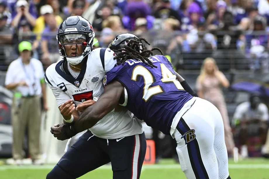
It’s none other than Defensive End, Jadeveon Clowney-

I know edge positions are blurred, but wasn’t he technically an OLB with the Ravens?
-
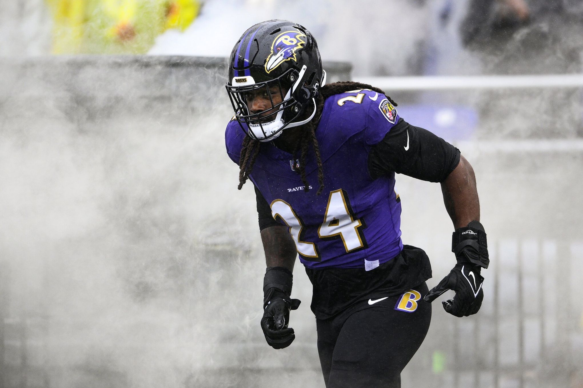
7 minutes ago, DCarp1231 said:
For those who don’t know…
Try to guess which position this Raven played—
It was not…
• RB
• WR
• DB
He looks like a linebacker, maybe inside.
-
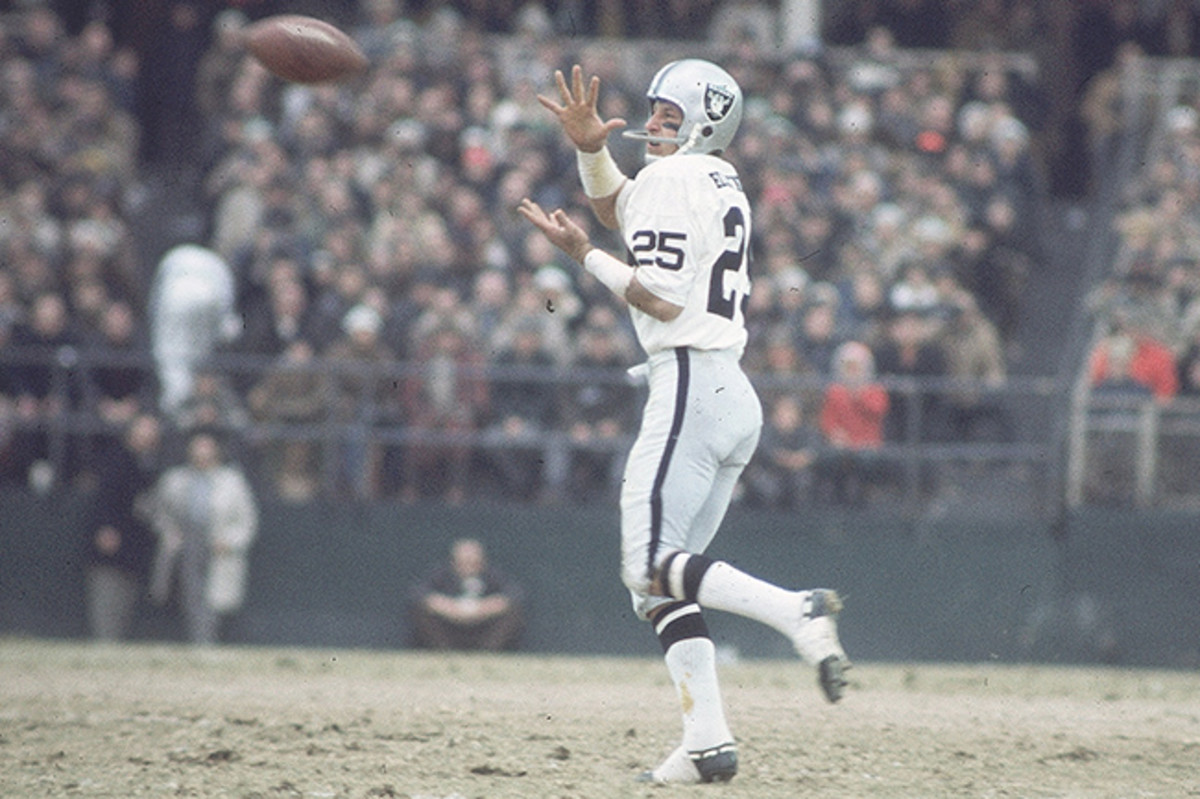
14 hours ago, tBBP said:
Ooh...
And depending on how you count him, the last guy to full-time get away with it (unless you count Devin Hester)...
I'd be with that, too!!!
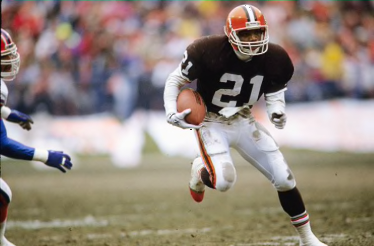
8 hours ago, Old School Fool said:If we're hijacking this thread with weird numbers then let's not forget about Ty Montgomery and Cordarelle Patterson wearing 80's numbers at running back as of this decade.
Eric Metcalf began his career as a running back. Montgomery and Patterson began theirs as wideouts. I think players who switch positions were generally allowed to keep their old numbers.
-
 3
3
-
-
1 hour ago, DCarp1231 said:
Considering college teams usually roster double the number of players as NFL teams, not likely.
The numbers will absolutely have to be amended again at some point, but double numbers won’t be a necessity.
Each position group should have access to a set of 30 numbers
K/P 20-49
QB 0-29
RB 10-39
WR 0-19, 80-89
TE 0-19, 80-89
OL 50-79
DL 70-99
LB 30-59
DB 20-49
You hardly ever see them anymore, but I loved RB numbers in the forties. John Riggins with the Indigenous Persons, Stephen Davis with the Persons and the Panthers, Mike Alstott with the Buccaneers…granted, Alstott was a fullback, Riggins was a fullback in a one-back offense, and Davis was a fullback-turned-halfback, but those numbers conveyed size and power to me.
-
2
-
 1
1
-
-
1 hour ago, BadSeed84 said:
The Eagles jersey (Granted the replica) with the updated wordmark, I'll tag @BBTV since he's been anticipating it.
Bland.
-
1 hour ago, tBBP said:
Both of those are booty, and both the height/width proportions and thickness of the numbers are way off, but the top is less fussy.
It was somewhat adapted from this circa '99:
I'm willing to bet it'll the first version if they do it at all. I personally would prefer the '98 refresh, but I don't trust the organization to actually pull the trigger on those (or for Nike/Fanatics to get the numbers/NOB font right if they do)...
Now that one with the full wordmark, I do remember that well.
-
59 minutes ago, TBGKon said:
It's actually reminiscent of an infrequently used Jaguars alternate logo from 1999-2012.
I maybe vaguely recall that?
-
2 hours ago, Old School Fool said:
Jaguars are having fans vote for the 30th season logo and two of the choices use gold and the number font from the 90's jersey so one can only wonder....
https://web.witcontests.com/jaguars/sweepstakes/vote/vote-for-the-30th-season-logo-240309
The bottom one, with the shield, reminds me of the Florida Panthers’ logo.
-
1
-
-
On 3/10/2024 at 10:21 PM, FiddySicks said:
Giants won three times and went with three distinctly different gold jerseys. I’ve always thought that was cool.2010: Classic Giants font
2012: SF on the left chest
2014: 70s/80s script
Same cap, though (no patch for 2010, updated gold WS patch for 2012, full gold patch with the trophy on the back for 2014) all three times.
I personally liked the 2010 jersey the best, and the 2012 cap the best.
The Giants have tip-top taste in sartorial style.
-
3
-
-
27 minutes ago, rfraser85 said:
Wow. I wish Samuel the best in fatherhood, but why would the 49ers make a hype video for this?
Because it’s the offseason? Because their free-agency moves haven’t been all that flashy and they need attention? To congratulate a team member on an incredible milestone in his life?
-
2
-
-
On 2/27/2024 at 9:30 AM, gosioux76 said:
This might just be me looking through nostalgia-tinted glasses, but I'd love it if they kept the Classic edition jerseys full time. Even the logo. Watching them play in that set, on that court, just feels right. I also like the updates to the colors they used on the classics. To me, they're a perfect basketball uniform.
They've also seemingly sold out of all the apparel related to the Classic edition. Either that or was an intentionally limited supply. The jerseys seemed to have been online for a day or two before they were gone.
I'm hoping that's an indication of high demand.
The Wolves had a great look from the get-go; in fact, I’d wager that all four of the late-1980s expansion teams began with nice looks (Wolves, Magic, Heat, Hornets). The problem with their original uniform/logo design is that it’s kind of like the NBA’s version of the Buccaneers’ creamsicles, in terms of the team’s performance and reputation while using them.
Minnesota was constantly terrible from 1988-96. Zero playoff appearances. They usually had one of the worst records in the league. It probably didn’t help that they also had outrageous guys like Christian Laettner and Isaiah Rider either - brash characters are fun when you’re winning but offputting when you’re bad.
If memory serves correctly, they went to the playoffs the first season of their new, more “intimidating” look, too - just like the Buccaneers.
-
2
-
-
On 3/2/2024 at 9:09 AM, BBTV said:
We've talked before about a movie or documentary, what it would be like, and who would play board members. I think the thread is in the Goldmine, but it could be fun to start a new one.
I call dibs on Ron Livingston playing me!
-
1 hour ago, rfraser85 said:
I have to disagree. The Chargers don't have enough gold on their jerseys make the gold pants look right to me, even with the powder blue socks. But I have strong biases against white helmets being worn with non-white pants, as well as solid white socks, especially since they're the wrong socks. I think the only time a team should wear solid white socks with their primary color jersey is if the pants are the same color as the jersey.
I look at this the same way I look at the Jaguars when they wear black/white/teal/black. The color balance is just off. This is a little better because the jerseys and pants have all three colors, but the factors I mentioned above offset that.
I don’t like plain white socks under any circumstances. A lot of teams could benefit from white socks with team-color stripes, though.
-
2
-
-
6 minutes ago, ruttep said:
That's a Canucks sweater.
THIS is a black Flames sweater.
A black Canucks sweater? I get that black-red-yellow used to be their scheme, but after so many years of the classic, lovely blue and green, the black Canucks sweater looks even more wrong than the Flames one.
-
1
-
-
8 hours ago, ruttep said:
It looks weird in general. The Coyotes and Canucks in the NHL both have matte helmets with their alternates and I don't really like the look.
(side note, goodwill being the yotes helmet ad is hilarious)
A black Flames sweater looks more wrong to me than the helmet finish does.
-
1
-
-
1 hour ago, WideRight said:
So, basically LA Tech?
Or SMU.
-
6 hours ago, BBTV said:
Patriotic for a team named for revolutionary-era patriots to wear the colors of the "red coats" that they were fighting against? More treasonous if you ask me (which you didn't) (and no, I'm not suggesting that any players get hanged for treason). Not every colonial soldier wore blue, especially since many were essentially wearing tattered rags, but red is distinctly British. And no, there's not green eagles or navy bears, but when the team is named for a very specific human that wore a uniform (or at least battled against humans in uniforms) then the colors should be more representative. Also their logo at the time wore a blue coat - that should definitely be an indicator that their jersey color was mismatched.
The Patriots should never have been in red, from their founding until the '90s.
I’d like to see a blue jersey in the old Pat style, with the old logo and striping pattern.
-
1
-
-
On 3/2/2024 at 3:32 PM, WideRight said:
One more for today. The New England Patriots.
As anyone can tell from my account name and avatar, I am a Bills fan, avidly since the age of 12. So, I have not had much positive to say about the Patriots in a long time. I liked the Patsies when they wore red, had Pat the Patriot on the helmet and won 3 games a year. That is the natural order of things. I am still convinced that Tom Brady, along with several of our post-1999 elections, and 9/11, and MTV never playing music, and Generation Z college kids wearing pajamas and fuzzy animal slippers to class, and a few other oddities, are all signs that the world ended at the Millennium and we are all actually living in pretty shoddily made matrix. I mean, come on!!! Tuck rule my ass!!Anyway, I wanted to return the Patriots to their red-emphasis glory and their on-field irrelevance, so the design pulls in a lot of elements from the Steve Grogan era, along with a few nods to the early Belicheat (sorry force of habit) years. Notes below.
1. First off, Pat the Patriot is back. It is a great logo. Yes, a bit cartoony, but it is both a Patriot and a football player, what more could you ask for? And it sits on a white shell, which just works.
2. One of my favorite Patriot looks ever was the pant set that they used only the 1st year of the Flying Elvis. I love how the blue transitions to the red just as in the logo. It works so well on the pants. So, that style is back, now on white pants or inverted with red pants.
3. I put the same basic stripe pattern on the helmet, and I think it works OK there, at least it is a bit different from just a straight up throwback look.
4. I pulled in some more modern elements with the numbering, the first use of silver in the new look. and I decided that while the shoulder stripe worked fine on the red jersey, it did not really pop for the white jersey, so I went with the shoulder stripe-colored sleeve combo, which I often like quite a bit.
5. You will see I also reverted to the older "Patriotic" font for the wordmark. It is very busy, but it is also very NE Patriots in my mind.
6. The alt look brings back more of the recent elements of Patriot design, the silver helmet, blue jersey, etc. I did not go fully Brady era, keeping the older pants and using a blue facemask instead of red. I consider this their nod to blue as a dominant color but with a team that normally stresses red.
So, before you critique this look, just know that my first version just had a repeating "cheaters" over and over as the stripe, and a poop emoji as the logo. So, considering that, this is an act of kindness on my part for the Patriots.
Those pant stripes are chef’s kiss.
-
On 2/28/2024 at 5:29 PM, WideRight said:
And something was bugging me about the Cards, so I looked again and I think that it was just too dark. So, I lightened up the red and the bronze/copper. Same design, just a bit brighter.
Just a quick added note here: I was surprised to find on the TruColor website that the Cardinal red used by this franchise has apparently been consistent over time. I could have sweared that the Cards I grew up with in the 80's had a much darker red, closer to the (Commanders) or Alabama than to the brighter red we see today, or like a team like Louisville or Indiana. But, according to them it has been basically the same cardinal red. I just misremember it as being more of a burgundy color.
They made it lighter in like 1988 or 1989. Since then it’s been the same - at least officially.
-
On 2/28/2024 at 2:16 PM, MDGP said:
It makes me think the "he picked the color to match Notre Dame" is just another thing made up by someone years later. Reminds me of how when I was at Penn State, there was this persistent myth that they switched from Black and Pink to Blue and White because the colors faded in the sun (I want to say that's the same myth surrounding the Arizona Cardinals' name origins too)
Speaking of yellow vs. white, I've always loved the Michigan Heritage Jersey mix-up. Despite the guy who runs the site explicitly saying he messed up and the jersey was actually white, I still see people use this image as proof they wore all yellow in the 60s.
Maybe people think that because Meatchicken are a bunch of yellow-bellied cowards.
Sorry, obligatory anti-UM trolling by an OSU alum. And yes, I’m quite aware what has happened the past three seasons.
-
2
-
 2
2
-
-
4 hours ago, Ted Cunningham said:
I've often thought that simply adding silver (or a lighter grey, as Nike has been essentially unable to produce silver on fabrics to this point) would certainly improve their current look. I don't mind Philadelphia's current uniforms. Even though the "midnight green" is a byproduct of the late 90s to mid 00s NFL dark era, it's a unique color in the NFL and I don't hate it. As a general rule, I like away uniforms that go primary/white/secondary/socks when the primary color is dark and the secondary color is some shade of gold or silver. I think that works for balance. (Digression: I also think that's why gold pants work so well for Washington.)
With that context, the one broad thing about the regular home and away looks I have never really liked was the balance of the away uniform: green/white/white/socks. Silver pants would add a lot of balance to that look, and would still look good, too, with the home uniforms (maintaining that dark-over-light look and avoiding two-tone dark-over-dark looks like Tampa's current iteration of the pewter uniforms).
Their insistence on wearing white socks 75% of the time doesn’t help either.
-
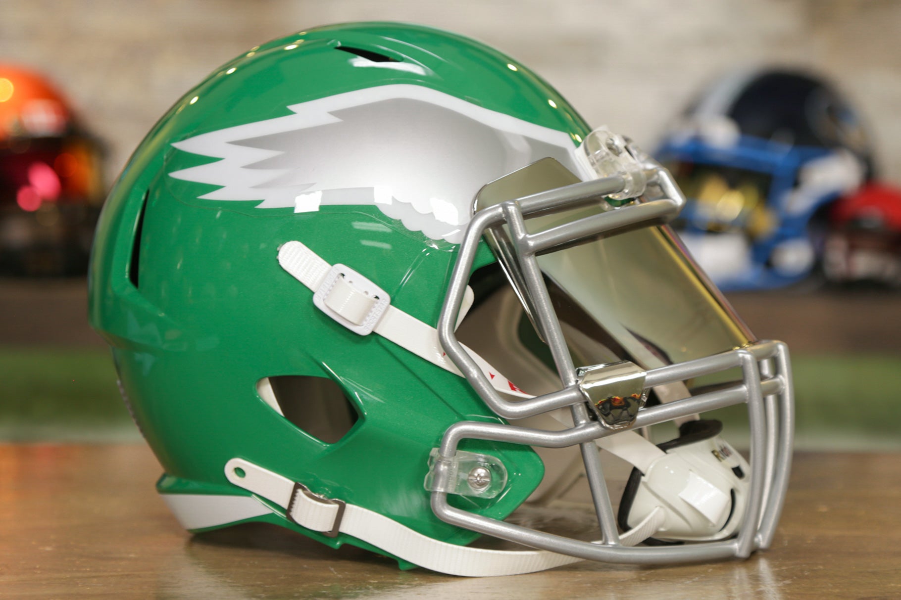
4 hours ago, Old School Fool said:
I feel like the Eagles should do a kelly green helmet with a chrome facemask. Something like the picture below but obviously update the wing.
Man, that’s gorgeous.
-
3
-
-
2 hours ago, Captain Poncho said:
The only time he ever wore them was in the preseason vs. New England in 1997. I also remember him saying at the time that he hated the monochrome outright, but I'm not sure if Nike had to scramble based on his dislike, though that's a thing that definitely could have happened given his importance to the team.
I wish players today would say they hate monochrome.
-
9
-
.jpg)


2024 NFL Changes
in Sports Logo News
Posted
The Texans and Bears actually already had the same shade of navy.
My thoughts: mostly surprise, especially if this is the “bull” uniform. I figured there would be bull horns on the front of the helmet with that set. Too “icy” and not enough red, at least that we can see.
Not sure what to think of the number font. Will probably reserve judgment till it’s been seen on the field.
Would be really cool if the navy-heavy road set were meant to contrast a red-heavy home set, like an inverse of their original look, but I doubt it. That seems like too much cohesive thought for the walnut-brained Nike designers.