


kerlonmoura
-
Posts
225 -
Joined
-
Last visited
Posts posted by kerlonmoura
-
-
On 11/4/2023 at 7:35 PM, LMU said:
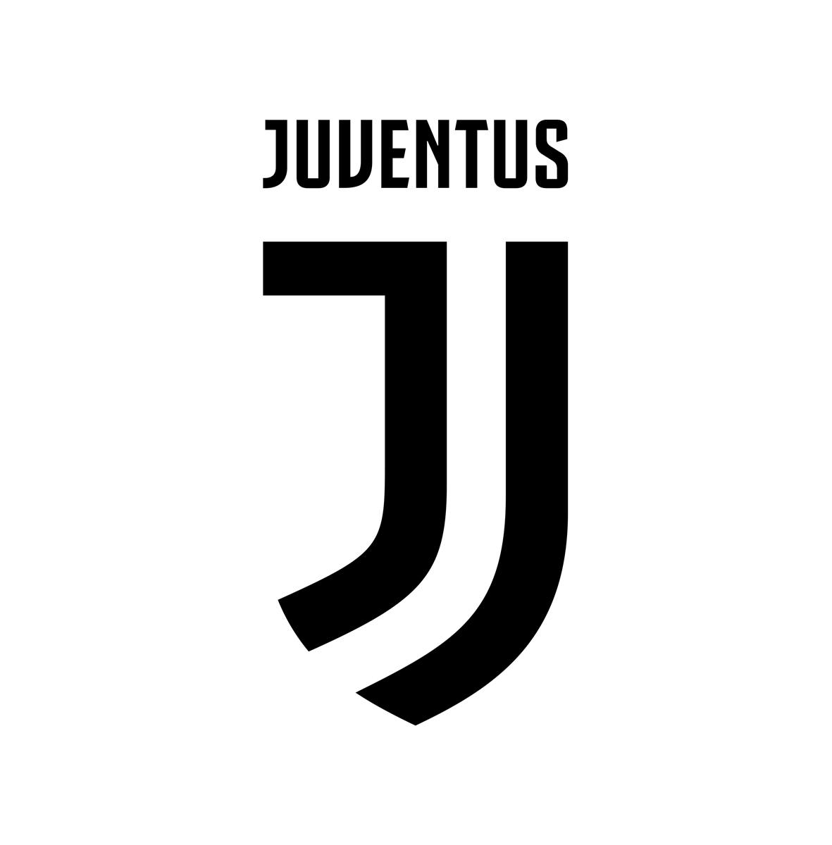
They're second in Serie A. If they changed the logo back in 2006 when they were relegated for match fixing then there'd be something to this. Not in this case.
Mind you that they won the league 9 seasons in a row between 2011-12 and 2019-20 and played 2 Champions League finals during that period.
However, between 2020-21 and 2022-23, they have been pretty mediocre, finishing the league 4th twice and 7th last season. They have also been humiliated in their Champions League campaign last year, only being able to collect 3 points in the Group Stage while losing to lowly Maccabi Haifa. Additionally, they have been hit with a Financial Fair-Play violation this season, causing them to be kicked out from European competitions.
Personally, on top of the rebrand being extremely controversial, when I look at the old logo it reminds me of the successful Juventus and the new one just evokes feelings of mediocrity.
-
-
-
12 hours ago, 4_tattoos said:
Does anybody else think Inter Miami is going to quickly reach the mark to be eligible for thirds next season once Messi jerseys become available?
I would assume next year's primaries will be pink. The black secondary kits will return next year. Wonder what direction they would go with a third?
I'm thinking light blue could be a good idea. Hope they don't go for something boring like a white jersey.
-
10 hours ago, Victormrey said:
I tried to get an "I" for the caps and the alt jersey. Does this work?

This is my personal opinion, but I think it will always get confused with a J no matter what, unless you get rid of the tail on the top left (especially when the letter is presented by itself).
-
 2
2
-
-
Looks like the Quakes pattern continues on the back panels:
-
Great work with all these!
Personally, I like the B in the black and white the most. Maybe including a rim to it like you did with the N and nets that incorporate the shape of the Brooklyn Bridge might be an interesting exploration
-
 1
1
-
-
1- France #2
2-Denmark #2
3-Argentina #2
4-Saudi Arabia #1
-
1st: Wales #1
2nd: Wales #2
3rd: Ecuador #1
4th: United States #2
-
10 hours ago, BlazerBlaze said:
And the cherry on top is the random Russian flag on the sleeve...
-
1
-
 1
1
-
-
On 6/28/2022 at 5:49 PM, MJWalker45 said:
I believe they'll be similar to the PSG third from last year with just the sleeve stripes.
I feel like swooshes on the sides only would make the jerseys look quite empty, I think there's a chance we might see the name of the country on the front if FIFA regulations allow it:
-
44 minutes ago, CaliforniaGlowin said:
This passed the focus groups? seriously? of what, 15-year-olds?
I think, in terms of passing focus groups, they were talking about the "Dark Mode" jersey, which was the following:
-
3
-
-
On 6/11/2022 at 12:45 PM, MJWalker45 said:
Puma going with the template again, with the miniature badge on the neck instead of being subdued.
I'm not completely sure, but I think these are concepts done using CLO3D/Marvelous Designer instead of actual kits.
-
1
-
-
4 hours ago, tigers said:
What's with the arrow in the middle of the clover?
Maybe a reference to springing up?
-
I really think they should've gone for something like this instead. I feel like the 31 looks incomplete and it actually resembles more of an 81:
-
11
-
-
13 hours ago, coco1997 said:
Absolute masterpiece, great work!
-
2
-
-
6 hours ago, Digby said:
“Creator kit” that’s just a black and white shirt, give me a break!
Orlando looks nice, but I can’t help but wish the gradient was just the whole of the shirt; still would’ve worked well as a clash option, but Orlando just always demand a white base I guess.
Seems like the main color is gray instead of white, the reveal photos don't seem to reflect it that well:
-
1
-
-
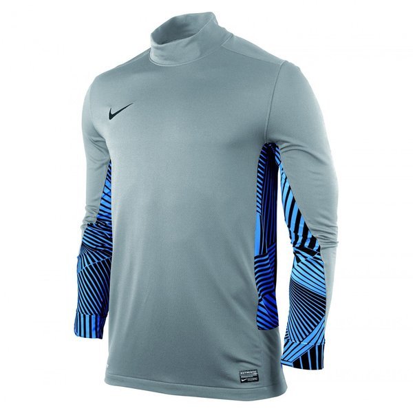
3 hours ago, dannykraft said:
meh
Reminds me of Nike's goalkeeper kits from 2011-12:
-
1
-
-
I've been following this thread for a long time, amazing stuff with all the kits and logos!
-
1
-


MLS Kits 2024
in Sports Logo News
Posted