


1insaneguy
-
Posts
1,168 -
Joined
-
Last visited
Posts posted by 1insaneguy
-
-
If they'd stayed with the Football Team branding, they would've had to come up with some kind of new helmet design and a better primary logo. I was getting tired of seeing that roundel, the plain W, and the numbers on the plain burgundy helmets by the end of the 2021 season. Everything about those screamed "placeholder" and would not have worked as a permanent brand.
-
I've changed my mind about the Commanders' white jerseys. Didn't like em at all before, but once I saw them on the field yesterday, they looked... pretty decent.
Still not loving the pattern on the numbers, but it honestly didn't look as bad as I thought it would. As for the monochrome white, there's some precedent for it, but they butchered it by wearing white socks instead of burgundy. They wore monochrome white against the Steelers in 2020 when they were the Football Team because Ron Rivera liked the idea. (https://www.nbcsports.com/washington/football-team/story-behind-washingtons-choice-wear-all-whites-spectacular) They also did it back during the second Joe Gibbs era. From what I can find, each of those previous monochrome white uniform combinations had burgundy socks and it looked much better.

FWIW, the players themselves wanted to bring back the look in 2015 as well, but Bruce Allen said no.
-
 5
5
-
-
Big fan of the Wizards throwback, although the gold/black jersey was my favorite from that era. I really liked last season's city jerseys as well. It's been a nice change from them simply recycling "the District of Columbia" or the "dc" shooting a basketball logo.
Now that I'm thinking about it, I really enjoy teams from DC using gold/gold accents. I think it's a nice touch, and even if the Wizards 90s-2000s look doesn't stick around past this season, I hope they somehow incorporate gold into their color scheme.
-
1
-
-
That pic of Ryan Ellis got me thinking about the greatest trade deadline acquisition of all time, Martin Erat, wearing the yellow Predators jersey.
-
1
-
-
Mike Green just retired. He only wore an Oilers uniform for two games.
-
Skate penguin with robo penguin as the shoulder patch and "Pittsburgh" with robo penguin as the shoulder patch my two my favorite Penguins looks.
-
1
-
-
I don't necessarily mind their currently identity, but I think the Islanders would look better if they used a darker shade of blue like the one in the picture below. (I'm not saying they should go back to those exact jerseys, just use that blue in their current set.)
-
2
-
-
He spent the most time with the Marlins, so I'd say Emilio Bonifacio in a Nationals uniform looks wrong. (Plus, even if he does somehow manage to revive his career with the Nats this year, it won't be in these uniforms.)
-
50 minutes ago, QCS said:
The Chargers do, but I agree, the helmet numbers are fine for this year.
The problem with doing a throwback is they're still honoring the old name, which is what they're trying to avoid.
Oh you're right, I forgot the Chargers new uniforms included helmet numbers. [insert worn-out joke about the Chargers being irrelevant here]
I guess I didn't word that second part clearly. I'm saying once they get helmet logos/new jerseys they could use the (hypothetical) combination of helmet numbers/logo on sleeve, as an alternate jersey/fauxback. That would eliminate the need for any Native imagery or uniforms associated with the name Redskins.
-
1
-
-
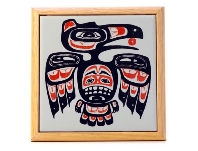
This has been unpopular with the DC fans I've talked to, so I'll put it here:
I don't mind that the Washington NFL team will be wearing helmet numbers this season. I understand it's more of a college tradition, but no other team in the NFL has them right now so it's unique. Obviously, I'd like a helmet logo (or really, any logo that isn't just a wordmark spelling out "WASHINGTON"), but the numbers will do for now. Maybe when they do get a logo, they can keep the helmet numbers and put the logo on the sleeve, similar to their throwbacks that had the plain leather-pattern helmet and the Native American logo on the jersey. Maybe they could use that combination as an alternate jersey- like a "fauxback." It would be a retro- looking uniform that somewhat resembles the throwback jerseys without having to use Native American imagery. (This picture below shows the original throwback jersey I'm talking about, for anyone wondering.)
-
1
-
-
It bothers me that the Colorado Avalanche changed the dot in the middle of the C on their shoulder patch to black. It just doesn't look right. Also having plain black numbers on their road jerseys looks awful.
-
1
-
-
2 hours ago, LuvTheNats said:
This clown is proof that George McPhee was an idiot. Erat for Forsberg was an epically bad trade, even at the time it went down.
George McPhee is one of the most overrated GMs of all time. I don't care what anyone says.
Oh well, at least he's trading away a different franchise's future now.
-
1
-
-
Since he retired today I thought I'd post this (as much as it pains me):
Ladies and gentlemen, Martin Erat on the Washington Capitals
-
I was just reading the discussion about the Dolphins logo in the NFL changes thread and Ryan Tannehill wearing this Dolphins uniform came to mind. Tannehill's rookie year, 2012, was the last year they wore these before switching to their current unis.
-
3
-
-
22 hours ago, kimball said:
This is probably best suited here. But, this is an article that claims the Vancouver Grizzlies and Charlotte Bobcats logos (even the New Jersey Swamp Dragons logo) were rejected names/logos for the Toronto Raptors. Pretty cool read.
"They considered Ravens and Dragons before eventually settling on Grizzlies."
I think Ravens would've been an awesome name for a basketball team in Vancouver, especially since ravens are native to that region. If the team took inspiration from Native American art (as they ended up doing with the Grizzlies logo), I think they could've put together a set of really cool logos and uniforms.
It's also interesting to consider what direction the NFL franchise that came to Baltimore about a year after would've gone in terms of identity if this happened.
-
9
-
-
19 hours ago, WBeltz said:
I'd like to imagine if the Nets did follow through with this identity, and it lasted until the present day what the uniforms would look like. Would they have still gone black heavy w/a Brooklyn move? Would this be a throwback that the young players think is "fire"?
I feel like they'd have gone black heavy, then introduced a purple and green city/earned jersey later on as well.
-
1
-
-
12 minutes ago, Echo said:
How so? There are 8 other players who played more games for the Caps than Laich.
Crap, you're right. Looks like I really am going insane because I was going off the fact that he was the longest tenured Capitals player on the team at the time he was traded. (Which was about 3 years ago.) My bad, I'll fix it.
-
1
-
-
Brooks Laich on the Leafs and Kings
NEW EDIT: Realized I should probably explain that he was the longest tenured Washington Capital
in the franchise's history.on the team at the time he was traded in 2016.Like Echo pointed out, he is not the longest tenured player in the team's history.
-
Call me crazy, but that's not a terrible jersey.Apparently, back when Duke and Georgetown first rolled out their BFBS alternates in the late '90s, UNC was supposed to follow suit with a dark-blue alternate. It never saw the court.

It's not terrible, but it wouldn't work for UNC.
-
Looks similar to their current logo.
-
If the link doesn't work? Go to the "share" option under the video on the YouTube page. It should give you a modified link. That one works more often than not.
I realized I was doing it wrong... I had pasted it as plain text or something. (As you can tell, I'm not the most tech savvy person out there.) Thanks, though.
-
Just post the YouTube link. It should embed automatically.
I've tried that. It hasn't worked before, but I'll try again.
-
How do you embed/insert a video?
-
Speaking of Patriots rare uni matchups:
The one time they played the red number Falcons

That's a pretty kick-ass match up.


NFL 2022 Changes
in Sports Logo News
Posted
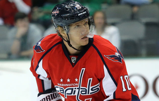
I was a fan of that jersey/pants combo, especially that exact shade of burgundy. My only issue was the helmet.
Making the helmet a shade of burgundy that matched the darker shade on the jerseys and adding a logo/striping (similar to their 2002 throwback below) would've worked.
Alternatively, making their main helmet a leather patterned one similar to what they wore in 2012 would've been a gutsy choice if they decided to go with the WFT name permanently. It also would've made the "Football Team" name seem like a call back to the early days of the game when mascots or team named didn't matter as much, rather than just a placeholder.