


Karnage84
-
Posts
161 -
Joined
-
Last visited
Posts posted by Karnage84
-
-
On 8/4/2023 at 10:58 AM, johne9109 said:
- Could be. TBH I don't know enough about the rosters of most NFL teams to know who the starting QB is so I'm just going off of the first QB listed on their Wiki page (NFL isn't my most followed sport)
- You'll have to wait and see
- I am using the facemask color for the brim as long as it fits aestheticly. For the Cards and Ravens it worked, but for the Falcons it looked weird so I just went all black.
- Yeah that name is pretty big. I'll eventually redjust it; thanks!
I honestly thought this was the case and was a great troll job. I'm now somewhat disappointed this was a happy accident.
-
18 hours ago, fouhy12 said:
Hey everyone! Got inspired by some of the throwbacks released recently and the conversation over in the NFL 2023 Changes thread to start working on some new concepts. I don't have a goal with this thread, just going to use it to post any NFL concepts I make as I go along.
Going to start here with my Seahawks concept. This one fuses the overall design of the throwbacks with the font from the newest set and the coloring of the past two uniforms.

Curious to hear your thoughts on this!
I was curious on what it would look like if the Seahawks took their classic set and darkened the blue and green (dark royal and a forest green) with the new logo on the helmet.
-
Is there any reason that you couldn't revive the Canton Bulldogs as a franchise? I'm sure someone owns the rights to the name (maybe the PFHOF) but I haven't been able to find anything to that effect.
The NFL does... but maybe Ohio Bulldogs or something to that effect could work.
-
On 7/7/2023 at 4:38 PM, MilSox said:
I'm also not sold on the Outlaws identity for this part of the country.
I'm kind of in the same boat. It just doesn't seem to fit the region even though everything else is pretty solid about this uniform set.
-
 1
1
-
-
Your work is always so solid. Really enjoying this series.
-
On 9/8/2022 at 2:16 AM, Kevin W. said:
Ottawa Senators - Alternate
If you swapped the logos between your 'regular' Sens jersey and this set, this black and white combo would be a stellar regular home and away set. Create a red version that has the leaf pattern and this would be what the Sens should do with their next jersey set. Great job overall.
-
16 hours ago, VampyrRabbit said:
Vice City is awesome, the colours are excellent and the crest is a thing of beauty.
The crest for Ottawa United is not good - like the crest for Quebec, it would be a nightmare to scale down and embroider because of the sheer amount of detail on one part of the crest (the skyline), and the spacing of the Fleur de lys is really bad. The bottom of it is way too close to the Peace tower, and it looks really awkward on the red and black. There is also way too much empty space either side of the Fleur de lys and beneath the Ottawa skyline.
To be honest, I would scrap the crest and start again, it just doesn't work. I would also use the Maple Leaf as a symbol, probably something like the maple leaf found on the current Ottawa flag and maybe find a way to incorporate the Fury flame into that.I'm in agreement, this isn't to the same level as some of your other stuff.
Ottawa is a bilingual city. Utilizing the fleur-de-lis isn't a terrible idea (as it would appeal to francophone fans in Ontario as well as on the other side of the river in Gatineau. However, it also would imply that it's principally francophone which isn't the case. If you could somehow blend - maple leaf, fleur-de-lis, flame and peace tower (without detail), you could have something interesting that would well represent the area. I'm also not sure about the double water as the Ottawa River is the only body of water that separates Ottawa and Gatineau (your larger market area).
If you are going to have to give up something, you can probably do away with the Fury flame. The city doesn't have a really strong connection to the Ottawa Fury (unlike the relationship with the Senators or the RoughRiders/RedBlacks).
-
On 6/5/2023 at 8:26 PM, Will94 said:
put silver to offset it
The navy does a better job of that and the Titans also use silver/dark grey in their colour combo.
-
Now that the Titans have moved away from it, I wonder what a white helmet would do for this set.
I just find that the red and the Columbia Blue don't mix well and need something to offset it.
-
1
-
-
On 5/11/2023 at 10:15 PM, RO_ said:
Yeah, there's something off about STL's palette. The more I look at it the less I like it. I wanted to keep Houston somewhat traditional, but I may change my mind. Still might add four more teams!
That's a good idea, I had it on the collar but it'd look better on the sleeves. Got a few updates:
Updated STL's colors. Tweaked both the royal blue and silver, and swapped out the navy blue for black for better contrast:
And here are a few ideas for Houston, I tweaked the shade of navy blue on all of these.
Option 1:
Basically the same, but with the secondary logo on the sleeves
Option 2:
Swapped the gold helmet for navy, this would give a potential expansion team the option to have a gold helmet (not sure if I like this one much though)
Option 3:
Dropped red and gold for a lighter shade of blue some other team in Houston might've worn once. I think I accidentally made the Argonauts.
Let me know what you think!
Option 1 110%
-
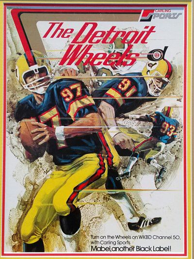
4 hours ago, Wildcomet said:
All good, I'll admit I was not sold on the vertical flip but posted it to see what others would think. I tried the horizontal flip this time and I think this might be a winner. It feels more connected as a single graphic now I think, and I hope its new orientation will help with it seeing as a smoke trail from the tire. I also tweaked the logo on the helmet to reflect the change.
Yeah it was a bit ahead of its time, I'd agree. It's a little busy, and the wheel having the drop-shadow while the surrounding D looks flat kind of bugs me a bit and drove most of my changes, but it is not particularly dated like some of the others from this league are (understandably so, being 50 yrs old and all). The wheel itself looks pretty solid so I tried not to change too much there.
I feel like you need more red on the away jersey.
I don't know a ton about the WFL but looking up the Wheels' old jerseys, there's a lot that you can draw inspiration from.
- Colours: A dark navy would be much better than black. There's also a history of this with the team (see below)
- Numbers: It looks like they utilized a stencil font
- Stripes: Two tire tread patterns over a fat solid would add texture and keeping it fresh while also paying homage to the original.
-
On 5/9/2023 at 10:31 AM, WideRight said:
Love your attention to detail @Brian in Boston MSA will be a factor moving forward, as will regional economic growth. The thing is that cities like Birmingham, Memphis, and New Orleans are among the best supporters of their teams on the field. Not sure if those teams would relocate (Remember that Birmingham already has a partial community ownership like the Packers, set up in the late 1990's.)
I can say that there will be relocations between 2008-2020, and that expansion again is not entirely off the table. With big markets like Dallas, Miami, San Jose, KC, Twin Cities, Milwaukee, and others still without USFL football, the pressure will be on any franchise that has attendance issues, stadium issues, ownership issues, or market size issues to consider a new market.
Any plans to expand north of the border?
-
On 5/9/2023 at 10:28 AM, WideRight said:
An interesting observation. I am not sure I see the comparison with the Ravens. It really is an attempt to use several elements of the Memphis Maniax. If purple were the dominant color, then perhaps Ravens, but the number font is very different, the striping is more XFL than NFL, and the crown logo on the chest is as close as I could get to the Maniax having two random triangles coming out of the collar.
Not to worry, however, team uniforms never stay static. Most teams change their looks at least once a decade, so this won't be the final look.
The sleeve stripes (this is solid but if you had two colours, it would match) and the shields on the sleeves is what does it for me.
-
21 hours ago, WideRight said:
And the vote is in. The Charlotte Monarchs will be joining the USFL in 2008. The announcement was posted today on the Alt History website, and here is the full design sheet.
And, to @BengalErnst, can you identify which 2001 XFL team has an influence on this team's look? It is subtle, but it is there.
I know that I'm boring but I would've liked to see the crowns on the sleeves as opposed to in the middle of the chest stripes. This just looks like a Raven jersey that was recoloured and derailed with a chest stripe + crown.
-
2
-
-
This is a great series. Looking forward to seeing what you have in store for the Lions. I'd suggest something along the lines of what you've done with the Browns - a great blend of traditional/modern. Incorporating white would also be a good idea to add a little more contrast to their current set. I feel like Carolina is moving in the direction of Carolina blue/black, so I don't think Detroit should go that way with black and/or a black jersey or helmet. It does look cool but it's also very reminiscent of the Matt Millen days which we want to forget as a franchise.
-
 1
1
-
-
I am really not a big fan of the numbers. I do like the silver numbers with the white outline on the blue jersey. I'd like to see a throwback that includes white numbers with silver outline on the blue jerseys and using the old Roary logo. It's different enough that it won't look like they're wearing their current jerseys but will still look like the Lions.
I did really like your spirit marks. They look cool and would be appealing on merch, signage, etc.
-
15 hours ago, WideRight said:
I really like this update. Any chance you would be OK if I used this concept for my USFL Seattle Dragons (alt history project)?
When the crossover you didn't know you needed happens....
-
This is looking like a great series so far. My thoughts:
- St. Louis - I am digging the updates overall. I really like the helmet design
- DC - I really liked the previous identity and I'm glad that you're drawing back on it. I wouldn't change the new primary logo as much but I would relegate it to a secondary logo/shoulder patch
- Seattle: Looks great. I don't see a reason to make any other changes.
- Las Vegas: I think you've done a really good job overall here. I really like the snake head logo as a primary. The 'V' is integrated (you could even argue the sides of the mouth are L's) but fits well into the logo. I'm digging the interlocking LV logo. If you do add gold I would want to keep it to a tasteful minimum. Red, Black, White is a good balanced colour scheme. Adding in gold can throw that a bit off balance and make things too busy if not done correctly.
The quality of the images and presentation are on point. Keep it up.
-
1
-
1
-
-
On 9/30/2022 at 11:56 AM, Djruggs said:
It's funny you should say that.
Up next we have the Ottawa RedBlacks. Very straight forward rebrand for Ottawa: make them the evolution of the RoughRiders.
My ONLY nitpick is that the helmet logo should be a bit bigger IMO. Maybe a red facemask instead of the white. I would also want the pant stripes to match the helmet stripes. I'm just a stickler for that detail.
Otherwise, these are top notch.
-
I'm intrigued to see what you do with the rest of the league. Ottawa unveiled a RoughRiders 'R' style helmet with stripes that looks amazing and should be the full time helmet IMO.
-
10 hours ago, ralphz said:
Nice upgrade. Good modernization. I had thought you were going to do something else!
I'm with @ralphz. Definitely an upgrade and really cleans it up nicely.
-
1
-
-
20 hours ago, TrueNorth13 said:
Toronto Maple Leafs
Maybe this can be the perfect thing for Leafs fans to be uplifted by after another first round exit. I won't lie, I have always found the current Leafs set pretty boring. Normally I'm not a big fan of uniforms that only use white and another colour, but I have warmed up to the simplicity of it. So I simply added some more interesting striping to the home and road, using a design from a previous uniform design from the Leafs history. I did add grey to the logo on both the home and road. The TLM alternate/shoulder logo also returns.
For the alternate, I was not a fan of the black uniform that the Leafs rolled out this year. It just didn't really fit their whole look. I know it's meant to be something different, and kind of modern, but I at least like a uniform set to feel like it's all one brand. The black alternate doesn't really feel like that. And the Bruins gold and black on the inside seems pretty weird to me. Anyway, I went with the reverse retro style uniform, with enough subtle changes that I think it improves on the RR design.
The city uniform, I went with the Toronto flag design, but incorporated the red version of the alternate logo on the front. Nothing crazy, Toronto's flag is the perfect design to fit onto a uniform. Again, it's not super special, but I didn't want to add yet another skyline for a city uniform.
This is a great look for the Leafs out on the golf course.
-
On 4/14/2022 at 8:21 PM, TrueNorth13 said:
The second time I'll post an updated concept. Every time I look at the Ottawa Senators home and road concept, I just like it less and less. I just didn't include enough red on the set, so it has been fixed.
You mentioned swapping the red and gold, which I didn't do, but I made red more prominent on both the home and road which I think helps a ton. I do stand by keeping gold as an accent colour, just because of how prominent it is on the logo. And I love an accent colour to pair with uniforms.
I see the comments about the white being an out of the box thing but I personally like this MUCH more than the original version. The gold is nice as an accent and it does help create a unique identity for the Sens while staying within tradition. While the current version of the franchise has only been around since the 90's, they've fully embraced their roots as an Original 6 team. The team is also leaning into their own modern history (which is what we're seeing with the current version of their jerseys). You've done a great job (with this version) of creating a unique identity without forgoing the team's history.
Solid job.
-
2
-
-
On 4/7/2022 at 3:01 PM, WideRight said:
Just about to kick off the 1998 season in the Alt History of the USFL (Website here), which means that NIKE will be announcing which 3 teams will get facelifts for 1999. The 3 1998 clubs (Washington, Baltimore and Memphis) kick off their new looks and now 3 more teams will get a facelift.
I actually have 4 designs ready to reveal, some just tweaks, some whole new looks. So, which of these 4 teams should make the cut for 1999?
Oakland Invaders
Birmingham Stallions
Pittsburgh Maulers
Portland Thunder
Only 3 will make the cut, and this could be the last year for NIKE, with bids coming in for the USFL uniform and fanwear contract starting in 2000 (and Phil Knight no longer the principle owner of a club.)
I thoroughly enjoy what you've been doing here and will disregard the new USFL for the abominations they've rolled out for this year.
Keep up the great work.


Reimagining Superheroes as Hockey Teams #15 - New Jersey Devils (Daredevil)
in Concepts
Posted
This has been a really interesting and refreshing series. Really solid work overall too.
Keep it up!