


FinsUp1214
-
Posts
3,001 -
Joined
-
Last visited
-
Days Won
13
Posts posted by FinsUp1214
-
-
My instant reaction to both last night’s and tonight’s games was “whoa! What the heck! This is crazy!” in the most positive way. It’s definitely one of the more bizarre WS matchups I can remember*, and I love it. Plus, it’s a matchup I can just sit back and enjoy. I don’t have a horse in the race and I don’t dislike either of the teams left to any degree at all. This should be fun all the way through.
*Red Sox/Rockies in 2007 comes to mind, but even then, that was far more one-sided bizarre towards the Rockies than anything; both because “Rockies win the pennant” was somehow a legitimately truthful sentence, and because they went from “sudden surprise inevitable buzzsaw” to “we suck again.gif” in the span of what felt like a few short days. They were like Pinocchio in Shrek 2 when he’s a real boy for two seconds but changed back to wood by a ricochet spell. One of the weirdest pennant winning teams I’ve ever seen.
-
 2
2
-
-
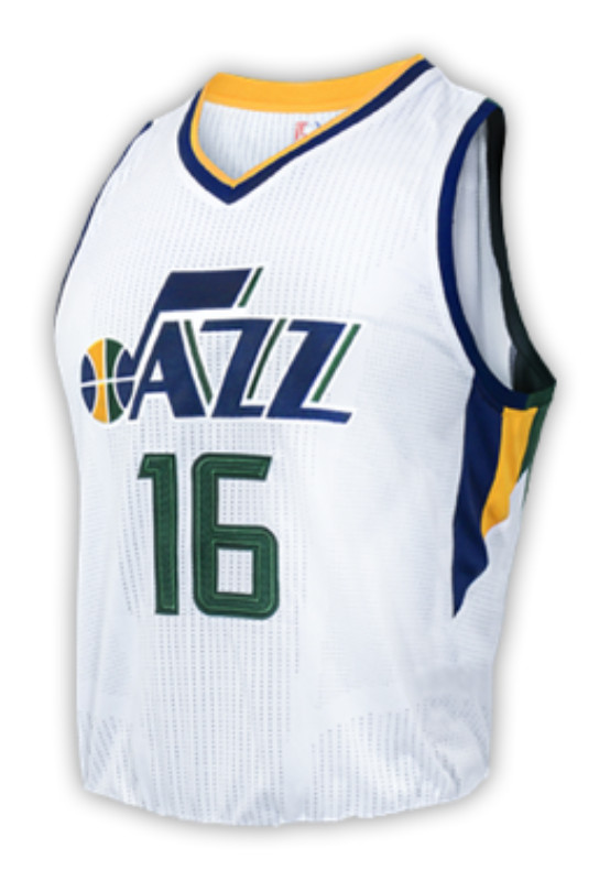
I can see a purpose for the Jazz’s city as a potential test for a new rebrand (probably not the originally intended purpose, but seems like they’re very conscious of fan input/reaction right now), and the Kings’ make sense as a 100th anniversary nod. I like Boston’s in a vacuum, and if Toronto’s design was in purple/black/red or even black/red, I’d say that’d be a strong candidate for a full-time design.
The rest? Hard evidence that the city edition is far past scraping the barrel. This feels like that scene in Elf when they’re pitching story plots at Greenway and Kyle Gass’s character pitches the plot of the “tribe of Asparagus Children” who are “self-conscious about the way thier pee smells.” There’s just nothing but nonsense left. I’d be floored if City Edition survives another two seasons.
-
3
-
-
I don’t consider the silver they used then to be little at all. The stripes on the sleeves and torso were fairly substantial and a bit more than mere trim, and the logo had a silver outline too. It’s hard for me to look at the usage and consider it too superfluous.

-
7
-
-
With all due respect to Mike Breen, who I genuinely think is a great broadcaster himself and not the problem, ESPN’s NBA broadcasts have always seemed so mediocre to me in comparison to NBC’s. The NBA on NBC felt like a massive spectacle that you couldn’t miss, and the coverage was excellent. Outside of Breen, ESPN’s has always felt a bit mailed in and somewhat forgettable.
While Turner isn’t without it’s flaws, I do think it’s much better than ESPN and I often find myself preferring to watch games there instead.
-
1 hour ago, CardsFan79 said:
I’d prefer them to just go back to the mid-2010s set (below), as I felt they were a great update to the classic look, but these purple ones would be 100000x better than the trash they’re wearing now. I wouldn’t even mind a rotation with both. One as a main, the other as an alt.
To be honest, as a fan I just never got around to liking these. The biggest problem to me was the color scheme - I thought the navy and the forest green were too close in shade together and often had contrast problems, and the navy never seemed necessary when purple was the better choice anyways. But I also thought the retro wordmark looked really weird and out of place on a uniform with modern elements and a modern number font. That the side panels and numbers were supposedly cut at the same angle as the ends of the letters on the wordmark made the uniform seem more forced than clever to me. I definitely understand and respect the intention, but it was one case of “neo-retro” that fell particularly flat with me in execution.-
7
-
-
1 hour ago, gosioux76 said:
And it holds up! That's what's remarkable about it to. It could just be the nostalgia talking, but that '90s set doesn't feel like a '90s set.
I totally agree, and I didn’t realize it until they wore the throwbacks this past season. I’d see highlights and think “wait a minute, that uniform is still working!” I can’t put my finger on why, but it has a sneakily contemporary look to it even still. I think it’s because it pushed the envelope just enough to be modern, but not so much that it looked like merely a product of its time. It caught me off guard in the best way when I realized that.-
2
-
 1
1
-
-
59 minutes ago, j'villejags said:
It wasn't perfect but I actually liked how the black in their old logo added some contrast with the shadow effect.
On a related note, the reason I vastly prefer the black shadow version is that it actually looks correct in terms of shading - the grey shadow makes no sense because it’s lighter than the blue or the orange, and the shadow as we all know should be darker than whatever area is highlighted.
In short, this version you’ve posted looks correct to me whereas the current primary and its color tweaked predecessors not only look incorrect, but look completely opposite to how light and shadow should function upon it.
-
3
-
-
I think the LED court is great for using and swapping out multiple court designs (and could also be a solution for placing the Finals logo back ON the court instead of only visible on TV screens), but I don’t think it needs all of that extra in-game animation. We certainly don’t need it to tell us when someone hits a 3-pointer. All of that seems like a lot of unnecessary distraction. I kept finding myself bugged watching that video by the court “reacting” to every point scored and I can’t imagine I’d sit through a whole game well with that.
I’m all for innovation and I’m all for the NBA potentially using this to solve some problems, but it ought to be done within reason and ensuring that it doesn’t create new problems. Restraint would be necessary with adopting such a court.
-
1
-
-
1 hour ago, the admiral said:
Either way, yeah, to the extent that Seattle sports were on the national landscape alongside music and tech, it was Griffey and the Sonics. The Seahawks never registered.
You’re not wrong at all on that. I can kind of see both sides of this coin though - on one side it’s absolutely true the Seahawks weren’t nearly as relevant then as the rest of what Seattle offered to 90’s pop culture, and that to some it can seem silly for the Seahawks of all teams to pay homage to it. On the other side though, I can see why the Seahawks would want to step up and honor the era; the Sonics are gone, the Mariners still look (almost) the same as they did back then, and the Kraken and Storm didn’t exist yet. The throwback is a (IMO) beautiful uniform in and of itself, and I don’t see a big problem with them paying homage to Seattle’s 90’s influence with it in a way that none of the other Seattle pro teams really can at the moment*.
It’s also worth noting that, if the Seahawks really want to pay tribute to 1990’s Seattle, this is probably a much better way to do it than a flannel grunge “city” edition or some sort of weird Frasier homage alternate that says “Tossed Salad and Scrambled Eggs” on the neck tape. I’ll choose the throwback over the many different alternatives the league is starting to creep into every time.
*I say at the moment in the hopes the Sonics come back someday and bust out a ‘96 throwback as soon as they can.
-
3
-
-
With regards to the “why the 90’s?” discussion, the official launch site for the throwback explains this.
https://throwback.seahawks.com/home
QuoteWhy the 90s? A pop culture revolution took off in the Seattle region in the 90s, stormed the nation’s music scene, forever transformed the world’s technology landscape, and changed our relationship with coffee. Rock icons Nirvana, Pearl Jam, Soundgarden and Alice in Chains all exploded in the early-90s from small venues like Re-Bar, El Corazon and The Central Saloon. Now tech giant Microsoft introduced platforms we can’t live without, and Starbucks became synonymous with coffee and created meaningful and lasting relationships between coffee drinkers everywhere and their baristas. Seattle left its mark on the world in the 90s and changed the course of history forever.
So if I’m understanding right it’s less about the teams who wore the uniform and more about Seattle’s influence on the decade itself.
BTW, the launch site is awesome and really well done. The AOL dial-up hit and all the little 90’s homages really brought me back.
-
3
-
-
I actually really like the cream colored font, I think it lends to a little bit of a “dusty” western feel to the logo, which fits well for Texas.
I really love this logo and its execution. The slightly rough, almost hand-drawn looking edges throughout are a really nice touch that lends a bit more to a rugged look. The color scheme is excellent too, and that roundel behind the state has a cool bandana pattern kind of look to it. Between this year’s ASG logo and next year’s, the MLB is doing a much better job with the logos than they are with the ASG uniforms for sure. Hopefully they can keep that momentum with the logos going for a few years.
-
10
-
-
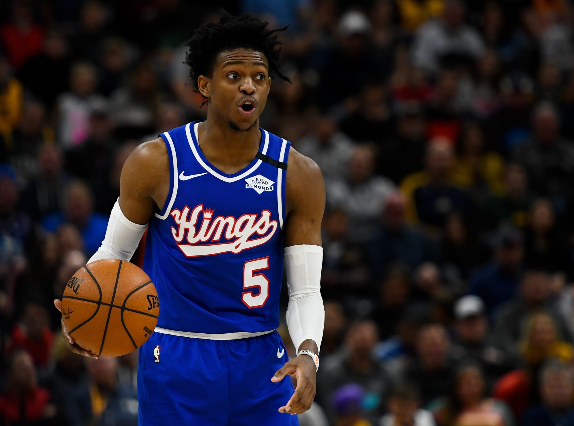
The Kings’ new set looks like an homage to multiple Kings eras at once, and if that was the intention, I think they did a pretty good job of it. I think I myself wouldn’t have gone with that particular side panel design - I think id have just done something on the shorts and not the jersey - but it still looks fine and works if the blending of eras is indeed what they were going for.
To be honest, I actually don’t mind the higher emphasis on black either. It helps to distance them a little from the purple primary teams in thier own division (Lakers and Suns), and the black uniform especially has some nice shades of the 90’s set. The switch of color hierarchy, at least to me, seems more intentional than “cool” and it’s working better to me than I thought it would.
The third uniform is a really cool idea, but I don’t think it’s executed as well as it could have been. I don’t think it needs “SACRAMENTO” over the “KINGS” word mark, and I think if the checkers on the side panels were black and silver/grey, it could have looked like a much better homage to the 90’s alt. As it is, I think it’s too heavy on the black and purple, and isn’t as balanced in color as it could be.
-
4
-
-
I’m curious how much the three teams’ changes will be reflected in the summer league uniforms (if at all), and how much we’ll be able to read into them. Seeing the Pistons’ wordmark and numbers are blue here rather than red, for example, leaves me to think there’s going to be some variance we’ll have to account for between what wordmark/number treatment is on the real uniforms and what’s on the summer league uniforms. Seems like that’s generally the case anyways.
-
1
-
-
If the Kings did a purple and grey or black homage to either one of these sets with the new wordmark, I’d be pretty darn thrilled:
Count me in as a fan of that new stacked wordmark, too. That and the new “Kings” wordmark, are very, very nice.-
6
-
-
I’m a sucker for drop shadow numbers, so I’m a big fan of WKU bringing them on across thier whole set. All in all, I like everything they’re doing from the neck down - the uniforms have this sort of late 90’s vibe to them - but I don’t like the chrome helmet and don’t think they need two white helmets. I’d prefer just the towel logo white helmet, as the “Tops” helmet looks too much like a Maryland helmet to me as well.
-
2
-
-
Looks like there was a gold and purple version of the water drip lines logo as well:
I have to be honest, the more I see the water drip version, the more I think I prefer it, despite the extra detail it adds. I kind of wish they’d update this one with the proper colors (with much more precise and cleaner tracing, of course).
-
10
-
-
The Caps are one in which I think the logo is far worse than the uniform itself; that’s not to say the uniform is great by any means, as it’s still an outdated Edge product. But if the Weagle or the recolored 90’s eagle were on the chest instead, I think it’d be at least passable.
The “capiLals” logo and the original that inspired it are both really bad. Bad enough to sink any uniform they’d adorn, really.
-
23 hours ago, Old School Fool said:
I've never seen this SA logo before...
Looks like it may be the same logo the Spurs used for an Ebbets Field Flannels collaboration a few years back:Pretty awesome stuff, if you ask me.
-
11
-
-
6 hours ago, TenaciousG said:
Nike can’t stop getting in its own way on these US kits. What was the last good one? It’d have to be the Waldos for me. Solid white isn’t going to sell or stand out and the splatter paint only marginally improves it. Also putting red directly on blue has always looked terrible. They need to figure this out. Ideally before the next World Cup.
Abstract Expressionism is one of my favorite art movements, so I do appreciate the tie that the white kits make to it. That being said, I do feel that the US needs to settle on a general look to own and call thier own once and for all, and ideally I do think that should be the Waldo route.-
1
-
-
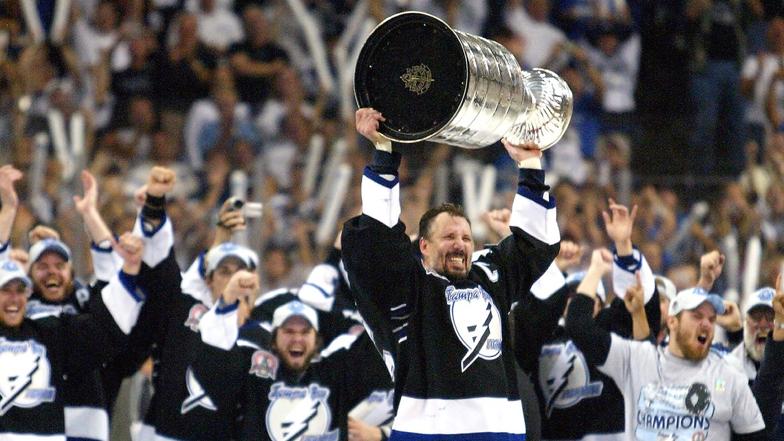
17 minutes ago, ManillaToad said:
I personally think Tampa Bay’s uniforms were good; it was the logo itself that stunk.100% agreed on Anaheim though, which may very well be the worst ever. There wasn’t a single redeeming thing on that uniform, and it was made extra painful that they won the cup the very season after they ditched the eggplant and jade.
-
6
-
-
2 hours ago, bowld said:
Best Nuggets uni is right here--
It’s tricky with the Nuggets, because I think the rainbow sets were the best design-in-a-vacuum uniforms in team history, but I think the 90’s set was the one that represented the name best. It had a rugged, western look to it that I always felt fit a gold miner theme very well. I’ll admit too that this is the Nuggets set I grew up watching and was most familiar with, so that coupled with the theme executing well in my eyes makes it the “essential” Nuggets set for me personally.All in all, I think it depends on what you’re looking for in the “best” Nuggets uniform. My answer is different depending on the criteria, but the “right” uniform to me would be the 90’s set, notwithstanding my ready admission that it’s less exciting and colorful than the rainbows.
-
5
-
-
I’ve said this before, but I just never thought powder blue and gold looked right on the Nuggets at all. I thought it was far too light and “sunny” for them. If they played in San Diego? Perfect. But for Denver? It just didn’t work for me.
This is not to say what they’re wearing now works either, but I don’t think I’d have been any more excited if they’d won in powder blue last night.
-
3
-
-
On 6/9/2023 at 3:31 PM, McCall said:
Ken Griffey, Jr. is second all-time in hits by a lefthanded outfielder born on November 21st in Donora, PA.
The all-time leader is Stan Musial, who also produced one of my favorite stat lines ever: an even split of 1,815 hits at home and 1,815 hits on the road.Donora has to be one proud town.
-
5
-
1
-
-
7 hours ago, Kevin W. said:
Tell Salt Lake to
 off and take the Real name from them. SD deserves it more.


 off and take the Real name from them. SD deserves it more.

2023 - 2024 NBA changes
in Sports Logo News
Posted
For me, there’s the tradition part of it and just being used to it, but I also like the maximum contrast that’s provided on two counts - 1) white vs. color provides maximum contrast between the two teams, and 2) as @Digby also pointed out, the paint area is usually (not always, but usually) painted in a team color, and white will contrast against that maximally as opposed to the same team color being worn against it. Uniforms can tend to blend in to the paint area for me at times when they’re the same color.
So in short, it’s both tradition and function that lends to my preference towards white at home*.
*Lakers in gold at home is an exception, of course.