FinsUp1214
-
Posts
3,001 -
Joined
-
Last visited
-
Days Won
13
Everything posted by FinsUp1214
-
Thats still my favorite Indians cap of all time. If I had my way - and this is probably an unpopular opinion in and of itself - that'd be their primary cap across the board. Maybe one with a red bill too as an alternate.
-
I'm with you. I've always thought it was really ugly and tacky. I get there's a lot of nostalgia and history to it, and I'm all for throwbacks in general, but it's still a terrible uniform.
-

Minor/Independent/Collegiate League Baseball Logo/Uniform Changes
FinsUp1214 replied to BigMac12's topic in Sports Logo News
Don't know if that pun was intended or not, but either way, I caught it! To be honest, I think it got pretty stupid really quick. I can't remember which was first, but I even thought Fresno Tacos was ridiculous as soon as it came out. It all needs to stop yesterday. -
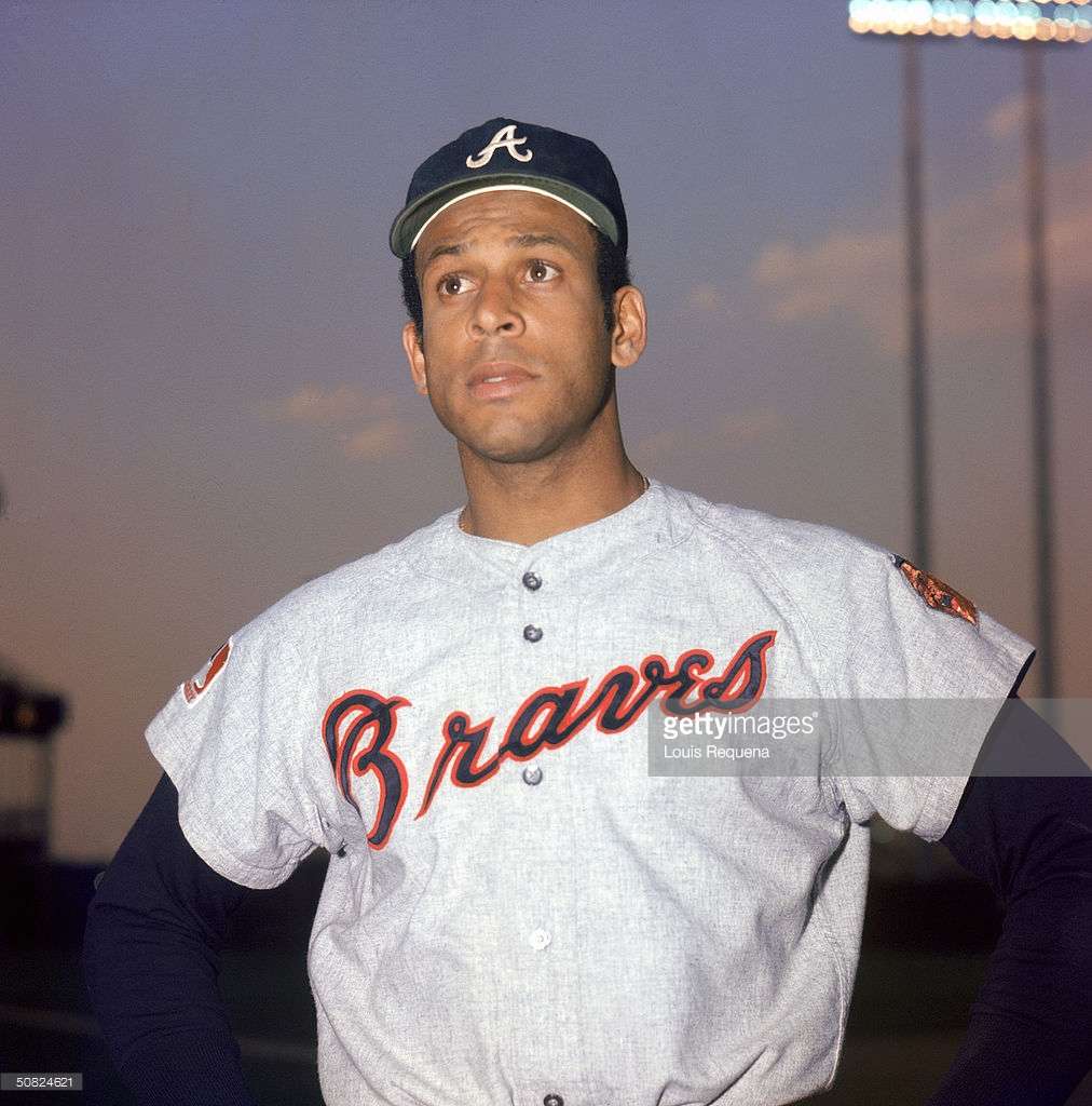
This is one of the best alternates in baseball. Love the cream, and love the homage to these fellas: I've seen flak for it being too similar to the currents and thus a sort of "worthless" alt, but I've never minded that considering it was nodding to the first uniform worn in Atlanta. It's good enough precedence to me for them to go for it.

-
Players in the "wrong" uniforms
FinsUp1214 replied to larrypep's topic in Sports Logo General Discussion
While looking for Hank Aaron in Braves pinstripes to put in the "right team, wrong uniform thread", I came across a trio of Hall-of-Famers who were also Braves at the time in some capacity, but qualified more so for this thread: Orlando Cepeda Hoyt Wilhelm And "Pitching Coach/Pitcher" Satchel Paige
-
Players on the "RIGHT" Team, but "WRONG" Uniform
FinsUp1214 replied to kimball's topic in Sports Logo General Discussion
Hank wore a few different uniforms with the Braves, but this one I think is the "most wrong": I would've said the pullovers, but hitting #715 in them really helps its case. Though to me, even with such a historic moment, his "right" set will always be the 50's-60's tomahawks.
-
Players in the "wrong" uniforms
FinsUp1214 replied to larrypep's topic in Sports Logo General Discussion
George Brett in a Team Australia uniform (before an exhibition game with the Mariners, explaining Griffey being there): He was apparently an advisor for the national team. Learn something new every day!
-
Players on the "RIGHT" Team, but "WRONG" Uniform
FinsUp1214 replied to kimball's topic in Sports Logo General Discussion
This one might be a bit tricky as his "right team" might be different depending on who you ask, but I'm gonna put this Reggie Jackson one here anyways: He's an Athletic to me first, and a Yankee close second.
-
An Oakland Athletics two-fer: 1) This is, to me, the best cap the A's have ever worn by far: It should've been the only cap in the entire set, and should have remained altogether. With it, that road uniform was easily a top five uniform during it's time. And 2) The A's in forest green and gold >>>>>>>>> Kelly green and gold. P.S: Totally used a Bartolo picture on purpose for added Big Sexy effect
-
Players in the "wrong" uniforms
FinsUp1214 replied to larrypep's topic in Sports Logo General Discussion
Larry Doby:
-
Players on the "RIGHT" Team, but "WRONG" Uniform
FinsUp1214 replied to kimball's topic in Sports Logo General Discussion
And now for a trip in the wayback machine: Al Kaline in the Tigers 1960 home set. It (thankfully) only lasted one season.
-
Players on the "RIGHT" Team, but "WRONG" Uniform
FinsUp1214 replied to kimball's topic in Sports Logo General Discussion
Some others that came to mind: Ladainian Tomlinson Terrell Davis Merlin Olsen
-
Players on the "RIGHT" Team, but "WRONG" Uniform
FinsUp1214 replied to kimball's topic in Sports Logo General Discussion
To be honest, this doesn't look that odd to me at all. Both because he wore this when he was the cover athlete of NHL 07 and I personally love this uniform a whole lot more than the current, so I remember him wearing it very well. That's not to say the current uniform isn't his right one - it absolutely is his right one - just that I don't think the blue/black/bronze looks particularly wrong, either. -
This jersey cut doesn't bother me at all: ...because I don't see it as being that far off from this cut:
-
Players on the "RIGHT" Team, but "WRONG" Uniform
FinsUp1214 replied to kimball's topic in Sports Logo General Discussion
Bryon Russell in not only right team/wrong uniform, but wrong number as well:
-
Rare NBA Getty Images, Google & Internet Find
FinsUp1214 replied to kimball's topic in Sports Logo General Discussion
I actually didn't know this till today, but the Liberty hosted a game at Arthur Ashe a few years back. Looks awesome. I'm really digging more and more the idea of outdoor games. I know there's a lot of intricacies and things that need to go perfectly for that kind of thing to work, but it's something that'd be really cool annually in the right places (Tennis arenas would obviously be ideal). I wonder also if some football stadiums could be used with seating configurations similar to how modern Final Fours have done. Could be tricky, but maybe it'd work?
-
Rare NBA Getty Images, Google & Internet Find
FinsUp1214 replied to kimball's topic in Sports Logo General Discussion
I don't know that a picture like this is particularly "rare", as you can find a few outdoor game pictures through google, but at the very least it's something that's only happened four times in NBA history. The Suns hosted an outdoor game at Indian Wells Tennis Garden in Indian Wells, California in 2008, 2009, and 2011. This was my favorite picture, from the 2009 game vs. the Warriors: And here is a picture of the stadium:
- 378 replies
-
- 8
-

-
- nba
- basketball
- (and 4 more)
-
That's part of why I'm a big advocate for socks being mandatory; as a uniform enthusiast, the designs of socks add something to a baseball uniform and gives it extra life. Those examples you used are perfect for what I mean (and some of the best socks in baseball history, among others). Each were intentionally designed to be part of the uniform and not a mere accessory; they were every bit as integral and essential to the team's identity as their caps were. Like the socks on a football uniform, it just completes and compliments everything in ways the uniform wouldn't be without them. Sometimes the socks even make the difference for a uniform. Case in point (IMO), the current Cardinals. A good-but-sorta-plain uniform when worn with long pants, but when a player busts out those gorgeous striped stirrups? All of a sudden, the sorta-plainness of the jersey has something of great substance to compliment it. It gains a spark. It looks complete and the sorta-plainness even looks complimentary itself to the stripes. Nothing's "missing" anymore. Or maybe in the cases on solid color socks/stirrups, that extra block of color on the bottom provides great balance and makes a great uniform even better. Big block of color coming from the cap, white or grey on the jersey and pants, big block of color on the socks. It's a great symmetrical and balanced look that certainly benefits even already-great looks like the Yankees, Tigers, Dodgers, etc. Long pants don't look terrible in my opinion, and they certainly don't ruin a uniform. But baseball uniforms really lost something - indeed, a very valuable design element - when socks/stirrups became less of a thing.
-
I'm a big fan of the low cut stirrup, also. It left a lot of room for stripes if you wanted them, didn't look nearly as tacky as the ugly high cut stirrups from the 80's-90's, and just has that classic, essential golden-age baseball look to it. DiMaggio, Musial, Williams, Greenberg...all those guys wore it. If I had my way, that look would be mandatory.
-
While I truly liked both looks a lot at the time, if I had a choice between one or the other ever staying, I'd have had the Islanders keep this darker set and let the Oilers take the course they've taken. The Oilers just look better AND right in the brighter colors and I liked the Islanders darker because 1) the orange trim really popped against that navy, and 2) it distanced a bit from the Rangers. Not that they've ever looked too similar, but it's always bugged me that for a long time and now again, the two NYC area teams were/are both royal blue.
-
The Mighty Ducks are an interesting case in regards to this thread. They're so "love/hate" across the board that I dont know that either opinion is particularly unpopular. Seems for every person who adores it, there's another that hates it. Just sort of evens out all the time. As for me? I'm in the "freaking love it" camp. All the things that bother others about it are just frankly non-factors to me (like the "too Disney" argument; I mean yeah, it's Disney, but so what? I don't care. It still looks great to me). And the identity is one of the biggest sources of childhood nostalgia rush in all of sports for me. Truth be told? I was something of a Mighty Ducks fan as a kid, but legit stopped caring much for them when they rebranded. Dead serious, I hated the rebrand that much. It was awful then and is still awful now (only now it's also aged). The Mighty Ducks identity was precisely what roped me in in the first place; being a kid in the 90's meant you were their target market as far as the brand was concerned, and hey, it worked on me and tons of other kids in my neck of the woods. And just to to be clear, I'm perfectly fine with them being just the "Ducks". The name isn't the problem at all. Whether "Mighty" is in there or not really doesn't make a difference to me. I just want the colors and the duck mask to come back permanently, and for the webbed-D and regurgitated-candy color scheme to be shot back to the dark demonic hole from whence it came.
-
Rare NBA Getty Images, Google & Internet Find
FinsUp1214 replied to kimball's topic in Sports Logo General Discussion
Speaking of the Salt Palace (re: conversation earlier), this is a really great picture of the entrance: Just an awesome, vintage feel to it. It got me looking for other pictures of the entrance as well. This one is more or less to show context of where the first picture is taken, but I also hadn't realized the entrance featured the old Golden Eagles logo as well. The two teams were a tandem tenant even up to the Delta Center's opening until the Golden Eagles were sold and moved to Detroit in 1994. I was born in 1992 and the Salt Palace I know now is a (very nicely) renovated convention center, so I'd never seen this entrance before. The next picture has something really neat to it: This is Pre-Jazz, as evidenced by the Stars logo at the left side of the entrance instead. Look closely underneath the Salt Palace logo also, and you'll see that Johnny Cash was coming to town that Wednesday.
- 378 replies
-
- 4
-
-
- nba
- basketball
- (and 4 more)
-
Minor/Independent/Collegiate League Baseball Logo/Uniform Changes
FinsUp1214 replied to BigMac12's topic in Sports Logo News
Yes on the "oh, almost" part! It really seems that way for Utah teams across the board. I'd throw RSL in there too. I think they're close, but not right on. I do think the Bees are the best looking team in the state for sure though. I could get behind the Bees working in a slight amount of red if done tastefully; maybe baseball's very own early 90's Canucks? I always loved that look, and if the Bees worked a balance of black first, gold second, and red trim, it could certainly work. Otherwise, Pirates-ish as it may be, as-is would be the next best thing. Oh, and I'm stoked Gulls night is coming back. I got me a Gulls shirt last year and love it! -
Minor/Independent/Collegiate League Baseball Logo/Uniform Changes
FinsUp1214 replied to BigMac12's topic in Sports Logo News
The Bees did update/clean up the logo (as well as introducing a new number font to match the wordmark) recently. I can't remember if it was last season or two seasons ago, but that was an official change. Here's a look at the new numbers, fairly subtle but noticeable when compared to the wordmark: