


FinsUp1214
-
Posts
3,001 -
Joined
-
Last visited
-
Days Won
13
Posts posted by FinsUp1214
-
-
28 minutes ago, projectjohn said:
The Pistons posted this on their social media yesterday. I'm presuming it might be a hint at their City Edition for next season being Motown themed.
Seems a bit early for an unveiling what with the Finals still in progress and the fact the Pistons have never unveiled a City Edition until the league-wide drop by Nike which usually takes place in early November.
My guess is that “MOTOWN” wordmark on the album cover is on the front of the jersey (if that is indeed what this is teasing). -
The uniform-correlated color sync of the team names serves a function for sure, but I also find it a bit distracting and not as aesthetically pleasant. Game 2’s with Miami in white also gave an impression that they were perpetually highlighted on the scorebug, if that makes sense, which lent to my distraction and bothered me a bit. I think a better solution would be to go soccer-style with it and have a strip of the uniform color next to the name rather than have the whole block filled in.
Of course the most ideal solution would be to just go back to strict white at home/dark on the road so you don’t have to call out a uniform color on the scorebug, but that’s a whole other discussion. The NBA has created a lot of aesthetic problems that I don’t think they’re even aware of or care about right now.
-
 2
2
-
-
3 hours ago, TrueYankee26 said:
And it is confirmed that the MUFC away kits not only are green and white stripes but a thin red stripe will be in the middle of the white stripes. They look like Christmas candy lol.
I actually really like the color scheme, just maybe not so much how it was used. I think a green collar, removal of the white/red/white stripes on the sleeves, and a slightly thicker stroke of red on each of the stripes could have worked better. As it is, I think there’s a bit too much white and a bit of clutter on the sleeves altogether. The color scheme itself I'm fine with though. I’ve always been a sucker for forest green, red, and white or off-white when used right.-
1
-
-
19 hours ago, Cujo said:
This cannot be stated enough!
I couldn’t agree more. On one hand, I get the whole thing with stickers being slick and the fact that uniforms are lacking the same real estate with the swoosh and ads now. On the other hand, the aesthetic of the Finals just doesn’t feel like a spectacle anymore and that’s still a problem for me.
The patch above the NOB looks like an afterthought being tucked away on the back, and while the logo is on the court digitally, you don’t get the same punch on pictures of the event without the court stickers. Case in point - those very pictures on the tweet of Kobe by half court and Drexler vs. Jordan on top of the sticker. I mean, those photos were quite obviously framed with the sticker in mind to capture the spectacle (and they’re incredible shots for doing so); you can’t do that now unless you get the stanchion in there, which depending on the action could be covered up anyway. That you can’t get photo shots like these anymore is a real shame and a big loss, artistically.
I don’t know…I truly do get the “why” of it, but that doesn’t mean I have to like it. The Finals just aren’t as visually exciting as they used to be.
-
6
-
-
Luis Arraez is having a pretty wild season statistically. The Athletic broke down his season (among other statistical fun facts across the league this year), and to save you a click and a paywall, here’s some of what Arraez is pulling off:
- He’s currently running a slash line of .382/.437/.466 despite only hitting one home run all season. The last player to have a remotely similar slash line with only home run was Willie Keeler in 1898 (yes, eighteen ninety eight) with .385/.420/.410.
- His on-base percentage is .437 despite only one homer. The last player to have an OBP of .430 or higher with one home run or less was Richie Ashburn in 1954 (.441).
- He, as of the article publishing, has a hits to runs ratio of 73/19. If he maintains his current pace, he’d be on pace for 207 hits to 53 runs. If that happens he would 1) leave the most runs unscored in a season in league history (154) and 2) would be the first player ever to have 200+ hits while scoring less than 60 runs. In short? The Marlins’ lineup is stranding thier best hitter at a higher rate than any team before.
Things can change by season’s end on each of these, but for now, Arraez is pace for a pretty amazing, wacky, vintage, and yet unlucky year all at once.
The article:
-
1
-
 1
1
-
-
The silver flakes don’t do nearly as much as I imagined they would on the Cardinals helmet. It almost looks like Vanilla Bean ice cream on the shell instead of anything shiny.
-
13
-
 2
2
-
-
12 minutes ago, Germanshepherd said:
LOCKERVISION REPORT FOR FINALS GAMES 1-4
GAME 1: NUGGETS (Mile High City, because of course) vs HEAT (Red)
GAME 2: NUGGETS (Navy icons, I like it) vs HEAT (White Hot Heat)
GAME 3: HEAT (White Hot Heat) vs NUGGETS (Mile High City AGAIN)
GAME 4: HEAT (White again, nice) vs NUGGETS (Navy icons)
It’s sad that (for now) I want this to be a sweep for either team so that the deciding game is in a correct non-city edition white vs. dark matchup. I shouldn’t want that, but this is what uniform matchups have become I guess.
Here’s to hoping there’s more good matchups in games 5-7. At least Miami has been pretty good about wearing the right colors in the right places for the most part this postseason.-
1
-
-
To me, the Texans have a modern classic of a uniform. It follows some general principles of one type of a classic football uniform - shoulder stripes, untapered pant stripes, legible number font - and it’s honestly rather straightforward in its composition, yet applies enough modern touches to keep it interesting and current without overdoing it. To have especially straddled the line between restraint and progress all the way back in 2002 was very impressive then, and has led to a uniform that - to me at least - has never dated and still works very well. The look is somehow all thier own too, I’ve never mixed them up for anyone and they are instantly recognizable. They are not, and have never been, in any position where they need to change in my book.
In a weird way as well, the modern touches the uniform does have give it a very slight but noticeable “space” look to it. Maybe it’s the dark navy base, red trims, star within the logo, and a healthy mix of curved and pointed elements between the logo, shoulder stripes, and number font, but I’ve always noticed at least a hint of space there, intentional or not.
All in all, the Texans nailed it out of the gate. I think it’d be a shame for them to bail out of a good thing.
-
12
-
-
I’m late on the classic edition guesses, and apologies if I’ve missed anything concrete, but aside from Utah, possibly Charlotte, and possibly Orlando, I wonder if Denver is perhaps the fourth team.
Unless I’m getting my “seasons vs. years” mixed up, this coming season should be the 30th anniversary of the team that upset Seattle as an 8-seed. Here’s my shot-in-the-dark guess:

-
4
-
-
Good afternoon, all!
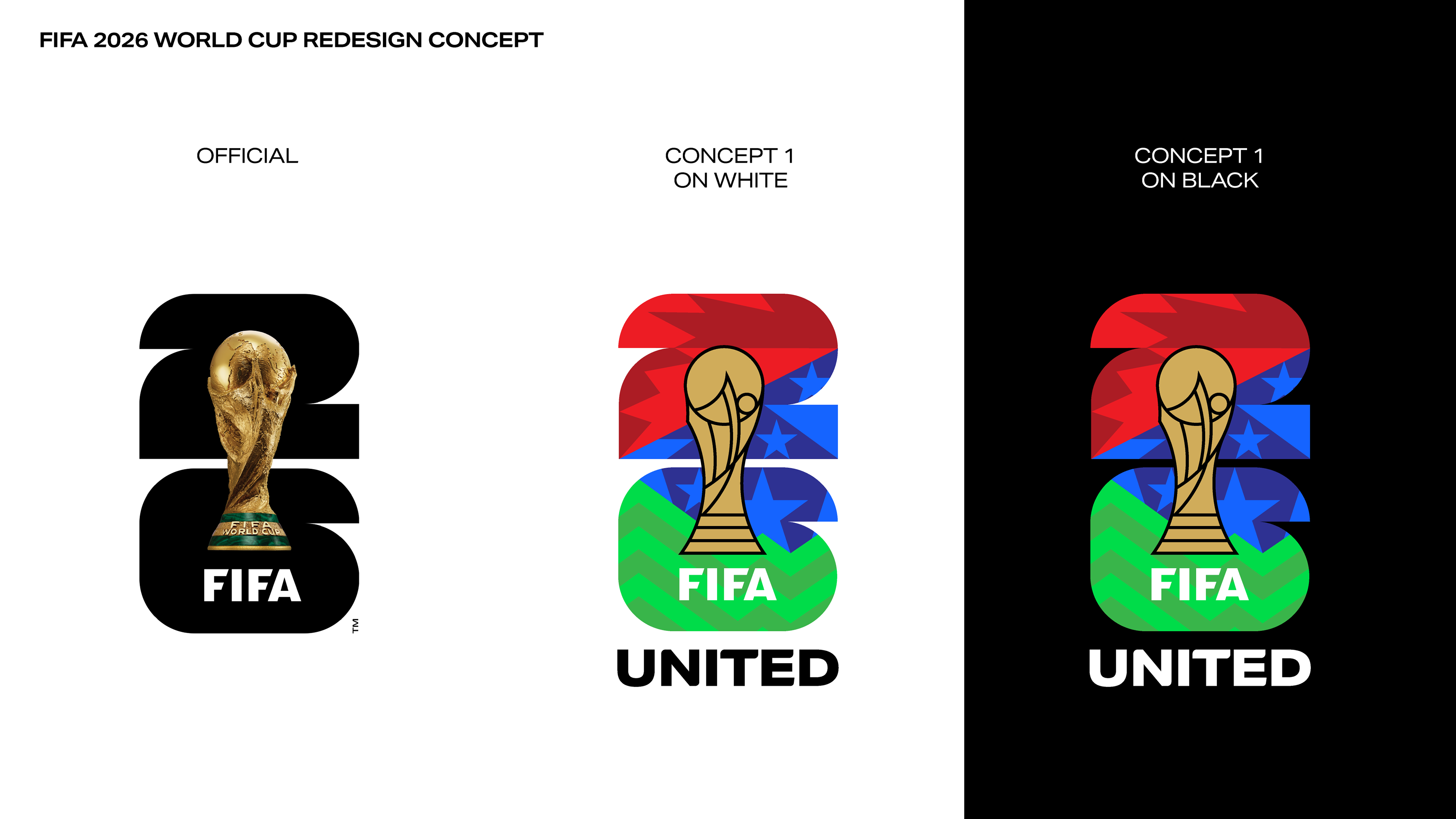
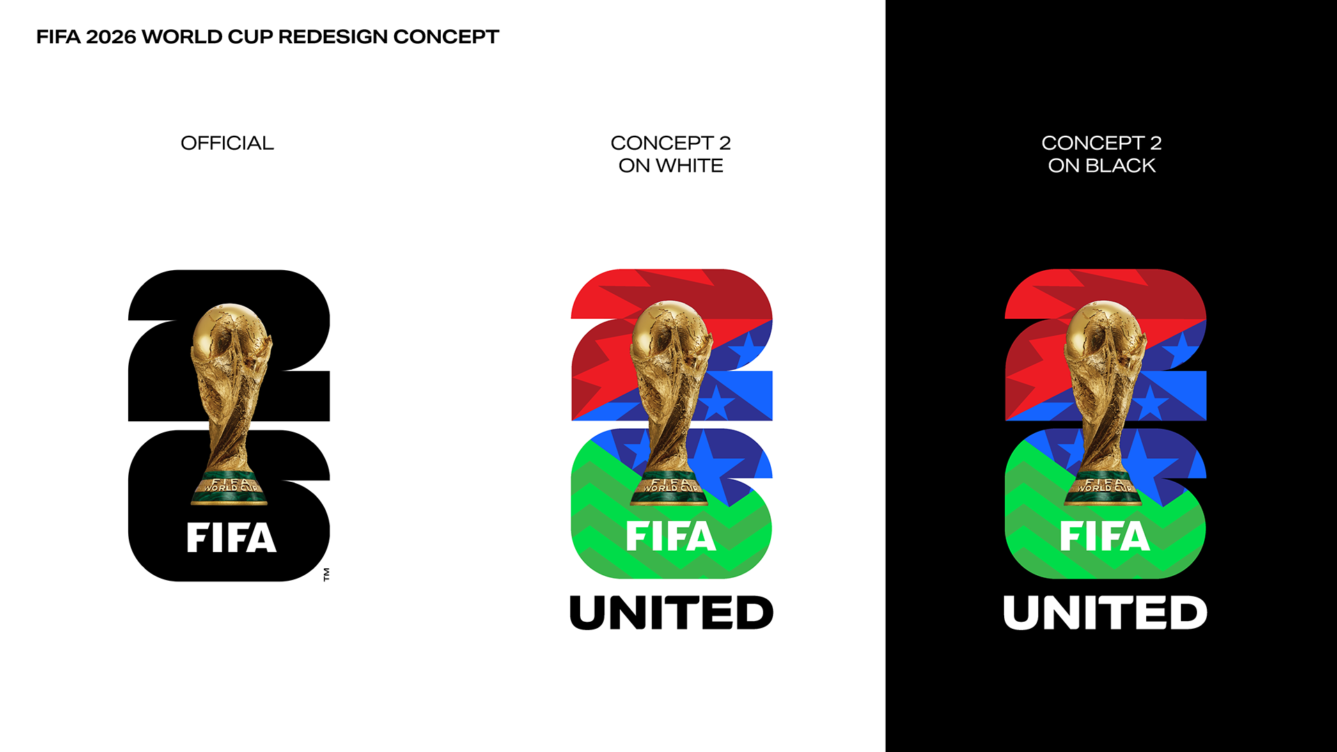
If you've been over to the FIFA World Cup 2026 logo thread at all, you've certainly seen me voice my displeasure at the newly unveiled logo. I won't keep you all reading too long, but suffice to say, I believe the logo suffers from a few major problems. The first and most obvious is the use of a png trophy pasted on top of the "26", a truly bizarre choice. Secondly is the avoidance of any sort of color, pattern, iconography, or symbolism that celebrates Canada, USA, and Mexico. While the 16 host cities do include branding with colors and patterns that represent each city (albeit a bit convoluted in some cases), the primary logo itself missed an opportunity to do the same for the host nations and immediately present the brand's intentions.
I had an itch to find a solution this morning, and cranked out this concept today. While I personally would have tried something completely different altogether, I wanted to challenge myself to see if I could make what FIFA was trying to do work somehow. The result is fairly self explanatory; I aimed to create something that gave the primary logo life, and tied it more strongly into the spirit of the host city branding approach. The logo in this concept now features a pattern composed of abstracted maple leafs for Canada, stars for USA, and a repetitive mountain pattern for Mexico that is inspired by the 1968 Mexico City Olympic branding. I also added "UNITED" underneath the "26" and trophy to more directly identify the name of the tournament.
I also tried one version with a more stylized, abstracted trophy to see how a more "icon" style logo could work, and also maintained the use of the photo trophy in the 2nd version just to see how that would work as well.
It's something I still want to play around with and polish up a bit more, but I wanted to get this out of my head and somewhere where I could get some eyes and thoughts on it. I'd love to hear any feedback and thoughts you all have!
Thanks for reading and viewing!
-
2
-
 3
3
-
 6
6
-
-
When you’re rolling out a major brand like this, you can’t afford to ask your audience to “be patient” or assume they will be. An initial brand rollout has to provide and present the context for what this is all about. Does this mean you have to release absolutely everything? No. But you have to release enough to provide the “why.” FIFA didn’t do that and spaced it all out too far, which allowed for the underwhelming logo to take all the attention and get daggered before the rest of the brand even came out. They were basically asking for it.
We didn’t see any this city stuff until the day (or days) after the logo itself was released. We got the plain logo and a bunch of colors, but we never saw anything akin to this the night of. We never saw the intended “modularity” of the logo and how that was going to be accomplished. That led to some people (myself being one of them) waiting for colors and patterns or something to fill the logo in, and being a bit jilted when it never happened. Had they released the logo with the video above together on the same night? Different story. I think that context would’ve helped it out a little bit and provided more of a “why.” It wouldn’t save it for me personally - the logo is still pretty flawed between the png trophy and the lack of its own colors or patterns - but it would have more clearly defined what the intention behind the logo and brand was.
So no, “patience” didn’t fix this, for me at least. The rollout strategy’s intentional delays between stages was a major flaw that led to lost context. The logo is still very underwhelming, lifeless, and I’m genuinely concerned about how well it’s going to function in various uses. Even the city branding, as great as a lot of it is, still presents a fair bit of confusion in its own right with multiple color schemes per city and overlapping between a few that’s already caused some confusion for me.
All in all, the city branding made the whole thing a bit more palatable, yes. But even still, it did nothing to take away or fix the other flaws the brand has in my opinion. The good and the bad co-exist and neither are cancelling each other out.-
9
-
-
16 minutes ago, raysox said:
Here is the roll out of the city specific branding + motion package. Still not defending the literal PNG but this is super bold.
I’ll fully admit that there’s some really cool stuff there, some of which I think is especially promising (that orbit pattern for Houston and 8-bit stuff for San Francisco is pretty awesome, actually. Hadn’t seen either of those yet). That being said, I think the fact that there was some good effort put into the city stuff while the main logo is left plain honestly upsets me a little more. It goes to show the main logo could’ve had a really cool pattern or design placed into it if they really wanted.
I get it - the intention I’m sure was for the main logo to “be the template” or whatever. But it still could have been that with some sort of RGB color scheme or pattern integrated within it. I don’t think it would’ve caused any disconnect to make that extra effort: in fact, I think it would have driven home what they were trying to do more with such a design. If they had run with something like that alongside what this video shows together on the same night instead, I would’ve been a little warmer towards this and understood what they were trying to do a little clearer. Rolling out the blank primary first and waiting to roll out the city stuff until the day(s) after didn’t allow for that context to be presented and recieved, and that chasm - among other mistakes - really hurt this.
So yeah, there is some good stuff here, but not quite enough to redeem the poor overall execution of the logo and brand as a whole.
-
4
-
-
One thing I still haven’t seen in the branding package is a wordmark akin to “Russia 2018”, “Qatar 2022”, etc. Is there a “United 2026” one floating around somewhere that I’m missing? That would especially be needed for television scorebugs:
I can’t imagine “FOX | primary 26 logo” in the top right corner is going to work that well on screen. It’s going to be too small a scale for the logo. They’ve got to have some sort of alternative option.
Also, it’s bugging me that the host cities have multiple color schemes rather than unique ones, and that some are overlapping (Philadelphia and Boston both have a yellow/blue/green option, for example). I think I’ve seen navy/powder blue/red for two different cities and keep mixing up who they’re even for. Kansas City and Houston, I think?
This whole thing’s just weird.
-
5
-
-
I’ve noticed a few occasions where some images don’t show up for me after about 10 seconds of a page trying to load. It’ll try to load it for a bit, then stop and put the question mark icon over where the image should be instead. I think there’s just so much going on with ads and images on this site that it’s as if it overloads and makes the page sort of “give up.”
To be clear, this isn’t a constant issue, but I’ve encountered it a little more lately. -
There’s somebody who lives at my apartment complex that has a Napoli window sticker and license plate holder on thier car. When I see foreign soccer club stuff around here, it’s usually one of the Mexican clubs, Premier League clubs, or Barcelona. Seeing anything from Napoli, let alone car decor, was a bit of a shocker.
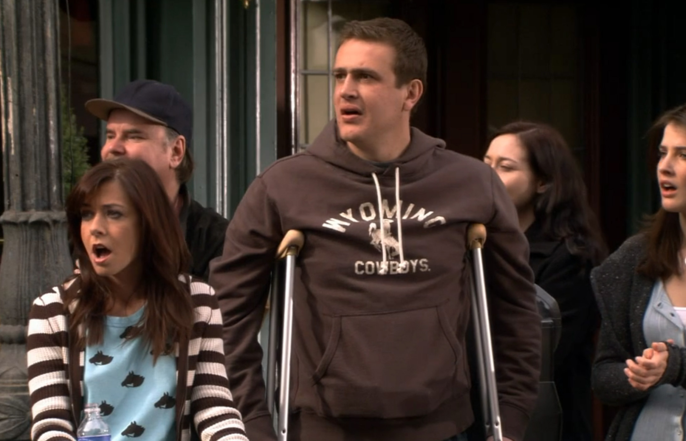
—One of my favorite examples from TV would be the various team gear some of the characters wear on How I Met Your Mother. There’s the Canucks gear Robin occasionally wears (which makes sense as her character is from British Columbia), but Marshall and Ted both wear random college and baseball team gear fairly often in the earlier seasons. The most random is probably Marshall - a character from Minnesota living in New York - wearing a Wyoming Cowboys hoodie:
-
11 minutes ago, andregunts said:
Guys it’s not 1930 anymore with a simple logo. Let’s see how the whole thing plays out and then we’ll see can look back and critique.
Where are you getting this idea that everybody wants it to be 1930 again from? Besides, there weren’t “simple logos” in 1930 anyways - most examples that are cited as sports logos from that time period were really illustrations, cartoons, or even full posters or cards that were never official logos as outlined in a specific brand guide. Branding was far looser back then, and was for quite a long time after that. If you’re just trying to simply call those you disagree with old, then whatever, but at least get the era a little closer to correct if you’re going to do that.
Anyways, you can have a progressive, forward thinking brand with a strong logo; the two are not mutually exclusive. I’d argue you’re putting yourself in a box if you think you can’t pull both off.
-
6
-
-
32 minutes ago, GriffinM6 said:
I think I've only felt this once before about a logo unveiling, but like, I'm physically angry at how bad this is. Like, this is completely and utterly horrible and devoid of any life or vibrancy. There's no way they don't change this logo within the next 3 years right? There's just no way, I refuse to believe it considering the amount of backlash it's already gotten on every form of social media.
Who tf knows though, it's FIFA, and it's not like they give two $hits about the fans.
Yeah, I’m feeling a lot of feelings with this one too. I think what I feel more than anything is shock, repulsion, and genuine concern about where World Cup branding (and maybe the branding of sports events in general) is headed moving forwards.
The opportunity to blend the cultural inspiration of three countries together and make something visually exciting was right there. Especially in a host area that for the most part is still growing Soccer interest and could use something more celebratory of the locale to inspire. It was an open net! How they deliberately decided to not only miss the net, but not take the shot at all in favor of “modularity” or whatever is severely dissapointing. And that’s not even considering the bizarre decision to literally slap a png image of the real trophy onto it, call it a day, and do so with a straight face.
I guess I’m just genuinely floored that this is really what all parties involved decided was the right course of action. I feel like I’m taking crazy pills.
-
5
-
-
46 minutes ago, McCall said:
Am I the only one who, from this angle, sees a giant lizard hand holding a globe?
Well….NOW you’re not the only one. That’s going to be hard to unsee!-
1
-
-
Also the presentation event itself was hilariously amateur hour, I guess I should have seen this coming. The YouTube stream crashing for five minutes, Lalas trying five times to say “Emmy Winning” but saying some variation of “Ebble Wimble” instead, 300 minutes of highlights for no reason but filler, and “watch parties” in Dallas, Seattle, and Vancouver that weren’t watch parties at all and filmed with Nokia Bricks should have been an indicator of what was coming.
That thing had a soundtrack and it was “Yakety Sax” on repeat.
-
1
-
-
I can’t believe that’s actually it. I was watching that final reveal waiting for it to fill in with colors or patterns or something, and then it just never did. I kept waiting for the png of the trophy to turn into something stylized, and it never did. They’re really going to run with that. Mother of mercy.
Maybe that’s what these 16 different host-specific logos are really - that shape filled in with whatever colors or patterns or icons ties it into the city. Even still, this is a really rough mark to lead out with. It’s an absolute nothingburger.
-
8
-
-
“All 16 hosts will have a custom version.”
Hmm, I’m intrigued as to what that could possibly entail. I feel like that could mean anything from “host city name under main logo” to a full on LA 2028 style package that literally includes 16 different logos based on the same template, but with an icon of some sort swapped out.
-
1
-
-
47 minutes ago, habsfan1 said:
Salt Lake City is an odd choice.
Their 12 000 seat arena for the ECHL Grizzlies is smaller than Winnipeg's building. They've never had much demand for NHL hockey, to my knowledge. If there are hardcore fans from that western area, I imagine they already support the Avs.
Strangely enough, I only know one Avs fan here and he’s a co-worker who is originally from Denver anyways. One other co-worker is a Wild fan because he lived in Minnesota for a while, another co-worker is a Kraken fan because he worked in Seattle for a few years and adopted it as a second hometown, and a friend of mine is a Caps fan because she worked in DC for a few years. There’s a decent number of Knights fans here, but not nearly enough for me to say Utah is strongly Knights territory either.This is a long way of saying I think there’s interest in hockey here, but those who are fans here either root for teams from places they have other connections to, or just recently hopped on to the Knights wagon. The Avs don’t really have a foothold here at all, so there wouldn’t be any worry of cutting into any sort of territory.
The biggest challenge for an SLC team would be the stadium. Soon-to-be-again Delta Celter wasn’t really built with hockey in mind and has bad sightlines, and as you mentioned, Maverik Center (formerly E Center) in West Valley is a minor league stadium. They’d either have to build a new stadium and grit out a season or two at the Delta Center, or renovate either existing stadium.
-
Shoot……that modern take on the wishbone “C” is actually really, really, really cool.
It absolutely shouldn’t be a full-time thing of course, but still. That’s an awesome cap logo. The red stripe on the cap is a nice touch too, which I’m assuming is a nod to team history:
-
6
-
-
22 minutes ago, BadSeed84 said:
That’s the most corny and wordy way to announce you tweaked a color and removed a logo outline. This age of social media marketing in which everything needs to be “that deep” is really making market-speak insufferable these days. Man.-
11
-


San Diego MLS expansion
in Sports Logo News
Posted
SC San Diego
But not “Soccer Club”…
60% of the time, they score every time!