


FinsUp1214
-
Posts
3,000 -
Joined
-
Last visited
-
Days Won
13
Posts posted by FinsUp1214
-
-
Pretty cool to see Jaren Hall drafted by the Vikings: I attended high school at K-12 charter school, and Jaren’s father, former BYU and CFL running back Kalin Hall, was the assistant director there. Jaren attended the same school (in the middle school section) as well until he transferred to Maple Mountain High School, so I saw him around the campus from time to time. I knew and interacted with his father much more than I did with Jaren, but even still, it’s pretty cool to see a kid I met and had seen around at my school years ago get drafted into the NFL. I’m super happy for him and his family, and rooting for him to get a shot to start for the Vikings down the road. With Cousins not getting any younger, that’s honestly not a bad situation for Jaren to find himself in.
-
1 hour ago, gosioux76 said:
I absolutely hate this part of the draft drama. Draft prognosticators spend the months running up to the draft identifying a guy as a sure-thing top 10 pick, build up expectations and get the guy an invite to the draft day green room, where we all watch him — and his family — look increasingly uneasy as every team passes him by.
And now this morning, McShay is on TV explaining all of the guy's flaws that he and Kiper just glossed over when they were absolutely certain he'd be the Colts' next QB.
Well, in McShay’s defense, his criticism of Levis has actually been fairly consistent. I watched all of the ESPN+ mock draft specials, and McShay had some pretty vocal concerns about Levis in all of them. He had Levis at pick 4 in a couple of mocks more so because he thought that’s where he would go, rather than where he should go. IIRC, he had another mock where he had Levis as low as the late teens to Tampa Bay (can’t recall if that was with thier original pick or a mock trade-up a couple of spots, though).
Kiper is the one who was singing Levis’s praises, I’d say even to an excessive extent. I remember him even saying at one point that he’d “throw all Levis’s 2022 film out” because he played hurt all year, which seems a bit irresponsible. I understand the general sentiment, but I would imagine playing ineffectively when hurt and probably aggravating his injuries to a worse extent would be a legitimate cause for concern.
-
 1
1
-
-
With regards to Levis, the Rams at pick 36, Tennessee at 41, Washington at 47, or even Tampa Bay at 50 make some sense. He could develop a year in any of those places (maybe longer if in LA). If he slides past all of them, however, then there must be a massive red flag somewhere. Turf toe, arrogance, too much mayo in coffee, who knows.
Minnesota is another team I would think could be in the QB market as an heir-apparent to Cousins, but they don’t pick again until 87. I think Levis and Hooker will be gone by then, but if by chance one of them are still there, that’d be a great place to take a shot. -
33 minutes ago, Digby said:
I miss the silver for the Rockets more than I miss the yellow. The silver-heavy era for them was looking pretty long in the tooth so I don't mind their most recent brand update, just don't like that black became the secondary color and silver is tertiary at best.
Yeah, I think personally I still prefer yellow as a secondary color (in moderation though…enough to maybe even be a tertiary color to white), but I will say that I grew to really like thier red and silver combo a lot over the years in its own right.
I wasn’t the biggest fan of the uniforms necessarily, but the color scheme itself really helped the Rockets carve out thier own thing and differentiate from the other red teams in the league. Thier color relationship to the rest of the league reminded me of how I easily tell a school like New Mexico, with thier cherry red/silver, apart from schools like Utah, Louisville, NC State, Wisconsin, etc.
-
5
-
-
On 4/24/2023 at 11:08 AM, pepis21 said:
New La Liga logo:

Imo ugly as hell
Oh wow, that’s a pretty significant downgrade. I didn’t expect them to depart from the original that far. The rainbow wheel was something I could always quickly associate and recognize as LaLiga, and this new logo really chucks that out the window.-
3
-
-
I always find myself kind of torn with the Broncos.
On one hand, as a 90’s kid who grew up on the Utah side of Broncos territory, I was consistently exposed to the ‘97 rebrand and the success that immediately followed. Many people in my hometown were Broncos fans, so I saw hats and merch everywhere. Still do, actually. I was five when they rebranded, so to me, the current Broncos identity is really the only one I know and associate with a team that was as close to a hometown team as I know (though admittedly, I am not and never was a Broncos fan myself). I’d be perfectly fine with them continuing to wear it for many more years.
On the other hand, I actually think the classic “D” look is a great look. I especially like the color scheme; I think royal blue and orange, when balanced right, is an excellent color scheme. The uniforms were really solid, classic, no-nonsense football uniforms too. In short, there’s a lot I like about the classic look, notwithstanding my stronger familiarity to the current identity.
All in all, this may just be a long way of saying a blend of both worlds wouldn’t be the worst thing in the world. The cyber horse logo in royal blue and orange, with a uniform akin to the classics, wouldn’t be a bad compromise to me. There’s aspects of both that I think are worth keeping and welding together, if that was ever an option the team wanted to pursue.
In any case, it amazes me that the current identity has lasted over a quarter of a century. It really doesn’t feel all that long ago, and to be honest, it’s never looked terribly dated to me either. It has somehow, someway, stood the test of time in my opinion, despite how open it was about pushing the envelope back then.
-
5
-
-
13 hours ago, Andrew_Gamer_NZP said:
There are parts of the Rangers city connect I really like: I’m a fan of the TX logo, the color scheme, and the clever ways they integrated DFW baseball history into the uniform (the Winged Panther, the TX logo modeled after the Eagles’ “D”, the spur, etc.).
However, the dark pants look extremely goofy and amateur, and are a huge knock for me. I also think the chest logo and numbers should switch sides, so the numbers are on the left and the logo is on the right. The layout as is looks a little awkward and strange.
All in all, this is a case of really digging individual parts of what the Rangers did, but not really digging the way they put it all together.
-
1
-
 1
1
-
-
On 4/19/2023 at 7:25 PM, tscuzzy said:
Feel like I've been seeing so many black uniforms recently... 13/16 teams in the playoffs have one!! No black for Philly, Lakers, or Denver.
It’s pretty bothersome when you realize a good 7 or so of those teams shouldn’t be wearing black at all, in any capacity, let alone in the playoffs.Black makes sense for Miami and Brooklyn. I’m also okay with Atlanta, Sacramento, and Phoenix wearing it sparingly in the playoffs due to some historical precedence, though with Phoenix especially my preference would be purple.
Memphis, Milwaukee, Boston, Golden State, Cleveland, New York, and LA Clippers are showing up to the wrong party here. They shouldn’t be in black whatsoever.
-
6
-
 3
3
-
-
27 minutes ago, DCarp1231 said:
Lost me at “large ARIZONA wordmark on the front so we can amplify our connection to the state of Arizona”
You play in the damn state of Arizona. How much more of an amplification do you need? GTFO
“How do we amplify our connection with the state of Arizona?”
”The State flag?”
“No, too obvious.”
”Maybe a kachina type pattern?”
”No, also too obvious.”
“The state outline? Saguaros? Sun rays?”
”No, no, no….all low hanging fruit.”
”I got it! ARIZONA on the chest, but like, really big.”
“How big? Like, Jets big?”
“Bigger.” *Stretches arms out to full wingspan*
”YES! That’s amplification! Everything’s bigger in Arizona!”
”I think you mean Tex-“
”SEND IT!”
-
5
-
 2
2
-
-
7 minutes ago, Survival79 said:
They were both previously listed as primary marks, but now they are not.
Yeah I noticed ESPN suddenly using the bear head site wide last week instead of the wishbone C. I wondered if something was up. I wonder what the reason for the switch was, it’s interesting that it was pretty much done without a peep.-
5
-
-
The more I think about it, I’m honestly kind of surprised that the collegiate style large wordmark on jerseys in the NFL has been a trend at all, let alone that it keeps surviving. You had the Browns kick it off with the ill fated Manziel set, then the Jets, then the Falcons, then the Commanders (not as large as the others, but larger than standard nevertheless), and now the Cardinals. I really don’t understand the ratter sudden appeal for that element and why it’s becoming a thing in the NFL. Is it just a piggy-backing kind of move from teams, or is there some sort of popularity to it that I’m missing here?
I do wonder a bit how much teams actually want to look like college teams nowadays and think that’s how they can strike a chord with younger audiences. It’s the only theory I can think of for the sudden rise of the large wordmark in a league that never really applied it in its aesthetics before. In any case, it has never caught on with me personally. -
The best thing I can say about these: not as bad as I feared, but not as good as I hoped.
I’m glad that they leaned more towards classic Cardinals than desert spacesuit, and think these could have been much worse. The rumored color scheme that had been shared earlier, to be honest, was not looking great in my head, so that potential crisis was at least averted. They had good intentions here, but the execution is lacking on multiple fronts.
It may be because they’ve never really featured it as a color, but the inclusion of silver by them is really jarring to me. It doesn’t look right on a Cardinals uniform, and it just seems kind of…there.
The road white uniform is my favorite of the three and closest to what I was hoping for, so I think I’m going to enjoy seeing that one in action more than the others. The inspiration is definitely there. But again, the silver looks really odd as used and pulls the set down a bit from what it could have been (I think I’d have made the inner stripe red and the outer stripes black). Maybe the silver is just something I’ll get used to, but for now, it’s a bit much. They may have been able to get away with silver flakes on the helmet only and no silver elsewhere.
The “ARIZONA” wordmark in the red jersey is just flat out bad. It’s comically large and looks especially imbalanced when over a single digit number (which is not ideal at all considering Kyler’s jersey is probably one of the most popular sells). I’m usually not that bothered by stripeless pants, but I am in this case. It leaves the home set looking rather empty and lifeless, to be honest. The classic Cardinals home set was indeed simple, but still had stripes on the pants and broke up the colors with an R/W/R combo. This home set under the helmet is just kind of one big blood clot of nothing.
Never been a fan of the Cards in mono black, and I’m still not. If they have to have a black uniform, then it needs the white helmet and even white pants. This color rush nonsense has run its course.
Honestly, the photoshop that was posted wayyyy back earlier yesterday with the state flags on the sleeve achieved what I was hoping for with a much stronger execution. This set tried, and I can appreciate the try and the intention, but just a lot of execution mishaps across the board. On a reaction scale of “repulsively gagging” and “joyously backflipping”, it’s somewhere along the region of “blandly shrugging.”
-
2
-
-
Two guesses just for the fun of it:
- The helmet fades from white at the top to sand at the bottom, with a sand colored facemask
- Copper and gold coexist with cardinal/maroon, dark grey, white, and sand.
Those aren’t necessarily what I want by any means, but those are my guesses. I also have no info whatsoever, just totally basing my guesses off of what’s been shared or hinted at here.
-
2
-
-
30 minutes ago, McCall said:
Plus Kansas City essentially draws some from Kansas, Nebraska, probably some of Iowa, even a little bit of Missouri. Salt Lake would probably just draw from that part of Utah, I imagine. South Utah, as well, but I'm not sure how populated that is.
The Southwestern corner of the state, with St. George (around 180,000 population in its metro area) and Cedar City (about 35,000 population in the city), is the only notably populated area in the South end of the state. The Southeast has very little people, as does the central part of the state immediately below the Wasatch Front.
There’s a chance SW Utah could add support - it’s still rabid Jazz territory down there - but there’s also a chance they’d support a Las Vegas team instead if it co-existed, which would be a little closer in proximity. I think SLC would draw more sure support from Southern Idaho (whatever parts of the state aren’t Mariners territory) and Wyoming, judging by some Jazz support I’ve seen passing through both areas. Neither are the kind of support Kansas/Nebraska/Missouri is to the Royals of course, but it’s something outside of the SLC/Greater Wasatch area.
-
I will say this: Gail Miller brings an instant clout and credibility to an SLC ownership bid that few other potential owners could. She’s one of the most beloved figures in Utah, has contributed greatly to the community, knows the community inside and out, and she was very highly regarded while owner of the Jazz. There’s nobody, really, that I would rather have heading a bid than her. The thoroughness and practicality of the bid and Stadium plan is more reassuring, and is nothing short of what I would expect from Miller.
As I’ve already stated, my hesitations with the SLC push lie solely with whether or not the growth of the population has reached the right level quite yet over any other factor. I very much want a team here and no doubt would support it myself, but I also want it to sustained long-term. My hope is that, if it were to ever hypothetically happen, the team could be sustained by the population’s projected growth as time passes, as opposed to waiting for it to reach a certain point. There’s a bit of a “if you build it, they will come” feel to that, and being a more cautious person by nature, I’m a little on the “I hope they come” side of things. But, again, of all people to pull this off, I think Gail Miller would be the one to do it. If she thinks it’s possible - and has actually put together a plan to do it - I’m willing to see where it goes.
-
2
-
-
I’m sure that kid is really going to appreciate being made fun of on television. Imagine he pulls his phone out after the game and he finds out through texts or retweets or whatever that he was blasted like that for no good reason at all. Kay’s serious-sounding use of “breaking the rules” killed off any “it was just a joke” defense he may or may not have. That was really poor and unfortunate on Kay’s part.
-
3
-
-
38 minutes ago, FiddySicks said:
Salt Lake is way more of a pipe dream than Montreal. At least Montreal actually had a Major League team at one point. Montreal has more than a million and a half people. Salt Lake has less than 200,000 people. It’s actually a miracle they have a basketball. They’re somehow a less appealing option than even Sacramento.
Well, yes, the city itself has just under 200,000, but SLC metro has about 1.25 million, and the greater Wasatch Front area (Ogden to Provo, with SLC located around the middle) has around 2.7 million. The cities along the range - where the wide majority of the state’s population resides - are nearly connected back to back the whole way down, so pulling the population of just one can be a little deceiving without considering the context of how close the most populous cities in Utah are to each other. The Wasatch is projected to keep on growing over the course of the next few years, as well.THAT BEING SAID, HOWEVER…..I do agree to some extent that expansion to SLC is a bit of a pipe dream, for now at least. Don’t get me wrong, I’m a huge baseball fan and would be thrilled to have the Major Leagues in my backyard here, but I also don’t think SLC is ready quite yet. As much as I’ve just touted the SLC area’s growth, I do think it needs to grow further more before I’m comfortable believing there’s a sustainable fanbase to draw from. There’s no doubt fans would be hot out of the gate - just look how we support the Jazz season after season - but basketball arenas are, by sheer numbers, easier to fill and sell out than Major League ballparks night in and night out. The sustainability of a team placed in SLC before the numbers are there, as opposed to the plausibility of fan interest, is where my hesitation lies for the time being.
-
2
-
-
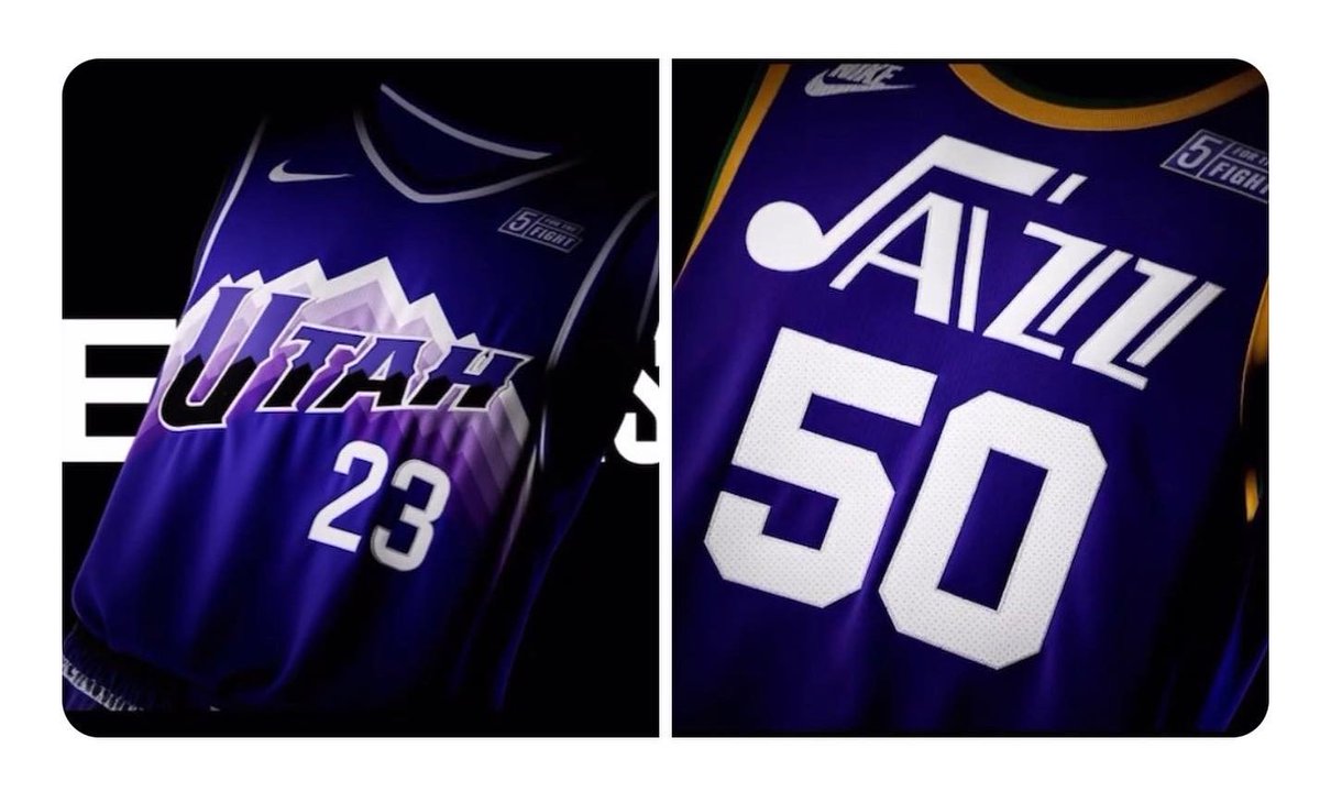
58 minutes ago, kimball said:
Yeah, they were already announced last summer by the Jazz. Since it's the Jazz's 50th anniversary they're wearing their 1974 road jersey as a throwback and I think the purple mountain is their city jersey since there is no Jordan logo.
Oh right, good catch! That would make more sense.
I think a part of me is really hoping the highlighter yellow statement gets the axe somehow, though if not replaced by the purple mountains, I feel like it’s not getting replaced at all. It’d be very easy to improve upon it, though. No doubt about that. -
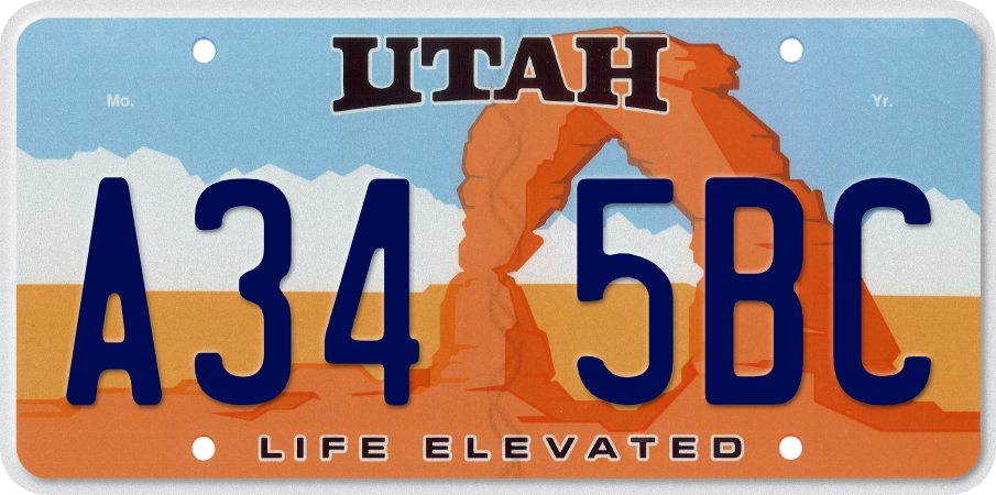
Oh, you nailed Utah. I love, love, love that color scheme; it reminds me immediately of the Delicate Arch license plate.
Just about the best accolade I could give it is that, as a Utah native, I’d be very proud seeing that uniform hit the field. Well done!
-
3
-
-
51 minutes ago, Conrad. said:
sadly, i do not
as for 2023/24 info, here's a nibble...3 teams are getting new main uniforms, 2 teams updating Statements, and 4 teams will have Classic unis.
I’m guessing/assuming what the Jazz unveiled for 2023-24 during this past summer would fall into both the updated statement and new classic edition categories (new purple mountain alt and the Pistol Pete throwbacks)?-
1
-
-
59 minutes ago, jerrylawless3 said:
Titans have officially teased Oilers throwbacks via this oil-barrel teaser video
I wonder if the supposed throwbacks would include the Tennessee Oilers patch, as a move to make it a “Tennessee Throwback” rather than a Houston one:-
12
-
 1
1
-
-
I think San Diego State actually has a bit of a shot Monday night. Thier defense has what it takes to rattle UConn and keep the game close, which UConn hasn’t been challenged with yet in this tournament. Also, Miami found a way to get a lot of shots in the paint off tonight, they just missed 14 of them and couldn’t make it the close game it should have been given the shots they had. If the Aztecs can frustrate the Huskies on defense and get shots in from the paint, things could actually tip in thier favor.
I hope, at least, that the game is close and exciting no matter who wins. Part of me still worries UConn is going to blast SDSU out of the stadium and end the wildest tournament I’ve ever seen with a total dud, but I’m also hopeful there’s still some Madness Magic left on Monday night.
-
Re: Panthers, I’m firmly in the “careful what you wish for” camp when it comes to uniform changes. The only two fixes I feel the Panthers need are removing the TV numbers altogether and limiting the mix and match combos (no silver/blue/black kind of nonsense). They’re set after that. Mash the reset button too hard, however, and you could overcorrect everything much too far. I fear a Carolina rebrand has the potential to disregard proper restraint.
The Titans were just a few tweaks away from being fixed once upon a time too, and then they threw restraint out the window and overcorrected into a Shakespearean Festival nightmare. I’m really hoping Carolina doesn’t go that far, either.
-
21
-
-
I have to say, there’s a part of me that’s really happy to see SDSU in the Final Four. I remember as a kid in Utah watching Mountain West Conference sports all the time, something like the Final Four always felt really distant for the conference (Utah had been in the WAC during thier ‘98 run). For the Aztecs - one of the conference originals - to finally break through and represent the Mountain West in the Final Four is pretty big, and it’s really cool to finally see it happen. If I had to choose one team to root for next weekend and the following Monday, it’d be for the Aztecs to win one for the old Mountain West.
-
1
-


2023-24 NHL Jersey Changes
in Sports Logo News
Posted
As much as I really like what they have now, I think this would have been an excellent set if it had been adopted. That shield logo on the sleeve stripes is really nice touch.
I’d be curious to see a larger version of both that shield and the shield logo on the pants as well; all in all, this looks like it could have been a really cool, vintage-inspired identity.