


SCalderwood
-
Posts
463 -
Joined
-
Last visited
Posts posted by SCalderwood
-
-
I'm actually okay with what the Pistons are doing. At this point, teams are getting so experimental that this looks relatively tame. I'm ok with the 313 logo... does it look "angry?" Yes, kind of, but I think that's the point. They managed to make 3 numbers look intimidating; I give them credit for that.
The Pistons have a very boring and generic-looking set of logos, so I guess they're doing the best they can to somehow do something different. The superimposed logo thing doesn't bother me all that much; I don't think it looks amazing or anything but it doesn't look terrible and it's something different. The downplaying of red and the "unpainted paint" ... I find myself okay with that, too. I guess they're just going for that bare bones look, like a lot of other teams have in the past, and I don't think it looks that bad. Pretty much every team that has gone to that simplistic unpainted look has found their way back to color, anyway. I guess it's just the Pistons turn to try it.
Probably what they realized is that if they did both the superimposed logo AND had red paint, it would look too cluttered, and would draw away from the attention of the superimposed logo. So if their heart was set on the superimposed logo, I think they were smart to make the actual court sort of plain.
-
 6
6
-
-
I think the whole point of the ad patch is for it to be a little obnoxious and draw attention to itself, just like any other ad in any other format. So even if there were logo versions that would blend in better, I'm not sure they'd want to use them, because "blending in" is not really the purpose of the ad; if anything, that is kind of what they're trying not to do.
-
5
-
-
On 7/24/2021 at 10:45 AM, insert name said:
I was slightly annoyed how the American League were blue and National League were Red when it's normally the other way around.
Ah, ok. Understood. To be fair though, the American league players were decked out in blue from head to toe. Maybe that's why the scorebug people thought it would have looked wrong to have the National League assigned blue on the scorebug,
I agree though, I wish the league were more consistent with these league color assignments in general.
I wonder how it would have looked with The AL wearing all red and the NL wearing all blue. I mean if they're gonna go monochrome, why not fully embrace those league colors.
-
On 7/14/2021 at 10:34 PM, insert name said:
This is frustrating on so many levels.

Maybe I'm missing something really obvious, but can you be more specific about what you think is so "frustrating" about this? I think it looks okay. What am I missing?
-
2
-
-
On 7/21/2021 at 10:37 PM, TBJ said:
Bucks really shouldve worn white or green. Cavs still take the title for the worst jerseys worn by a championship winning team though.
I'll narrow that down further - they should have worn white, because the game was in Milwaukee.
-
6
-
-
They definitely have the Donruss Diamond Kings vibe going on.
-
4
-
-
On 6/15/2021 at 4:52 AM, TJKiddsHead said:
this matchup is why i can't completely get on the "color vs color is always an abomination that should never happen" train. these games all looked great. in fact, you could do color vs color with most teams in the league and there'd be at least 2 different combos that look fantastic and dont have fans wondering who is who. there just doesnt seem to be any focus / intention at all with who is wearing what. the nets debuted a black earned jersey that perfectly fits their aesthetic and it feels like they've worn it twice. the clippers are wearing two different drab black uniforms nonstop. utah never wears anything other than red rocks at home even though they'll probably phase it out in a year or two. it's just all so muddled and every team looks like every other team.
For me, it's not so much about aesthetics as it is about the league's responsibility to demonstrate a certain level of consistency, as a professional organization. The color-vs.-color matchups seem very arbitrary - yes, they are planned well ahead of time, but how are decisions being made for what uniforms each team is wearing in what game? There doesn't seem to be any planning in that regard and it feels very random. Any organization lacking rhyme and reason in their decision-making just makes me take everything else they do less seriously, like they don't really have a grip on what they are doing.
-
4
-
-
2 hours ago, dont care said:
Who?
Bill Laimbeer.
-
2
-
-
8 hours ago, sayahh said:
Looks like it is perhaps also reversed with the cowboy hat on the left?
Maybe they took the concept of "reverse retro" a bit too literally, j/k.
-
2
-
-
On 5/16/2021 at 11:09 AM, projectjohn said:
I've noticed that Bally's has made the gray space under the scorebug somewhat if not totally transparent, which helps a little.
Still holding out hope that that they will eliminate the continuous out of town scores ticker, although that's probably unlikely.
The way they have those logos squeezed into those wide rectangular boxes, not fitting vertically yet having so much extra space on the left and right, looks sort of awkward. I think they should just go with "CHI" and "DET," and if still they really want to keep a logo in the box, they should make it smaller and shove it towards the left.
-
On 5/8/2021 at 8:54 AM, Old School Fool said:
I don't understand it either. Out of all the teams I expect to screw up new uniforms, the Lakers weren't on that list and yet they went and did it. I don't hate the look, I hate the fact it's the only purple jersey the team has. It would be an okay alternate jersey or something but it can't be this. I would understand if it was the year 2001 and they did it, but they did this in 2018. All the teams in sports that have unnecessarily added black have gotten rid of it by now (except the Reds for some reason) but the Lakers did the exact opposite, it doesn't make any sense.
I'll take what you said a step further. I do hate the look. I think it looks bad in a vacuum, and I think it looks bad in the context of their identity and history. I don't think it would be okay as an alternate jersey, because if it was an alternate jersey, that would mean that they would have 2 purple jerseys where mainly the only difference is the side panel color, which to me would be even sillier than having the black side panels to begin with.
Having said all of that, I have to admit something. I'm usually pretty anti-BFBS, but somewhat surprisingly (to myself), I found myself okay with the Lakers' black jerseys when they first came out. I think I was okay with them because 1) They branded them as "Hollywood Nights" jerseys, so it felt somewhat purposeful and not just "let's add black to try to look cool," 2) They did not alter any of their other jerseys to incorporate more black than they already did or let black otherwise creep into their identity, 3) I don't recall them overwearing that jersey, and 4) I genuinely thought they looked pretty good - strictly as an occasional alternate.
-
9
-
-
5 hours ago, spartacat_12 said:
Cavaliers is a great nickname with some terrific design possibilities. Not sure why you'd want them wearing a generic wordmark that could be used by any team, especially when there's another team in the league literally called the Nets.
I definitely agree with you there... "hey look, we made the V look like a net" logos/uniforms were stupid.. I don't ever want to see those again. The mid-late 90s logos/uniforms were pretty bad also... their identity was just the word CAVS with a ball going into a net.
At least the Cavs seem to have realized this and have somewhat stuck with an actual cavalier theme/identity (and generally consistent color scheme) for nearly 20 years. I give them a lot of credit for that. With the exception of the black sleeved alternate, I actually think they've always looked really good since 2003, except for maybe CavFanatics and recent City jerseys (this year's suck). Yes they've made some changes here and there but they've managed to keep the same general theme and look continuing for a long time now, so good for them.
-
3
-
-
11 hours ago, LA_Angels said:
1. The "Black Jays" look from 2004-2011 was the best the Jays ever looked
2. This is the best scorebug of all time, and I doubt anything will ever come close again.
I'll die on my mid 2000's hill if I have to.
I think the Black Jays look is the worst they've ever looked, but I still don't think it was that bad and I don't think it deserves hate. It did feel very appropriate for the 2000s. I actually don't think the blue jays have ever looked bad, but the late 90s/early 2000s look aged quickly and already looked dated by 2003. I remember when I first saw the Black Jays look in 2004, I thought it was refreshing and cool. I liked the logo, wordmarks, the shade of blue, and the blue jay itself. Light blue, black, white, and graphite is a great color scheme on its own, and when you see a picture of a blue jay, it actually makes a lot of sense. Having said that, there is no way I would still want them to be wearing that look today. But I'm glad that they went through the Black Jays phase, it was different and fun while it lasted. Ultimately though, it was too drab and that was it's main downfall, IMO.
Things that I think could have made that set look better -
-having a blue alternate to be worn at home
-having a blue cap to be worn as a home cap... and possibly modifying the home jerseys to include more blue so as to match this cap
-restricting the black alternate to road games, and not wearing it so much
-restricting the black cap to road games
-keeping the road wordmark consistent with the home wordmark... I think at some point they changed the road wordmark and numbers, and it looked out of place
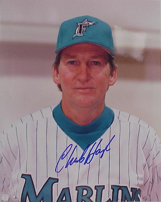
In other words, just figuring out some way to better way to balance the blue and black in that set could have made it look better, instead of letting the black completely dominate. That's really my only complaint. It's actually kind of the same problem that the Marlins have had for decades. I guess black jerseys and caps just sell better than bright blue (or orange) ones. That's the only explanation I can think of.
As for the FSN scorebug... I think I may agree with you there. Or, at the very least, I can't think of one I like much better.
-
1
-
-
20 hours ago, QCS said:
Speaking of the new Hornets' statements, I really hope it's simply a purple version of our current set (preferably with Charlotte on it, although Hornets would also be acceptable). I'm tired of having jerseys from three different sets and as long as it uses both purple and teal effectively it would be a good-looking jersey.
Agreed... they have such a beautiful color scheme, and I remember fans - not just Charlotte fans, but pretty much all NBA fans - being so happy to see that classic purple and teal look again.
Then, just a few years later, what did we get... "BUZZ CITY." "CHA." Black jersey. Mint jersey.
I want exactly what you want, but that seems like reasonable request for like 15 years ago, not today. Nike's strategy seems to be to ignore the simplest, most elegant solution and instead come up with weird ugly convoluted designs and colors ... and then have the team wear them too often.
-
7
-
-
9 hours ago, -Akronite- said:
There's bad juju or whatever, but if the Knicks tossed every jersey they sucked in they'd have nothing to wear (I know I know, they're actually good this year). This is so beautiful and shelving it is a crime:
I'm guessing a Knicks orange jersey design is already somewhat in the works, since they're basically forced to churn out some new crappy uniform each year. They went with a black jersey this year, I've gotta think that another try at an orange jersey can't be too far behind, but I don't expect it to look anything like what's pictured above. That would make too much sense and look too good.
-
4
-
-
On 8/10/2020 at 3:03 AM, dmmdoublem said:
After keeping an eye out for years, I finally found a full game showing off the Oakland Athletics KICU package from the mid/late 2000's. This is from their final season on the channel before moving to CSN/NBCSCA full time the following year. I've always loved this era of KICU graphics, especially in the years prior to this one that used a score bug in the bottom right-hand corner (the score bar you see in this video was only used for one year; the rest of the package remained unchanged from the "bug" era of the prior handful of seasons). Unfortunately, this video isn't of the highest quality, but with how rare A's games from the mid-90's through late-00's are on YouTube, I'm grateful. EDIT: Here's literally three seconds of the score bug that was used in the prior season. I like the score bar used in the video below, but when I think of this era of the A's on KICU, I think of the bug. As mentioned previously, the rest of the graphics package didn't change upon the shift from bug to bar.
I never liked it when TV stations would have the scorebug/bar ONLY displayed during the "main" behind-the-pitcher camera view, and then have it disappear whenever any other different camera view was being displayed, including when the ball was actually in play. This always seemed very silly and annoying to me, and I'm glad that no TV station (that I know of) really does that anymore. If you're going to have a scorebug, just let us see it the whole time, ESPECIALLY when the ball is in play. Isn't that kind of the point of a scorebug? Haha.
-
1
-
-
On 3/25/2018 at 12:13 PM, MiK said:


Along with this -
But you know what? After seeing Checkers and Rally's next to each other, this is the first time I have realized that they don't use the same font.
Maybe this should be in the category of "related logos that are more different than you figured they would be." Which, now that I think about it, is basically the exact opposite of this thread.
-
2
-
-
Here's a really rare uniform matchup.
This picture is from 6/15/05, which was the series finale of a 3-game series of MIL @ TB. This series was the only time the Brewers in their current look ever played the Devil Rays in their green/black look. TB never played at MIL during the 7 years that these uniforms overlapped so the home-away reverse of this is a "matchup that never happened," which I find kind of surprising, even with it being an interleague matchup.
Sidenote, Hideo Nomo pitched for the Devil Rays in this game and earned his 200th career victory, I guess I wasn't following the league closely that year because I definitely don't recall Hideo Nomo ever pitching for Tampa Bay.
-
3
-
-
Nene spent 10 years on the Denver Nuggets. His rookie year (2002-2003) was the last year before they switched to powder blue, so he spent this one season wearing the older uniform.


You could also probably classify these pics as "players with the wrong hairstyle."
-
2
-
-
On 4/25/2017 at 10:49 AM, SilverBullet1929 said:
It didn't say it's his right uniform, I said it's not a wrong uniform for him. There is a difference. And I did say I'm biased as a Marlins fan since day one. I did agree with your prior post about him. As far as time wearing that uniform, Hough in a Marlins uniform is much like Zobrist in a Cubs uniform and it's hard to call Zobrist in a Cubs uniform wrong even though he's a Ray to most people.
Well, I think is a wrong uniform for him. I don't think a player wearing a uniform has to be "forgettable" or "blink of an eye" for it to be the player's wrong uniform, at all; in fact I think many of the posts in this thread are quite memorable, and that's why people are posting them.
Since you brought star players into this, I guess the classic example of this is Michael Jordan. I would go so far as to say that Michael Jordan in a Wizards uniform is practically the epitome of a player in wrong uniform. That does not mean that Jordan's years as a Wizard were forgettable or unsuccessful; quite the opposite actually, as pretty much every sports fan knows that he played for the Wizards the last two years of his career, and he actually had two pretty good years as a Wizard. I'm a Wizards fan and I would love to claim that Jordan looked right in a Wizards uniform, but the fact is that he did not, and I am not going to pretend that he did. The point is that he spent the vast majority of his career in a different uniform, and just rode out the last 2 years of his career in a different, "wrong" uniform ... like Hough.
-
17 hours ago, SilverBullet1929 said:
True but as a Marlins fan since 93 (actually earlier), it's hard to call Hough in a Marlins uniform as his wrong uniform. Being the Opening Day starter for both of the first 2 seasons, he didn't have a "blink and you'll miss it" role here like the other guys.
He pitched for around 10 years as a Dodger, then around 10 years as a Ranger, and then finished his career with 2 years as a Marlin. I would hardly call a uniform that a player wore for 2 years out of a 20+ year career his "right" uniform, regardless of whether he was an opening day starter when wearing them. -
On 4/17/2017 at 11:37 PM, SilverBullet1929 said:
I posted this last year with pics so I won't bother with all the pics again but along with Mike Piazza and Andre Dawson above, other significant players who have a Marlins uniform as their wrong uniform include Terry Pendleton, Tony Perez, Tim Raines, Aaron Boone, Ryan Dempster, Byung Hyung Kim, Adrian Gonzalez, Jason Grilli, Joe Girardi, Trevor Hoffman, Carlos Lee, Dan Haren, Mat Latos, Carlos Zambrano, Tino Martinez, Heath Bell, Rafael Furcal, and Placido Polanco.
Maybe not a "significant" player, but I would add Charlie Hough to that list. I remember watching him pitch for the Marlins in 1993, and remember it looking very jarring to see this oldish-looking guy in his mid-40s rocking that teal-heavy uniform that was clearly designed to look cool and trendy. A guy who spent the vast majority of his career pitching in the relatively traditional looks of the 70's Dodgers and 80's Rangers just did not look right in a Marlins uniform. I would say this is almost a case of "wrong uniform, wrong generation."
-
1
-
-
On 4/2/2017 at 11:45 PM, insert name said:
Sorry, I'm in the wrong thread. At some point I got confused with them because they all have similar names.
So I guess that was a "Post on the right theme but in the wrong thread." How meta.
-
1
-
-
18 hours ago, bwburke94 said:
Sonics KD is probably "wrong team", even though it's the right franchise.
No, it's the right team, just when it was under a different name. The Thunder and Sonics are the same team. Before KD moved to GSW, he had only played for one NBA team.
-
2
-


2021-22 NBA Changes
in Sports Logo News
Posted
I would say the Pistons are both boring and classic. And that's not necessarily a bad thing. But I'm also not against teams trying different things every now and then. And I do not put the Pistons into some untouchable category where I don't think they should be allowed to change anything at all. To me, they are not one of those "untouchable" team identities.
I actually respect the Pistons a lot for keeping things as consistent as they generally have. They've maintained essentially the same colors, logos, and uniforms (except for silly alts, but that goes for every team these days) for nearly 20 years (along with some occasional tweaks). My biggest complaint about the Pistons is their navy and gray/chrome alternate identity thing, but I am against alternate identities and color schemes for all teams, not just the Pistons.
I didn't particularly mind the Pistons' teal years. They were fun, they fit the era, and they looked good. I would not want them to be worn today, but they felt right for the time.
I'm often against change for the sake of change, but I find their new court rather inoffensive. It could have been SO much gaudier, ugly, and worse. It just doesn't strike me as something to get too bothered about. To say that teams should never change just to "try something different," I can't agree with that.
Finally, if you want to get really technical about keeping things classic and not changing just to try something different, I give you the court of the 1958 Detroit Pistons:
If you are truly a proponent of classic looks and not changing just to "try something different," you should be happy that the Pistons are "returning" to their original unpainted court. After all, their red/blue court was just "trying something different" - they never needed a red/blue court. They could have just kept the above court forever.