-
Posts
44 -
Joined
-
Last visited
Posts posted by Red-Knight
-
-
On 11/15/2023 at 9:31 AM, OchentaYOcho88 said:
Needs the guitar pant stripe and it would be dang near perfect.
yeah! I have been struggling finding a decent picture to see exactly what it looked like to recreate it. So stripes for now.
-
On 11/9/2023 at 8:57 PM, BengalErnst said:
I’d love to see your take on all the new AFL teams
Appreciate the support! Once we know all the teams, I may take a stab at this

-
It came out on Saturday morning, that the team is looking to do a brand refresh but still keep the old logos for merch. interview link
That news kind of stinks but hopefully the new brand is as kool as the original.
I spent the last feel days prior compiling some old logos and trying to vectorize and modernize some. I created a mini brand proposal of what a 2024 version of the kats could look like with the old marks. But alas...
-
 1
1
-
-
So the Nashville Kats are back!
Tried to make something similar to their 90s look in their first iteration.

-
 8
8
-
 1
1
-
-
I know this is a market not on the radar for the MASL, but they just built a new state-of-the-art arena which would be great for MASL soccer. Not too big, but not too small. SO for kicks and giggles, I designed a brand identity for an hypothetical expansion team in Clarksville. Tennessee Twisters.
Chose the name because I wanted to make a logo inspired by the Dallas Tornadoes of the NASL. That is the only reason haha.


-
 4
4
-
-
On 9/13/2023 at 9:13 PM, alexandre said:
That ice template is really cool- did you make it yourself?
Nah! Thanks though haha its from a guy named Orion Taylor https://www.orionataylor.ca/shop He has some great stuff for sale. Worth it for sure.
On 9/13/2023 at 11:48 PM, Vgkenjoyer said:This is incredible, I used to follow the SPHL a bit when the IceGators were still around, it fits exceptionally well with the other teams in the league’s logos.
Thanks so much! I am working on a concept for the team mascot just for fun! I think "Chopper" would be a fitting name
-
With the SPHL holding an exhibition in Clarksville on Oct. 13, it is rumored that the SPHL is looking to expand to the Clarksville market.
As someone who lives in the area, I took a stab at creating an SPHL expansion identity called the "Clarksville Force"
Tried to play on the military theme with the 101st next door at Fort Campbell. Plenty of other military themes in the SPHL too so it fits well.
I also thought it would be fun if this new SPHL team played up a rivalry with Knoxville, so I made up a cup that would go back and forth between the winners.


-
 4
4
-
-
Thanks for the feedback! Would something like the below fit the club culture and brand better?

-
 4
4
-
-
With the news that Bury will be back officially as a "Phoenix Club" in the English football pyramid, I thought I'd take a stab at redesigning their logo. Now I know they would never change since it has barely changed over their 100+ year history. But a merger of the 2 groups and rebirth of the club would be a perfect time for a rebrand. My goals were to make it bolder and more manageable for merchandising opportunities, yet at the same time still feel like Bury FC and capture the history. 2 concepts below. I included currents crests and some other concepts used as inspiration.


-
 6
6
-
 1
1
-
-
NHL - 33 Teams
Move Coyotes to Houston. They become the Houston Aeros.
Bring back the Atlanta Thrashers for 33 teams. 3 conferences of 11. Top 5 in each conference make the playoffs for total of 15 teams.1 wild card berth given to the team with the best record not in a playoff position for a total of 16 playoff teams.
16 teams are then re-seeded based on overall season record
84 game schedule. Every team plays home and away with every team not in its conference (22 teams - 44 games total). Play home and away twice with teams in own conference (10 other teams - 40 total games).
-
 2
2
-


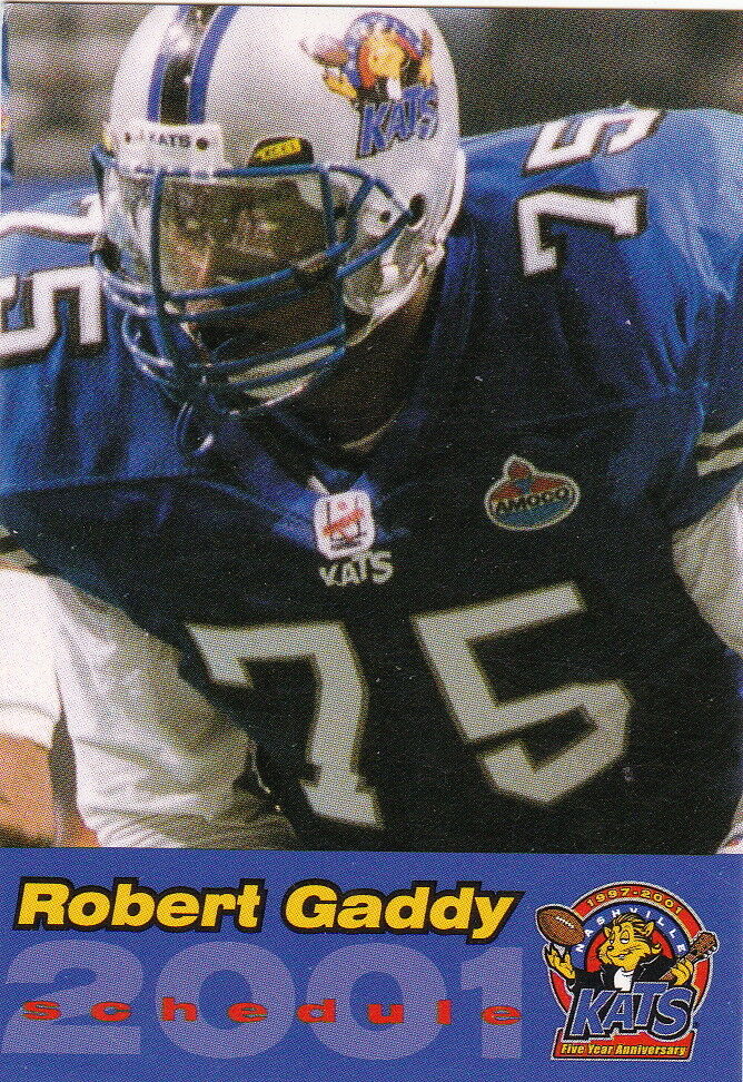
Nashville Kats (AFL) Uniform Concept
in Concepts
Posted
tried mocking it up. Couldn't get the numbers right but this is close enough
