-
Posts
3,781 -
Joined
-
Last visited
Posts posted by AJM
-
-
Sun Devils new black uni with some glow in the dark elements...
-
 1
1
-
 3
3
-
 3
3
-
 1
1
-
 1
1
-
-
Roma 23-24 Away
-
Just a sneak peak but happy to see white outline on player numbers return and the state flag removed from the chest.
-
 1
1
-
-
Not much here...but they're "in the building"
-
 12
12
-
-
Not much of a secret, but AS Roma makes switch to Adidas official. Now just holding out hope for nice looking kits.
-
 1
1
-
-
-
-
14 hours ago, LMU said:
I can tell you that Mesa has been a quiet convo in economic development circles in the valley for at least a year...somewhat in the background in case the deal fell apart. Fiesta Mall site.
-
On 5/14/2023 at 8:11 AM, TruColor said:
I'm thinking you might be right about that.
a closer look at those practice tees.
-
1 minute ago, kimball said:
Don't get me started on these garbage unis
 awful...definitely a failed attempt at trying to modernize the 90s throwbacks. Even worse was the grey sleeved abomination that they simply just slapped the western font wordmark on. Unfortunately I don't think simply bringing back that era's unis is on the table, which is a shame because I agree that they still hold up.
-
 2
2
-
-
4 hours ago, TheOatsMustFlow said:
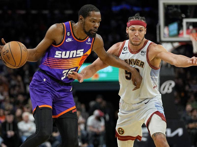
That twitter account has referenced these before...not a fan. Pretty sure its knowledge that Suns are getting new Association (white) and Icon (purple) jerseys next year, but hopefully far better executed than these.
Numbers used here don't match current set (implies new/updated numbers), numbers no longer match angle of trailing sun burst/rays, wordmark moved inside trailing sun burst/rays and has resulted in different angle and higher placement on chest, and basketball on both barely visible. All downgrades IMO if your goal is to refresh/modernize the classic edition.
Suns classic edition (90s throwbacks) for reference:

-
 1
1
-
-
Designer speak
-
-
2 minutes ago, jerrylawless3 said:
Take with a heavy pinch of salt
I'm not going to buy a lot of stock in info from someone with the username: pineapplevodkashot
-
 2
2
-
 6
6
-
-
obligatory twitter update
-
-
16 minutes ago, AJM said:
https://www.instagram.com/reel/CrCUo1zNvgT/?igshid=YmMyMTA2M2Y=
Still up on instagram...sneaky copper accents in this vid

-
https://www.instagram.com/reel/CrCUo1zNvgT/?igshid=YmMyMTA2M2Y=
Still up on instagram...sneaky copper accents in this vid

-
 1
1
-
-
12 minutes ago, HOOVER said:
If this is Photoshop, it’s a pretty decent one. Even has Valley of the Sun in the inside collar.Doubt the Cardinals would incorporate any elements specific to the valley or Greater Metro Phoenix area as a "state" named team.
State flag and copper or other "desert colors" (ugh) would make sense.
-
 1
1
-
-
-
Sun Devil baseball inspired uni and Mullett Arena inaugural season patch.
-
 4
4
-
-
27 minutes ago, Germanshepherd said:
Woof. These would at least be watchable if the numbers were maroon.
They're worse in person hahah. Traditionally that color has been reserved for salute to service/veterans themed unis...not much else to say here.
-
 1
1
-
-


Just sharing a game photo featuring ASU's 1975 throwbacks plus a cool/special element our equipment team did for Chinese-born RB Jackson He.
-
 14
14
-
-
Arizona State 1975 throwbacks to be worn on Dec. 5
-
 2
2
-


MLB 2024 Uniform/Logo Changes
in Sports Logo News
Posted