


crosfam
-
Posts
374 -
Joined
-
Last visited
-
Days Won
2
Posts posted by crosfam
-
-
6 hours ago, ManillaToad said:
The Giants look fantastic both home and away. Consistency is not a prerequisite for having a good look
I love the Giants look , save for the white home pants. They looked much better in gray. I like the B/W and W/R jerseys and that they differ so. The all white fauxbacks are a nice break.
-
 5
5
-
-
Just a few weeks before the draft and no official unveiling by the Bengals? And no new Cardinals uni this year? The horror...
-
On 2/21/2021 at 1:57 PM, dont care said:
What is “gunmetal blue?” They wore sea foam blue which looked nothing like any kind of gunmetal I’ve ever seen.
When they rolled those unis out, the new lighter (as opposed to Navy) metallic blue was referred to as gunmetal blue. Name wouldn't pass muster today.
-
1
-
-
1 hour ago, _DietDrPepper_ said:
I have to agree. I’d actually go as far as to say it’s better then the two uniforms that came after it. Them and the Falcons were the only teams to make the piping not look terrible. I enjoyed both those uniforms.
That helmet was awesome. Current one is nice but I miss teal flake as much as I miss Seahawk gunmetal blue. Neither coming back any day soon.
-
3
-
-
1 hour ago, lahaye7 said:
Love UNC Throwback look. A&M needs stripes on their pants (or socks.)
Great looking game. UNC has a nice white helmet, but blue is better. So glad A&M went back to simple unis from Manziel look.
-
1
-
-
NM bowl will likely feature red jersey vs green jersey. Unique history there wilth the state question, "red or green", meaning what chile do you want. Chile, not chili.
-
21 hours ago, Lights Out said:
I thought the blue helmets would look nice, but for some reason, I'm not really liking it - even with the blue pants to match. They look like Kentucky when the camera's zoomed out.
I like variety, but Florida should stick to classic orange helmets. I like when they switch up orange and blue tops and pants though.
-
3
-
-
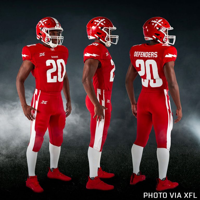
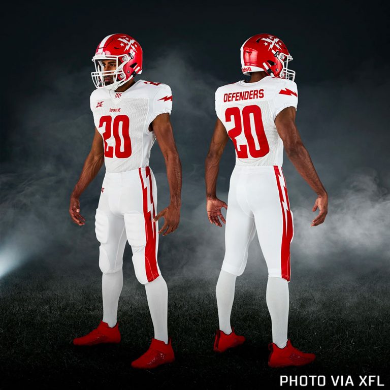
Oilers+American Red/White/Blue + Patriots = Houston Roughnecks. Simple formula. Not much white, but implied. I thought I'd hate it but it grew on me. As for the Vipers double green, I bet they wanted a distinctive garish look that would remind folks a bit of the distinctive garish original Buccaneers.
-
5 hours ago, MJWalker45 said:
Seattle would look so much better with white pants at home.
Yes they would. As a Seattle fan, the blue pants look to "broncoish" to me. Change the pant stripe to green for continuity with jersey and go W/W/B or W/B/W. Orange cleats work.
-
The Houston Patriots, I mean Roughnecks, almost look great. The blue numbers should be white or light gray. LA is OK.
-
1
-
-
Seattle Dragons. Helmet great, but lessen the orange. Go with more blue with dark green trim, and a just touch of orange. TV had a dragon graphic that was primary blue that looked nice. Orange cleats were cool, but not looking forward to orange striped pants next week.
-
1
-
-
17 hours ago, oldschoolvikings said:
If they were to get rid of the red pants and add some red socks, this would be my favorite of the bunch;

I think most teams want two pant options, but DC would look good red over white and white over red. As a Seattle fan, I hate the blue/orange home pants, especially with a white helmet. Too much orange for me. They could retire them now.
-
I am a Seattle fan, so I will enthusiastically support Jim Zorn and the Dragons. But I can't support my team looking like the Denver Broncos. Please put away the blue and orange pants and wear the white pants with green stripe home and away. It will look better with the white helmet anyway.
-
I live in ABQ. I love the "Green Chili Cheeseburgers" identity and unis the most.
-
1
-
-
3 hours ago, DG_Now said:
Unclickbaiting from the mothership:
I like Dragons because it's a plural that ends in "s." I'm very simple.
Sea Dragons maybe? I am bummed none of them are sea related.

NFL Changes 2021
in Sports Logo News
Posted
I finally saw Bengals in action last night. Huge improvement. Lets hope white side panels on color jerseys never resurface. Thier white jersey is likely thier best look.