


AndrewMLind
-
Posts
1,219 -
Joined
-
Last visited
-
Days Won
4
Posts posted by AndrewMLind
-
-
8 minutes ago, CDCLT said:
The O's hat sucks.
This may very well be a case of the fans of the team liking something more than outsiders. The O's hat is fantastic, and most Orioles fans I know agree with that sentiment. I like the City Connect hat because it's new and a unique twist on something they only wore for one season, but I don't like it more than the O's hat or want to see that replace the O's hat, only add to it.
-
On 5/22/2023 at 10:13 AM, Shumway said:
...throw that awful "O's" cap in the trash where it belongs.
I'm glad some of you aren't in charge of my favorite team. You would have to update their Cartoon Bird logo if you did that, since it is wearing an O's cap, but I thoroughly enjoy that small detail and that hat.
-
 1
1
-
 1
1
-
-
48 minutes ago, aawagner011 said:
The belt should be orange. No reason for it to stick out that much.
This is my only complaint (maybe that it needs an orange bill, too). I love them otherwise. They still look like the Orioles and aren't over the top like some City Connect uniforms.
-
2
-
-
Most fans were always going to be disappointed if they didn't look like Old Bay tin cans or feature "Charm City" in the Domino Sugars sign font across the chest, but I'm going to reserve judgment until they're unveiled.
I think the hat is going to be fantastic, the white wordmark reminds me of their Turn Ahead The Clock jersey and the subtle orange accents should really pop on an all-black uniform. Just hard to create a brand new city-specific look for a team that already has one of the best uniforms in the league without borrowing too many design cues from said look and everyone like it.
-
1
-
1
-
-
I received this graphic in an email the other day, which includes pattern you can see on the jock tag, sleeve cuffs and patch on the left sleeve of the leaked jersey. The white "B" is in that patch and jock tag, and every indication is that's what will be on the hat, as well, though I'd rather it be orange.

-
2 hours ago, the admiral said:
I've always wanted a B hat for the Orioles. The idea that people would confuse a black and orange hat with a cursive letter with a navy and red hat with a Tuscan letter feels like a reach. May it one day replace the terrible cartoon bird.
This post started off with so much promise.
-
7
-
 1
1
-
-
2 hours ago, aawagner011 said:
Can we stop with the special holiday caps? We don’t need these ugly merch dump caps that don’t match any team’s uniform. Mother’s and Father’s Day, Armed Forces, and Independence Day caps are all needless. Just put a little classy flag on the side for Independence Day. Maybe a ribbon for Memorial Day. I might be missing a holiday or two. I can’t keep up with which holidays get a cap and which don’t.
From a uniform aesthetic standpoint, I completely agree, but I also understand why they're worn on the field from a merchandise standpoint. There are many people who buy them solely because the team actually wore them rather than any other fashion hats that are on the shelves. In fact, my father-in-law actually purchased one after seeing them worn this weekend and he would have never done so otherwise.
-
2
-
-
It is hidden in the release, but the Hornets are getting a new Classic Edition uniform next season. They previously wore a teal classic uniform in 2017-18, white classic uniform in 2018-19 and purple classic uniform in 2019-20.
-
3
-
-
The XFL end zones remind me of the first few Big Ten Championship games, when they used a small italicized font (which I believe aligned with FOX's brand).
-
For those, like me, who wished the numbers matched the wordmark:
-
4
-
-
The new template's biggest issue could be solved by the V touching the bottom of the collar, which would allow the wordmark and numbers to be moved up an inch or two and not make the template look bunched below the collar, but Nike clearly wanted to make that part distinct.
-
6
-
-
On 5/2/2023 at 7:43 PM, BBTV said:
Melo-era colors with the alt wordmark from the navy jersey could have been their forever jersey.
I have never agreed with something more. The Nuggets' look has gone downhill ever since they slightly altered the design ahead of the 2010-11 season alongside the move to the Rev30 template, and especially since they moved away from powder blue.
-
28 minutes ago, upperV03 said:
It’s been called both things since it was first revealed by Oregon in 2019. When the Ducks unveiled the 2019 uniforms on social media, they called it Vapor Fusion. Then they put out this graphic before the first game of the 2019 season calling it Vapor F.U.S.E.:
That was my point. When it was first revealed over the summer, Oregon called it Fusion, which I've confirmed with Nike sources was the original name for the template. Oregon then started using Fusion and F.U.S.E. interchangeably about a month later, which was likely a mistake given the catalog version's name. Eventually, Nike just leaned into that moniker for both versions, which is why we're seeing that used now.
-
14 hours ago, Old School Fool said:
I really hope those perforated numbers aren't on every jersey, it will look stupid for teams like the Raiders, Bears and Packers among others.
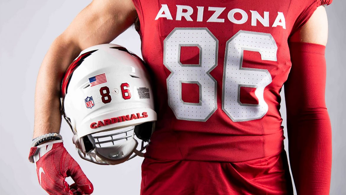
They won't be. Oregon has them, but Ohio State and Georgia did not (and, like Florida State and others, will not have them when they move to the template on a full-time basis this season). Arizona is the only NFL team that I'm aware will have them.
-
On 5/5/2023 at 11:13 AM, bowld said:
Field Utility Special Edition...

Its a football jersey....
Interestingly, the template was originally called Vapor Fusion and the catalog version was Vapor F.U.S.E, just like the catalog version of Vapor Untouchable is Vapor Pro, but somewhere along the way, Nike adopted F.U.S.E. for both. I somewhat refuse to call it anything other than Fusion, though. Looks better, sounds better, etc.
-
1 hour ago, ssj_homeslice said:
The reebok/ripon era looks like the dark ages compared to now.
I thought NFL uniforms started looking cheap in the mid-2000s, especially once college football started using newer templates (see: Miami Hurricanes in 2004). I couldn't wait for Nike to get the contract.
-
1
-
 1
1
-
-
5 hours ago, Ted Cunningham said:
Also, rewinding just a bit:
- When previous posts talked about Houston wearing a red helmet and blue jerseys, I, too, thought of the Memphis Express of the AAF. Keep the white pants though; no need to go red/blue/red/blue.
- I think contrast is key for Houston: with both options going over white pants, I think they'd look good in either of a blue helmet/red jersey combo or a red helmet/blue jersey combo. Even if Buffalo got a wild idea about making their 90s look (or something similar) permanent, there's enough of a difference in the two looks that having both Houston and Buffalo in red/blue/white/(whatever color socks) would be fine.
I'd prefer red helmets, blue jerseys, blue pants and red socks.
-
1
-
 1
1
-
 2
2
-
Had a friend on site send me these illustrated logos from the 2023 NFL Draft. They're on signage and fencing all over the draft hub:
-
8
-
-
No changes to the Panthers' collar or TV numbers and blue is still listed as the alternate. I imagine the TV numbers will still be pretty small on the players given how much there is to fit on the shoulders and sleeves:
-
2
-
-
18 hours ago, BadSeed84 said:
No, its just the bumps in the helmet giving you that impression.
It is only shaded with "3d" effects.
There aren't any "bumps" in that area. The curvature of the helmet plus the design of that logo is what gives off the 3D effect, otherwise every logo that wraps around the helmet would do that.
-
The Cardinals' press release referred to the helmet logo as "3D," which I initially brushed off as them not really knowing how to explain the metallic gradient design. However, this angle absolutely gives off a three-dimensional feel, ala some of Simon Brokmann's work:
-
4
-
2
-
1
-
-
Got this email from PETA this morning:
In response to the Cleveland Browns’ request for fan submissions for a new dog logo, PETA is sending a letter today to team owner Jimmy Haslam urging him to choose a brown mixed-breed dog from an animal shelter for the design. The group notes that bullmastiffs, such as the current team mascot, Swagger Jr., are a breathing-impaired breed prone to heart murmurs, hip dysplasia, and other painful conditions and that promoting this breed through the logo would contribute to the homeless-dog crisis by encouraging fans to increase the demand to breed more of them while dogs in shelters lose the opportunity to be adopted into a loving home. Featuring a homeless dog could instead inspire fans to save a life by finding their next animal companion at a shelter.“The Dawg Pound has had a rough time of it, but the 70 million animals who are homeless in the U.S. right now face far worse,” says PETA President Ingrid Newkirk. “PETA is calling on Jimmy Haslam to score a win for these dogs by promoting adoption and making a dog from a shelter the new face of the franchise.”I appreciate the sentiment, but I feel like them encouraging the Browns to do a shelter drive alongside of the logo search/unveiling would be a better way to help/bring awareness to the animals than simply modeling the new logo after a specific dog or breed.-
1
-
-
My initial thoughts are that they simply needed to put the stripes on the red jersey and pants and the wordmark on the white and black jerseys. Would have been both classic and modern, but it feels a bit disconnected between the home vs road/alternate uniforms right now.
That said, considering this was my concept from three years ago, I'm not all that disappointed with the overall direction:
-
6
-
-
1 minute ago, TheMilkman said:
The Cardinals instagram profile pic is blank??? New logo???
Might just be your connection. I see the same logo they have on Twitter.


2024 NFL Changes
in Sports Logo News
Posted
To be fair, the Broncos' rumors that were first shared on Reddit seem to have some credibility when you could have easily dismissed them as "Reddit junk," as well. We also didn't report that the Seahawks were getting new uniforms, only presented the rumor, gave historical context and reached out to the Seahawks to allow them to confirm or deny the rumor. They never responded. Now that they have, we'll have another story. We did exactly what we're supposed to do, whether a rumor turns out to be true or not.