


BVZ
-
Posts
160 -
Joined
-
Last visited
Posts posted by BVZ
-
-
Gators will look brilliant this weekend. I am shocked by how much I like that look, as a one off. Would prefer a glossy shell, but the script, white face mask and striping is all consistent with their normal look.
I can understand why if they were going to wear a blue lid in a non-throwback way, this was the time to try it. Tennessee wears orange with white lids. The blue lids and pants should look great. Big fan of most of the changes Florida has made under the Jordan brand.
-
 1
1
-
-
4 hours ago, WavePunter said:
Makes life hell for the equipment staff.. even simple things like quickly snagging a jersey from the rack takes longer without TV numbers..
Makes life hell for the equipment staff? Having to look at the front or the back of the jersey is hell now? Good grief man, give me a break. They signed up for this.Someone was on here last week complaining about having to re-paint the Notre Dame helmets each week, which used to be a tradition. I guess going the extra mile to make something special just isn’t valued like it once was. Its a damn shame if you ask me. End rant
-
3
-
-
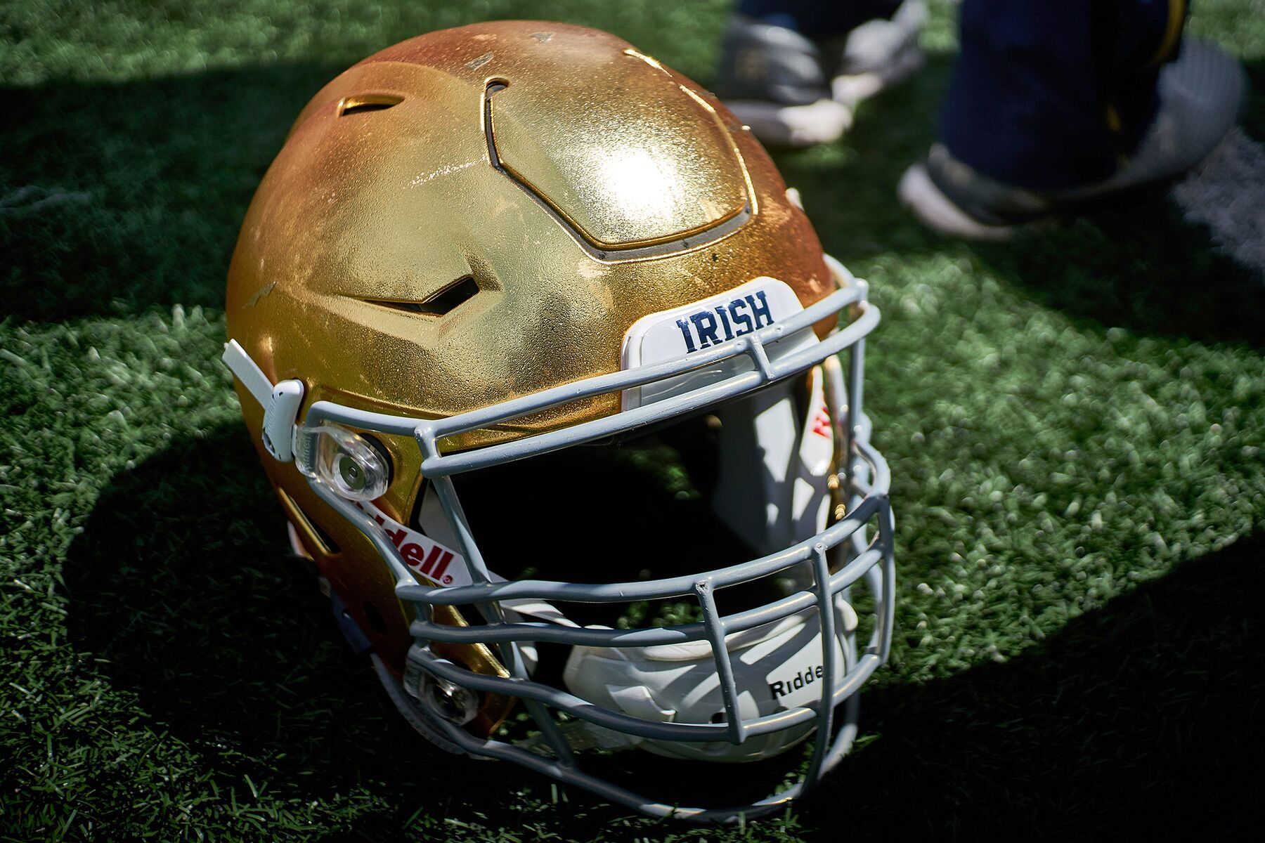
On 11/9/2020 at 12:00 PM, DPHF said:
How is the current ND helmet not true gold? From where I'm sitting, it's the truest gold in sports. And it's now much more representative of the Golden Dome from which it draws inspiration.
Are you referring to the actual gold flecked paint from their previous helmets? Because these still have gold in the paint, but this application doesn't have to be re-painted every week (which is enough to make me love this current helmet, as someone who used to be a part of that weekly re-painting. It always made for a fun fact, but a decidedly unfun process.)
Just seemed to be a green tint to the lids Saturday night. Maybe it was my tv.I preferred the gold used during the Brady Quinn years. Not concerned with how it’s painted, just how it looks.
-
1
-
-
12 hours ago, ramsjetsthunder said:
I'd like to take a moment to honor one of the greatest uniform elements in sports history that is too often forgotten.

Hate how they look green on TV now. Would look great for South Florida, but they need to go back to the true gold, in my opinion -
Gators going with the blue pants tomorrow. Assuming A&M will be in the standard maroon tops with white pants.
Should be a great looking matchup.
The last time Florida came to Kyle field was Manziel‘s first start and the Aggies first game in the SEC. A&M wore their new adidas uniforms with the shoulder stripes, while Florida (still outfitted by Nike) went all white the Orange lids. A&M lost by a field goal, which proved to be the difference in them going to the SEC championship game over Alabama.
-
This is a traditional A&M uniform. I think everyone liked the previous set when it was revealed, but it’s tied to the Sumlin era. The removal of the number beveling, helmet finish back to glossy, and white masks were necessary changes.
I know some would have liked to keep the shoulder stripes, but this is a no-nonsense look and fits the mentality Jimbo is trying to bring back to the program. Nothing flashy, let the play on the field speak for itself. I think the players and fans will both like these uniforms. Wear white socks always, and white pants on the road!
-
Was really hoping to see maroon collars and cuffs on the away uniforms. Adidas fan jerseys are vastly inferior to what Nike produces.
Looking forward to seeing the rest of the new custom number font. I’m not a fan of the trend of random notches in numbers but these look very subtle. Overall, a massive upgrade with the return of glossy helmets and white face mask with an enlarged wordmark. As an Aggie, I really like the look. I do think white socks would be much better than black.
-
5
-
-
1 hour ago, Clintau24 said:
Florida is releasing Ring of Honor merch for each inductee during the next few years. It's a merch drop, highly doubtful they have any connection to on-field uniforms.
They also dropped a Jack Youngblood jersey alongside the Emmitt Smith
I realize I am probably in the minority here, but I much prefer this striping on the away's to what they have currently. The floating stripes look fine, and I understand they provide consistency. But when paired with the current away numbers, this look would be consistent as well, sharper overall, and historically relevant.
Count me as a fan of the above Emmit Smith orange jersey as well. The blue just pops so much more as the middle stripe. Florida has great uniforms, some of the best in all of college football but I think they are still a few tweaks away from perfection. Not a fan of the white alternate lids, but the throwbacks vs Auburn last year were top notch.
-
5
-
-
4 hours ago, Punchy_Gungus said:
While not quite as egregious as Native-American imagery, the fighting irish logo is certainly stereotypical, and potentially harmful. Stereotypical depiction of any race or people is racist. I feel like you could still use the name but lean more toward other imagery to avoid stereotypical depictions of a culture. Honoring the culture of a nation or tribe is all cool to me as long as there are no offensive imagery or names involved. As a user over on Brand New put it; 'No one wants to see their race, gender, or creed evoked to sell product.'
Hey man, no disrespect intended here because your comment was eloquently worded. But it’s a leprechaun. No different than Lucky Charms. No one is being harmed, in this instance.-
5
-
-
1 hour ago, JTernup said:
Agreed, SCAR is definitely not going Jordan, I would bet my life on it. As you mentioned, in football at least the Jordan branding is saved for elite programs and Jordan's alma mater. They have also given out Jordan branding for one of three reasons, Jordan affiliation (UNC), as a reward for long time Nike schools that have had a lot of success (UF, OU), or to sweeten the deal for a blue blood program making the jump to Nike (Michigan). SCAR definitively does not fit into any of those categories.
Not only that but it sure seems like Nike and Jordan have decided to use the Jordan branding on one school per conference, I'd bet given how they have handled it that each of the Jordan schools have some language in their contracts that states they will be the only Jordan outfitted school in their respective conferences.
Agreed. Although there is no way Jordan would allow schools to have an exclusive over the entire conference. If Alabama wanted to go with Jordan, they would find a way to make it happen.Far more likely that Jordan is just protecting their brand, as they always have. South Carolina wouldn’t make sense, but USC west coast would. Curious to see who the next school will be to jump on board.
-
1 hour ago, Brave-Bird 08 said:
I don't understand how so many people on these boards just prefer block fonts and chest wordmarks over something intentionally designed. The shoulder stripes and the well done bevels that tie into the logo make the current TAMU set a modern classic. I don't think they need to change a thing.
I think the current set is extremely well designed, and was perfect for A&M as we moved into the SEC with a high-powered Sumlin offense led by Manziel and Evans in 2012. In general I think Aggies like the uniforms, but the combos went overboard and the play on the field went down after Johnny left.
With Jimbo at the helm, we want a return to the classic, no-nonsense design. The bevels look fine on the numbers, but they look bad on the logo that inspires them. The glossy maroon helmets and white facemasks are superior to the satin lids and grey masks. I will say, I do like the shoulder and pants striping.
-
2
-
-
I expect A&M to adopt a version of their ‘98 throwbacks also full time. Mond, the AD, and the equipment staff have all responded to tweets which indicate this.
I think we’ll see the shoulder stripes removed, the bevel taken off the number font, an enlarged “Texas A&M” across the front with white facemasks. Probably a pair of maroon pants to wear on the road as well.


NFL 2023 Changes
in Sports Logo News
Posted
I enjoy hearing folks perspective on their uniform “rules of thumb” because I don’t necessarily have any myself, and immediately start looking for outliers. But you’re right.
I’m ok with the Patriots in silver helmets and navy pants (as long as the socks are white with striping - dynasty era), and I can get behind the Saints in gold helmets and black pants (with white socks and striping). But the Panthers always look best with silver pants to match their silver helmets, regardless of uniform color. They could ditch the silver altogether (full rebrand) as others have suggested, but then they wouldn’t look like the Panthers. Fix the helmet striping, clean up the uniform striping, ditch the shoulder numbers (or put them on the sleeve). Black or blue socks, and no leotards.