


sportzfan
-
Posts
610 -
Joined
-
Last visited
-
Days Won
1
Posts posted by sportzfan
-
-
You are 1insaneguyFor some reason I like the Bills old uniforms. Don't get me wrong, I actually like their current uniforms. I just really like these for some strange reason:

(I know that nobody agrees with me.)
-
 1
1
-
-
All-one-color uniforms should be outlawed.
So should black alts.
Is it really unpopular?
for every sport except basketball, and some cases for hockey, and some cases for soccer. Hell even football has some cases where monochrome looks good.
-
Looks a little too busy, they look more like ugly Christmas sweaters than hockey sweaters. I don't mind the trees on the alt because it's an alt and the creativity is really cool. but the home and rode have way too many colors and stripes of all kinds of widths. I think getting rid of the colors at the end of the sleeves and making the tan around the stripes symetrical it would look a lot better
-
No it's definitely right for him. He raced that car for 4 years I think. And that's more than long enough to be considered right for any driver with how often sponsors switchThis one never looked right on him...or anyone.

Valvoline will always be Mark Martin's proper uniform to me.
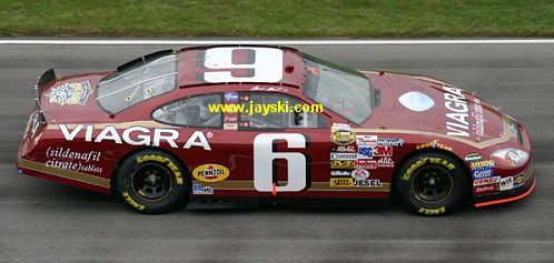
Here's a weird one too...Viagra painted on the old Folgers scheme:
-
I really like that Super Bowl ring personally. You can tell its a Redskins ring without it having any Redskins logos on it but instead having the feathers from the logo. I also like it because one of my dads friends had a mold for the faces of those rings and i thought it was really cool when i saw it as a kid because i never saw anything like it before.
-
the logo needs a little bit of cleaning up (just pixilated a little bit), but outside of that this is a great concept, blue and grey is much better than blue and black for the lightning, and infinitely better than blue and white of the current tampa bay maple wings.
-
I like the Jaguars and bengals full body logos because they seem the most natural. The panthers one seems like a very unsual way for the panthers head to be turned. The Seahawks looks more like an illustration, and I don't know what the Broncos one is even trying to do.
-
-
i wouldn't consider something rare when they play in those jerseys for 3+ years, the hornets and pacers played in those uniforms for 5 years, and nets and hawks played for 3, and had to play each other at least 2x each year.
-
didn't the hawks and cavs play in those uni sets for 5 straight years?
-
the fact that i never noticed the navy before proves my point, the colors bleed together, and you are right its not royal, just don't know what else to call it (seafoam blue from the old seahawks jerseys?)
-
Having the navy and royal blue isn't working, especially with them right next to each other they bleed together and get lost.
-
I believe they kept the rippon template, I can't find anything about them having techfit jerseys on Google
Packers too.
Yes, the Jaguars, Giants, and certain colts players had them before the switch to nikeIs Torry Holt in a TechFit jersey like the ones talked about before?
-
Yes, the Jaguars, Giants, and certain colts players had them before the switch to nikeIs Torry Holt in a TechFit jersey like the ones talked about before?
-
Very ugly, it looks like a counterfeit ring
-
your sig is huge

Unpopular Opinions
in Sports Logo General Discussion
Posted