


EBrooks
-
Posts
31 -
Joined
-
Last visited
Posts posted by EBrooks
-
-
2 hours ago, coco1997 said:
Thanks!
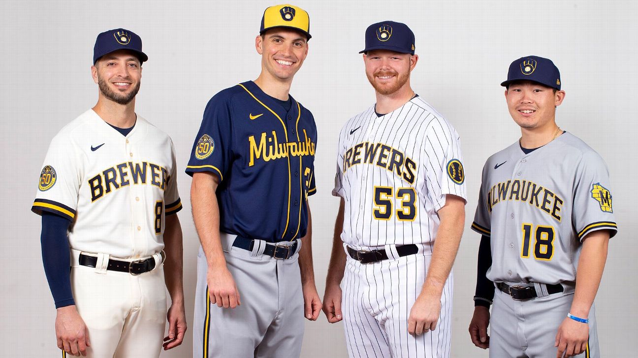
Up today is my tweak of the Brewers set which was unveiled yesterday:
BREWERS:
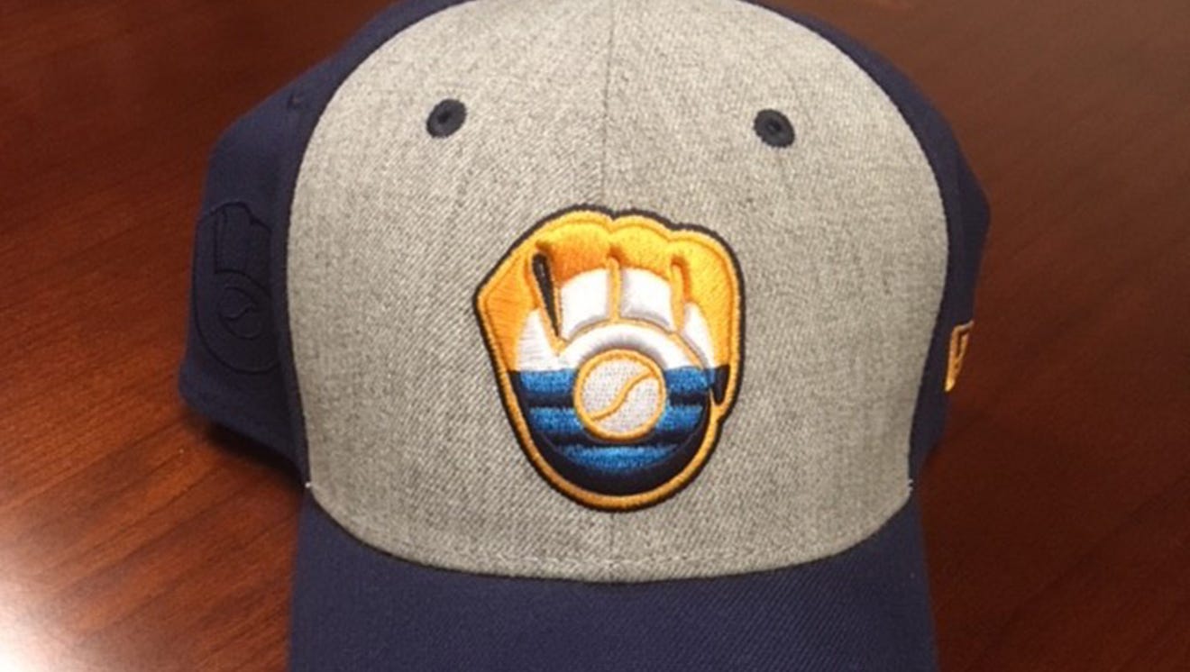
All in all I like what Nike did with Milwaukee, but I can't help but find the set a bit half baked. The first change I knew I had to make was was POWDER. BLUE. PANTS. It blows my mind that, given the number of teams to jump back on the powder blue bandwagon over the past few years, the Brewers of all teams have held out. This was the perfect opportunity to recommit to it and they still blew it.The next big change was the cap design. Based on countless comments I've read both on this forum and on Twitter, everyone seems to dislike the cap. (I saw a fair number of Brewers fans suggest putting the baseball grill logo on the cap, but I tried that and it just doesn't work.) Personally, I appreciate what Nike was trying to do here, but I don't think the execution works, so I decided to scrap the MKE/44 altogether and, inspired by this fashion cap I came across online, come up with a new design that combines the BiG logo with the People's Flag of Milwaukee.
Here's a closer look at the cap logo:
I also modified the team's current barrel style numbers to match the "Brew Crew" script--gold with navy drop shadows. I added front numbers because I think they help balance the design and bring it in line with their other jerseys. I was initially annoyed by the lack of navy piping on the sleeves, but after reading that it's supposed to resemble foamy beer, I was OK with it. And given that explanation, it made no sense to keep the single stripe of gold on the collar. The baseball grill on the sleeve remains goes untouched because it's easily the single best thing about the entire design.
I also worked up a version of the uniform in colors truer to the People's Flag:
It's definitely more distinctive than powder blue, but I'm not convinced it wouldn't make people's retinas detach on the field.
Let me know what you think! I hope I did your team proud, @NicDB.
Overall, I like the changes you made to the Brewers City Connect—especially the number font and powder blue pants.
As a Brewers fan, the City uniforms were fine but there was just nothing that really screams Milwaukee to me (Nothing against your concept, but I can’t stand the City of Milwaukee flag and think it’s incredibly overplayed).
These are some ideas that I had to make the uniforms more “Milwaukee”—would be interested to see if you could work with any of them!
-Find a way to utilize the barley leaf somewhere in the design. This to me was the biggest miss
-Use the font from the Summerfest marquee for the script on the front of the uniform
-Subtle brick pattern on the numbers OR use a barrel pattern (imo, the Barrelman logo is criminally underused)
-Use the face/outline of the Allen-Bradley clock tower as a frame for the cap logo or sleeve logo (This might make things a little cluttered, but it’s such an iconic part of the Milwaukee skyline).
Keep up the great work! Really glad I found this series.
-
 1
1
-
-
Reminds me a lot of the Air Force Academy's logo/colors


City Connect tweaks (Phillies 4/9)
in Concepts
Posted