Rygi13
-
Posts
304 -
Joined
-
Last visited
-
Days Won
1
Posts posted by Rygi13
-
-
We finally know all of Adidas’ top 6 teams.
-
 1
1
-
-
Nebraska new template
-
 2
2
-
-
I think the design will be pretty subtle, similar to what they wear today.


-
 4
4
-
-
I’m assuming the numbers are just big because it’s a youth jersey
-
 4
4
-
-
New Michigan State Uniforms
-
-
OSU Grey Uniforms 2023
The white outlines on the numbers really make them pop against the grey. Great look, should be in the annual rotation.
-
 13
13
-
 1
1
-
-
Miami appears to be keeping the same Adidas uniform construction as last season, similar to Louisville.

-
 3
3
-
-
Are we expecting new Colorado uniforms at Pac12 media day?
-
Colts alternate would be perfect if they didn’t insist on adding black to them.
-
 6
6
-
-
4 hours ago, j'villejags said:
I'll be honest -- the state flag was subtle enough for me that I did not even know it was there. Looking at old pics and I kinda like it.
Looks like they are adding it back though on the side of the jersey though? Seems like an odd placement but I'll withhold judgement for now.Matches earlier leaks

Nebraska To Celebrate 100th Anniversary Of Memorial Stadium With Throwback Uniforms – SportsLogos.Net News
The old state flag treatment was much better.-
 7
7
-
-
I'm not positive, but I think they basically buy blank uniforms from Nike and then apply all of the graphics, numbers, etc.
I also have no clue how the financials work. Is Nike paying Cal? is BSN? are they both?
Will Nike produce and sell Cincy/ Cal gear? Will BSN be responsible for that? No idea.
-
Cal Golden Bears new uniforms
Our first look at the new Cal "Nike" uniforms provided by BSN same provider as Cincinnati. They carry over the same shoulder stripes from UA. However the "Cal" script on the chest seems really really low due to the FUSE template.
Overall, I'm impressed. BSN was able to create a unique uniform with custom striping and not just an off-the-shelf Nike template.


Better look at pant stripe:
-
 7
7
-
 1
1
-
-
This new construction could even allow for some cool throwbacks with laces!
1886 Indiana throwback
Based on these laced-up uniforms
-
Adidas is starting to roll out its new college football uniform template. I don't mind Adidas' more unconventional use of materials and uniform construction, I think it limits some of their creativity when it comes to designs. I wanted to see how a football uniform could look if Adidas brought the shoulder yolk and neck construction from their NHL hockey jerseys to the gridiron.
NHL Shoulder construction
NHL-inspired design on the right

The new design is much more in line with what Nike has been doing.
Neck Design Options
Here are a few images showing the different panels of the collar and how they could be combined for different looks.
What do you think? Should Adidas have gone in this direction? -
23 hours ago, monkeypower said:
This from Texas Tech football's local beat writer as Tech is doing a huge reno to their football stadium, including putting in new turf.
Someone get a drone out there!
-
2 minutes ago, TrueYankee26 said:
Pretty cool graphical video by Nebraska showing the progress of Memorial Stadium in 100 years
-
10 minutes ago, Htown1141 said:
Adidas gets a really bad rep here for their worst stuff, but they haven't made a bad primary look for a school since arguably UCLA in 2015? USF 2015? I argue that Texas A&M, Washington, Rutgers, NC State (I love the shoulder stripes and the new set), Louisville, USF (starting 2018), Miami, Georgia Tech, Mississippi State, Nebraska, and in the last few years BC, Kansas, and UTEP look as good, if not better, than they ever have. The alternates can get kinda quirky, sure, but for every "The 'Ville" set, there's 5 throwback sets that are lovingly researched (2018 Miami, 1939 and 1956 Texas A&M, 1990 UW, anything Mississippi State, anything Nebraska, 1950's Louisville) or a Mississippi State Statesmen/GT Black Watch sets that show a deep appreciation for their source material.
Their templates have been really strong since 2019 (the WVN A1 was released in 2019 and they fixed the collar on the primeknit), and their new top-end template, the A1 Ghost, looks to be their answer to the Vapor Untouchable. Their templated offerings with the primeknit left a lot to be desired with the weird half stripes, but if UTEP, Arkansas State's 2022 white uniform, and LA Tech's powders are anything to go by, most schools seem to be switching to the WVN that gives them as many templated sleeve offerings that go all the way across the caps, as well as UCLA stripes.
Put some respect on their name, Adidas does almost all FBS schools right and will accommodate for CD's designs as well (UTSA's Christopher Muñoz designed their current set). At this point, their hit rate is arguably higher than Nike's, and any proprietary numerals (2012 or 2020 A&M, UW, Louisville, GT [although I think these were designed by someone externally], NC State, Nebraska, Indiana, USF) go toe to toe with anything Nike has pumped out in the last half decade.
Indiana's new primary look is awful, but other than that I agree with you.

-
 1
1
-
-
First look at Cincinnati's new uniforms? I hope these are just a placeholder for media day, because these look extremely cheap. They do have a weird apparel deal with BSN Sports who sells uniforms to high schools.

They appear to be on this template with the mesh side panels.
Sidenote: I love Houston's "hidden" shoulder stripes. I've never noticed them before but its a nice subtle touch to their uniforms that makes them feel even more premium! -
Something like this probably

-
 1
1
-
-
11 minutes ago, tBBP said:
Are those supposed to be a relic to the Antwaam Randle El days? (Is that the throwback they're talking about?)
Whatever the case, definite downgrade—but it also seems like this one falls on IU, not their supplier.
It’s a fauxback to the Bill Mallory era.

-
New Indiana Football Uniforms


As an Indiana fan. I hate these. The mismatched fonts, BFBS, and cheap materials are embarrassing. Indiana's deal with Adidas is notably up at the end of June 2024, could this be a sign of a rocky relationship with Adidas?
I doubt it. I think Tom Allen just loves the throwback look and black accents and made Adidas change the design too late in the process and ended up getting cheaper materials.-
 8
8
-
 1
1
-
-
On 6/21/2023 at 2:33 PM, bowld said:
Imagine this helmet with white jersey and blue pants, in a 1PM sunny game @ SF.


Quick rough mockup-
 17
17
-
 8
8
-
 1
1
-
-
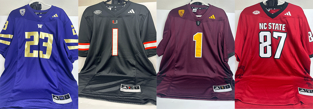
Looks like Adidas is introducing a new uniform material/ knit pattern. Gone is the chevron pattern on the chest. It also looks like the "W" logo moves to the actual collar instead of being applied to the jersey under the collar.
Love to see the return of pant stripes. It seemed like Adidas and Nike were dead set on killing the pant stripe. At least Adidas seems to be bringing them back!
Looking forward to seeing the rest of Adidas' portfolio updated.

-
 1
1
-


College Football 2023
in Sports Logo News
Posted
https://uni-watch.com/2023/07/05/exclusive-adidass-caste-system-for-college-football-uni-templates/