


Rygi13
-
Posts
305 -
Joined
-
Last visited
-
Days Won
1
Posts posted by Rygi13
-
-
-
2 hours ago, MNtwins3 said:
I could really see ND becoming a Jordan school
I don't think ND has the Jordan je ne se quoi. I also don't see them putting an idol of a non-catholic man on their uniforms.
-
I put together some photoshops of some of these designs to give a more realistic look at how they'd appear in person and on tv.
Toronto
New Jersey
Seattle
-
 2
2
-
-
Saw this article today: Imgur is banning p*** and purging old anonymous uploads - The Verge
Most of the concepts I've posted on this board have been hosted on Imgur without an account. I've created a new imgur account and started to upload all of my old pictures and am in the process of changing the embed links on my old post. It's pretty easy but time-consuming!
I wanted to give everyone a heads-up because I would hate for all the great stuff posted here to disappear when Imgur purges anonymously posted content!
Not sure if this is the right place to post this, but wanted to spread the word!
-
5
-
 1
1
-
-
Heritage Classic - Commonwealth Stadium
The "Battle of Alberta" appears to be hitting the pond next season. The Flames and Oilers will both wear province centered uniforms as they fight for provincial supremacy and braggin' rights. The color-on-color matchup will feature sweaters in Alberta's provincial colors of blue and gold.
EdmontonAlberta OilersThe Oilers dig back into their past and bring out a recolored version of their inaugural, 1972 WHA "Alberta Oilers'", orange sweater. The blue and orange are swapped, Reverse Retro style. The "Oilers" wordmark is replaced with Alberta on the crest.
AtlantaCalgaryAlberta FlamesThe Flames also throw it back to 1972, their first season in Atlanta. The iconic Flames' "A" comes back, this time to represent "Alberta". The "A" is placed on a gold sweater, for the first time in Flame's history. The new uniform swaps white and gold from the team's first white uniform.
-
2
-
-
Montreal Canadiens - Reverse Retro-ish
This concept stretches the reverse retro concept a bit and more into the City Connect/ City Edition territory. The Habs alternate draws inspiration from the flag of Montreal. The traditional stripe is bisected by a vertical stripe. I couldn't decide between a full cross and a subtler look. The fleur de lis, rose, shamrock, and thistle from the flag are finished in silver. The White pine from the center of the flag is located inside the collar.
-
3
-
-
2023 Stadium Series
The Canes host the Caps at NC State's Carter-Finley Stadium. Inspired by the games' setting both teams will wear College Football inspired uniforms. Neither team will wear white in the spirit of College Football's amazing color vs color matchups.
Carolina Hurricanes
The Canes' uniforms are inspired by their NC State's 1970's uniforms. The sleeve stripes are pulled directly from the gridiron and the C on the chest is a nod to letter logos seen across college sports. The TV numbers appear on the shoulders, a common sight in football and are rendered in a font inspired by State's "S" helmet sticker.
Washington Capitals
The Caps sweater also features a letter on the chest. Washington draws inspiration from the Annapolis based Navy Midshipmen's football history. The W on the chest features stars above, as does Navy's primary logo. The football style shoulder stripes come from the Navy's uniforms of the 60's. Oversized TV numbers adorn the sleeves so they can be seen from Carter-Finley's nosebleeds. -
2023 Winter Classic
The Pens and Bruins will Clash at Bostons' Fenway park. Check out my other thread in which I mocked up the rink for this game. Today, both teams announced the logos they will wear during the game. I took these logos and mocked up what I think they should wear this winter.
Pittsburgh Penguins
The visitors rock cream color sweaters inspired by the Pittsburgh Pirates uniforms from the 20's. The team also revealed the logo on a cream background, which I took as a clue. The sleeve feature bold numbers, stripes and patches of the city's coat of arms large enough to be seen across the stadium.Boston Bruins
The hosts wear an inverted version of their 1948 white uniforms, which inspired the wordmark on this years jersey. The "Spoked B" logo from that year is featured as a shoulder patch. Large stripes adorn the sleeves, but absent are any player numbers in line with the 48/49 uniforms.-
3
-
-
Chicago Blackhawks - Portland Rosebuds Reverse Retro
This may be a bit of a stretch since the Blackhawks didn't move to Chicago from Portland, but "an ownership group based in Chicago purchased the rights to each Rosebuds player and used the existing roster to form the Chicago Blackhawks in 1926". This uniform dates back to, as far as I can tell, 1915. The circus font on the chest changes from Portland to Chicago and the crossed hockey sticks are replaced with the Hawk's crossed tomahawks.
I decided to keep the color of the original uniform since it adds a new color to Chicago's uniform history. However, in the spirit of Reverse Retro, I made another version in Black to closer match the Hawk' colors.-
3
-
 1
1
-
-
Winnipeg Jets - Atlanta Thrashers Reverse Retro
The Jets throw it back to the Thrashers era in Atlanta. The jersey is primarily styled after the team's 2006/07 look. The Jets opt for a simpler version of their primary logo on the center of the sweater, a slight nod to the Thrashers' more angular alternate logo. Jets replace the arrows on the bottom of the jersey. The "Winnipeg" wordmark replacing "Atlanta" on the left sleeve. The right sleeve wraps of the uniform with the "Jets" script wordmark and the Thrashers' font for the players numbers.
-
2
-
-
While Indiana has some pretty nice and simple end zones (with a font that matches Assembly Hall's baseline), I would love to see them embrace the Candy Stripe motif in the end zones.
Indiana has experimented with some funkier end zone designs in the past...-
4
-
-
Found this cool picture of the Portland Winterhawks ice in 2016 with a large center ice logo!
-
1
-
-
The Seahawks do own "neon". This new set is a mashup of the Midnight Green and Kelly Green eras.
-
1
-
-
The Eagles' social media channels have been using a lot of neon green the past few seasons and the team just wore neon green numbers to practice the other day. I thought the numbers actually looked pretty good paired with the midnight green jerseys.
I thought I'd take a stab at designing a new set that incorporates candy apple green as a secondary color, while also removing black from the set. I've always thought the black and midnight green combination looks terrible, especially on the large Nike collars.
The new Home set features neon green numbers and the team's new "controversial" wordmark, which I actually quite like. The arm cuffs feature a truncated contrasting stripe. The pants feature a new stripe that is an evolution of the team's current set, which are a contrast nightmare. The helmet features a color shifting paint job with a midnight green base and sparkles a lighter shade when it catches the light.
The away set swaps the lighter numbers for midnight green and a midnight facemask for a white one.
The Color Rush set introduces an alternate helmet with a lighter helmet, a nod to the kelly green days while keeping with the new modern eagles identity.
-
3
-
-
I found this example from the Olympics of a rink playing around with the concept of "hiding" the center line. I'd love to see some more experimentation!
-
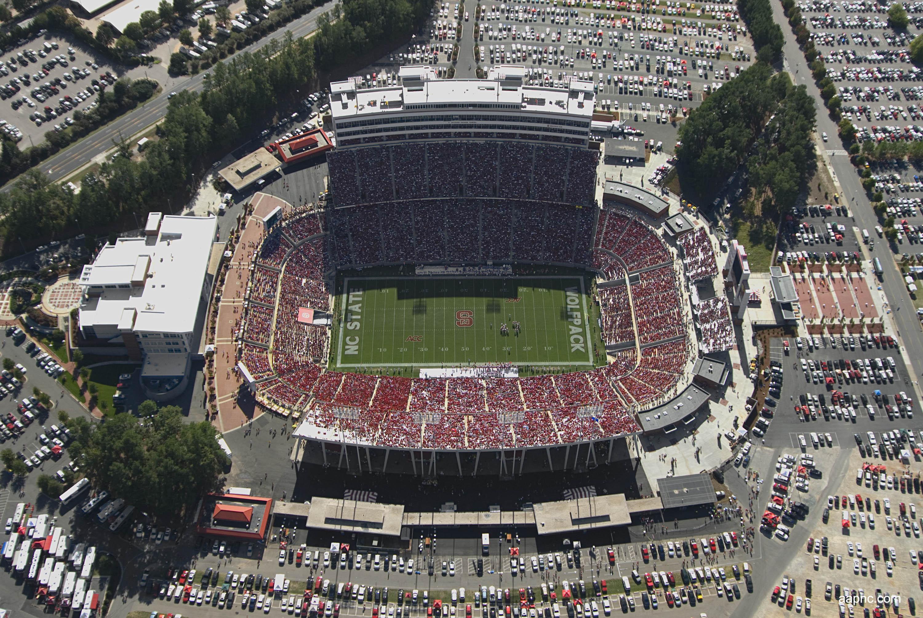
2023 Stadium Series - Raleigh, NC
The rink to be installed at Carter-Finley Stadium is inspired by the NC State football field it sits on top of. Each "End Zone" mimics the look on an end zone that's paint has faded in the off season and is now covered in a February dusting of snow. Although, I'm not sure how common that is in Raleigh. The centerline features oak leaves from the state tree featured on the event's logo.-
1
-
-
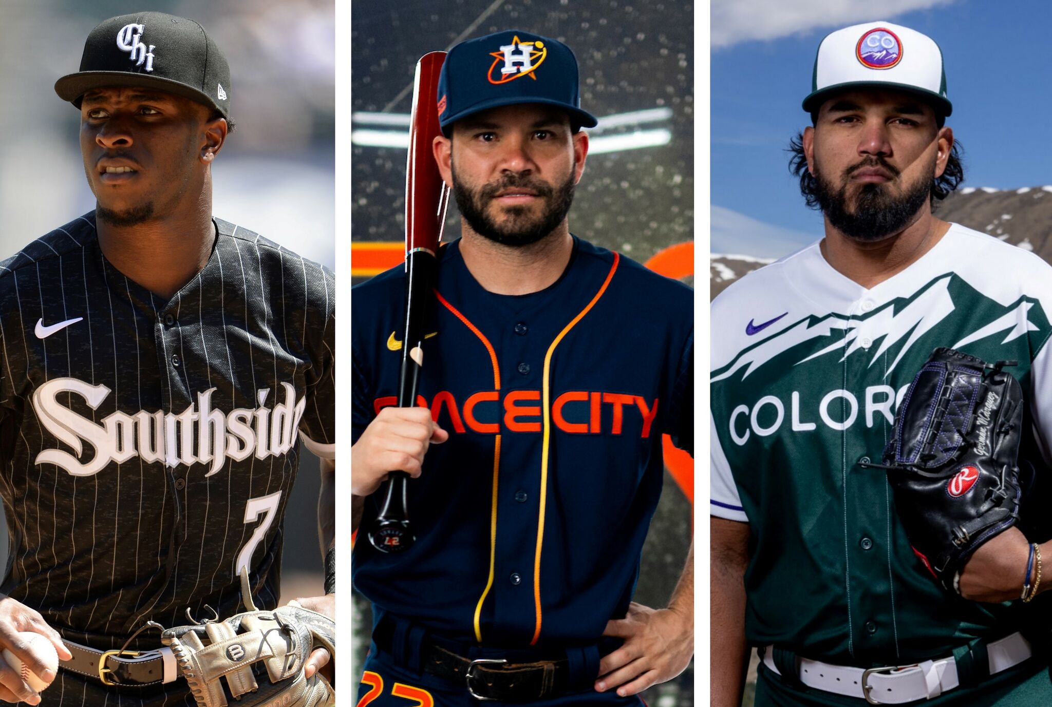
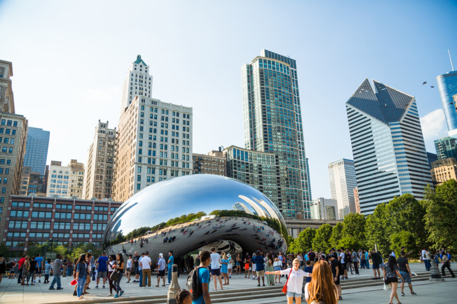
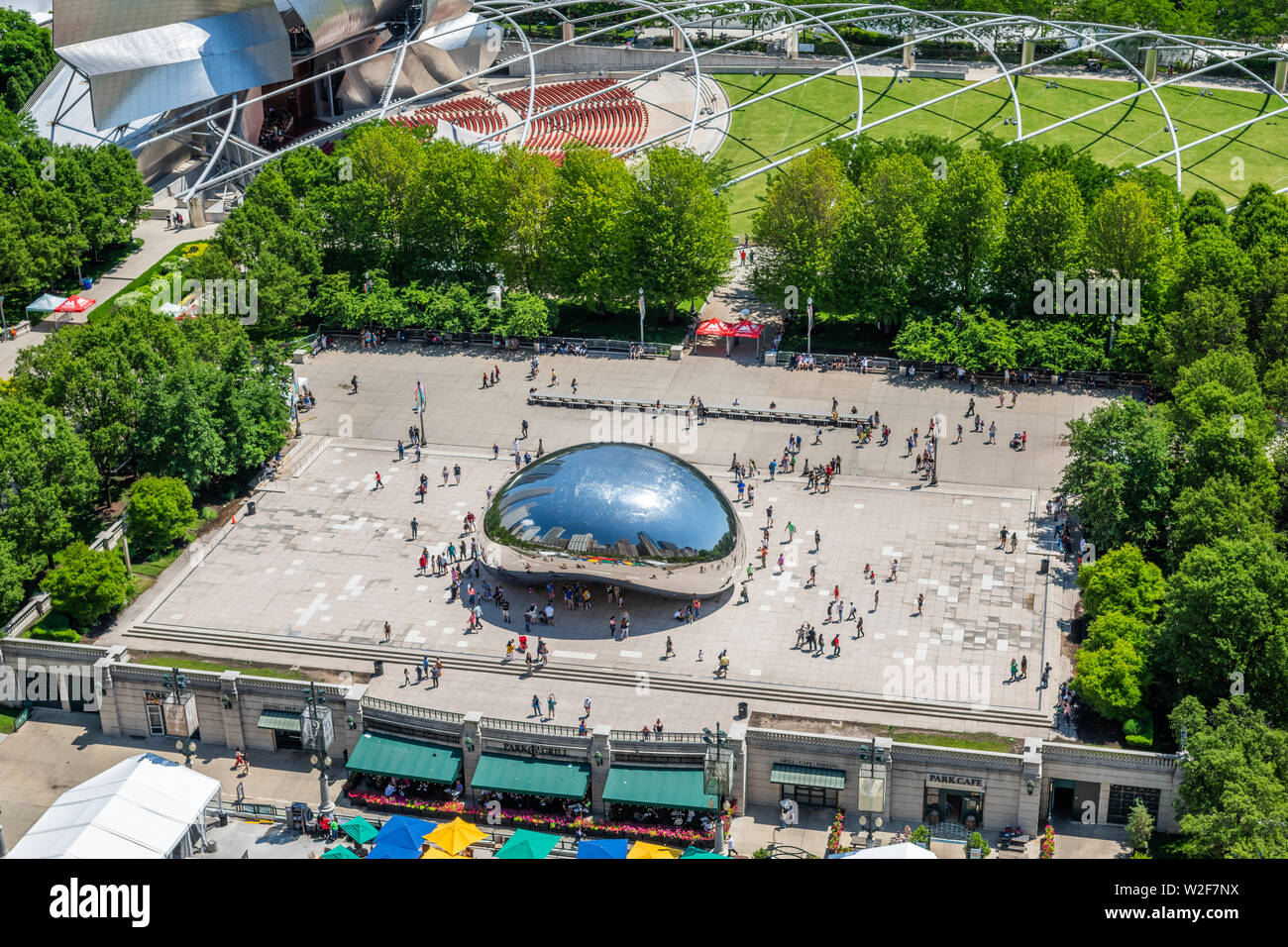
Da Bears revealed their uninspired orange alternate helmets today. I played around with a few ideas to improve the helmet like adding a helmet stripe and changing the color of the wishbone C.
I think the stripes (borrowed from the shoulders) make the helmet a bit better, but they still feel a bit bland and the set feels too "top heavy" and has too much orange.
I wanted to take a new approach to a Bears alternate helmet, an approach inspired by the city (a trend Nike has been bringing to their other Pro leagues). The Cloud Gate,derisivelylovingly referred to as "The Bean" is the focal point of Millennium Park and not too far from Solider Field. The new helmet would feature the same chrome finish as The Bean creating a helmet as striking and controversial as the statue that inspired it. The chrome domes paired with the orange uniforms and white pants creates a well balanced set that reflects (pun intended) the city that the team calls home.
I present:
The "Bean" Helmet-
12
-
-
On 7/15/2022 at 8:23 AM, chcarlson23 said:
The Wild logo is at the wrong angle. It’s too flat for what it actually is. The Mothership has wrong angle on their logos if that’s where you got them from.
Good catch. Updated!
-
1
-
-
Hartford Whalers
The Whalers center line features the harpoon wrapped in a rope imagery from the team's old uniforms.
-
7
-
-
On 7/14/2022 at 1:00 AM, VampyrRabbitDesign said:
Could you do a version of the Ducks rink with the Mighty Ducks logo at center and the D footprint logo repeated on the centerline? Also, considering they do play at The Pond, something similar to what you've done with the frozen pond for the winter classic would suit Anaheim well.
For Jersey, having the state outline repeat on the centerline (similar to Arizona) could work.
And I'll be that dude and ask the question that 99.9% of Hockey design threads get asked - Could you do designs for the Whalers and the Nordiques too?
Quebec Nordiques
Decided to go with the era specific arena name. The Nordiques get the large logo treatment and fleur-de-lis down the center line. Between the goal lines and boards also feature a trio of fleur-de-lis ala the team's uniform. The face-off dots in each team's zone also feature a fleur-di-lis.-
1
-
-
Pittsburgh Penguins
Wrapping up the set, at least of current teams, he Penguins get the larger logo treatment and the red line repeats the triangle in the team's logo.-
2
-
-
Philadelphia Flyers
Only two changes for the Flyers, a larger logo, and the removal of one of the two arena logos.-
2
-
-
Nashville Predators
Besides the larger logo, Nashville adds the piano key motif from their uniforms neck lining to the red line.-
4
-
-
LA Kings
The King's center ice logo gets the same metallic treatment that their uniforms recently got. The center line features a repeating pattern of the "jewel" from the center of the crown in their crest.
-
2
-


/cdn.vox-cdn.com/uploads/chorus_image/image/70179621/usa_today_17207529.0.jpg)
/cdn.vox-cdn.com/uploads/chorus_asset/file/13294851/Screen_Shot_2018_10_18_at_4.30.03_PM.png)
College Football 2023
in Sports Logo News
Posted
Looks like Adidas is introducing a new uniform material/ knit pattern. Gone is the chevron pattern on the chest. It also looks like the "W" logo moves to the actual collar instead of being applied to the jersey under the collar.
Love to see the return of pant stripes. It seemed like Adidas and Nike were dead set on killing the pant stripe. At least Adidas seems to be bringing them back!
Looking forward to seeing the rest of Adidas' portfolio updated.