

KittSmith_95
-
Posts
1,828 -
Joined
-
Last visited
Posts posted by KittSmith_95
-
-

No idea why the Avs don't just bring back the Bernie paw pad version of the foot logo for their shoulder patch if they wanted to shift away from the Yeti foot. -
I really like these, but feel like there was a missed opportunity to do a homage to the inaugural Clippers script from 82-87 with the alternate "C" logo on that alternate. Also not a huge fan of the choice to go with no outlines on the scripts or numbers.
-
I'm all for the navy pants becoming the full time look for Columbus. The red ones always stood out like a sore thumb.
-
 3
3
-
 1
1
-
-
These Colts jerseys feel so disjointed. The helmet doesn’t fit the rest of the jersey, and both look good on their own, but they do not work together.
-
1
-
-
So, Flyers...
I like most of the changes here, but those sleeve numbers need outlines and I personally would've added an extra thin stripe of white/orange to each hem over top the black (much like Columbus's current hems). Just thos two tweaks and these would be pretty much perfect.-
1
-
-
On 5/6/2023 at 11:04 AM, DCarp1231 said:
Ah, so even more evidence of said logo being a bad logo in general.
It's not a bad logo. It's a bad helmet logo.-
1
-
-
Not much speculation on who's getting new Statements... I have a feeling the Raptors are getting a HWC or new Statement (promoting the current blacks to full time status).
-
I think both the realistic bird and cartoon bird can co-exist and both work as cap logos.
-
6
-
-
These are weird.
They look super cohesive and I love a lot of the elements, but I need to see how they look on the field before I judge the addition of black too harshly. I do think the set would look better with white pants, but the black might not be as bad when watching the team in action.
But if this leads to a full rebrand, I'm all for embracing this new script and trident.-
2
-
1
-
-
4 hours ago, Silent Wind of Doom said:
Wow. I always thought that was just alliteration and a fairly generic name. Neat.
In less neat news, New Era shut down the Braves' big hat home run celebration.
Hey New Era, instead of shutting the celly down, why not make them a big hat so they're following the rules and get to keep the celebration going? SMH.-
10
-
-
The Bolts don’t even have to add black, just change the shade of blue slightly to a shade closer to what they originally wore, and they’d stand out.
-
1
-
-
Can somebody mock up what the white jerseya would look like with the black pants? I think the red pants look good, but I'm curious about that combo.
Seeing mock-up's of these with the pants mixed and matched has me liking this set a lot more than last night.-
1
-
-
These are the ultimate mixed bag of uniforms for me. They're simple and traditional, yet monochrome. They can't wear the red pants with the whites cause they have no stripes. The home looks more like an alternate than the actual alternate. I kinda want to see what the whites would look like with the black pants, but I also don't get the addition of silver.
All in all, a true mix between a C+ & B- for me. -
Seriously?
You go traditional for the white and alts, and THIS is what uou do with your reds?-
4
-
-
They're really doing the blacks before the reds? SMH.
-
On 4/17/2023 at 2:29 PM, DTConcepts said:
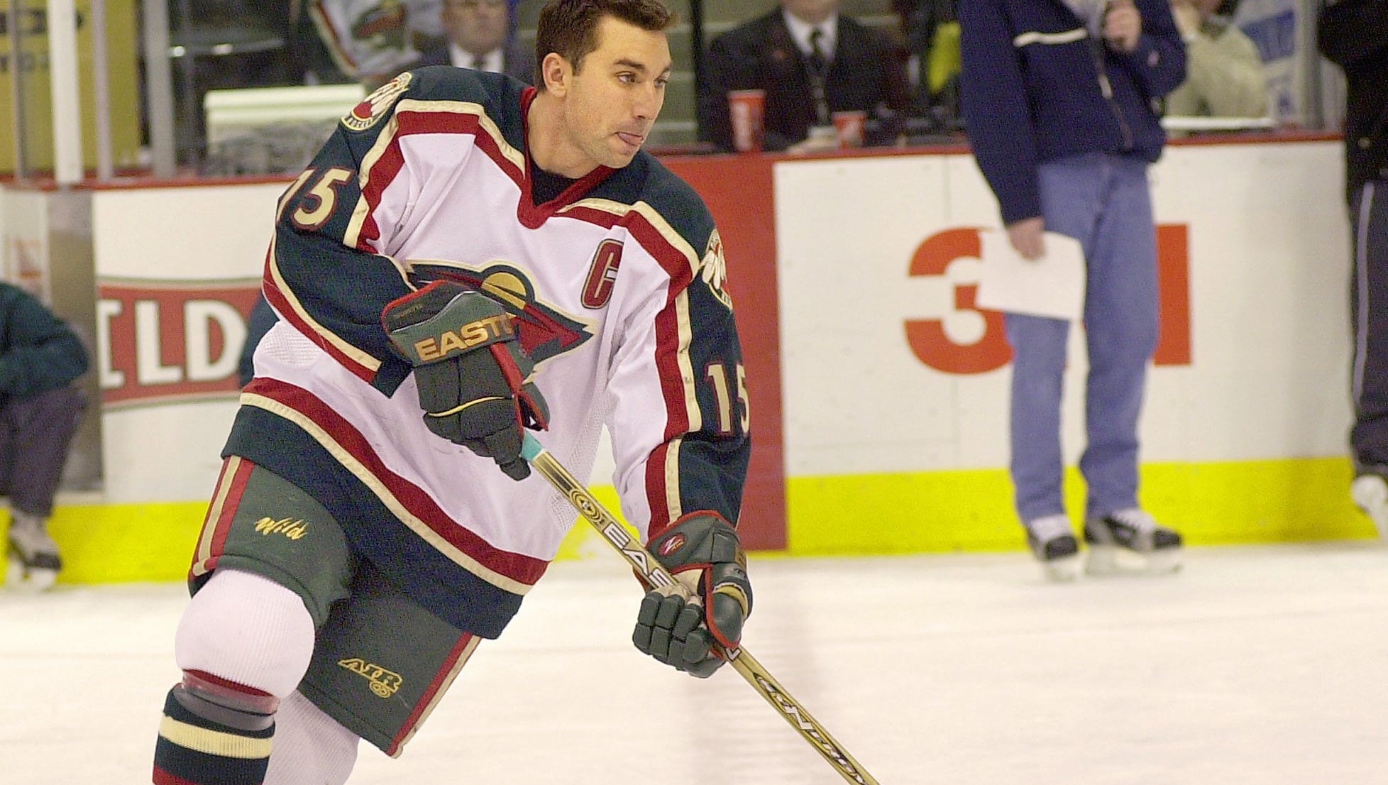
I don't think it was ever their real tertiary color, but the Wild did heavily feature that Y2K gold in their player gear up until the Reebok Edge takeover.
The Wild should bring these back or at least do the green as a throwback jersey. Everything they've done since shedding this identity has always had issues with colour management. I even liked the updated Edge variant of the whites!-
5
-
 1
1
-
-
The more I look at it, the more it grows on me. It's much better than the previous mark, but I'm not sure if the black lettering was the smartest choice.
-
While the Raptors have shown they're willing to bring back purple sparingly, they've always thrown it back to the inaugural jerseys, and not the jerseys that put the team on the map thanks to this guy.
Oddly enough the same thing goes for Chris Bosh, albeit one can argue his right jersey is a Heat uniform & these are the Raptors jerseys of my childhood: -
They really didn't think this through, eh?

-
 1
1
-
 5
5
-
 4
4
-
-
I get the premise of the Stadium Series is to do off the wall & futuristic ideas, but both of these fall flat.
Also, I feel bad for every Caps fan who’s wanted Weagle on the chest.
-
1
-
2
-
-
The ASG Jerseys look sharp.-
8
-
2
-
-
So, this a mixed bag.
Arlington: Boring. This is not just a downgrade, it doesn't even look like an "R".
DC: The Defenders old logo was fine. This is bland, and generic. Downgrade.
Houston: Lateral at best, but overall a nice logo. Definitely won't cause Oilers confusions anymore.
Orlando: I really dig this? The colours are distinct, the logo looks good, the only thing I'm not huge on is the name itself.
San Antonio: Opposite of Orlando. Love the name, hate the colours and logo. Sure, it's one Dwayne's nicknames from his wrestling days, but it fits a football team. Just wish the logo was stronger.
Seattle: I.... like this? I feel like it's going to look great on a helmet if done right, colours pop.... name's a little cheesy though. Much like the Kraken moniker, I assume it will grow on me.
St. Louis: Battlehawks are back. Good. Did anything about this logo change?
Vegas: This one does nothing for me. It's too generic for it's own good. -
The speculated T-Wolves jerseys seem to have been leaked too:
-
1
-
-
There had been rumblings the Yotes were going to do a new alternate jersey already.


2024-25 NHL Changes
in Sports Logo News
Posted
The Canes logos:
Top Left: Neat idea... for a name & number font and Captain's "C", but not a primary logo.
Top Right: Good idea of going for a negative space thing ala Whalers, but it looks forced, and not sure it'd work on a jersey.
Mid Left: Terrible.
Script and variations: I like it, but for merch, not for a jersey itself.