

HoopsCoach55
-
Posts
262 -
Joined
-
Last visited
Posts posted by HoopsCoach55
-
-
Why not split the difference on making them look unique: Purple over white at home, white over purple on the road and black over anything as the alt. Maybe even move to a purple helmet with black facemask?
-
 1
1
-
-
For the Sharks, I'd love to see it the H/A sweaters in the same striping as the black set, I always loved that look for the Sharks.
Wild: It seems almost too plain with the red gone, maybe bring it back as a trim/spot color to help things pop?
Caps: Love the look, wonder if an outline on the numbers would improve it.
Canucks: Beautiful and I don't even like that team!
Bruins: I love the throwback gold B and think it'd be a great look on the whites too.
Bolts: I think that using the old school blue on the H/A/3 jerseys would be even better than the Leafs Blue they use.
Panthers: Purr-fect!
Sens: Also perfection, way to go!
Kings: I can't stand this team but man you make them look good. I wish they'd go back to the forum blue and gold, but still solid here!
-
1
-
-
On 3/14/2019 at 4:08 PM, alxy8s said:

Despite the fact that Jostens is just reusing the same template for EVERY pro ring lately..... Can we acknowledge that MLS has some of the best and most consistently good rings?
-
13 hours ago, 1991 said:
I believe this is the Missouri State Bears baseball Missouri Valley championship ring, this is my favorite ring i have seen since the 2011 St. louis Cardinals World Series ring.
I love the base design of the ring, but the bear logo is too small, and the face should always say what you won, not who you are. Otherwise, it's a good looking ring
-
2
-
-
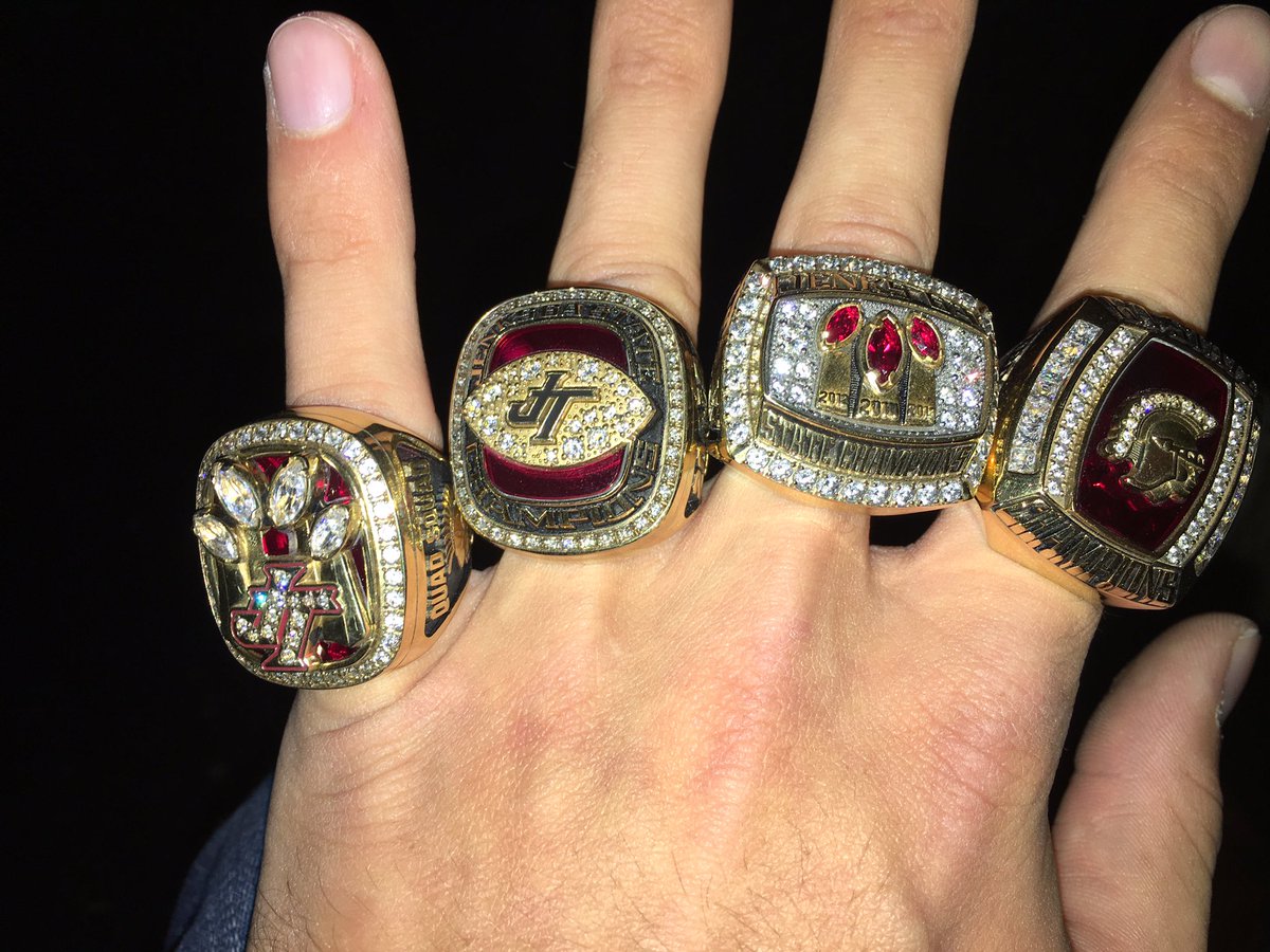
Here are the Jenks (OK) football rings from 2012-13-14-15
-
1
-
-
As a coach, my preference would be to wear the newest one, be it a Championship or league/conference championship, unless there is a message that wearing another would be best for. Six years ago, we lost a former player to a surgery gone wrong, and our head coach, who never wears his rings, wore the ring from that team for the entire season to honor him.
-
That 2008 ring is so out of place with the baby blue instead of the red. Great display however!
-
Here are my two rings. Oklahoma Class 6A Basketball Champions in 2009 and 2010. (Sorry about the Instagram filter)
1

-
I like that Back to Back ring there, 1991
-
Alabama, Tulane and WV are perfect, Arkansas just needs to have the pig heads on the white jersey to be red instead of white. I would use the gray trim and pants for MSU instead of TAMU, and focus on maroon and white for the Aggies.
-
On 7/1/2017 at 2:33 AM, Championship Sports Rings said:
Here is your first look at the new 2017 North Carolina National Championship Ring. It was made by Jostens. Traditionally the ring account for the Tar Heels basketball team has been with Herff Jones as i knew the HJ Ring rep for the basketball team but when Head Coach Roy Williams got there they have used pretty much every major ring company to make their rings and National Championship Rings. The 2005 National Champs ring was made by Balfour , the 2009 ring was made by HJ.

Can't stand UNC, but thats a great looking ring! Is it the team design or just the NCAA one?
-
35 minutes ago, Top Shelf said:

Marc-Andre Fleury, Vegas Golden Knights
Not sure how this is the wrong jersey? (I kid, Lets Go Knights!)
-
Best thing about the Patriots is how they keep the same designs through each ring. Every SB ring is the Patriot head over the team's total Lombardi trophies, rather than each design representing that particular team alone. Not big on the actual design of the ring, but love that its part of the same family style.
-
Good to hear. San Antonio is a triple-A market at the very least, IMO. My guess is it'll be either Las Vegas or Colorado Springs that will pack up shop and become that eventual PCL Missions club. All other clubs seem pretty firmly entrenched and/or popular.
New Orleans has been tossed around too. Not too long ago they were a target of the Astros. They wanted to move the Zephyrs to the Houston metro area.
While Vegas has gotten to the point where they are always the last AAA affiliate left at the dance in agreements, and I wish they would bounce, I have a gut feeling it's New Orleans who is the team to leave. If they want, I could see NOLA possibly as a Texas League team down the road if they choose to reemerge
It'd be just my luck to see the 51's move before I move out there and catch a game. But my friend who's from San Antonio is thrilled at the thought of them becoming a AAA team in the PCL, but since we live in OKC and he'd get to see them in town every year, of course he would be. It's going to be real interesting to see how the moves go over the next 2 or so years, after all, that's how the Redhawks became the Houston farm team before selling to the Dodgers after so many years of being the Rangers system.
-
OSU: Not a fan of the black numbers, but like you said, it's your concept.
IU: Great way to make Indy look different from OU and Alabama! Love it.
UM: That's how you tweak a traditional look, really liking the white pants.
MSU: Solid look, but the Nike bronze trim has kind of grown on me, something just seems missing.
PSU: Solid and clean.
RU: Another solid look but I think the tops need a bit more grey, maybe an inner trim on the numbers?
UM: A great way to get away from the heavy flag design and keep it clean, but I really miss the old tortoise shell helmets!
UN/UW: Both solid looks, but I agree that the numbers should be flipped, and maybe darken the red on UW
Overall, great designs!


Indigo's National Football League -- Ravens Update
in Concepts
Posted
Sorry to double post, but seeing this just made me think..... what if KC pulled a Ravens gold pants and tried yellow pants with the home red tops?