


TheRoyalsFan20
-
Posts
76 -
Joined
-
Last visited
Posts posted by TheRoyalsFan20
-
-
Just making sure. I'm glad I never saw them wear it. It just doesn't seem to fit the color scheme. And I remember it in NFL 2k5. Best football game ever.
-

That's a Dolphins jersey right?
-
Also, believe it or not, the purple coloring is wrong.
This is from their official website:

-
Comparison:

I'm agnostic on the arch, but the revised mountain is better.
I just think the small letters seem a little less forced.
-
Looks similar to their current logo.
Also I think the purple and gray looks better than black and purple
-
Looks similar to their current logo.
Yep, but I think it's cleaner and better looking.
-
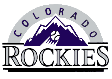
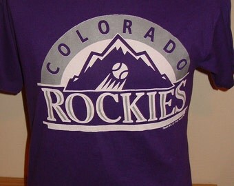
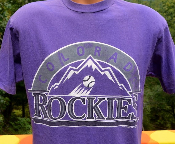
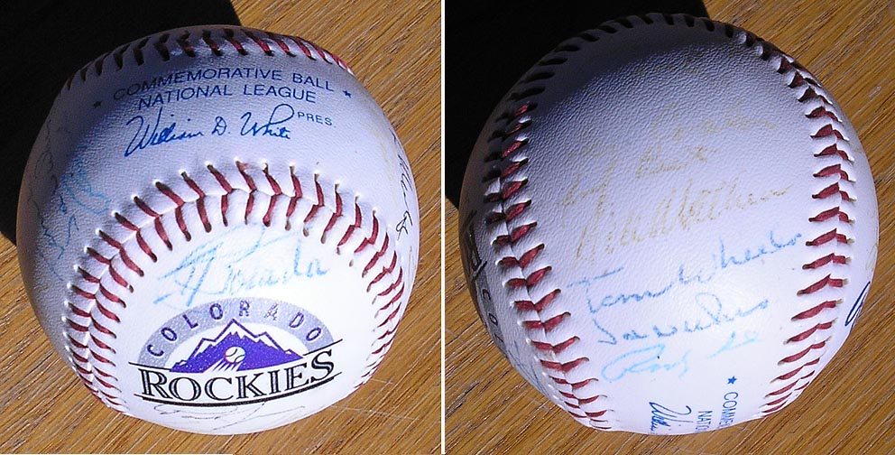
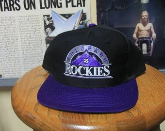
Not sure if anyone's posted this, but this was the Colorado Rockies' original branding up until their debut season in 1993. Some people have told me it has something to do with the baseball and arch lettering, but the only people who know why it wasn't used is the Rockies themselves. It has to be one of the best logos i've seen from the 90s.
Here's some merchandise. It took me awhile to find some of this.

 <----- This might be a baseball card
Unused Logos and Uniforms
in Sports Logo General Discussion
Posted
Jaguars lawsuit logo and uniform