


Megildur
-
Posts
175 -
Joined
-
Last visited
Posts posted by Megildur
-
-
Love the title and great start! I love the black-and-orange combo and the use of the maple leaf for the Giants is quite smart. I'd take your Marlins over the current ones 10 times out of 10.
-
 1
1
-
-
12 hours ago, MJD7 said:

That teal alt is a thing of beauty! I love what you did here.
I do feel like the navy alt could use some white or maybe a lighter gray added to have the word mark stand out more from the navy. It's a bit muddled for me as is. I would totally be down for the Mariners switching to these for good though, so well done.
-
 1
1
-
1
-
-
Love this so far! Definitely a great start, as others have said, and I'm excited to see what else you create. The kit designs and color choices have been really sharp.
22 hours ago, jackkmart said:With regard to Leavenworth, I stumbled across the town's Wikipedia page while researching locations and I had a similar idea. A Swiss/Bavarian style team is definitely the move there.
It's funny you stumbled across Leavenworth's wiki page because I literally stumbled upon the town last summer and was confused af. I stopped for brunch with my SO and had no idea that there was a Bavarian tourist trap in Washington state lol. Something I noticed amongst a lot of the souvenirs was not only Bavarian-inspired stuff, but also PNW imagery like Bigfoot. Mashing those two themes together could make a really cool team.
-
1
-
-
If a soccer club's crest would look good as a sticker, then I consider that a design win. And that Cavemen crest would make a great sticker. I love the jersey designs too, especially the stalagmite/stalactite pattern.
-
I love this! The style is certainly different than a lot of concepts here, which really adds to its uniqueness. My favorite little detail is the bats crossing the t's in the word marks. Make more of these? Please?
-
The pinecone-to-plaid transition is kinda funky, but I like it. I like the bridge inspiration for St. John's as well, but despite it's reasoning, I don't really like the ODOT green shades. Lastly, I love the Simpsons-based jersey for Springfield!
-
23 hours ago, coco1997 said:
Thanks for the feedback! Here are the Green Monsters with your suggested tweaks:
I feel like my original version has more personality, but to each his own.
Your original definitely does have more personality. This is definitely less mascot-based and more Red Sox-based, but I think the hat is a big improvement regardless. Thanks for putting this together!
-
1
-
-
On 3/21/2023 at 3:47 AM, Victormrey said:
Nice updates! I prefer the first one primarily because it maintains the orange-navy-red order of colors from the sleeve striping.
-
1
-
-
All of these are really nice and I'm enjoying how willing you are to going in new directions than what some teams look like in real-life. South Korea and Canada are both really sharp, while I wish I could get a t-shirt of that third Czech jersey (love the use of patterns). The Japan update with navy lettering and a pink outline is another one of my favorites. Pink is underused in baseball.
I didn't notice at first that Columbia's word mark was three colors, rather than two. Similar to the sleeve piping as @coco1997 mentioned, the drop shadows are so thin that the colors blend together. Would outlining the yellow-orange in navy first and then having just a read drop shadow improve that?
-
1
-
-
Dang, I never realized until today how much I want the Rockies to go with two shades of purple. I love that. Also, that Mustangs cursive script is awesome and I love their color scheme.
I'm not sure about the Monsters, though, especially when it comes to the blue pants. I'd suggest making the brim of the hat green, the front panel that shade of blue, and keeping the "B" as is, like you have in the Green Monster logo. I would also scrap the number on the front as I really like that the Red Sox don't have one.
-
1
-
-
15 hours ago, MJD7 said:
22 hours ago, raysox said:
I think Germany could use another pass. Not necessarily your fault but I think they could really use a fresh start. Their brand stands out as underwhelming for me with the Times New Roman D on the cap, and just a generic script on the front. Maybe something with a Germanic font, or take cues from their football team that's always really sharp. Dress em up like the Pirates in the 90s and you'll have yourself a solid concept.
14 hours ago, raysox said:Personally I like 1 and 2. I think with both you could do some effects on the text like the old nationals script where the “eutschlan” is arched and both D’s are bigger. Or maybe skew it on the right side and have a number on the front.
I think treating the font different than a straight line across the chest would move away from that negative connotation
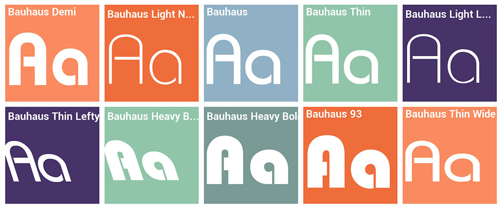
3 hours ago, Victormrey said:As for Germany, what about going for a Bauhaus approach? That way you'd be using a German font without any negative historical connotation.
I agree with raysox about 1 and 2 being the best options, and in regards to the larger first and last letter, with an arched "eutschlan". Looking back at the Pirates' old '97-'00 word mark, as well as the Motre Bame Brewers (while avoiding interlocking letters) and the '05-'10 Nationals, there's room to make it work well. While I think font 1 is the most "classically German," font option 2 or 6 are less "busy" fonts that may work well for the wordmark. I think you also throw in some pinstripes too -- maybe with more space between them than normal baseball pinstripes, to emulate football striping OR with some of the more out there designs in the WBC, might I even suggest horizontal pinstripes, like this former national football team jersey?
I think there's room to make a German baseball team concept that looks German and doesn't including any negative connotations, it's just a tricky balance to create. National pride and patriotism in Germany is not the same as in the US, and that especially extends to the frequency you see the German national flag in Germany versus seeing the American flag in the US. Over the last 15 years, especially, there's been debate specifically regarding use of the flag. Here's a short piece on that and it also briefly explains the history behind Germany's current flag. I would use that piece to inform the color choice. I suggest sparingly using colors, as Germany's football team does, and using the flag gold or a metallic gold more than any shade of red.
Hopefully that's helpful and not overstepping into your concept too much. I'm really enjoying this series, especially Argentina, Brazil, and Great Britain!
-
2
-
1
-
-
On 3/13/2023 at 11:58 PM, TheGiantsFan said:
The orange shorts were definitely a last-minute change from the original brown shorts, and you're totally right that it looks better with brown!
EDIT 3/15/23: At the suggestion of @mcrosby on Twitter, the crest has been redrawn so that the soccer ball is underneath only the horse's front feet. The kits have been updated accordingly!
I never thought that I needed a Pendleton x TheGiantsFan crossover, but this is absolutely awesome. I love the home kit -- the design, the colors, all of it. If I have one nitpick, though, it's that the white name and number is somewhat hard to distinguish from the orange top. Would an all brown name & number look more clear? Or white with a brown outline?
I really like what you did with Roseburg too. The tree rings and diagonals are well-thought out.
Also, I realized after commenting on Brookings that you mentioned in its details that it was influenced by Brighton & Hove Albion. I had to laugh at myself a little for stating the obvious with my comment.
-
1
-
-
Love these! I'm a big fan of the powder blue pinstripes and that the Argentinian flag is mimicked with the sleeve cuff striping on the white jersey. I liked @CDCLT's suggestion to scrap the white pinstripes, but then in practice, the powder blue feels too plain without them. Also, out of curiosity, what's the font you used for "Argentina"?
Also, for the cap... maybe isolating the cap off rsaline's Baseball Uniform Template would work?
-
1
-
-
I really like Brookings! It reminds me of Brighton & Hove Albion, but better.
-
I really like that cap logo for Houston, but I'm less sold on the alien head. Will Boston be the "Green Monsters," "Monsters," or "Wally's"?
-
1
-
-
On 3/3/2023 at 9:41 PM, Kooky01 said:
Really like this one, that logo just screams retro in a good way. Overall very basic, but it works for sure!
On 3/4/2023 at 7:50 AM, teeray01 said:Pretty cool stuff here. Looking forward to seeing what you do with
Montreal.
Thanks y'all, glad you like the recent designs!
On 3/3/2023 at 4:00 PM, maxwasson said:Really liking this concept thread, I do have an idea for what the Kansas City team could be called, I saw this name in a Sports Alternate History forum, and I thought it could stick for KC.
Name suggestion: Kansas City Imagineers
I appreciate the idea (and the compliment!), though I don't plan to have a KC team in the UBA.
On 3/4/2023 at 2:19 PM, coco1997 said:Memphis turned out awesome. Love the very Swinging Padre/Mr. Redlegs-esque King Tut logo. My only nitpick is that the bat the mascot is wielding seems oversized, unless that was a deliberate choice.
Keep up the awesome work!Thanks! And yeah, the oversized bat is deliberate. It is a little chunky though, haha.
-
1
-
-
Fun concept idea, coco1997. My favorites so far are the Moose and the Seals. The teal and brown of the Moose is pretty unique and I love anything San Francisco Seals-related, especially when its well done.
-
1
-
-
One of my goals behind this fictional league was to include some cities that had Big 4 / Big 5 teams, but no MLB team. And, with that, to bring them early into the UBA so they have long franchise histories. Some of that was possible by not letting certain cities have multiple teams (Chicago), while also having the league be 32 teams rather than 30. With that being said:
MLB cities without a UBA team: Tampa Bay, Kansas City, Oakland, Miami, Cincinnati, Pittsburgh
UBA cities without a MLB team: Montreal, New Orleans, Memphis, Charlotte, Las Vegas, Indianapolis, Jacksonville, Vancouver, Portland
Now, I did involve some of those ‘MLB cities without a UBA team’ as starting points for franchises that would eventually move elsewhere. That’s all part of the lore of the league that I try to get into a little bit (but not too much!) with my concepts. I’ll post the divisional alignment before the next team too.
Let’s get to the next team first, though. Next up: Swingin’ King Tut and the Memphis Pharaohs…
The UBA expanded by two teams in 1984, with San Francisco and Memphis joining the Continental League in advance of the season. While the Miners got a quick title in 1989 and have a franchise .493 winning percentage, Memphis has been straight up awful. 2024 marks the Memphis Pharaohs’ 2nd postseason appearance ever and they only made it via a Game 163 victory over California. The franchise sports a .442 winning percentage, worst amongst all 32 teams in the UBA. Still, even as the second wild card team, fans in Memphis are excited and the Pharaohs’ young core gives them plenty to be happy about beyond this season. The team will need to get beyond divisional foe New Orleans in the Wild Card Series to advance.
In Game 163, Sam Welsh threw 7 scoreless innings against California, allowing just 2 hits and striking out 6. That performance, followed by a 2-inning save from Marty Bergquist, was vital for the Pharaohs as the final score was 1-0. Mid-season acquisition George Shepperd has the only playoff experience for the Pharaohs’ starting rotation, while right fielder Travis Schommer has the only ring amongst the team’s position players (last year with San Diego).
The black and yellow color scheme is derived from Memphis’ city seal, which also can be found on the city flag. The city of Memphis is named after Memphis, Egypt, which is where the Pharaohs nickname comes from. The main logo, affectionately known as “Swingin’ King Tut,” has sometimes led fans of the team to believe that the club is cursed due to its use of the Pharaohs’ moniker. As a younger team, though, Memphis wears their alternates just as often as their main home and away jerseys. The yellow-brimmed cap is also worn just as frequently as the black-brimmed cap.
Swingin’ King Tut is based off Mr. Red, the Padres’ Friar logo, and this older Orioles’ logo. The black and yellow use is very reminiscent of Pittsburgh’s use of the colors. And don’t worry, I’m still planning to make a “Monsieur Montreal” logo too!
-
3
-
2
-
-
On 3/1/2023 at 5:46 PM, coco1997 said:
The Saguaros look great, but it's kind of odd for a team named after cactuses to not wear at least some green.
Thanks for the comment!
I absolutely agree with that sentiment. I originally was thinking a green-and-yellow color scheme, but it just didn't fit with my view of a team from Phoenix. The orange-and-blue color scheme came from seeing images of Saguaro National Park at sunset, with the orange being the sunset and the blue being inspired by the silhouettes of the cacti (with some artistic interpretation involved lol).
For reference (taken from Google images):
-
On 2/20/2023 at 2:33 PM, Megildur said:
I've got the following planned for eventually:
- the previously mentioned Mr. Met / Mr. Redlegs homage, who will go by the name "Monsieur Montréal",
- a National Park-related team out of Phoenix,
- a Milwaukee team with a bird logo based on that of the Norwich City Football Club,
- and a team from Washington D.C. that is rather patriotic, but not because it's red, white, and blue.
****
Did you know the Phoenix Suns were founded in 1968? I didn’t, until before this project. How's that relevant to the UBA universe? Well, the Phoenix Saguaros were established even earlier, beginning play in 1960 alongside division foe Atlanta. The Saguaros didn’t have a winning season until 1972, their first championship appearance until 1977, and have had a mostly “eh” existence in the UBA. Their lone championship came in 1999, in their sixth playoff appearance of the 90’s, which is certainly Phoenix’s most successful decade by far. The Saguaros’ spot as the Federal League’s first Wild Card in 2024 marks the team’s fourth playoff appearance of the 21st century and their 12th overall.
Brandon Martin, who’s the longest-tenured Saguaro after joining the team via trade in December 2016, leads the #2 ranked pitching staff in the Federal League. Homegrown 5-time All-Star Edgar Leon has also been with the team for awhile, finishing 2nd in the FL Rookie of the Year Award voting back in 2018. Both stars are a major reason why Phoenix has made the playoffs this season. Yet, both will also be free agents this offseason.
Phoenix has a retro style look, with a simple blue-and-orange logo and a Western script on the front of their jerseys. Their primary cap is blue with a simple orange ‘P’, while the secondary hat is typically worn with the club’s alternates and in Spring Training. Note that the concept here has the Wild Card Series patch on the jersey’s right sleeve, as Phoenix prepares to face off against Detroit in a best-of-three series.
Phoenix has had five different ‘eras,’ so to speak, in terms of their design identity. From 1960-71, the Saguaros rocked green and yellow. That decade of suck resulted in the franchise switching colors and names in advance of 1972, taking on “Arizona” as their location identifier with blue and orange as their new colors. The name and colors would stick through a logo change for the 1985 season, before a dramatic redesign in 1996 saw the team return to “Phoenix” and swap out blue for purple, black, and yellow. As a part of a larger movement of returning to past logos for inspiration, the 2012 redesign saw the Saguaros return to blue and orange again, with the logo largely based off the team’s 1972-84 look. As this season marks the 25th anniversary of the club’s lone championship in 1999, the team sports a throwback from that year.
The inspirations here come most clearly from the Seattle Mariners’ 1977-80 logo, the Texas Rangers’ 1972-81 logo and jerseys, and the retro-y rebrands of the Baltimore Orioles, Toronto Blue Jays, and Houston Astros in the early 2010s. The spoiler contains the Saguaros’ past looks, alongside the logos I used for inspiration.
SpoilerC&C appreciated. Hope you enjoy!
-
3
-
-
On 2/14/2023 at 4:51 AM, weirdguyace said:
This is a fantastic concept series. Most of the time I can do without red/white/blue concepts but everything you did for the Admirals' identity is unbelievably clean. One of the nicest I've ever seen here to be honest!
Thank you! Glad to know it was a hit.
On 2/14/2023 at 9:43 AM, TheSquirrel said:Can you give us a hint of what you have in the works like you did previously about the Miners & Tridents?
Yeah, absolutely! I've got the following planned for eventually:
- the previously mentioned Mr. Met / Mr. Redlegs homage, who will go by the name "Monsieur Montréal",
- a National Park-related team out of Phoenix,
- a Milwaukee team with a bird logo based on that of the Norwich City Football Club,
- and a team from Washington D.C. that is rather patriotic, but not because it's red, white, and blue.
I also have the following updates that I want to make:
- abandoning the pinstripes for Philadelphia's away and alternate jerseys,
- adjusting San Francisco's monogram so the S is above the F, to read more clearly as SF and not FS,
- fixing up Jacksonville's cursive script,
- and finishing Las Vegas, which includes scrapping the circle-around-the-number and improving the primary logo.
No guarantees on when this will happen, but that's what my list looks like at the moment!
-
1
-
-
On 1/14/2023 at 10:04 PM, teeray01 said:
I'm curious about the Mr. Met/Mr. Red Homage concept you had planned. Is this still a possibility?
Yep, it is the plan, I've just had some difficulty designing it so far.
On 2/1/2023 at 4:37 PM, N8theGR8 said:I especially like the Cleveland Greens. Maybe as an alternate hat they could add white front panels and a green “C”. I really think that would add even more to an already amazing uniform line-up
I like the sound of that (and thanks for the compliment). I'll draft that up when I'm working on it next.
****
Unfortunately, I don't necessarily know when I'll have the next teams out. I'm a bit slow with this, though I'm always doodling designs for it.
-
I'd echo what everyone else has said so far -- a bit of yellow, less WBC logos on the jersey -- and, I think both jerseys could use a number on the front. Otherwise, big fan of the simplicity of the look, the font choice, and the flag on the shoulder. Give me more! Lol
-
1
-
-
On 12/28/2022 at 3:35 PM, TheGiantsFan said:
The disclaimer on this Nike concept is a good time to announce that since the end of November, I've been working as a graphic design contractor at Nike's Beaverton headquarters! I'm currently making training materials for Footwear engineers, but I'm hoping that I'll be able to get into Global Football making kits for real!

I had to login again so that I could congratulate you on this. It seems like a great (and well-deserved) thing for you. I've always loved your work here!
-
1
-


Raysox's States Baseball League 33/52 (DE, PA, IA)
in Concepts
Posted
Love Delaware! It's one of my favorites and it just has a classic feel to it. I love the addition of the hen on the sleeve especially.