


kroywen
-
Posts
1,490 -
Joined
-
Last visited
-
Days Won
4
Posts posted by kroywen
-
-
23 hours ago, Magic Dynasty said:
These...


...are the most overrated uniform set of all time. In fact, I would say that the modern-day version of them are much better. The gaudy, prime 90s giant sun across the front, purple, gradients on the logo, the asymmetrical shorts with "Phoenix" written on them... while the 90s in particular are extremely overrated, this takes the cake in my mind.
*ducks*
To be honest, I despise these uniforms. I find purple and black to be a terribly muddled and dark color scheme, and honestly, I can only take purple and orange in limited doses. I love purple-and-gold, but think orange should be limited to use as a trim color against purple (which is more or less is here, fortunately).
The incredibly gaudy sun, clip art wordmark, gradients, text on shorts, and unnecessary BFBS, all make this a textbook example of terrible uniform design. It might evoke nostalgia, but the design is much better left in the past.
-
 3
3
-
-
No Kings jersey will ever beat these beauties, in my book:

-
3
-
-
53 minutes ago, Bmac said:
What's the deal with downtown Phoenix at this point? The Suns want nothing to do with them?
The Suns have a basketball-only arena, much like Barclays. The Coyotes did play there from 1996 to 2003, while securing an arena deal (and eventually constructing) for their current arena in Glendale. Much like the Isles at Barclays, it was a disaster:
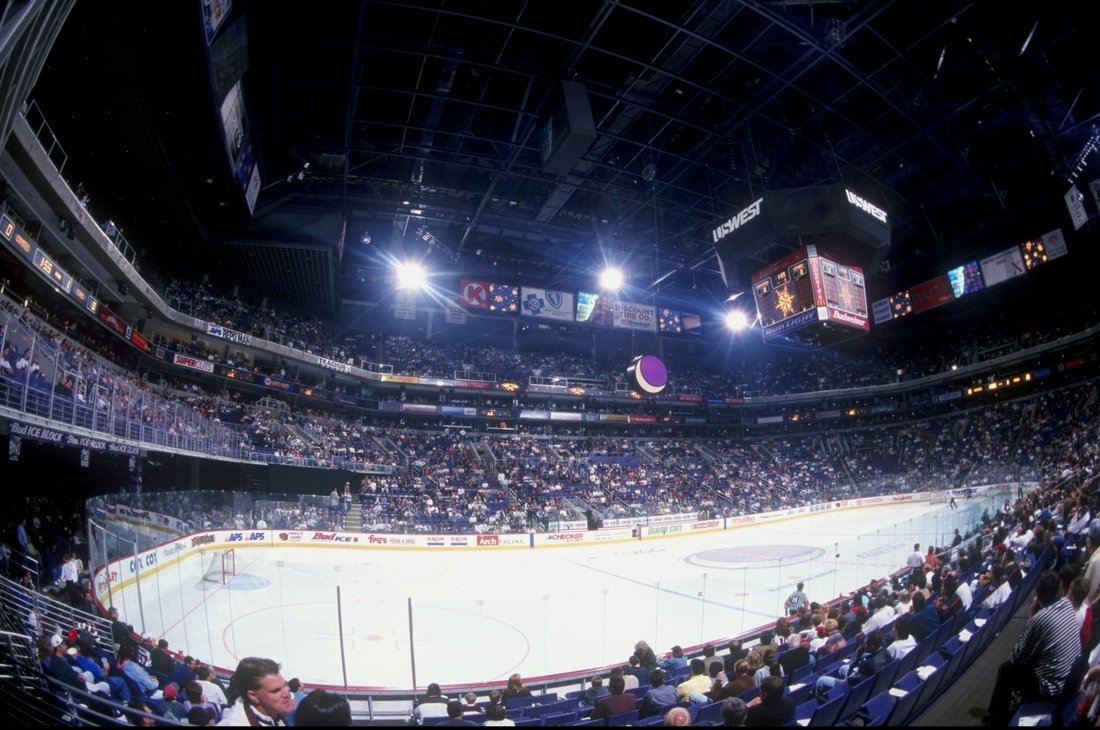
For a team already struggling to draw people, with a dwindling fanbase, the last thing they need is to move into an arena that literally cannot fit a hockey rink.
-
1 hour ago, Ferdinand Cesarano said:
The team has done a good job utilising the New York City flag. Their corner flags are New York City flags with the NYCFC logo in place of the seal (so City flags with the City logo).

I wish NYCFC would go whole hog and use the actual city flag, with the city seal, as their corner flags. Understand why they don't, to emphasize their own brand, but it would be such an awesome touch.
As it is, their corner flags do make great use of the city's flag design.
-
2
-
-
1 hour ago, fouhy12 said:
I'm not sure if your representation of the field really matches just how washed out it was.
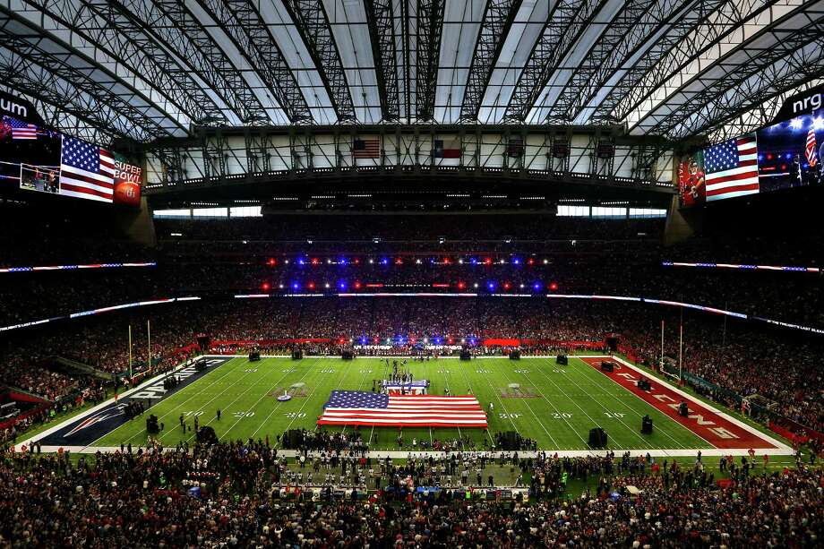
This picture really shows how washed out the Super Bowl logos were.
To the point of being almost invisible. They just blend in with the grass.
Between the washed out Super Bowl logos, the faded paint in the Pats' endzone, and the general blandness of the field markings (which has been a problem for quite a few years now), this was one of the worst Super Bowl fields ever. Combine the aesthetic appearance with the inexcusably poor condition of the field, and this really felt like amateur hour.
If you ever told me that the above picture was taken at the Super Bowl - before the game began, no less - I'd have never believed you. Incredibly boring field and rather ratty looking.
-
Not sure what looks worse: the Patriots offense or their end zone markings. The blue has almost completely faded in one part of the end zone.
-
19 minutes ago, DG_Now said:
How would you all put odds at the Islanders staying in New York vs moving to a new market?
I consider the Islanders to be a cornerstone NHL franchise and would hate to see them move, but am curious how long sentimentality will hold out for them if the market won't.
I'd still put the Islanders staying in New York at better than 50% odds. Maybe 60-65% chance of staying. The only relocation destinations I can see them entertaining are Seattle and Quebec City. Maybe Kansas City, though the NHL has never expressed much interest or confidence in that market's viability.
In an ideal world, from my perspective, they'd build in Willets Point (or in Flushing Meadows Park itself), and NYCFC would build an adjacent stadium. You'd have the Mets, the Isles, NYCFC, and the USTA all within one location, served by a single subway stop and LIRR station. But that's still a remote possibility, especially given that the City would be highly reluctant to pour public funds into a new stadium and new arena, less than a decade after subsidizing two ballparks and the Barclays Center. Maybe if Bloomberg or Giuliani were still mayor, but not under de Blasio (or any likely 2017 primary opponent of his). Any new construction will need to be primarily funded privately, which is (unfortunately) unlikely.
-
I'm sure the goal of Islanders ownership is to build an arena in Queens, preferably at Flushing Meadows (or Willets Point). Barring that, they'd probably choose to build at Belmont Park rather than go back to Nassau Coliseum permanently.
Obviously Nassau Coliseum would serve as a temporary arena while the Isles are constructing something new, but I'm sure that a permanent stay at Nassau (with a long-term lease) is the absolute last resort for Isles ownership. They might sooner move out of the area altogether than play in a 12,000 seat arena in the middle of Hempstead. (Not that such an arrangement would bring in any less revenue than their current situation at Barclays.)
-
And while the other man elected played his entire career with the Astros, Jeff Bagwell was originally a Red Sox prospect:

(And Sox fans are still angry about that trade.)
-
2
-
-
In honor of their elections to the Baseball Hall of Fame:
Ivan Rodriguez, Yankees (second half of 2008):

Tim Raines, Orioles (this might be the ultimate "wrong" uniform: he played 4 games with the Orioles in October 2001, just so that he could play alongside his son Tim Raines, Jr.):

-
1
-
-
1 hour ago, DNAsports said:
What I meant was the placement of white in the stripes is odd
I couldn't disagree more: I actually think that the Steelers have the best stripes in the NFL. The way the gold and white play off of one another, without ever touching, is perfect.
The Steelers have perfected the white/gold color balance. All they need is to go back to block numbers, and they'll be all set.
-
4
-
-
I'm a fan of the loopy W, myself. The Nats' "monumental" identity did have a lot of potential, but on the whole, I prefer their current identity. Not a fan of their home uniform - would much prefer the beautiful "Nationals" script be used on the front - but I think the current identity is more visually attractive than the "monumental" identity. Also not bogged down with unnecessary gold trim.
-
1
-
-
The Bridgeport Bluefish, one of the two remaining original teams of the independent Atlantic League, released their 20th Anniversary logo, despite it being their 20th season, not 20th anniversary (which would be 2018).
I haven't liked most of the recent tweaks to the Bluefish identity - they introduced racing stripes to their home unis last year that just did not fit, and have started using an awful looking "Fish" wordmark - but I actually really like this logo. It fittingly uses elements of their identity that have been there since the start in 1998 (except the font, though it's an attractive font anyway):
It's somewhat remarkable that they've made it to their 20th season, and I can't help but think that the so-called "20th anniversary" celebrations might be doubling as a potential farewell, if they do wind up leaving Bridgeport (or folding) in the next couple of years. It's probably why they're celebrating this season, rather than next year. There may not be a next year. Their attendance plummeted in the mid-2000s, and they've been near last in attendance in the Atlantic League for over a decade now. There were talks about moving to Yonkers a few years back, but those thankfully fell through.
Bridgeport is the only remaining mid-size struggling and/or post-industrial city left in the Atlantic League, which used to be the league's bread and butter. Gone are Newark, Camden, Atlantic City, Nashua, Newburgh... the league found that teams placed in prosperous outer suburbs or exurbs would make more money. (Well, other than the league's entry into New Britain last year, I suppose.)
As a side note, the first ballgame I ever attended was the second Bluefish game ever back in 1998. Their entry into Bridgeport, along with the magic 1998 Yankees season, and the McGwire/Sosa HR chase, are what got me into baseball.
-
1
-
-
17 hours ago, FlyEaglesFly76 said:
That is :censored:ing ugly
I wouldn't go as far as to say it's ugly, but the colors are so painfully muddled and dark. It might look better if, say, the numbers were white, outlined in gold, rather than the old way around. And/or if you lightened up the gold (while keeping it metallic).
But as is, it's just a terribly drab, boring, indistinctive look. No comparison to the beautiful and vibrant royal blue and athletic gold.
-
4
-
-
6 minutes ago, Dolphins Dynasty said:
Then I'll counter it by saying that the claw-ball is much superior.
")
Here, I'll throw down a truly unpopular opinion:
I would love for the Raptors to completely ditch their identity forged around the Jurassic Park craze and instead adopt the excellent "Toronto Huskies" moniker.
Short of that super-unrealistic scenario, just design a whole new logo and visual identity, because they've never had a good one in their entire 20-year history.
-
3
-
-
This isn't so much a realignment as an alternate history. What if Walter O'Malley agreed to a stadium deal at Flushing Meadows, as proposed by Robert Moses, and kept the Dodgers in Brooklyn? I tried to keep the timeline as close to reality as possible.
1958: The Dodgers and the City of New York reach an agreement to build a new multipurpose stadium in Flushing Meadows. Realizing they are the odd man out in New York, the New York Giants announce a move to Minneapolis, and become the Minnesota Giants.
1961: Prior to the 1961 season, American League owners vote to expand by two teams. For the past few years, Calvin Griffith had been in discussions with Los Angeles officials to move the Washington Senators to LA. The main obstacle was trying to find another AL team to accompany them to the West Coast, without which other AL owners would not approve a relocation to Los Angeles. With the expansion, the original Washington Senators opted to relocate to Los Angeles to become the Los Angeles Angels. The San Francisco Seals and a replacement Washington franchise, the "new" Washington Senators, became the two new AL franchises.
1962: The new Flushing Meadows Stadium opens in Queens, and the Brooklyn Dodgers decide to rename themselves the New York Dodgers as a result. The National League, not wanting to have fewer teams than the AL, opt to expand as well for the 1962 season. Expansion franchises are awarded to the Houston Colt .45s, and not wishing to miss out on the West Coast, the Los Angeles Stars.
1965: The Houston Colt .45s rename themselves the Houston Astros upon their move to the new Astrodome. Meanwhile, the new Angel Stadium in Chavez Ravine opens up for the Los Angeles Angels. The Los Angeles Stars relocate to Anaheim, though they maintain their name.
1966: The Milwaukee Braves relocate to Atlanta, becoming the Atlanta Braves.
1968: With Oakland not being a relocation option for the A's, thanks to the presence of another AL team there, Kansas City Athletics owner Charles Finley reaches an agreement with the city of Milwaukee to relocate there for the 1968 season. AL owners, sick of Finley's constant attempts at relocation and aware of Milwaukee's success as a major league market less than a decade prior, approve the relocation. The Milwaukee Athletics are formed.
1969: Under pressure from Missouri Senator Stuart Symington, who would famously call Milwaukee "the luckiest city since Hiroshima" on the Senate floor, the American League hastily decides to expand in preparation for the 1969 season, with Kansas City guaranteed a replacement franchise. The National League, already planning on expanding in the early 1970s, decide to move up their expansion plans to align with the AL. The AL awards franchises to the Kansas City Royals and the Seattle Pilots, while the NL gives franchises to the Montreal Expos and the Oakland Oaks.
1970: With the Seattle Pilots going bankrupt, and no stadium construction in sight, a San Diego-based ownership group buys out the Pilots, and relocates them to San Diego, renaming them the San Diego Padres.
1972: The Washington Senators relocate to Dallas, and become the Texas Rangers.
1977: Under pressure from a lawsuit from the city of Seattle regarding the relocation of the Pilots to San Diego, the American League decides to expand, creating the Seattle Mariners and Toronto Blue Jays.
1993: The National League expands, creating the Florida Marlins and the Colorado Rockies.
1998: The National League expands again, creating the Arizona Diamondbacks and the Tampa Bay Devil Rays.
2005: After years of flagging attendance, the Montreal Expos relocate to Washington, renaming themselves the Washington Nationals.
2013: In order to even out the two leagues, the Tampa Bay Rays move to the American League. The NL East is reduced from six to five teams. The Detroit Tigers move to the AL Central to accommodate the arrival of the Rays to the AL East. The Texas Rangers move from the AL Central to the AL West, increasing the size of that division from four to five teams.
In 2016, baseball looks as follows (differences from our timeline in italics):
AL East:
Baltimore Orioles
Boston Red Sox
New York Yankees
Tampa Bay Rays
Toronto Blue Jays
AL Central:
Chicago White Sox
Cleveland Indians
Detroit Tigers
Kansas City Royals
Milwaukee Athletics
AL West:
Los Angeles Angels (in Chavez Ravine, Los Angeles)
San Diego Padres
San Francisco Seals
Seattle Mariners
Texas Rangers
NL East:
Atlanta Braves
Miami Marlins
New York Dodgers (in Queens, NY)
Philadelphia Phillies
Washington Nationals
NL Central:
Chicago Cubs
Cincinnati Reds
Minnesota Giants
Pittsburgh Pirates
St. Louis Cardinals
NL West:
Arizona Diamondbacks
Colorado Rockies
Houston Astros
Los Angeles Stars (in Anaheim)
Oakland Oaks
The toughest thing within this timeline was the A's relocation to Oakland and subsequent 1969 expansion. Finley was in talks with a slew of cities - Louisville, San Diego, Oakland, Seattle, Denver, Milwaukee, etc. The Sporting News actually reported in 1967 that he had agreed to a relocation to Milwaukee, and that he had a TV contract in place, but fell one vote short of getting the relocation approved by AL owners. This timeline assumes that sometime in 1967, he persuaded one other owner to vote in favor of the relocation.
The other alternatives would've been to have Finley agree to move to either Seattle or San Diego (I know he had in-depth discussions with Seattle; not sure how far he even got with San Diego, though he may have been more interested in that California market had Oakland been unavailable). Seemed to be less of a jump to have the tentative Milwaukee deal get approved than to have him strike an agreement with either Seattle or San Diego.
I would guess that under this timeline, the AL's Los Angeles Angels (who would've struck a stadium agreement in Chavez Ravine upon relocation from Washington) and San Francisco Seals would've become the "dominant" franchise in their respective metro areas, being that they were the first franchises to arrive, and would be in the largest city in the area. This would've dramatically changed the balance of power between the NL and the AL in the 1960s and 1970s, being that the AL would've had the two dominant franchises in the LA and Bay Area markets. Would they have been motivated to implement the DH in 1973 in that case? Would the NL have been looking to play catch-up with the AL and implemented it instead? Would the continued presence of the Dodgers (whose 1960's core would've looked largely the same) have resulted in them being the dominant franchise in New York from 1964 up until, say, the 90's? Would Bud Selig have ever gotten involved in baseball in Charles Finley moved a team to Milwaukee? (I tend to think that he would've - he might've bought out the Athletics once Finley decided to sell) Lots of interesting hypotheticals.
-
1
-
-
2 minutes ago, WSU151 said:
Disagree (yes I know what thread this is). Without the piping, it's just another plain jersey with a wordmark. The piping is pretty awesome.
I think just having sleeve piping would work well. Or perhaps a faux v-neck, like the Giants. Simple placket piping would look fine though - it's just that the gigantic piping they have now clashes terribly with the wordmark.
-
40 minutes ago, MCM0313 said:
I like the piping overall though. Would it make the logo easier to see if the chest piping were navy?
If it were just thin navy piping (not outlines), it would definitely be easier to see the logo. Though I tend to think the front is busy enough as it is, between the wordmark and the tomahawk, that piping is unnecessary and just causes clutter.
-
1 hour ago, FinsUp1214 said:
I knew this thread was here somewhere!
I hope this stat line is worthy of a nearly-year bump, but I found it really interesting.
It's been easy for me as a history junkie to compare Clayton Kershaw to Sandy Koufax; two insanely dominant left-handed Dodger aces that are the premier pitchers of their time. What surprised me in comparing the two is how close a few of their stats are. I focused mostly on avg per 162 game season stats because Koufax still has the longer career by 3 seasons at this point (though some overall career stats are fairly close, though).
Where they're identical
Average W-L per 162 games: 16-8
Cy Youngs: 3
MVPs: 1
Where they're close
Avg. Hits allowed per 162 games: Kershaw 167, Koufax 168
Career Win Pct.: Kershaw .677, Koufax .655
Avg Strikeouts per 162 games: Kershaw 247, Koufax 229
Avg. IP per 162 games: Kershaw 227, Koufax 222
Avg. GS per 162 games: Kershaw 34, Koufax 30
Career ERA titles: Kershaw 4, Koufax 5
Aside of course from the obvious difference in World Series titles, it's fascinating to see how close their careers have turned out to be. Yes, he needs a ring at the very least (but more likely two or three) to get on Koufax's overall level, but hey, there's still time.
And with the benefits of (hopefully) good health and modern medicine, Kershaw should be able to keep pitching for quite a bit longer than Koufax did. The future is far from a given, of course - we've seen plenty of elite pitchers fall off a cliff in their early 30's - but there's a very good chance Kershaw winds up combining Koufax's prime with much greater longevity.
It's amazing that he's only 28 still - he's been pitching at an elite level for 8 (!!!) years now. I can only hope there are a lot of years left in that arm.
-
3
-
-
The Atlanta Braves' uniforms are a completely muddled mess, thanks to the awful front piping. The wordmark is hard to read against the oversized piping, and there are way too many uniform elements on the front competing for attention.
The simple elimination of the front piping would improve the uniform immeasurably. Excuse the 5-second mockup in MS Paint, but I think the "clean" version on the right would be so superior. I'd also replace the sleeve and pants piping with simple, thin navy piping, personally.

-
2
-
-
No way the AHL relocates a team to Atlantic City. The city goes through some pretty extreme boom and bust cycles, and right now, they're in terrible shape economically. The casinos are failing under intense competition from casinos Connecticut and the Poconos, as well as racinos in and around NYC, and the city is damn close to bankruptcy.
The Atlantic League put a team in Atlantic City back in 1998, and they wound up failing within a decade, leading to a now vacant ballpark right in the middle of Atlantic City. No way a team would build a new arena for an AHL team, which would likely meet the same fate even quicker.
-
3 hours ago, Silver_Star said:
They need to ditch the grey facemask and bring back the white facemask. They need to ditch the grey part of their pants piping and then fix the road whites so that blue will be prominent and that will be your giants uniforms!
Other than the gray facemask, this?

That's probably their absolute best look, IMO. Though I've always wondered how a recolored version of their current road jersey would look - blue numbers and stripes, rather than red. Wouldn't have a historical precedence, but would probably look really good.
-
1
-
-
On 9/10/2016 at 4:12 PM, Silver_Star said:
As much as I hate the uniform, their facemask is grey too.
Like I said, they need to go back to this,
I much prefer the current blue uniform, without any red trim, to the one pictured there. But that white uniform is pretty damn sharp. We're going to basically get that with white socks during color rush, so I'm looking forward to that.
To me, though, this is the perfect look for the Giants (well, I could leave the gray stripes in the pants behind, but not a big deal):

-
1
-
-
5 hours ago, Gothamite said:
Thats because it's just the city seal on a bedsheet. A wavy, two-toned bedsheet, but bedsheet nonetheless.
I kind of like incorporating the Packers into the city seal, as the team is so integral to the community, its sense of self and its economy. It's one of the things which makes Green Bay literally unlike any other place in the country, and I'm okay celebrating that.
But the flag should be something different. The flag should be something better.
I don't mind referencing the Packers on the city flag at all, but actually putting their logo on the flag seems a little far to me. A well-designed green and gold flag would represent an obvious nod to the Packers, without going as far as having the team logo displayed.
-
1
-


Unpopular Opinions
in Sports Logo General Discussion
Posted
I am a big soccer fan, but I have to admit - soccer jerseys are, on the whole, less visually attractive than those of most North American sports. The advertisements are the biggest culprit there, obviously, but the constant need to debut new jersey designs annually causes lots of problems as well. Both clubs and designers frequently go off-the-wall with designs to differentiate them from previous years' designs, and wind up creating visually jarring, ugly looks.
From a uniform nerd perspective, it's incredibly fun to track, since there's a glut of new jerseys for every team every single year, as if MLB, NFL, NBA, and NHL had all their teams debuting updated jerseys every single year. But on the whole, most are not visually attractive, and many are eyesores due to ugly piping, jarring advertisements, unnecessary patterns, etc.
The varying clash jersey colors did bother me as well when I first started following soccer, but you quickly get used to it. Many teams have traditional clash colors (Arsenal's navy and yellow, United's white and black, etc.) which become familiar to both fans and rivals. I do generally prefer when teams use their primary colors on their clash kit, but I can certainly appreciate that certain clubs have developed unique traditions around their clash jerseys. What I can't stand is when teams choose completely random colors with not historical connection or relevance to their team for their third kits.