


kroywen
-
Posts
1,490 -
Joined
-
Last visited
-
Days Won
4
Posts posted by kroywen
-
-
On 12/20/2023 at 6:46 AM, Old School Fool said:
I've always wanted the Yankees to wear this in a regular season game. This is all you need to do.

Imagine finally going to your first game at Yankee Stadium and seeing this on the field.
There is one uniform the Yankees belong in at Yankee Stadium. I'm woefully biased, but they're baseball's premier franchise playing in the Stadium. There's only one look they should be wearing there.
Also, why do the Yankees need an alternate at all? They have a classic home look and a classic road look, both recognizable, and any fashion jerseys or BP jerseys will set like hotcakes without ever being worn in a regular season game.
I'm glad the Yankees are one of the few clubs never to wear an alternate and I don't ever want to see that change. The Players' Weekend jerseys and the horrible Mother's Day/Father's Day/Memorial Day alterations are bad enough. (One of the very few times I will ever say "if the Boss were alive...")
-
 2
2
-
 3
3
-
 1
1
-
-
On 9/13/2023 at 12:38 AM, Germanshepherd said:
It makes me sad that we never see basketball numbers above 50.
You have so much room to work with and you only choose a slim layer of it! I wanna see 73's 86's 59's 97's etc. all on the court. I think that'd look cool.
I suspect most players like carrying over their HS and college numbers wherever possible. With the NCAA opening up eligibility for numbers over 55, I bet we'll see more high numbers in the NBA in the future.
-
1 minute ago, GriffinM6 said:
Even worse after last night.
I was about to say, we have an all-time great entry in this category after last night.
-
1
-
-
22 hours ago, DarthBrett said:
They did. Here's a brief timeline of their most recent powder blue alts. There have been 3 different ones since they introduced the first one in 2008. The 2010-2011 alt is the same one as 2008-2009, but they wore it with a new alt powder cap for those 2 years.
I think I like the 2012-21 the best? The new one is easily the worst, IMO -- having an outline looks so much better on a powder blue uniform, regardless of whether it's white outlined in royal blue, or vice versa.
This entire set is a downgrade.
-
I hate the giant stripes on the sleeves, but other than that, those uniforms all look good. Think I prefer the script "Kansas City" to the block letters, but that's probably just what I'm used to. Objectively, block lettering looks better for a two-word name.
Though the A being split down the middle is
 .
.
-
5
-
-
On 1/25/2020 at 5:40 PM, DNAsports said:
2-in-1 Unpopular Opinion:
Every once in a while they get brought up, but the Ravens gold pants from 2015 are a far better option than their black pants. Regardless of if the blacks ever get a stripe treatment.
I wouldn’t mind if they get brought back for this year’s 25th anniversary.
Side Note: 25 years of the Ravens? Good lord where has the time gone...
Personally, I'd prefer white pants, and white pants only, for the Ravens. Go Black/Purple/White/Black at home, and Black/White/White/Black on the road.
But if they must have a second pair of pants, it should be gold. The black pants pair terribly with a purple jersey, and you wouldn't even know their primary color is purple when they wear the Black/White/Black/Black combo on the road.
-
On 1/16/2020 at 9:21 AM, Waffles said:
New York Governor Andrew Cuomo wants to add "E Pluribus Unum" to the state seal, and hence the state flag.
If this passes, it would be a huge missed opportunity to go big and truly revamp one of the least interesting state flags in the country.
Having two unrelated Latin phrases on the same banner? Talk about overkill.
This is Cuomo at his most Cuomo, though.
-
2
-
-
13 minutes ago, llfhockey said:
Feel like this opinion is very 50-50. I just see the red helmet as one that went through 4 super bowl losses and also the majority of our famous playoff drought.
The red helmet always stuck out like a sore thumb to me. It didn't go with the rest of the Bills' uniforms, IMO. And the gigantic center stripes were hideous.
-
6
-
-
6 hours ago, BringBackTheVet said:
Are there any American sports rivalries where the rivalry between cities does matter? Boston and NY aren't "rivals", because they're not competing for attention or to be the cultural or economic center. It's just sports. Boston could have a rivalry with Philadelphia, but to my knowledge doesn't. I don't see any way in which St. Louis and Chicago are rivals outside the context of sports. Maybe NY has one with LA over being the entertainment or media capital of the country? Maybe the CA cities do? DAL/HOU? IDK.
I don't see any American rivalries that would be based on anything as deep as what the TOR/MTL one is.
Back off topic: I'd contend that there's a legitimate rivalry between SF and LA that goes beyond sports. They're stuck, by an accident of history, in the same state, competing for the same resources and tax dollars, and historically, competing over being the West Coast's preeminent city. (It was SF from the time of the gold rush until probably the rise of the movie industry in Hollywood, shifted down to LA with the concentration of the entertainment industry there, and is probably right now in the process of shifting more toward SF due to the tech boom, and the movie/music industries being less concentrated in LA.) There's a whole urban versus suburban, tech versus entertainment, hipsters versus trendy people, etc., thing going on there, that I think stretches beyond sports.
Boston versus New York? There's definitely some rivalry there outside of sports, though it's primarily a sports-fueled rivalry. But there's a palpable difference in attitudes between the two cities, with each one having a strange mix of admiration and disdain for the other. Growing up in Connecticut (and well within the Tri-State area), there was definitely a little identity crisis in our neck of the woods between wanting to be stereotypical quaint New England towns, and touting our great access to the nation's biggest metropolis. So I think that plays into the Boston/New York thing a little, but it's mostly a sports thing (give truth serum to most New Yorkers and they'll tell you they secretly love going to Boston... and vice versa).
Neither of these top Toronto/Montreal though, if for no other reason than there's no gigantic language or cultural difference in our country as there is in Canada.
-
3
-
-
On 7/4/2019 at 11:17 AM, BringBackTheVet said:
Maybach isn't a thing anymore? One of the condo buildings near me offers free use of a Maybach with driver... wonder what they're doing now.
They were folded into Mercedes' brand in 2013, and then revived as "Mercedes-Maybach" in 2015. https://en.wikipedia.org/wiki/Maybach
And I drooled over one for a solid 10 minutes at the New York International Auto Show this year. I wouldn't associate it with failure; I'd associate it with prestige.
-
3
-
-
I'm suddenly realizing just how good that Motre Bame monogram looks in the BiG colors. Thing is, I have no clue how it would fit in to the BiG identity without seeming shoehorned in. And I don't think the rest of the Motre Bame identity would look good recolored in BiG colors.
-
2
-
-
Good lord, these MNF graphics on ESPN are hideous. Way too bright, reads very blurry from a distance, and commands way too much attention.
Whoever designed this didn't get the "flat graphics" memo from like, 8 years ago, did they?
-
1
-
-
The Panthers should move to the blue jerseys full time, and make black a trim color only:

-
12
-
-
....that's supposed to be a "B"?
(Unfortunately, that "B" is the least of this thing's many, many problems.)
-
2
-
-
Just had audio randomly start playing on my computer while on a phone conference across a few different countries, so yeah... not good.
(Obviously it was completely boring and I was killing time on here, but regardless.)
-
1
-
-
21 minutes ago, the admiral said:
It's triple-A hockey, but I like the AHL's mix of NBA markets without NHL teams and depressed mill towns of upstate New York. No, just kidding, I hate the mix, I want more depressed mill towns!
The AHL is nothing without depressed mill towns. Long live the Utica Comets.
Signed,
A Guy Born in an AHL-Hosting Depressed Mill Town in Connecticut
(Though said depressed mill town has stereotypical rich suburbs thanks to being in commuting distance of Stamford and NYC, but ignore that.
 )
)
-
This is like naming a team after "I Can Has Cheezburger" in the year 2018. Sorry, you were way too late on this, SI Yanks.
Also, as @Waffles mentioned, the pizza rat was on a stairwell to a subway. There are no subways in Staten Island. This is like renaming the Brooklyn Cyclones after a Broadway reference.
-
4
-
-
2 hours ago, LMU said:
We purposely removed the different reactions since we didn’t want to have bruised egos running amok. I’m assuming the most recent board update is still treating likes as one of several reaction options.
I fully support that, personally. The "Like" option is a good; anything else just leads to users sniping at one another via reactions, rather than engaging in an actual discussion.
(As you can probably guess, I was one of those minority of Facebook users who didn't want a "dislike" button at all.)
-
6 minutes ago, Kaz said:
I'm guessing this is related to "____liked" reverting back to "_____reacted to" when we had Buzzfeed reactions to choose from.
Makes sense. It does seem like the interface is wanting me to choose a "reaction" option after I click the first time, but not giving me anything to choose from.
(So the board software is now a vague metaphor for life. Great.)
-
1
-
-
Is anyone else having issues with liking posts? If I just click once, the like doesn't go through - I'm having to double click (and keep a brief pause in between the two clicks) in order for a like to go through. It's very strange. Has been happening the past few days.
-
2
-
-
On 5/20/2018 at 4:24 PM, johnnysama said:
The face of the Angels franchise in the 21st century, Jered Weaver, had a very short stay with the Padres before quietly hanging them up last year.
Sure that's not this guy?

-
9
-
-
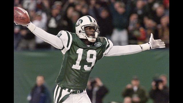
7 hours ago, jn8 said:
Actually, if I’m not mistaken, that appears to be a 2016 image. The 2017 Jets updated to the new vapor untouchable template:

The updated template greatly improved the color, in my opinion at least
I think you're right - Getty Images had that marked as a 2017 image, but looking at it closely, I'm guessing it's from December 2015 against the Titans. That's definitely the pre-2017 template. Much better, though still a tiny bit off from the pre-Nike Jets' shade of green:
-
2
-
-
1 hour ago, Cosmic said:
I think they've gotten better, but it was really, really bad at one point. They reached unintentional Irish rainbow status.
It has definitely gotten a bit better, but it's still pretty damn bad. That above picture I posted (repeated below) is from 2017. It's probably the worst example of unintentional Irish rainbow I've seen from this past season, but there's no reason that this should ever happen:

-
5 hours ago, insert name said:
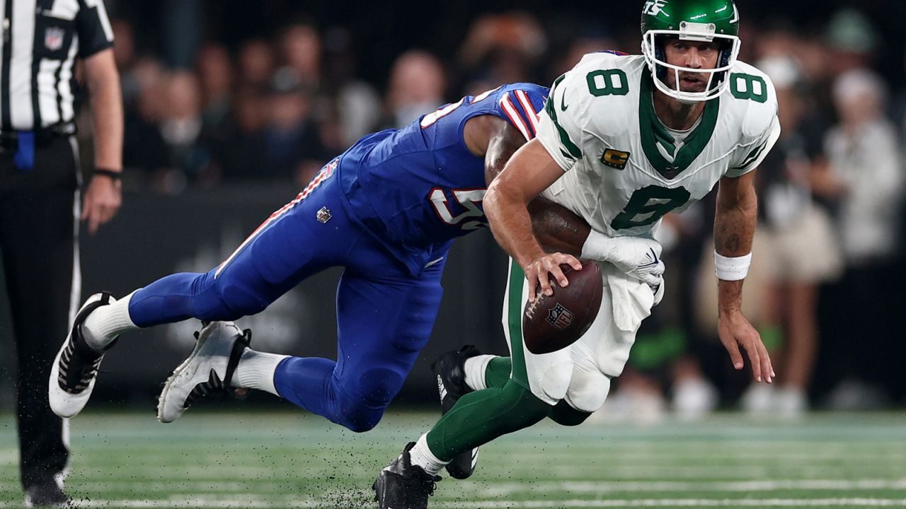
The Packers are one of 2 teams that, as of now, have never switched to the Nike sets. That’s why their uniform looks the same as before and I hope to god it stays like that.
Nike butchered the hell out of the Jets. It went from a modern classic to a damn mess.
Had forgotten that, but you're right. The Packers would probably have the same drab colors and mismatched panels as the Jets had they moved to the Nike sets.
I don't think I've ever seen a manufacturer butcher an existing uniform quite the way that Nike did with the Jets. Not talking about rolling out a poor new design, a la the Browns - I mean butchering the simple manufacturing of a uniform. The Jets have to have the sloppiest looking uniform in all of sports right now - the mismatching panels and completely incorrect shades of green look like a cheap Chinese knock-off of a professional uniform. There's flaws in the Nike template that are present on most/all NFL teams, but for some reason, they just cannot get the Jets' green uniforms right. And worse yet, other manufacturers had no problem with it for a decade+ beforehand. It's unbelievable.
-
3
-
/cdn.vox-cdn.com/uploads/chorus_image/image/63185509/usa_today_12289070.0.jpg)
/cdn.vox-cdn.com/uploads/chorus_image/image/68887212/1308959887.5.jpg)


2024-25 NHL Changes
in Sports Logo News
Posted
Why am I now picturing the Kings in Dodger blue jerseys with red numbers?