


Meshmaster101
-
Posts
149 -
Joined
-
Last visited
Posts posted by Meshmaster101
-
-
bros.... we've retvrned...
-
On 1/12/2023 at 12:34 PM, Ringneck75 said:
Kansas is strongly rumored to be changing things up. Rumors are dropping the trajan font and adopting the 1941 Jayhawk "Warhawk."
I don't know if they are moving more toward a look similar to this or not but their coach does like to mix up uniform combinations.

watch these people bring in red primary jerseys, i'll transfer to k-state if that happens i hate when we wear the reds
-
some poor 11 yr old kid who wears a "sarcastic comment loading...." tshirt :censored:ting up the thread with the same joke is an amazing reason to lock the thread, i agree.. i also love doing whippets in the bathroom during my shifts at kohls
-
 1
1
-
-
If the sounders change their shade of blue, i will take the E line into downtown seattle and start punching random bikers
-
cant wait for wichita st
-
normally when people try to do concepts on classic looks lke the raiders i get butthurt but youve done a good job with it. i love the number font. i think the numbers need to be a LITTLE bigger though.
-
 1
1
-
-
6 hours ago, guest23 said:
Everyone is ignoring that civilian ship captains go back many centuries. In my opinion nfl captaincy better reflects maritime law than that of military rank.
I swear, this system is so dumb. It’s already walking the line of sailing fetish, they might as well just push it over. Just like the rest of their stolen valor nonsense mimicking pirates and sail boats.
-
guys only the military is allowed to have team captains sorry yall try again next time !

-
3
-
-
On 8/28/2021 at 11:51 AM, TrueYankee26 said:
CBS Super Bowl graphics in College Football. CBS Sports Network.
oh goodness i forgot about cbs new scorebug they debuted at the super bowl. i thought the one they had was bad but im not looking forward to watching cbs games this year lol.
-
1
-
-
the drop shadow on those looks weird it reminds me of how coke used to put drop shadows
-
oh lord alt helmet shells got approved be prepared to see :censored: like this on social media lol
-
1
-
-
that looks great, you ought to do that with the white and brown jerseys too
-
brother how long has that been chilling in your freezer
-
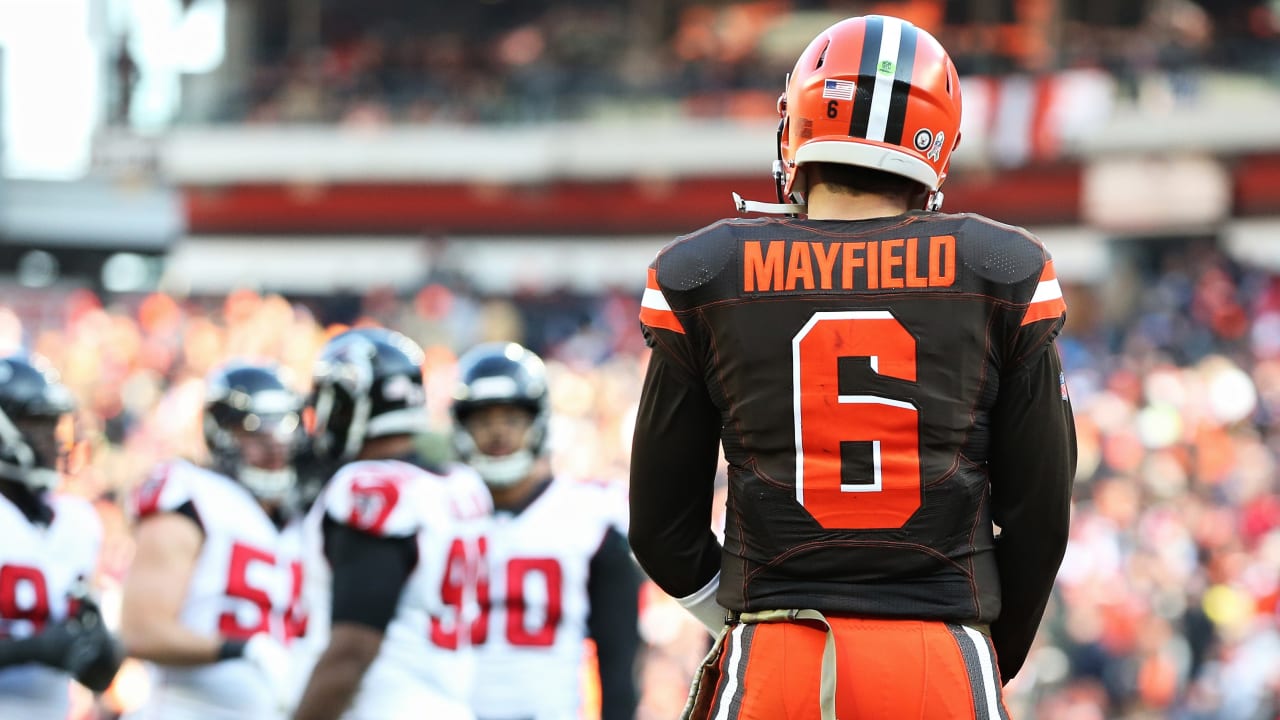
if the browns these next seasons are something to remember then im sure that baker & obj would probably fit this once the browns change their uniforms.
-
1
-
-
as a seattle native i gotta say i like 5 the best
-
the fact that 4 is in the lead for votes is giving me a tumor
-
On 2/26/2019 at 9:48 AM, SFGiants58 said:
Hello Young Sapien, the flag of the infamous Aum Shinrikyo death cult was a good-looking banner.
As as far as cult flags go, it’s better than the Branch Davidian one.
The sperm eel (or serpent/snake) really nails it. Yes, that terrible phrasing was intentional.
the sprement
-
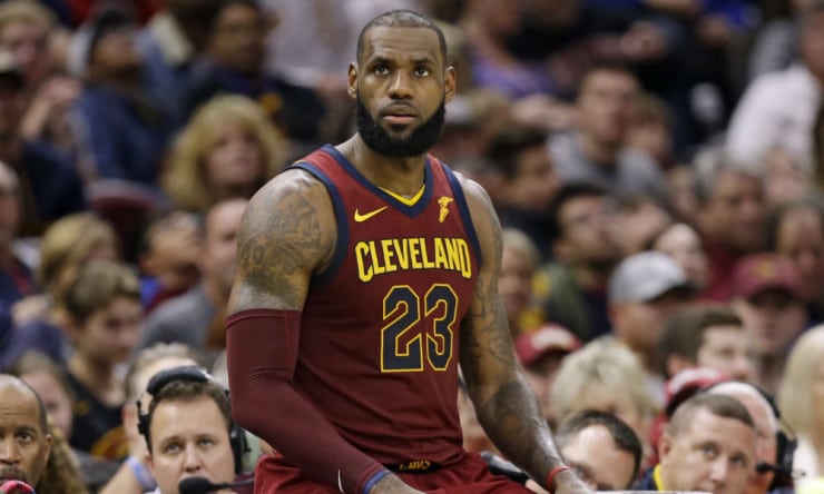
These don't really look that wrong right now, but i'd bet that once these jerseys develop an association to playing without Lebron, these jerseys will probably look a lot weirder on him than right now
-
1
-
-
On 6/13/2017 at 0:13 PM, BlueSky said:
The very essence of this thread:

why TF is he wearing Yeezys.
-
On 29 ngɔn osú 2013 at 8:51 PM, Joshawaggie said:
Most of the independent stores I see around here have the new font, but there are still a few malls that have the inlined, including the MOA, if you can believe that.
There's an independent Sears around here that still uses the inlined logo.
Nobody goes there anymore.
It's about to go out of business.


College Football 2023
in Sports Logo News
Posted
can they just man the fk up and make a uniform with the circus font. our football team can barely put together a coherent look and all people ever have to say is "OMG PUT THE WARHAWK ON IT!!!1!! SO ANGRY AND BADASS!!!!" there are people in high places trying to RUIN this teams confidence before jalon daniels #6 plays his heisman winning senior season to restore America forever