


JJ Anderes
-
Posts
319 -
Joined
-
Last visited
-
Days Won
1
Posts posted by JJ Anderes
-
-
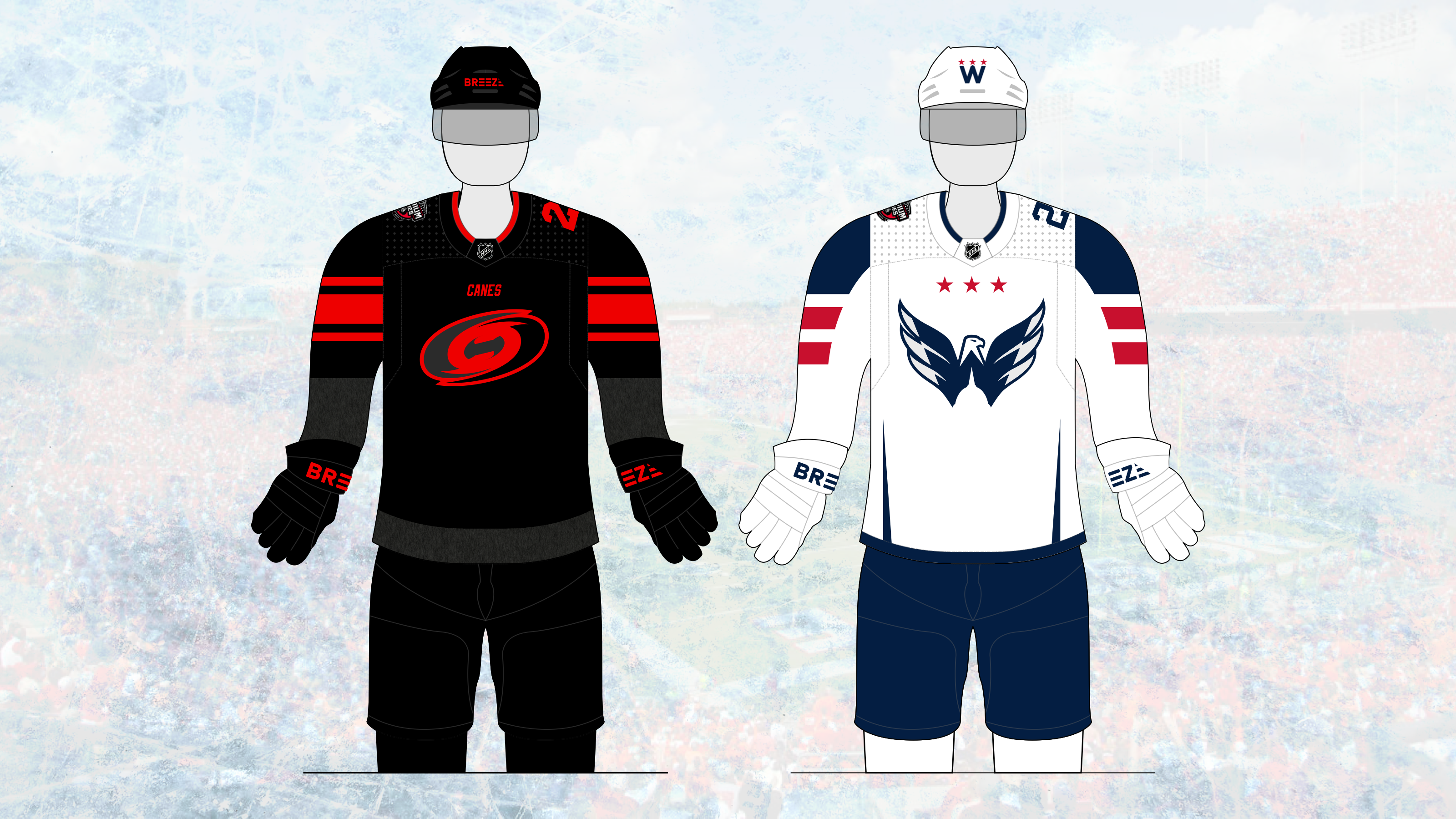
Here's my take for the upcoming Stadium Series game between the Capitals and Hurricanes.

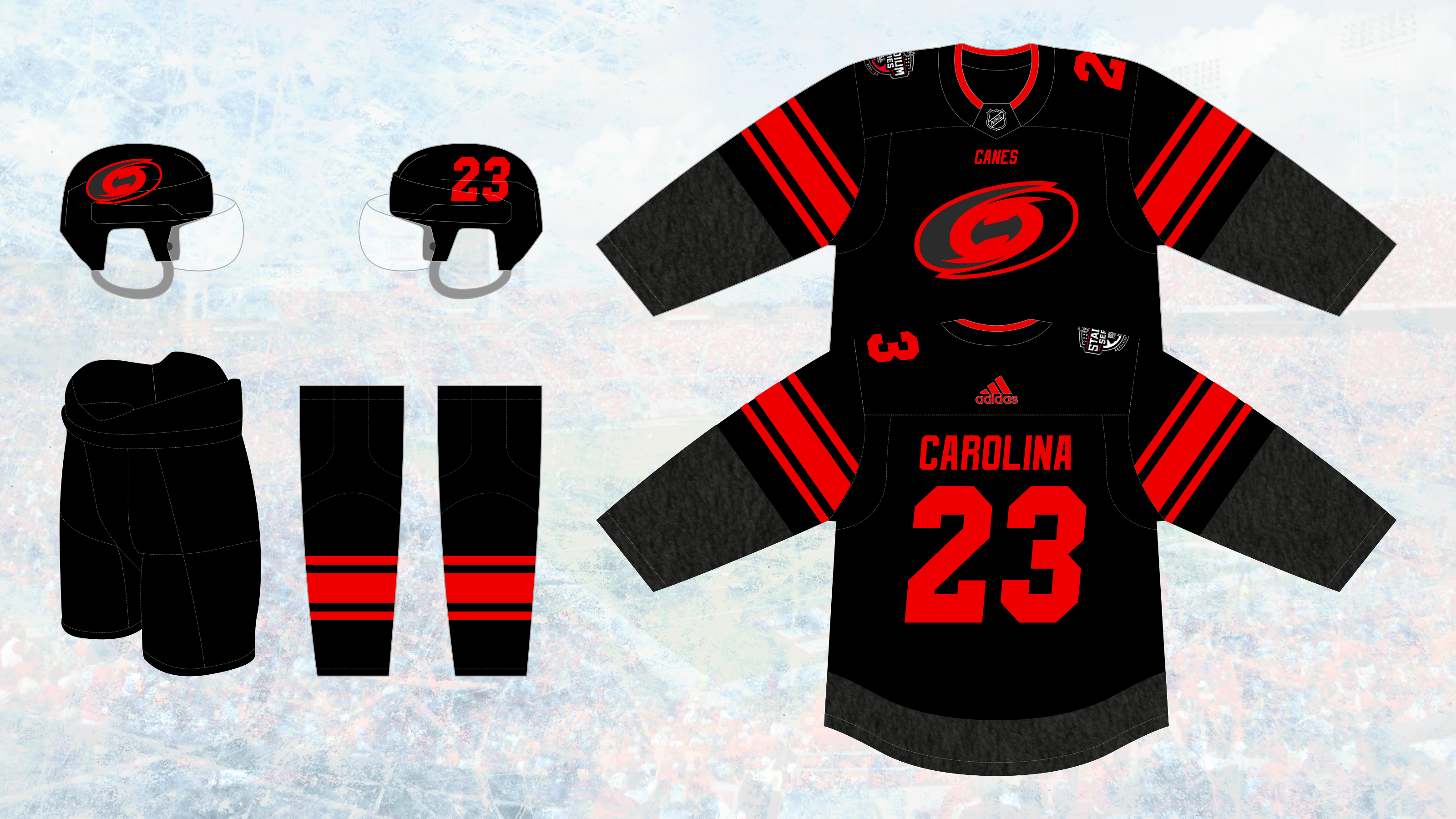
The Caps have somehow never used their best logo of the Reebok/Adidas Era as a primary, and it's time that changes. The Canes get a new version of their logo, and while it looks more simple, there are a couple extra details. The left swirl doubles as a "C" and the eye triples as an "H", and, although a little harder to make out, a faceoff dot. The C and H are accented in storm gray.
While this jersey doesn't defer too much from their leaked version in 2021, I made a couple changes, both inspired by their hosts for the game. The striping layout (a little higher on the sleeve than usual) design and wordmark under the collar are inspired by NC State's football uniforms. The italicized typeface is a nod to both the Wolfpack wordmark and Carolina's inaugural uniform. The weathered gray texture fills in the otherwise simple body of the uniform.
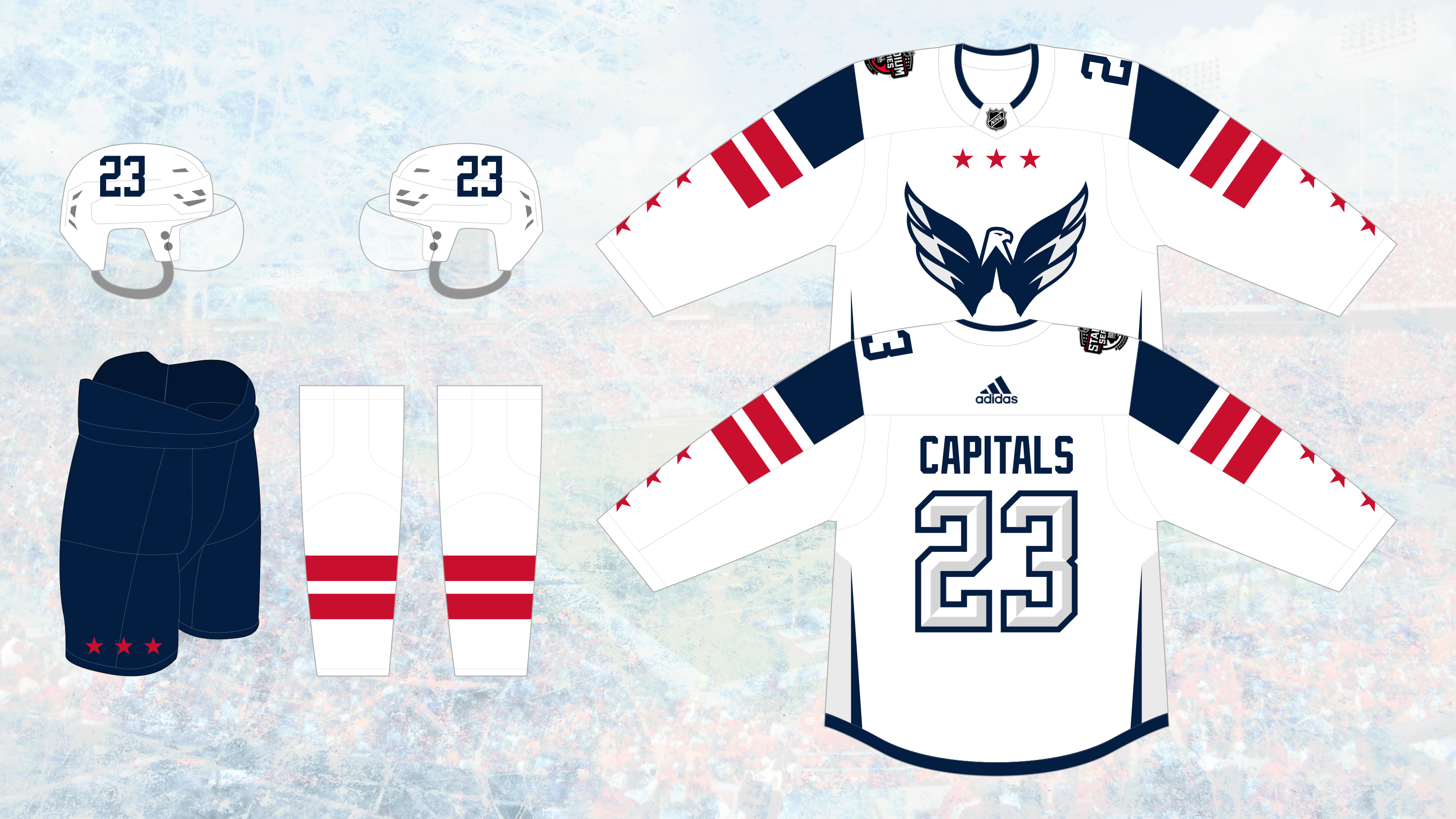
As NC State is to Carolina, so are the Commanders to the Capitals. The sleeve striping is derivative of the commanders new road uniforms, and the helmet logo/number layout is similar to the alternate black helmet. The three stars symbolic with DC appear under the collar and, per tradition, on the bottom sleeves. The side piping and beveled number font represent DC's architecture, especially the Washington Monument.
-
 2
2
-


2024 Stadium Series by DT Concepts — Set Four ARI vs. LAK 3/14
in Concepts
Posted
Loving colorado's colors, but feel like they could get away with their current font just fine. This one feels too standard/blocky.
Take my credit card info and charge whatever amount you feel is appropriate for that Minnesota one, Jesus Christ it's gorgeous!